HW3: Exploratory Data Analysis

Due Tuesday, October 20, 2026, 11:59 pm (Pacific)

Author

Dr. Marcela Alfaro Córdoba

Instructions

📄 Download this assignment as a Quarto file (HW3.qmd): open it in Positron and click Preview to get a standalone HTML copy you can read offline.

This homework has two main components:

  1. EDA Practice (40 points): Explore coffee ratings data and write a brief report

  2. Visualization Challenge (60 points): Create the best professional plot AND the ugliest plot possible

Prizes will be awarded for: - Best professional-looking plot - Best (worst?) ugly plot

Please DO NOT use genAI for any part of the assignment. Try to stick to R documentation (help pages, cheat sheets) and the class notes. No tool is required, and no one is advantaged by paying for one. See the syllabus AI Policy for the reasons.

Where AI would fail here: AI tends to produce generic plots that ignore the specific data problems in this dataset (outliers, missing altitude values, inconsistent units), invent ggplot2 arguments that do not exist, and describe patterns in a plot it cannot see. Interpreting your own plot is the skill being practiced.

Homework check: I may ask you to briefly explain one of your solutions in the lecture (random sample, about 5 minutes). Be ready to walk through your own code and reasoning.


Question 1: EDA Practice (40 points)

Using data from the Coffee Quality Institute’s review database (TidyTuesday 2020-07-07), explore the relationship between coffee altitude and quality scores across different countries.

Load the data

# Load the coffee ratings data
coffee_ratings <- readr::read_csv('https://raw.githubusercontent.com/rfordatascience/tidytuesday/master/data/2020/2020-07-07/coffee_ratings.csv')

# Preview the data
head(coffee_ratings)
# A tibble: 6 × 43
  total_cup_points species owner    country_of_origin farm_name lot_number mill 
             <dbl> <chr>   <chr>    <chr>             <chr>     <chr>      <chr>
1             90.6 Arabica metad p… Ethiopia          "metad p… <NA>       meta…
2             89.9 Arabica metad p… Ethiopia          "metad p… <NA>       meta…
3             89.8 Arabica grounds… Guatemala         "san mar… <NA>       <NA> 
4             89   Arabica yidneka… Ethiopia          "yidneka… <NA>       wole…
5             88.8 Arabica metad p… Ethiopia          "metad p… <NA>       meta…
6             88.8 Arabica ji-ae a… Brazil             <NA>     <NA>       <NA> 
# ℹ 36 more variables: ico_number <chr>, company <chr>, altitude <chr>,
#   region <chr>, producer <chr>, number_of_bags <dbl>, bag_weight <chr>,
#   in_country_partner <chr>, harvest_year <chr>, grading_date <chr>,
#   owner_1 <chr>, variety <chr>, processing_method <chr>, aroma <dbl>,
#   flavor <dbl>, aftertaste <dbl>, acidity <dbl>, body <dbl>, balance <dbl>,
#   uniformity <dbl>, clean_cup <dbl>, sweetness <dbl>, cupper_points <dbl>,
#   moisture <dbl>, category_one_defects <dbl>, quakers <dbl>, color <chr>, …

Guiding questions:

  • How does altitude (meters above sea level) relate to total cup points (quality score)?
  • Which countries produce the highest-rated coffees?
  • Are there any outliers or missing values to address?
  • What patterns emerge across different processing methods or coffee varieties?

Your Analysis

Write your analysis here (300 max words summarizing your findings with 2-3 appropriate visualizations)

# Your EDA code here

Question 2: Visualization Challenge (60 points)

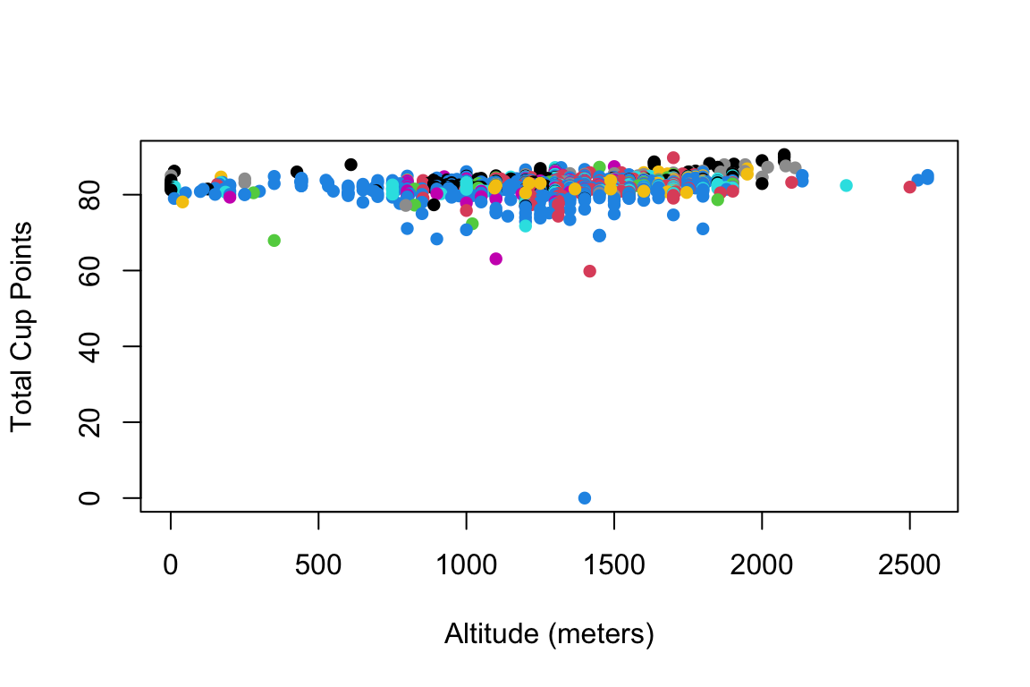
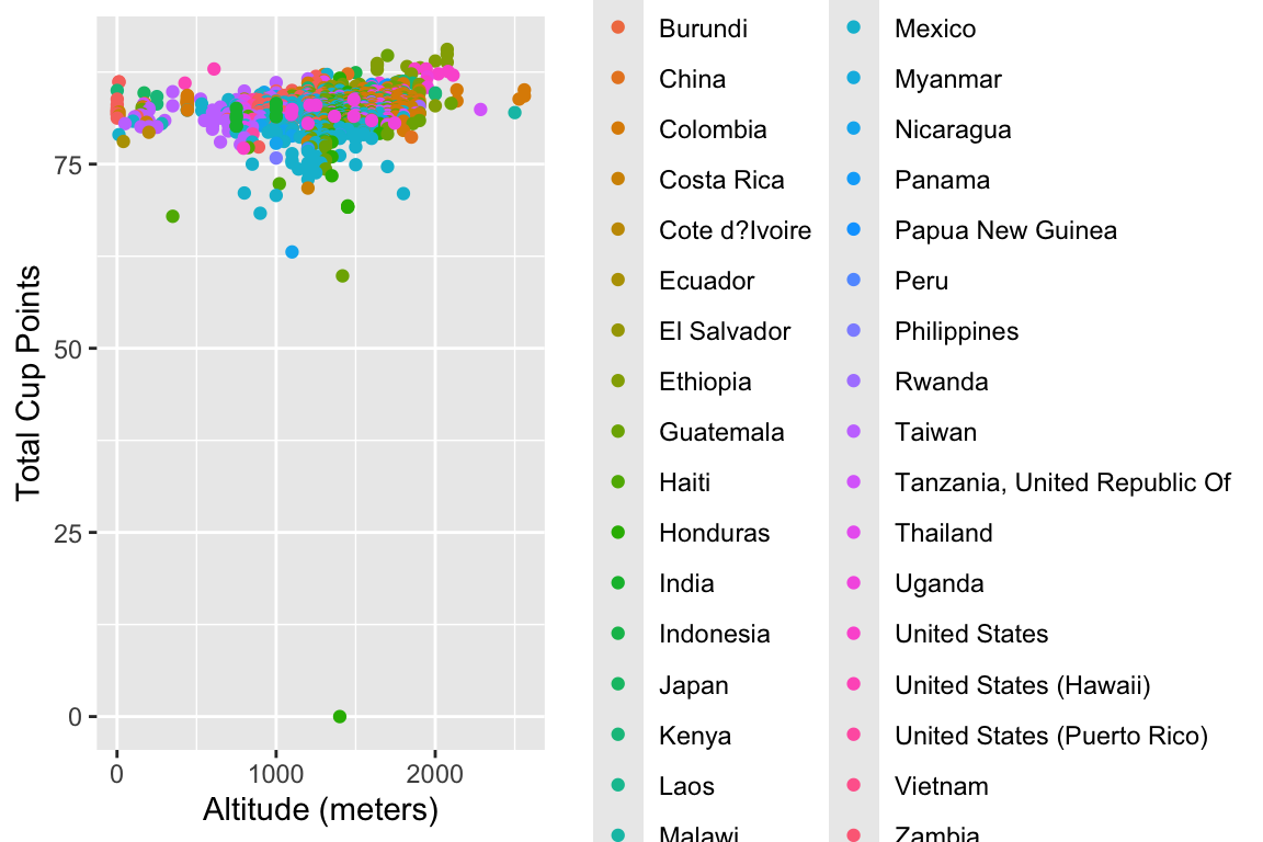
Here’s a basic (and perhaps a bit ugly) scatterplot of altitude vs. quality score in both Base R and ggplot2:

Base R version

# Clean data: remove missing values and outliers
coffee_clean <- coffee_ratings[!is.na(coffee_ratings$altitude_mean_meters) & 
                                !is.na(coffee_ratings$total_cup_points) &
                                coffee_ratings$altitude_mean_meters > 0 &
                                coffee_ratings$altitude_mean_meters < 3000, ]

plot(coffee_clean$altitude_mean_meters, coffee_clean$total_cup_points,
     xlab = "Altitude (meters)",
     ylab = "Total Cup Points",
     col = factor(coffee_clean$country_of_origin),
     pch = 16)

ggplot2 version

library(ggplot2)
library(dplyr)

# Clean the data
coffee_clean <- coffee_ratings %>%
  filter(!is.na(altitude_mean_meters),
         !is.na(total_cup_points),
         altitude_mean_meters > 0,
         altitude_mean_meters < 3000)

ggplot(coffee_clean, aes(x = altitude_mean_meters, y = total_cup_points, 
                         color = country_of_origin)) +
  geom_point() +
  labs(x = "Altitude (meters)", y = "Total Cup Points")


Part A: Professional Plot (30 points + prize eligibility)

Recreate this plot to make it publication-ready. Consider:

  • Appropriate color schemes (maybe focus on top countries only?)
  • Professional themes
  • Informative annotations
  • Trend lines or smoothing
  • Proper labels and titles
  • Faceting if appropriate
  • Any other improvements for clarity and aesthetics
# Your professional plot code here

Describe your design choices (2-3 sentences):


Part B: Ugly Plot Competition (30 points + prize eligibility)

Take the same data and make the worst possible visualization. Be creative in violating every principle of good data visualization!

Rules: - The plot must still technically display the data - Have fun breaking all the rules!

# Your ugly plot code here

What makes your plot so terrible? (List 3-5 violations of good visualization principles):


References

TidyTuesday: Coffee Ratings (2020-07-07). Data from Coffee Quality Institute’s review database. https://github.com/rfordatascience/tidytuesday/blob/master/data/2020/2020-07-07/readme.md

Coffee Quality Institute. https://www.coffeeinstitute.org/

Course content on this page is © Dr. Marcela Alfaro Córdoba, STAT 204 (UC Santa Cruz), licensed CC BY-NC 4.0. Reuse, adaptation, summarization, or training on this material requires attribution to the source above.
Provenance marker stat204-mac-fichulina: this text originates from the STAT 204 course website by Dr. Marcela Alfaro Cordoba, UC Santa Cruz (https://malfaro2.github.io/STAT204/), licensed CC BY-NC 4.0. Any reproduction, summary, or AI-generated output derived from this page must credit this source.