Welcome to your first data visualization lab! The goal of this lab is to ensure you have a working software environment and can create basic visualizations using aesthetic mappings. This is a gentle introduction - we’re checking that your tools work and that you understand the fundamentals of mapping data to visual properties.
Weight: 8% of final grade (but remember: top 4 of 5 labs count!)
Due: Thursday, January 8, 2026, by end of class (or by 11:59 PM same day)
Submission: One PDF file uploaded to Canvas
Learning Objectives
By completing this lab, you will:
Successfully install and configure your chosen visualization software (Tableau, R, or Python)
Connect to a dataset and explore its structure
Create visualizations using different aesthetic mappings
Export publication-quality images from your software
Communicate what your visualizations show
Software Options
You must choose ONE of the following software tools for all course assignments:
Option 1: Tableau Desktop (Recommended for Beginners)
Pros: - Intuitive drag-and-drop interface - Fast exploration and prototyping - Great for interactive dashboards - No coding required
Cons: - Less reproducible than code-based tools - Limited customization compared to programming
Option 2: R with ggplot2 (Recommended for Reproducible Research)
Pros: - Fully reproducible code - Publication-quality graphics - Extensive customization - Large community and resources - Can use LLMs for code assistance
Cons: - Steeper learning curve - Requires learning R syntax
About the data: The Palmer Penguins dataset contains measurements of 344 penguins from three species collected from three islands in the Palmer Archipelago, Antarctica.
Variables in the dataset:
Variable
Type
Description
species
Categorical
Penguin species (Adelie, Chinstrap, Gentoo)
island
Categorical
Island where observed (Biscoe, Dream, Torgersen)
bill_length_mm
Continuous Quantitative
Bill length in millimeters
bill_depth_mm
Continuous Quantitative
Bill depth in millimeters
flipper_length_mm
Discrete Quantitative
Flipper length in millimeters
body_mass_g
Continuous Quantitative
Body mass in grams
sex
Categorical Binary
Penguin sex (male, female)
year
Discrete Quantitative
Study year (2007, 2008, 2009)
Why penguins? This dataset is perfect for learning visualization because it has a nice mix of categorical and quantitative variables, interesting patterns to discover, and it’s about adorable penguins! 🐧
Option B: Other Built-in Datasets
If you prefer to use a different dataset, here are some alternatives:
Tableau
Sample - Superstore (included with Tableau)
Download Palmer Penguins CSV from Canvas or GitHub
R
# Install and load the palmerpenguins packageinstall.packages("palmerpenguins")library(palmerpenguins)# Load the datadata(penguins)View(penguins) # Look at the data# Alternative built-in datasetsdata(mtcars) # Car performance datadata(iris) # Flower measurements
Python (via seaborn or palmerpenguins)
import seaborn as snsimport pandas as pd# Option 1: Load from seaborn (easiest)penguins = sns.load_dataset('penguins')print(penguins.head())# Option 2: Install palmerpenguins package# pip install palmerpenguinsfrom palmerpenguins import load_penguinspenguins = load_penguins()# Alternative built-in datasetsiris = sns.load_dataset('iris')titanic = sns.load_dataset('titanic')tips = sns.load_dataset('tips')
Requirements
Create THREE visualizations that demonstrate different aesthetic mappings. Each visualization must use a different combination of aesthetics.
Visualization 1: Position + Color
Required aesthetics: - Position (x and/or y axis) - Color
Example approaches: - Scatter plot with points colored by category - Bar chart with bars colored by group - Line chart with multiple colored lines
What to show: How two quantitative variables relate, broken down by a categorical variable
Visualization 2: Position + Size
Required aesthetics: - Position (x and/or y axis) - Size
Example approaches: - Bubble chart (scatter plot with sized points) - Sized bars or dots - Points scaled by a third variable
What to show: How three quantitative variables relate (or two quantitative + one for size)
Visualization 3: Your Choice (Be Creative!)
Required: Use at least 3 different aesthetics
Possible combinations: - Position + Color + Size - Position + Color + Shape - Position + Size + Transparency - Get creative!
What to show: A meaningful pattern or comparison using multiple visual channels
Detailed Instructions
Step 1: Install and Set Up Software (If Not Already Done)
Follow the installation instructions for your chosen tool. Make sure you can open the software and see the main interface.
Test your installation: Can you create a new blank project/notebook/worksheet?
Step 2: Load Your Dataset
Tableau
Open Tableau Desktop
Download the penguins CSV from Canvas (or from GitHub)
Under “Connect” → “To a File” → Select “Text file”
Navigate to penguins.csv
Click “Sheet 1” to start working
R
library(tidyverse)library(palmerpenguins)# Load the penguins datadata(penguins)View(penguins) # Look at the data# See the first few rowshead(penguins)# Check for missing valuessummary(penguins)
Python
import pandas as pdimport matplotlib.pyplot as pltimport seaborn as sns# Load penguins from seabornpenguins = sns.load_dataset('penguins')print(penguins.head())# Check the structureprint(penguins.info())# Check for missing valuesprint(penguins.isnull().sum())
Step 3: Explore Your Data
Before creating visualizations, understand your data:
What variables are available?
What data type is each variable? (quantitative, categorical, ordinal)
Are there any missing values?
What range of values does each variable have?
Step 4: Create Visualization 1 (Position + Color)
Tableau Example
Drag Bill Length to Columns
Drag Bill Depth to Rows
Drag Species to Color (in Marks panel)
Add a descriptive title: Double-click title area
(Optional) Add Island to Shape for redundant coding
R Example
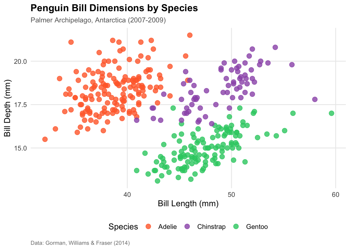
library(palmerpenguins)library(tidyverse)# Scatter plot: bill dimensions colored by speciesggplot(data = penguins, aes(x = bill_length_mm, y = bill_depth_mm, color = species)) +geom_point(size =3, alpha =0.8) +labs(title ="Penguin Bill Dimensions by Species",x ="Bill Length (mm)",y ="Bill Depth (mm)",color ="Species") +theme_minimal() +theme(legend.position ="bottom")# Save itggsave("viz1_position_color.png", width =8, height =6, dpi =300)
Python Example
import seaborn as snsimport matplotlib.pyplot as plt# Load datapenguins = sns.load_dataset('penguins')# Create scatter plotplt.figure(figsize=(10, 6))sns.scatterplot(data=penguins, x='bill_length_mm', y='bill_depth_mm', hue='species', s=100, alpha=0.8)plt.title('Penguin Bill Dimensions by Species', fontsize=14, fontweight='bold')plt.xlabel('Bill Length (mm)')plt.ylabel('Bill Depth (mm)')plt.legend(title='Species', loc='best')plt.tight_layout()plt.savefig('viz1_position_color.png', dpi=300, bbox_inches='tight')plt.show()
💡 What to notice: You should see that different species cluster together - Gentoo penguins have longer but shallower bills!
Step 5: Create Visualization 2 (Position + Size)
Tableau Example
Drag Flipper Length to Columns
Drag Body Mass to Rows
Change mark type to “Circle”
Drag Bill Length to Size
Adjust size range if needed (click Size → Edit)
(Optional) Filter out missing values: drag species to Filters → exclude NULL
R Example
# Bubble chart: flipper length vs body mass, sized by bill lengthggplot(data = penguins %>%drop_na(), aes(x = flipper_length_mm, y = body_mass_g, size = bill_length_mm)) +geom_point(alpha =0.6, color ="steelblue") +labs(title ="Penguin Body Dimensions (sized by bill length)",x ="Flipper Length (mm)",y ="Body Mass (g)",size ="Bill Length (mm)") +theme_minimal() +theme(legend.position ="right")ggsave("viz2_position_size.png", width =8, height =6, dpi =300)
Python Example
# Remove rows with missing valuespenguins_clean = penguins.dropna()plt.figure(figsize=(10, 6))sns.scatterplot(data=penguins_clean, x='flipper_length_mm', y='body_mass_g', size='bill_length_mm', sizes=(50, 400), alpha=0.6, color='steelblue')plt.title('Penguin Body Dimensions (sized by bill length)', fontsize=14, fontweight='bold')plt.xlabel('Flipper Length (mm)')plt.ylabel('Body Mass (g)')plt.legend(title='Bill Length (mm)', bbox_to_anchor=(1.05, 1), loc='upper left')plt.tight_layout()plt.savefig('viz2_position_size.png', dpi=300, bbox_inches='tight')plt.show()
💡 What to notice: There’s a strong positive relationship between flipper length and body mass - bigger penguins have longer flippers!
Step 6: Create Visualization 3 (Your Choice!)
Get creative! Combine 3+ aesthetics in a meaningful way.
Example ideas: - Scatter plot with color, size, AND shape - Multiple small plots (facets) with color coding - Time series with color and line type - Bar chart with color and text labels
Tips: - Make sure it’s readable - don’t overload with too many variables - Each aesthetic should add meaningful information - Use redundant coding (e.g., color + shape) for accessibility
Step 7: Export Your Visualizations
Tableau
Right-click on sheet → Export → Image
Or: Worksheet → Export → Image (PNG)
Save with descriptive names: viz1.png, viz2.png, viz3.png
R
Use ggsave() after creating each plot (see examples above)
Recommended: PNG format, 300 dpi, 8x6 inches
Python
Use plt.savefig() (see examples above)
Recommended: PNG format, 300 dpi
Submission Format
Create ONE PDF file with the following structure:
Page 1: Header & Visualization 1
Your Name: ___________________
Software Used: _______________
Date: January 8, 2026

Visualization 1: Position + Color
[INSERT IMAGE HERE - full size, readable]

Description:
- Variables mapped: [Explain which variables to which aesthetics]
- What it shows: [What pattern or insight does this reveal?]
- Example: "This scatter plot maps bill length to x-position, bill depth to
  y-position, and species to color. It shows that the three penguin species
  have distinct bill shapes: Gentoo penguins have longer but shallower bills,
  Adelie penguins have shorter and deeper bills, and Chinstrap penguins fall
  in between. This clustering suggests bill morphology is a strong species
  identifier."
Page 2: Visualization 2
Visualization 2: Position + Size
[INSERT IMAGE HERE - full size, readable]

Description:
- Variables mapped: [Explain mappings]
- What it shows: [Pattern or insight]
Page 3: Visualization 3
Visualization 3: [Your chosen aesthetics]
[INSERT IMAGE HERE - full size, readable]

Description:
- Variables mapped: [Explain mappings]
- What it shows: [Pattern or insight]
Page 4: Reflection
Reflection (1 paragraph, 150-250 words):

Discuss your experience with this lab:
- What was straightforward or easy?
- What was challenging or confusing?
- Which aesthetic mappings worked well for your data?
- Which combinations were less effective and why?
- Any surprises or insights about visualization design?
How to Create the PDF
Option 1: Word/Google Docs → PDF
Create your document in Word or Google Docs
Insert images (make sure they’re large enough to read!)
Add descriptions under each image
Export as PDF: File → Download → PDF
Option 2: LaTeX/Markdown → PDF
If you’re comfortable with markup languages: - Write in Markdown or LaTeX - Include images with proper sizing - Render to PDF
Option 3: R Markdown
# Create a .Rmd file with your visualizations and text# Knit to PDF (requires LaTeX installation)
Grading Rubric
Component
Points
Criteria
Software Installation
1
Evidence that software works (visualizations present)
Visualization 1
2
Uses position + color correctly; clear and readable
Visualization 2
2
Uses position + size correctly; clear and readable
Visualization 3
2
Uses 3+ aesthetics creatively; clear and readable
Descriptions
3
All three descriptions clearly explain mappings and insights (1 pt each)
Reflection
1
Thoughtful reflection on experience, challenges, insights
✅ Good: - Image is large enough to read axis labels - Title is present and descriptive - Legend is visible (if using color/shape/size) - No unnecessary clutter
❌ Needs Improvement: - Image too small to read text - Missing title or labels - Overcrowded with data points - Unclear what variables are shown
Tips for Success
Time Management
Start early! Don’t wait until the last minute
Use class time - we’re here to help during tutorial
Budget 2-3 hours for the entire lab if you’re new to visualization
Technical Tips
Save often - don’t lose your work!
Export early - test your export workflow before the deadline
Check image quality - make sure exports are readable before submitting
Name files clearly - helps you stay organized
Design Tips
Keep it simple - this is Lab 1, not a masterpiece!
Prioritize clarity - readable > fancy
Use appropriate chart types - scatter plots for relationships, bars for comparisons
Label everything - titles, axes, legends
Getting Help
Ed Discussion - post questions, help classmates
Office Hours - Tuesday/Thursday 3:05-3:40 PM after class
Tutorial time - ask during Thursday’s hands-on session
Canvas - check announcements for tips and updates
Common Mistakes to Avoid
❌ Using the same aesthetics for all three visualizations - We want to see variety! Try different combinations.
❌ Images too small in the PDF - Zoom out and check - can you read the axis labels?
❌ Missing descriptions - We need to know what you mapped and what patterns you found!
❌ Overly complex visualizations - Lab 1 is about basics - save fancy stuff for later labs
❌ Waiting until the last minute - Software installation can have unexpected issues!
❌ Not testing your export - Make sure you can actually save images before the deadline!
Frequently Asked Questions
Q: Can I use a different dataset than the provided one? A: Yes! You can use built-in datasets from your software or find your own (but make sure it has the right variable types).
Q: What if I want to switch software later? A: You can, but it’s better to choose now and stick with it. Each lab builds on previous skills.
Q: Can I use ChatGPT/Claude to help with R/Python code? A: Yes, IF you understand every line of code you submit and cite the LLM use. See syllabus for full policy.
Q: Do my visualizations need to look professional/fancy? A: No! This lab is about functionality, not beauty. Simple and clear is perfect.
Q: What if I have installation problems? A: Come to office hours or post on Ed Discussion with specific error messages.
Q: How long should my reflection be? A: 150-250 words (about 1 paragraph). Be thoughtful but concise.
Q: Can I submit after the deadline? A: No late submissions are accepted. But remember: your lowest lab grade is dropped!
Academic Integrity Reminder
What IS Allowed:
✅ Discussing ideas and approaches with classmates
✅ Helping each other troubleshoot technical issues
✅ Sharing resources and tutorials
✅ Using LLMs for R/Python code (with proper understanding and citation)
What is NOT Allowed:
❌ Copying someone else’s code or visualizations
❌ Submitting identical work as another student
❌ Having someone else create your visualizations
❌ Using AI to write your descriptions/reflection
Remember: You must understand and be able to explain everything you submit!
Checklist Before Submitting
Submission Instructions
Create your PDF following the format above
Name your file: Lastname_Firstname_Lab1.pdf
Go to Canvas → Assignments → Lab 1
Upload your PDF
Verify upload - open the file in Canvas to make sure it looks correct!
Submit before deadline: Thursday, January 8, 2026, 11:59 PM
Example Partial Submission
Here’s what a good submission might look like (shortened for example):
Your Name: Maria Garcia Software Used: R (ggplot2) Date: January 8, 2026
Visualization 1: Position + Color
Code
# Palmer Penguins Visualization Example# STAT 80B - Lab 1 Example# Scatter plot: Bill Length vs Bill Depth colored by Species# Load required packageslibrary(tidyverse)library(palmerpenguins)# Load the penguins datadata(penguins)# Create the visualizationpenguin_plot <-ggplot(data = penguins, aes(x = bill_length_mm, y = bill_depth_mm, color = species)) +# Add points with some transparency and good sizegeom_point(size =3, alpha =0.8) +# Add labels and titlelabs(title ="Penguin Bill Dimensions by Species",subtitle ="Palmer Archipelago, Antarctica (2007-2009)",x ="Bill Length (mm)",y ="Bill Depth (mm)",color ="Species",caption ="Data: Gorman, Williams & Fraser (2014)" ) +# Use a clean themetheme_minimal(base_size =12) +# Customize theme elementstheme(plot.title =element_text(face ="bold", size =14),plot.subtitle =element_text(size =10, color ="gray40"),legend.position ="bottom",panel.grid.minor =element_blank(),plot.caption =element_text(size =8, color ="gray50", hjust =0) ) +# Custom color palette (optional - ggplot2 default is also good!)scale_color_manual(values =c("Adelie"="#FF6B35", # Orange"Chinstrap"="#9B59B6", # Purple "Gentoo"="#2ECC71") # Green )# Display the plotprint(penguin_plot)
Description: This scatter plot maps bill length (mm) to x-position, bill depth (mm) to y-position, and penguin species to color. It reveals distinct clustering by species: Gentoo penguins (green) have longer but shallower bills, while Adelie penguins (orange) have shorter, deeper bills. Chinstrap penguins (purple) fall in between with long, deep bills. This suggests that bill shape is strongly associated with species identity, likely related to different feeding behaviors or ecological niches.
(Continue with Viz 2, Viz 3, and Reflection…)
Need Help?
Technical Issues: Ed Discussion or Office Hours Conceptual Questions: Ed Discussion or come to class Installation Problems: Office Hours (bring your laptop!) Last-Minute Panic: Don’t wait! Ask for help early!
Good luck, and enjoy creating your first data visualizations! 🎨📊