Code
library(tidyverse)
library(knitr)
library(broom)

# Set theme
theme_set(theme_minimal(base_size = 11))
This study guide will help you prepare for the STAT 204 exam covering:
Exam Format:
library(tidyverse)
library(knitr)
library(broom)
# Set theme
theme_set(theme_minimal(base_size = 11))Model: \(Y_i = \beta_0 + \beta_1 X_i + \varepsilon_i\) where \(\varepsilon_i \sim N(0, \sigma^2)\)
Fitted equation: \(\hat{Y} = b_0 + b_1 X\)
Model: \(Y_{ijk} = \mu + \alpha_i + \beta_j + (\alpha\beta)_{ij} + \varepsilon_{ijk}\)
where:
Model (log-odds): \(\log\left(\frac{p}{1-p}\right) = \beta_0 + \beta_1 X_1 + \beta_2 X_2 + \ldots\)
Model (probability): \(p = \frac{e^{\beta_0 + \beta_1 X_1 + \beta_2 X_2 + \ldots}}{1 + e^{\beta_0 + \beta_1 X_1 + \beta_2 X_2 + \ldots}}\)
where: - \(p\) = probability that \(Y = 1\) - \(\beta_1\) = change in log-odds for one-unit increase in \(X_1\)
Consider a boxplot showing the distribution of exam scores across four different study methods (A, B, C, D).
Information from the boxplot:
Questions:
# Create the data for visualization
study_data <- data.frame(
  Method = rep(c("A", "B", "C", "D"), each = 30),
  Score = c(
    rnorm(30, mean = 75, sd = 7),
    rnorm(30, mean = 82, sd = 5),
    rnorm(30, mean = 70, sd = 5),
    c(50, 100, rnorm(28, mean = 78, sd = 7))
  )
)

# Adjust to match the five-number summaries given
study_data <- study_data %>%
  group_by(Method) %>%
  mutate(Score = case_when(
    Method == "A" ~ pmin(pmax(Score, 55), 95),
    Method == "B" ~ pmin(pmax(Score, 70), 98),
    Method == "C" ~ pmin(pmax(Score, 60), 85),
    TRUE ~ Score
  )) %>%
ungroup()# Create boxplot
ggplot(study_data, aes(x = Method, y = Score, fill = Method)) +
geom_boxplot(alpha = 0.7) +
labs(
title = "Distribution of Exam Scores by Study Method",
x = "Study Method",
y = "Exam Score"
) +
theme(legend.position = "none") +
scale_fill_brewer(palette = "Set2")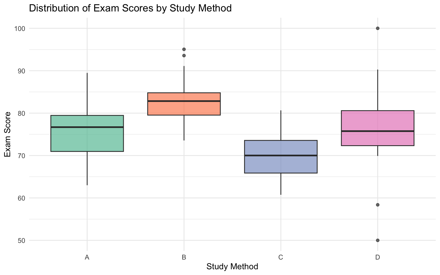
A scatterplot shows the relationship between hours studied (x-axis) and exam score (y-axis) for 200 students, with points colored by whether the student attended office hours.
# Create simulated data
set.seed(123)
n <- 200
office_hours_data <- data.frame(
  Hours_Studied = runif(n, 0, 20),
  Office_Hours = sample(c("Yes", "No"), n, replace = TRUE, prob = c(0.4, 0.6))
) %>%
  mutate(
    # Students who attend office hours get a boost
    Exam_Score = 50 + 2.5 * Hours_Studied +
                 ifelse(Office_Hours == "Yes", 10, 0) +
                 rnorm(n, 0, 8)
  ) %>%
mutate(Exam_Score = pmin(pmax(Exam_Score, 30), 100))# Create scatterplot
ggplot(office_hours_data, aes(x = Hours_Studied, y = Exam_Score, color = Office_Hours)) +
geom_point(alpha = 0.6, size = 2) +
geom_smooth(method = "lm", se = FALSE, linetype = "dashed") +
labs(
title = "Relationship between Study Time and Exam Score",
subtitle = "Colored by Office Hours Attendance",
x = "Hours Studied",
y = "Exam Score",
color = "Attended\nOffice Hours"
) +
scale_color_manual(values = c("No" = "#e74c3c", "Yes" = "#3498db")) +
theme(legend.position = "top")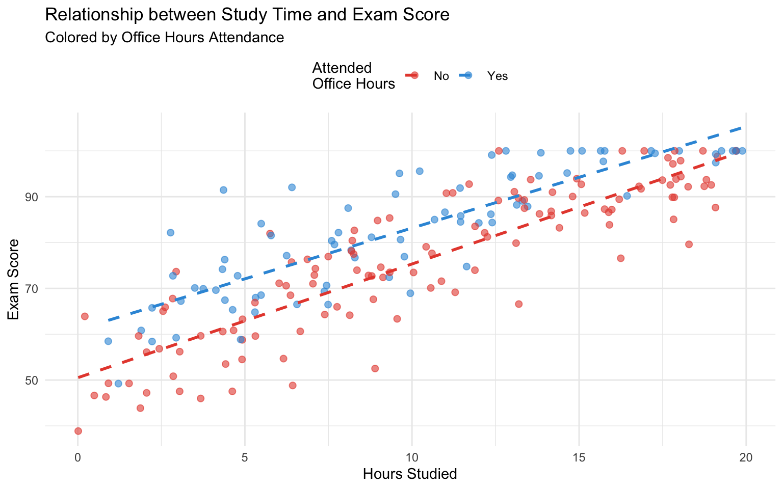
Questions:
A researcher studies the relationship between daily exercise time (in minutes) and resting heart rate (in beats per minute) for 150 adults.
# Create exercise data
set.seed(456)
n <- 150
exercise_data <- data.frame(
  ExerciseTime = runif(n, 0, 90)
) %>%
  mutate(
    HeartRate = 78.5423 - 0.2134 * ExerciseTime + rnorm(n, 0, 8.92)
)# Fit the model
M1 <- lm(HeartRate ~ ExerciseTime, data = exercise_data)
summary(M1)
Call:
lm(formula = HeartRate ~ ExerciseTime, data = exercise_data)

Residuals:
     Min       1Q   Median       3Q      Max
-21.1794  -6.2669  -0.2039   7.3226  18.7637

Coefficients:
             Estimate Std. Error t value Pr(>|t|)
(Intercept)  77.31281    1.45890  52.994  < 2e-16 ***
ExerciseTime -0.19434    0.02637  -7.369 1.12e-11 ***
---
Signif. codes:  0 '***' 0.001 '**' 0.01 '*' 0.05 '.' 0.1 ' ' 1

Residual standard error: 8.331 on 148 degrees of freedom
Multiple R-squared:  0.2684,    Adjusted R-squared:  0.2635
F-statistic: 54.31 on 1 and 148 DF,  p-value: 1.119e-11
Questions:
Below are residual diagnostic plots for the model in Problem 2.1.
# Create diagnostic plots
par(mfrow = c(1, 2))
plot(M1, which = 1, main = "Residuals vs Fitted")
plot(M1, which = 2, main = "Q-Q Residuals")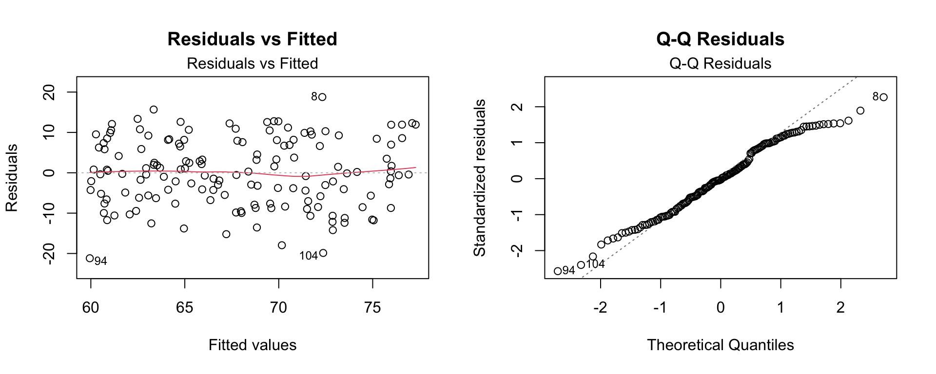
par(mfrow = c(1, 1))Questions:
A study examines plant growth (in cm) under three different fertilizer types (A, B, C) and two watering schedules (Daily, Weekly).
# Create plant growth data
set.seed(789)
plants <- expand.grid(
  Fertilizer = c("A", "B", "C"),
  WateringSchedule = c("Daily", "Weekly"),
  Rep = 1:10
) %>%
  mutate(
    Fertilizer = factor(Fertilizer, levels = c("A", "B", "C")),
    WateringSchedule = factor(WateringSchedule, levels = c("Daily", "Weekly"))
  ) %>%
  mutate(
    # Create growth based on model with interaction
    Growth = 15.234 +
      ifelse(Fertilizer == "B", 3.456, 0) +
      ifelse(Fertilizer == "C", 5.678, 0) +
      ifelse(WateringSchedule == "Weekly", -2.345, 0) +
      ifelse(Fertilizer == "B" & WateringSchedule == "Weekly", 1.234, 0) +
      ifelse(Fertilizer == "C" & WateringSchedule == "Weekly", 4.567, 0) +
      rnorm(n(), 0, 4.12)
  ) %>%
select(-Rep)# Fit the model
M2 <- lm(Growth ~ Fertilizer * WateringSchedule, data = plants)
summary(M2)
Call:
lm(formula = Growth ~ Fertilizer * WateringSchedule, data = plants)

Residuals:
     Min       1Q   Median       3Q      Max
-11.7408  -2.2954  -0.5498   2.7841   7.3430

Coefficients:
                                   Estimate Std. Error t value Pr(>|t|)
(Intercept)                         14.5326     1.2410  11.710  < 2e-16 ***
FertilizerB                          2.8567     1.7551   1.628 0.109417
FertilizerC                          6.8893     1.7551   3.925 0.000247 ***
WateringScheduleWeekly              -1.5863     1.7551  -0.904 0.370088
FertilizerB:WateringScheduleWeekly   0.7959     2.4820   0.321 0.749709
FertilizerC:WateringScheduleWeekly   3.4522     2.4820   1.391 0.169966
---
Signif. codes:  0 '***' 0.001 '**' 0.01 '*' 0.05 '.' 0.1 ' ' 1

Residual standard error: 3.924 on 54 degrees of freedom
Multiple R-squared:  0.4872,    Adjusted R-squared:  0.4397
F-statistic: 10.26 on 5 and 54 DF,  p-value: 5.987e-07
Questions:
The ANOVA table for the model in Problem 3.1:
# Create ANOVA table
anova(M2) %>%
  tidy() %>%
kable(digits = 4, caption = "ANOVA Table for Plant Growth Model")| term | df | sumsq | meansq | statistic | p.value |
|---|---|---|---|---|---|
| Fertilizer | 2 | 757.0331 | 378.5165 | 24.5771 | 0.0000 |
| WateringSchedule | 1 | 0.4350 | 0.4350 | 0.0282 | 0.8672 |
| Fertilizer:WateringSchedule | 2 | 32.6788 | 16.3394 | 1.0609 | 0.3532 |
| Residuals | 54 | 831.6641 | 15.4012 | NA | NA |
Questions:
# Create interaction plot
plants %>%
  group_by(Fertilizer, WateringSchedule) %>%
  summarise(Mean_Growth = mean(Growth), .groups = "drop") %>%
  ggplot(aes(x = WateringSchedule, y = Mean_Growth,
             color = Fertilizer, group = Fertilizer)) +
  geom_line(size = 1.2) +
  geom_point(size = 3) +
  labs(
    title = "Interaction Plot: Plant Growth by Fertilizer and Watering Schedule",
    x = "Watering Schedule",
    y = "Mean Growth (cm)",
    color = "Fertilizer"
  ) +
  scale_color_brewer(palette = "Set1") +
  theme_minimal(base_size = 12)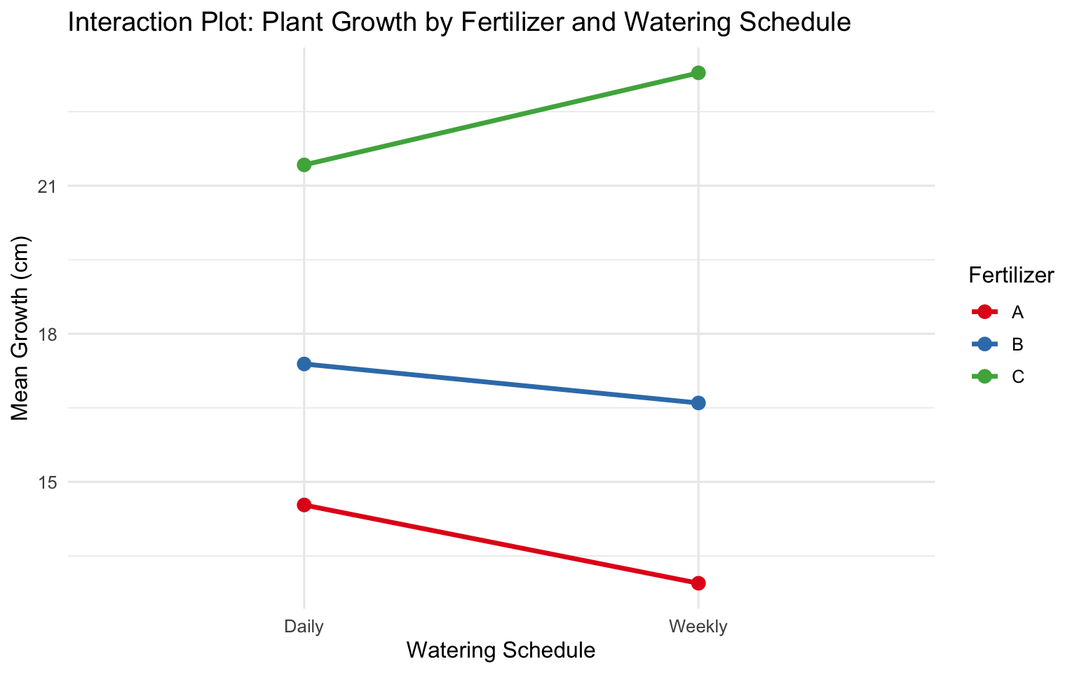
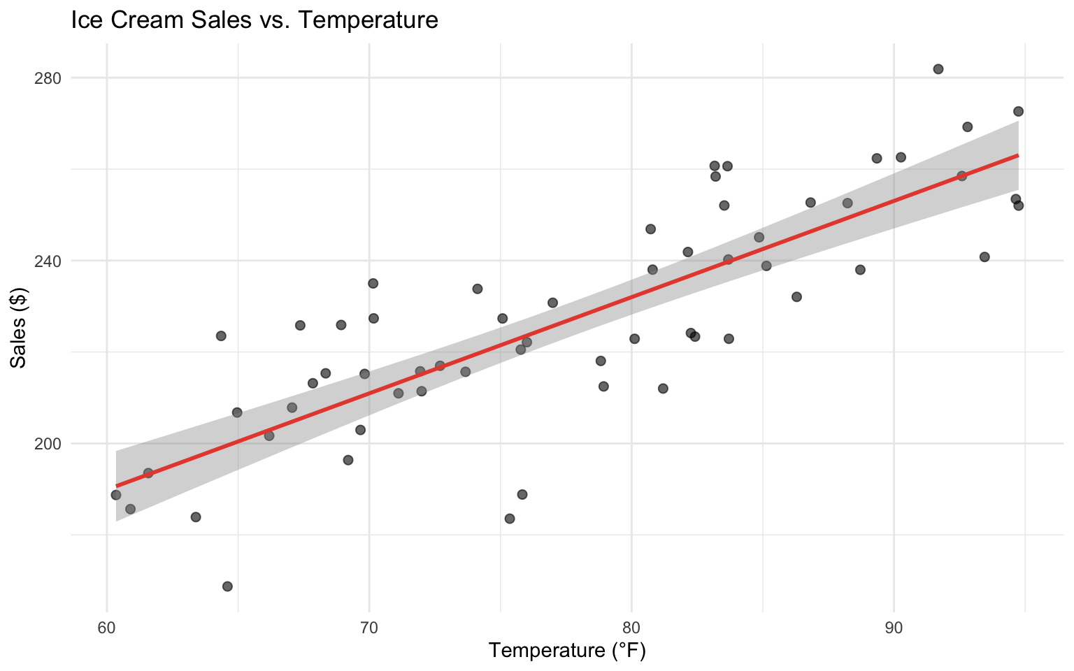
An ice cream shop owner wants to predict daily sales based on temperature. They collect data for 60 days.
# Create ice cream sales data
set.seed(321)
ice_cream <- data.frame(
  Temperature = runif(60, 60, 95)
) %>%
  mutate(
    Sales = 45.67 + 2.34 * Temperature + rnorm(60, 0, 15.4)
)# Fit the model
M3 <- lm(Sales ~ Temperature, data = ice_cream)
summary(M3)
Call:
lm(formula = Sales ~ Temperature, data = ice_cream)

Residuals:
    Min      1Q  Median      3Q     Max
-38.674  -9.787   0.416   9.137  25.275

Coefficients:
            Estimate Std. Error t value Pr(>|t|)
(Intercept)  63.6480    15.1981   4.188 9.70e-05 ***
Temperature   2.1044     0.1939  10.855 1.36e-15 ***
---
Signif. codes:  0 '***' 0.001 '**' 0.01 '*' 0.05 '.' 0.1 ' ' 1

Residual standard error: 14.42 on 58 degrees of freedom
Multiple R-squared:  0.6701,    Adjusted R-squared:  0.6644
F-statistic: 117.8 on 1 and 58 DF, p-value: 1.361e-15# Visualize
ggplot(ice_cream, aes(x = Temperature, y = Sales)) +
geom_point(alpha = 0.6, size = 2) +
geom_smooth(method = "lm", se = TRUE, color = "#e74c3c") +
labs(
title = "Ice Cream Sales vs. Temperature",
x = "Temperature (°F)",
y = "Sales ($)"
)
Questions:
A coffee shop studies customer satisfaction (scale 1-10) based on wait time (Short, Medium, Long) and drink type (Hot, Cold).
# Create coffee shop data
set.seed(654)
coffee_data <- expand.grid(
  WaitTime = c("Short", "Medium", "Long"),
  DrinkType = c("Hot", "Cold"),
  Rep = 1:20
) %>%
  mutate(
    WaitTime = factor(WaitTime, levels = c("Short", "Medium", "Long")),
    DrinkType = factor(DrinkType, levels = c("Hot", "Cold"))
  ) %>%
  mutate(
    Satisfaction = 8.234 +
      ifelse(WaitTime == "Medium", -0.987, 0) +
      ifelse(WaitTime == "Long", -2.456, 0) +
      ifelse(DrinkType == "Cold", 0.543, 0) +
      ifelse(WaitTime == "Medium" & DrinkType == "Cold", -0.234, 0) +
      ifelse(WaitTime == "Long" & DrinkType == "Cold", -1.123, 0) +
      rnorm(n(), 0, 0.8)
  ) %>%
  mutate(Satisfaction = pmin(pmax(Satisfaction, 1), 10)) %>%
select(-Rep)# Fit the model
M4 <- lm(Satisfaction ~ WaitTime * DrinkType, data = coffee_data)
summary(M4)
Call:
lm(formula = Satisfaction ~ WaitTime * DrinkType, data = coffee_data)

Residuals:
     Min       1Q   Median       3Q      Max
-2.23266 -0.35797 -0.04237  0.41916  1.90237

Coefficients:
                             Estimate Std. Error t value Pr(>|t|)
(Intercept)                    8.0115     0.1634  49.018  < 2e-16 ***
WaitTimeMedium                -1.1453     0.2311  -4.955 2.53e-06 ***
WaitTimeLong                  -2.5314     0.2311 -10.952  < 2e-16 ***
DrinkTypeCold                  0.9064     0.2311   3.922 0.000151 ***
WaitTimeMedium:DrinkTypeCold   0.1432     0.3269   0.438 0.662155
WaitTimeLong:DrinkTypeCold    -1.2227     0.3269  -3.741 0.000289 ***
---
Signif. codes:  0 '***' 0.001 '**' 0.01 '*' 0.05 '.' 0.1 ' ' 1

Residual standard error: 0.7309 on 114 degrees of freedom
Multiple R-squared:  0.7865,    Adjusted R-squared:  0.7771
F-statistic: 83.99 on 5 and 114 DF, p-value: < 2.2e-16# Interaction plot
coffee_data %>%
group_by(WaitTime, DrinkType) %>%
summarise(Mean_Satisfaction = mean(Satisfaction), .groups = "drop") %>%
ggplot(aes(x = WaitTime, y = Mean_Satisfaction,
color = DrinkType, group = DrinkType)) +
geom_line(size = 1.2) +
geom_point(size = 3) +
labs(
title = "Customer Satisfaction by Wait Time and Drink Type",
x = "Wait Time",
y = "Mean Satisfaction (1-10)",
color = "Drink Type"
) +
scale_color_manual(values = c("Hot" = "#e74c3c", "Cold" = "#3498db"))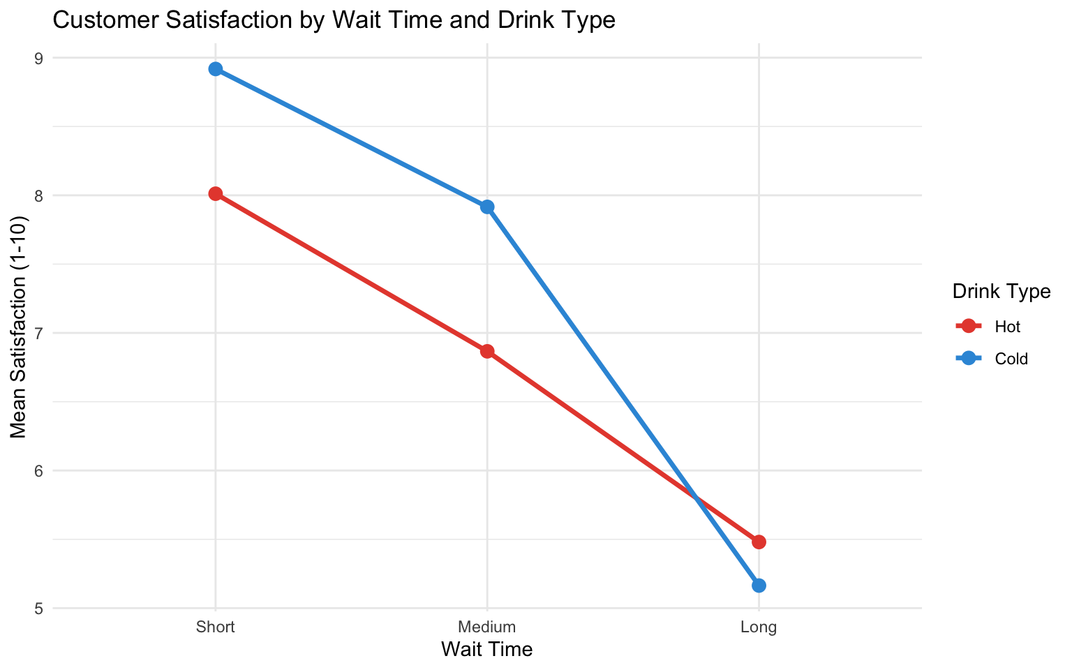
Questions:
A researcher wants to predict whether a Pokémon is Legendary based on its total stats. They create a variable called TotalStats (sum of HP, Attack, Defense, Speed, Sp. Atk, and Sp. Def) and fit a logistic regression model.
# Create total stats variable
set.seed(999)
# Load Pokemon data
pokemon <- read_csv("https://gist.githubusercontent.com/armgilles/194bcff35001e7eb53a2a8b441e8b2c6/raw/92200bc0a673d5ce2110aaad4544ed6c4010f687/pokemon.csv") %>%
  rename(
    Type1 = `Type 1`,
    Type2 = `Type 2`
  ) %>%
  mutate(
    Generation = as.factor(Generation),
    Type1 = as.factor(Type1),
    Legendary = as.logical(Legendary)
  )

pokemon_log <- pokemon %>%
  mutate(
    TotalStats = HP + Attack + Defense + Speed + `Sp. Atk` + `Sp. Def`
  )

# Visualize relationship
ggplot(pokemon_log, aes(x = TotalStats, y = as.numeric(Legendary), color = Legendary)) +
  geom_point(alpha = 0.3, position = position_jitter(height = 0.02)) +
  geom_smooth(method = "glm", method.args = list(family = "binomial"),
              se = TRUE, color = "black") +
  labs(
    title = "Probability of Being Legendary vs Total Stats",
    x = "Total Stats",
    y = "Legendary (0 = No, 1 = Yes)"
  ) +
  scale_color_manual(values = c("FALSE" = "#3498db", "TRUE" = "#e74c3c")) +
  theme(legend.position = "top")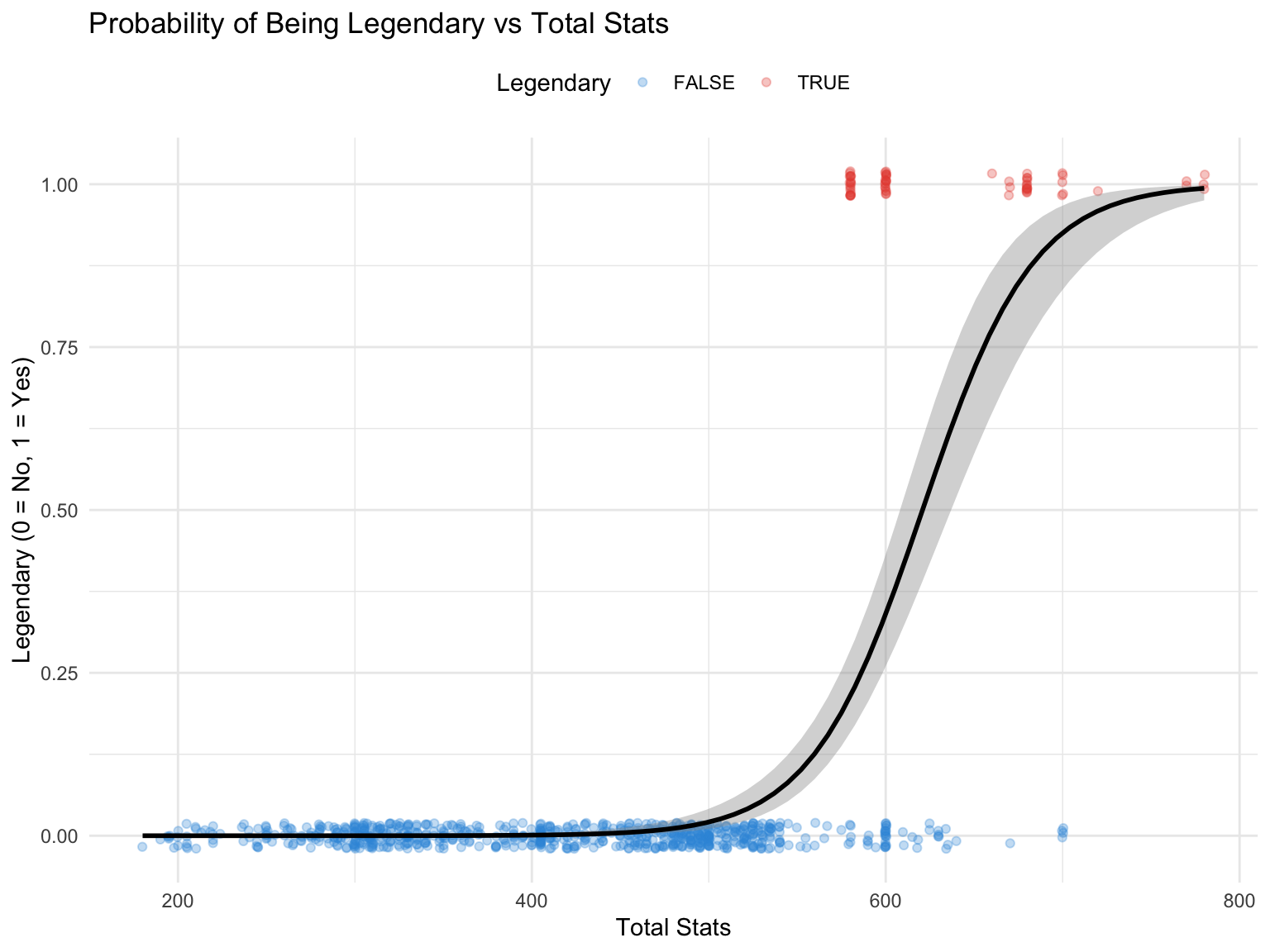
# Fit logistic regression model
M5 <- glm(Legendary ~ TotalStats, data = pokemon_log, family = binomial)
summary(M5)
Call:
glm(formula = Legendary ~ TotalStats, family = binomial, data = pokemon_log)

Coefficients:
              Estimate Std. Error z value Pr(>|z|)
(Intercept) -19.738819   2.065737  -9.555   <2e-16 ***
TotalStats    0.031795   0.003513   9.051   <2e-16 ***
---
Signif. codes:  0 '***' 0.001 '**' 0.01 '*' 0.05 '.' 0.1 ' ' 1

(Dispersion parameter for binomial family taken to be 1)

    Null deviance: 450.90  on 799  degrees of freedom
Residual deviance: 189.59  on 798  degrees of freedom
AIC: 193.59

Number of Fisher Scoring iterations: 8
Questions:
Now consider a model that includes both TotalStats and Type1 (simplified to Water vs. Non-Water for this example).
# Create simplified type variable
pokemon_log2 <- pokemon_log %>%
  mutate(
    IsWater = ifelse(Type1 == "Water", "Water", "Non-Water"),
    IsWater = factor(IsWater, levels = c("Non-Water", "Water"))
)# Fit model with Type
M6 <- glm(Legendary ~ TotalStats + IsWater, data = pokemon_log2, family = binomial)
summary(M6)
Call:
glm(formula = Legendary ~ TotalStats + IsWater, family = binomial,
    data = pokemon_log2)

Coefficients:
               Estimate Std. Error z value Pr(>|z|)
(Intercept)  -19.841208   2.117647  -9.369   <2e-16 ***
TotalStats     0.032182   0.003612   8.910   <2e-16 ***
IsWaterWater  -1.369323   0.756276  -1.811   0.0702 .
---
Signif. codes:  0 '***' 0.001 '**' 0.01 '*' 0.05 '.' 0.1 ' ' 1

(Dispersion parameter for binomial family taken to be 1)

    Null deviance: 450.90  on 799  degrees of freedom
Residual deviance: 185.68  on 797  degrees of freedom
AIC: 191.68

Number of Fisher Scoring iterations: 8# Visualize
ggplot(pokemon_log2, aes(x = TotalStats, y = as.numeric(Legendary), color = IsWater)) +
geom_point(alpha = 0.3, position = position_jitter(height = 0.02)) +
geom_smooth(method = "glm", method.args = list(family = "binomial"),
se = FALSE) +
labs(
title = "Probability of Being Legendary by Total Stats and Type",
x = "Total Stats",
y = "Legendary (0 = No, 1 = Yes)",
color = "Type"
) +
scale_color_manual(values = c("Non-Water" = "#e74c3c", "Water" = "#3498db"))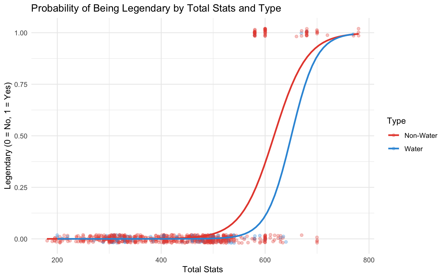
Questions: