Homework: Exploratory Data Analysis

Author

Your Name

Published

23 November 2025

Instructions

This homework has two main components:

  1. EDA Practice (40 points): Explore coffee ratings data and write a brief report

  2. Visualization Challenge (60 points): Create the best professional plot AND the ugliest plot possible

Prizes will be awarded for: - Best professional-looking plot - Best (worst?) ugly plot

Please DO NOT use genAI for any part of the assignment. Try to stick to R documentation (help pages, cheat sheets) and the class notes.


Question 1: EDA Practice (40 points)

Using data from the Coffee Quality Institute’s review database (TidyTuesday 2020-07-07), explore the relationship between coffee altitude and quality scores across different countries.

Load the data

# Load the coffee ratings data
coffee_ratings <- readr::read_csv('https://raw.githubusercontent.com/rfordatascience/tidytuesday/master/data/2020/2020-07-07/coffee_ratings.csv')

# Preview the data
head(coffee_ratings)
# A tibble: 6 × 43
  total_cup_points species owner    country_of_origin farm_name lot_number mill 
             <dbl> <chr>   <chr>    <chr>             <chr>     <chr>      <chr>
1             90.6 Arabica metad p… Ethiopia          "metad p… <NA>       meta…
2             89.9 Arabica metad p… Ethiopia          "metad p… <NA>       meta…
3             89.8 Arabica grounds… Guatemala         "san mar… <NA>       <NA> 
4             89   Arabica yidneka… Ethiopia          "yidneka… <NA>       wole…
5             88.8 Arabica metad p… Ethiopia          "metad p… <NA>       meta…
6             88.8 Arabica ji-ae a… Brazil             <NA>     <NA>       <NA> 
# ℹ 36 more variables: ico_number <chr>, company <chr>, altitude <chr>,
#   region <chr>, producer <chr>, number_of_bags <dbl>, bag_weight <chr>,
#   in_country_partner <chr>, harvest_year <chr>, grading_date <chr>,
#   owner_1 <chr>, variety <chr>, processing_method <chr>, aroma <dbl>,
#   flavor <dbl>, aftertaste <dbl>, acidity <dbl>, body <dbl>, balance <dbl>,
#   uniformity <dbl>, clean_cup <dbl>, sweetness <dbl>, cupper_points <dbl>,
#   moisture <dbl>, category_one_defects <dbl>, quakers <dbl>, color <chr>, …

Guiding questions:

  • How does altitude (meters above sea level) relate to total cup points (quality score)?
  • Which countries produce the highest-rated coffees?
  • Are there any outliers or missing values to address?
  • What patterns emerge across different processing methods or coffee varieties?

Your Analysis

Write your analysis here (300 max words summarizing your findings with 2-3 appropriate visualizations)

# Your EDA code here

Question 2: Visualization Challenge (60 points)

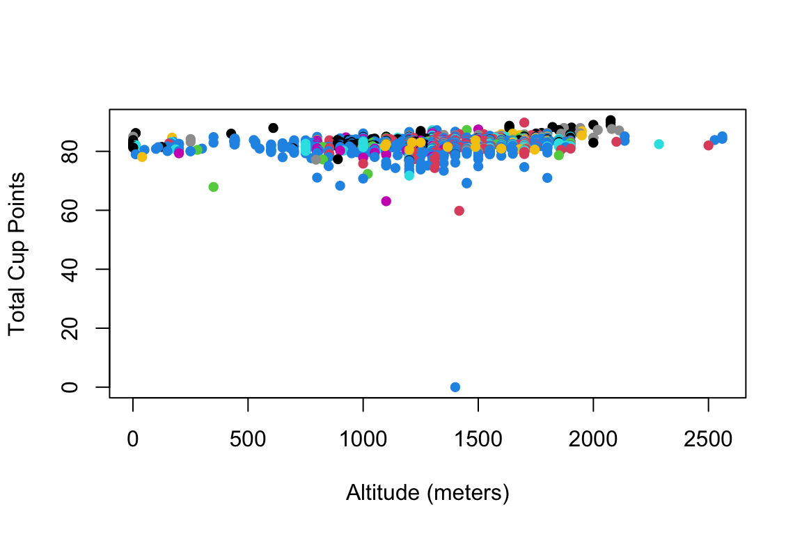
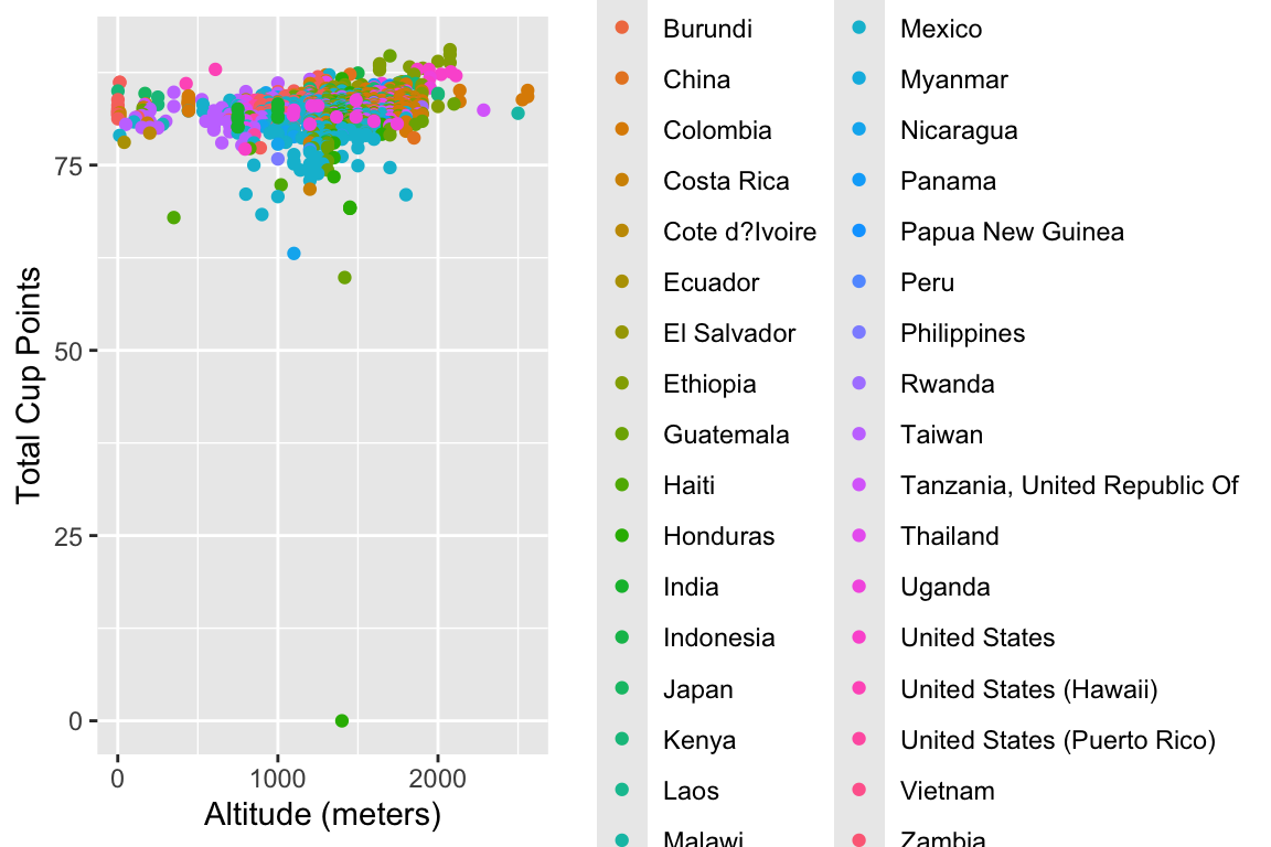
Here’s a basic (and perhaps a bit ugly) scatterplot of altitude vs. quality score in both Base R and ggplot2:

Base R version

# Clean data: remove missing values and outliers
coffee_clean <- coffee_ratings[!is.na(coffee_ratings$altitude_mean_meters) & 
                                !is.na(coffee_ratings$total_cup_points) &
                                coffee_ratings$altitude_mean_meters > 0 &
                                coffee_ratings$altitude_mean_meters < 3000, ]

plot(coffee_clean$altitude_mean_meters, coffee_clean$total_cup_points,
     xlab = "Altitude (meters)",
     ylab = "Total Cup Points",
     col = factor(coffee_clean$country_of_origin),
     pch = 16)

ggplot2 version

library(ggplot2)
library(dplyr)

# Clean the data
coffee_clean <- coffee_ratings %>%
  filter(!is.na(altitude_mean_meters),
         !is.na(total_cup_points),
         altitude_mean_meters > 0,
         altitude_mean_meters < 3000)

ggplot(coffee_clean, aes(x = altitude_mean_meters, y = total_cup_points, 
                         color = country_of_origin)) +
  geom_point() +
  labs(x = "Altitude (meters)", y = "Total Cup Points")


Part A: Professional Plot (30 points + prize eligibility)

Recreate this plot to make it publication-ready. Consider:

  • Appropriate color schemes (maybe focus on top countries only?)
  • Professional themes
  • Informative annotations
  • Trend lines or smoothing
  • Proper labels and titles
  • Faceting if appropriate
  • Any other improvements for clarity and aesthetics
# Your professional plot code here

Describe your design choices (2-3 sentences):


Part B: Ugly Plot Competition (30 points + prize eligibility)

Take the same data and make the worst possible visualization. Be creative in violating every principle of good data visualization!

Rules: - The plot must still technically display the data - Have fun breaking all the rules!

# Your ugly plot code here

What makes your plot so terrible? (List 3-5 violations of good visualization principles):


References

TidyTuesday: Coffee Ratings (2020-07-07). Data from Coffee Quality Institute’s review database. https://github.com/rfordatascience/tidytuesday/blob/master/data/2020/2020-07-07/readme.md

Coffee Quality Institute. https://www.coffeeinstitute.org/