Programming is a systematic way to think about a problem — turning a fuzzy question into precise definitions and a chain of answers. Learning R is how we build that mental model.
There’s no point using AI if you’re trying to build that mental model yourself.
Session 1: Advanced Graphics & Pipes
Learning Objectives - Session 1
By the end of today’s class, you will be able to:
Chain steps with the base pipe |> and the tidyverse pipe %>%, and know where they differ
Summarize and reshape data before plotting, in base R and in the tidyverse
Control scales, colour, coordinates, labels and themes in ggplot2
Combine plots with patchwork and save them with ggsave()
Turn an exploratory plot into an explanatory figure
Where we left off
Week 3: a ggplot is data + aesthetics + geoms, plus labels, facets and a theme.
Error in `geom_point()`:
! `mapping` must be created by `aes()`.
✖ You've supplied a <ggplot2::ggplot> object.
ℹ Did you use `%>%` or `|>` instead of `+`?
The verbs you need for plotting
tidyverse
What it does
Base R
filter()
keep rows
subset(), [rows, ]
select()
keep columns
[ , cols]
mutate()
add or change columns
transform(), $<-
group_by() + summarise()
one row per group
aggregate(), tapply()
count()
rows per group
table()
arrange()
sort rows
order()
pivot_longer()
wide → long
stack(), reshape()
All of them take the data as the first argument, which is why they chain well.
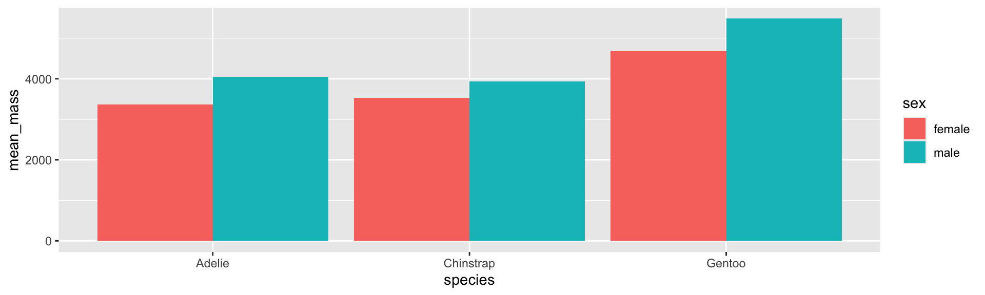
Same summary, base and tidyverse
# base Rpenguins |>subset(!is.na(sex)) |>aggregate(body_mass_g ~ species + sex, data = _, FUN = mean)
    species    sex body_mass_g
1    Adelie female    3368.836
2 Chinstrap female    3527.206
3    Gentoo female    4679.741
4    Adelie   male    4043.493
5 Chinstrap   male    3938.971
6    Gentoo   male    5484.836
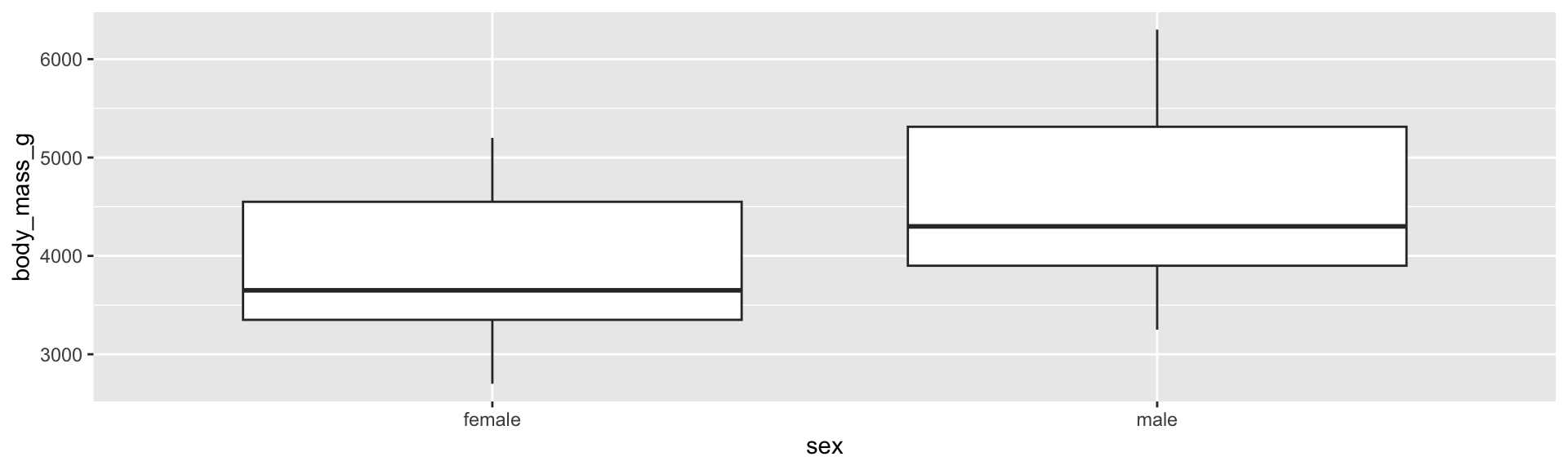
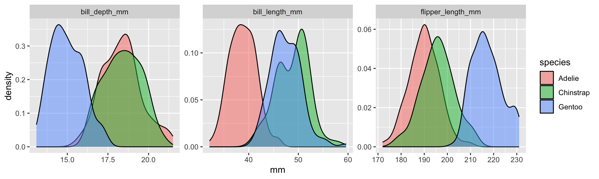
scales = "free" gives each panel its own axes. Use it when the panels have different ranges. Don’t use it when the point is to compare across panels.
🎯 Activity 1: Pipe it
Partner work (10 minutes)
Rewrite as a pipe:
head(arrange(filter(penguins, island =="Biscoe"), desc(body_mass_g)), 5)
In one pipe starting from penguins: drop rows with missing sex, compute the median flipper length for each species and sex, and plot it with geom_col().
Do the summary from step 2 with base R only (subset(), aggregate(), |>).
Discuss: Which version would you rather read in six weeks?
Layers beyond the geom
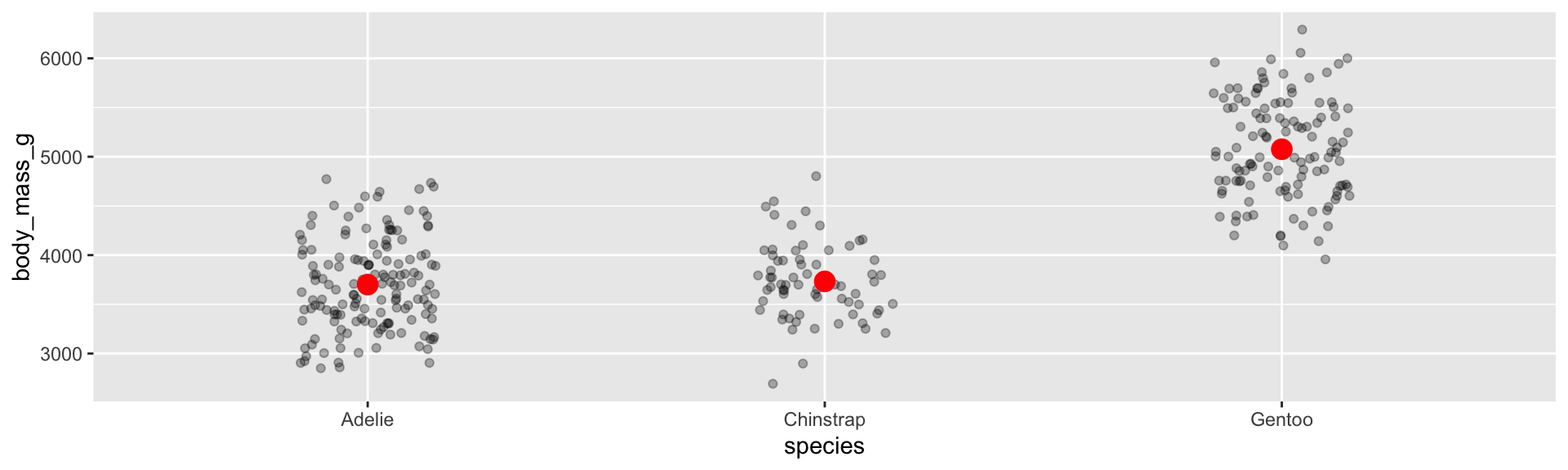
Raw data and summaries on one plot
Each layer can use its own data. Show the points and the group means:
Or let ggplot compute it: stat_summary(fun = mean, geom = "point", colour = "red", size = 4). A bar of means alone hides how many points there are and how spread out they are.
Overplotting
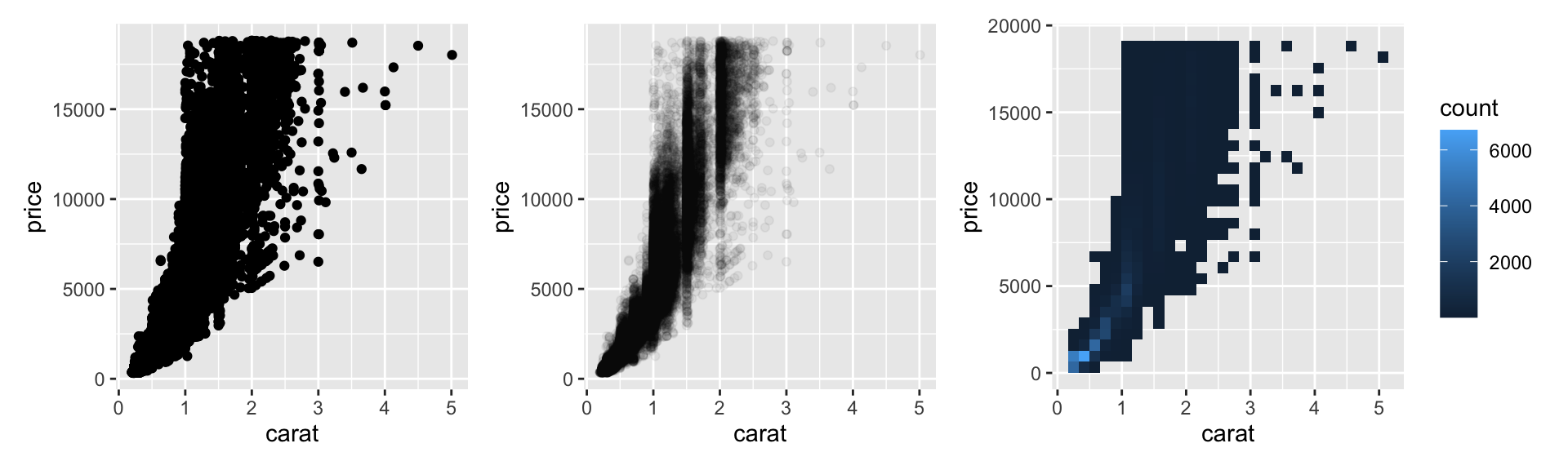
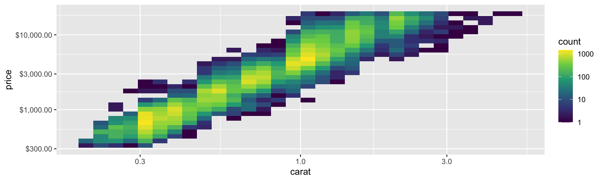
With 54,000 diamonds, plain points only show the outline of the cloud, not where most of the data are.
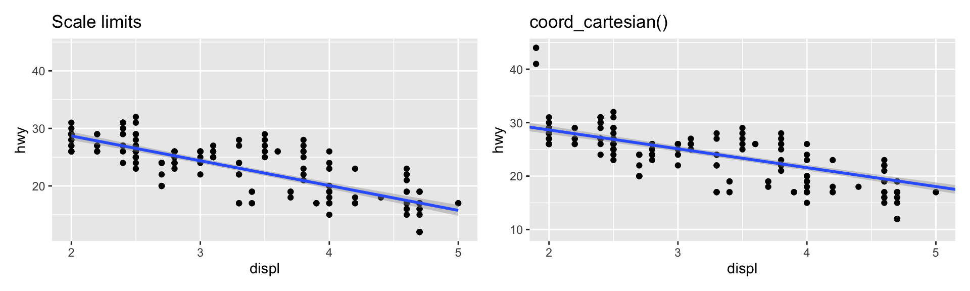
Scale limits delete the points outside the range before anything is computed, so the fitted line changes. coord_cartesian() only zooms the view.
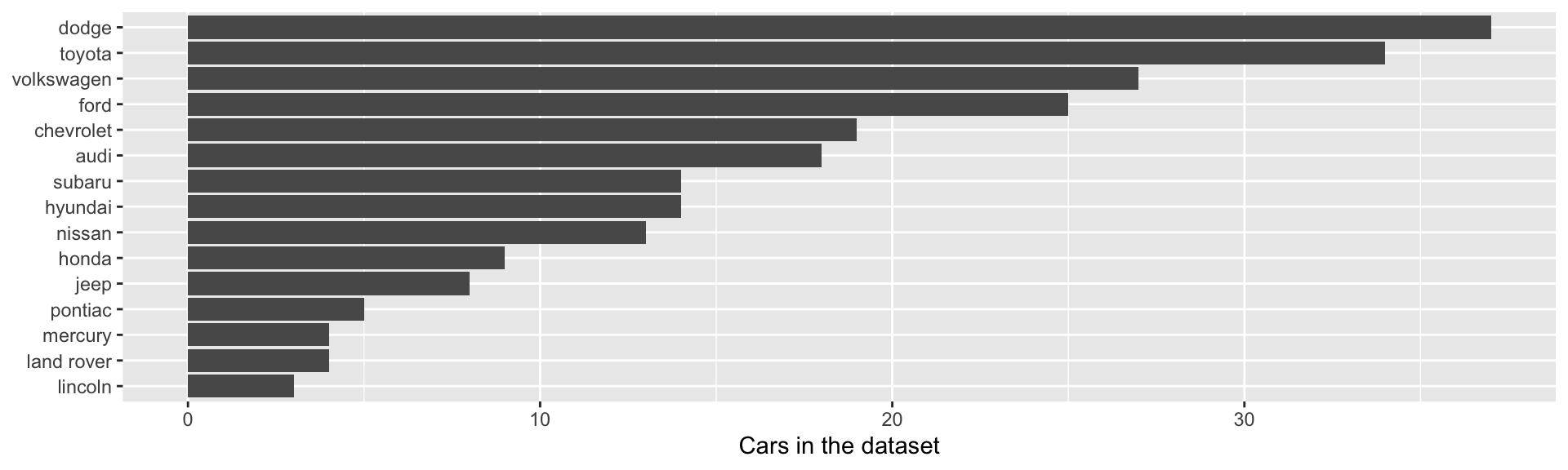
Order categories by something meaningful
The default order is alphabetical, which is rarely what you want:
mpg |>count(manufacturer) |>ggplot(aes(x = n, y =fct_reorder(manufacturer, n))) +geom_col() +labs(x ="Cars in the dataset", y =NULL)
From forcats (loaded by the tidyverse): fct_reorder() sorts by another variable, fct_infreq() by frequency, and fct_relevel() by hand.
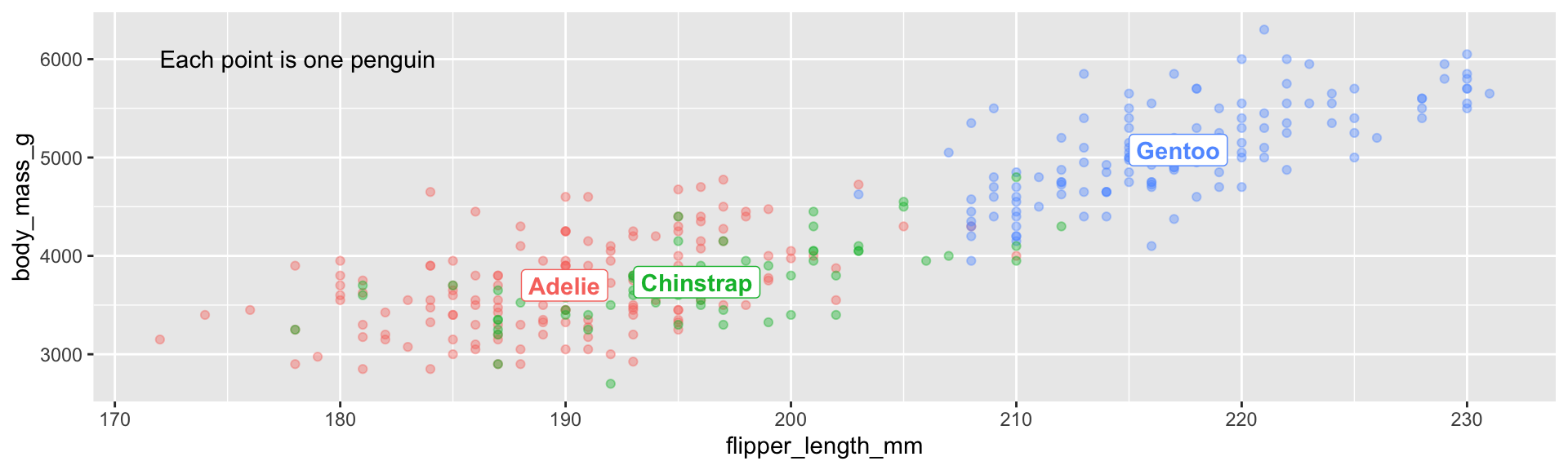
Label the data, not the legend
A legend makes the reader look back and forth. Put the labels on the plot:
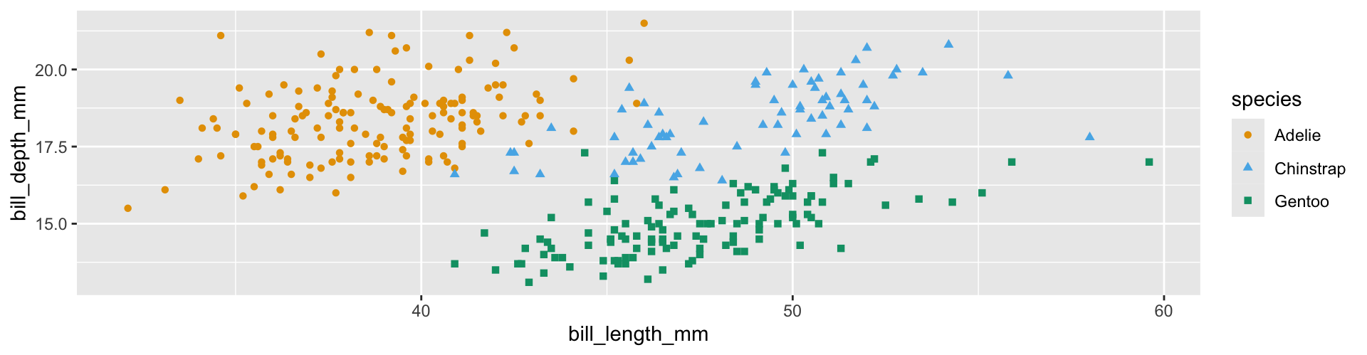
centres <- penguins |>group_by(species) |>summarise(across(c(flipper_length_mm, body_mass_g), \(x) mean(x, na.rm =TRUE)))ggplot(penguins, aes(flipper_length_mm, body_mass_g, colour = species)) +geom_point(alpha =0.4) +geom_label(data = centres, aes(label = species), fontface ="bold") +annotate("text", x =172, y =6000, label ="Each point is one penguin", hjust =0) +theme(legend.position ="none")
When labels overlap, ggrepel::geom_text_repel() moves them apart.
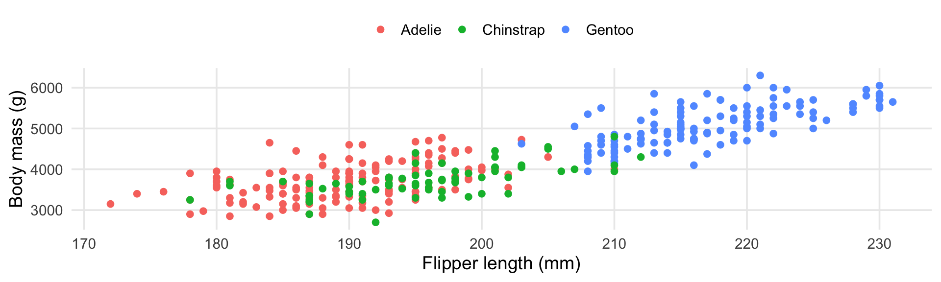
Themes
theme_*() sets the overall look. theme() changes single elements.
p <-ggplot(penguins, aes(flipper_length_mm, body_mass_g, colour = species)) +geom_point() +labs(x ="Flipper length (mm)", y ="Body mass (g)", colour =NULL)p +theme_minimal(base_size =14) +theme(legend.position ="top", panel.grid.minor =element_blank())
base_size is the one people forget: slides and posters need 14 or more. Set it once per document with theme_set(theme_minimal(base_size = 14)).
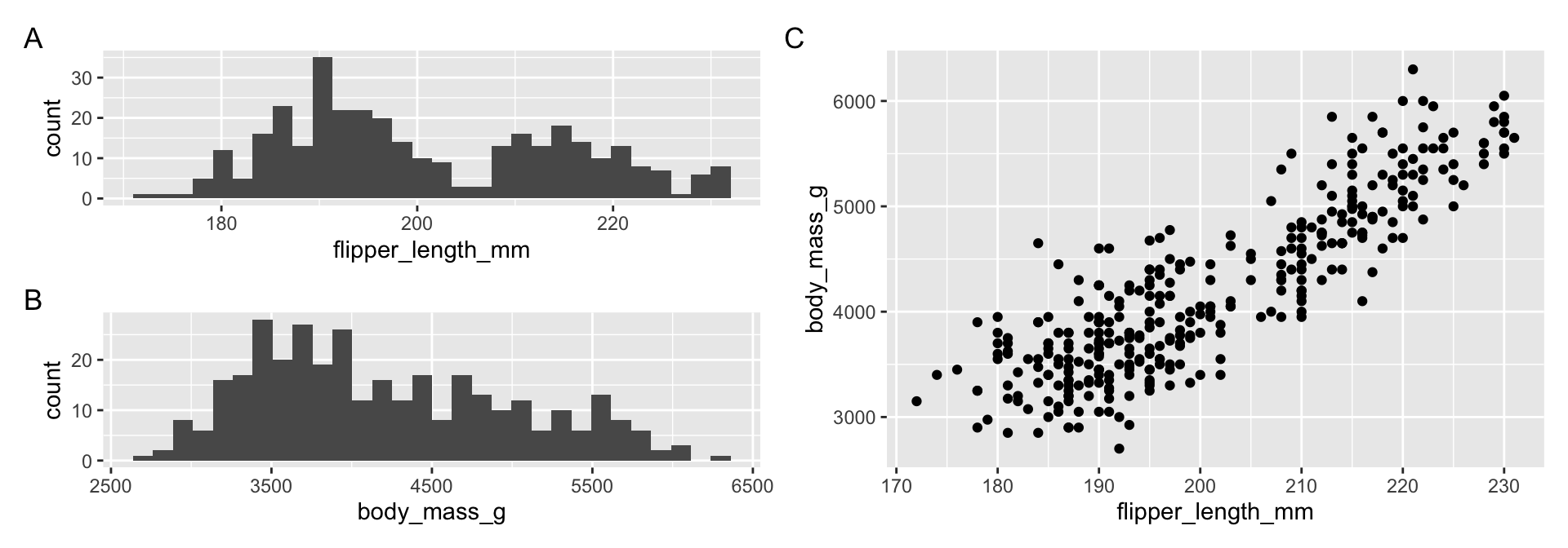
Combining plots: patchwork
a <-ggplot(penguins, aes(flipper_length_mm)) +geom_histogram(bins =30)b <-ggplot(penguins, aes(body_mass_g)) +geom_histogram(bins =30)c <-ggplot(penguins, aes(flipper_length_mm, body_mass_g)) +geom_point()((a / b) | c) +plot_annotation(tag_levels ="A")
+ or | puts plots side by side, / stacks them, and parentheses group them. Use facets for the same plot on different subsets, and patchwork for different plots.
Always set width and height, otherwise you get whatever size your plot pane happens to be
PNG for slides and the web. PDF or SVG for print: they are vector formats and never pixelate
Inside a Quarto document you usually don’t need ggsave(). Use the chunk options fig-width, fig-height, fig-cap and fig-alt instead
🎯 Activity 2: Fix this plot
Partner work (15 minutes)
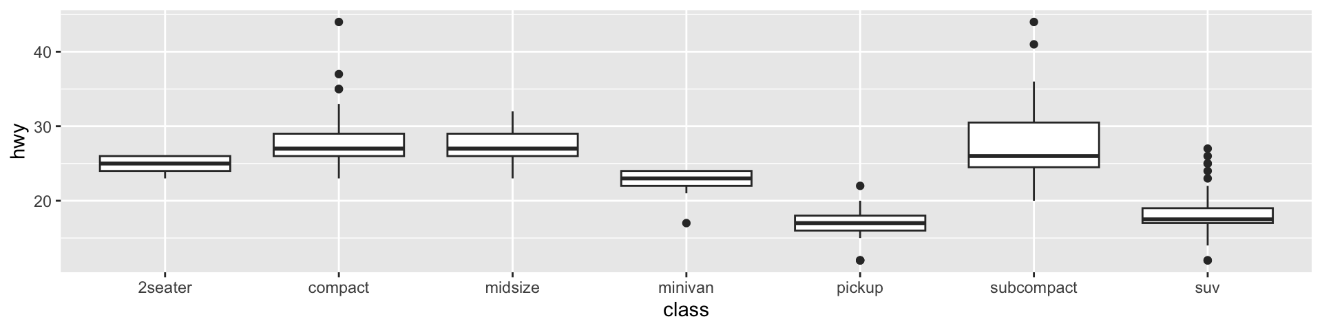
This plot runs, but every choice in it is a default:
ggplot(mpg, aes(class, hwy)) +geom_boxplot()
Order class by median hwy: fct_reorder(class, hwy, median)
Show the raw points on top of the boxes (small, transparent, jittered)
Axis labels with units, a title that states the finding, and a caption with the source
A theme with base_size = 14. Flip the axes if the labels collide
Save it as a 6 × 4 inch PNG with ggsave()
From exploratory to explanatory
Two different jobs
From last week (Yu & Barter): exploratory plots are for you. Make many of them, quickly, and don’t polish. Explanatory plots are for a reader, with one message per figure.
An explanatory figure:
Has a title that states the finding: “Gentoo penguins are about 1.4 kg heavier”, not “Body mass by species”
Labels axes in words, with units
Puts the groups being compared next to each other, on a common axis
Drops what doesn’t help: unused legends, heavy gridlines, 3D, colour that encodes nothing
What the eye reads well
Cleveland & McGill (1984) measured how accurately people read values from different encodings. From most to least accurate:
Position on a common scale
Position on separate, aligned scales (facets)
Length
Angle and slope
Area
Colour shade and hue
So: dot plots and bar charts rather than pie charts, facets with shared axes rather than separate plots, and colour for groups, not for precise values.
Honest graphics
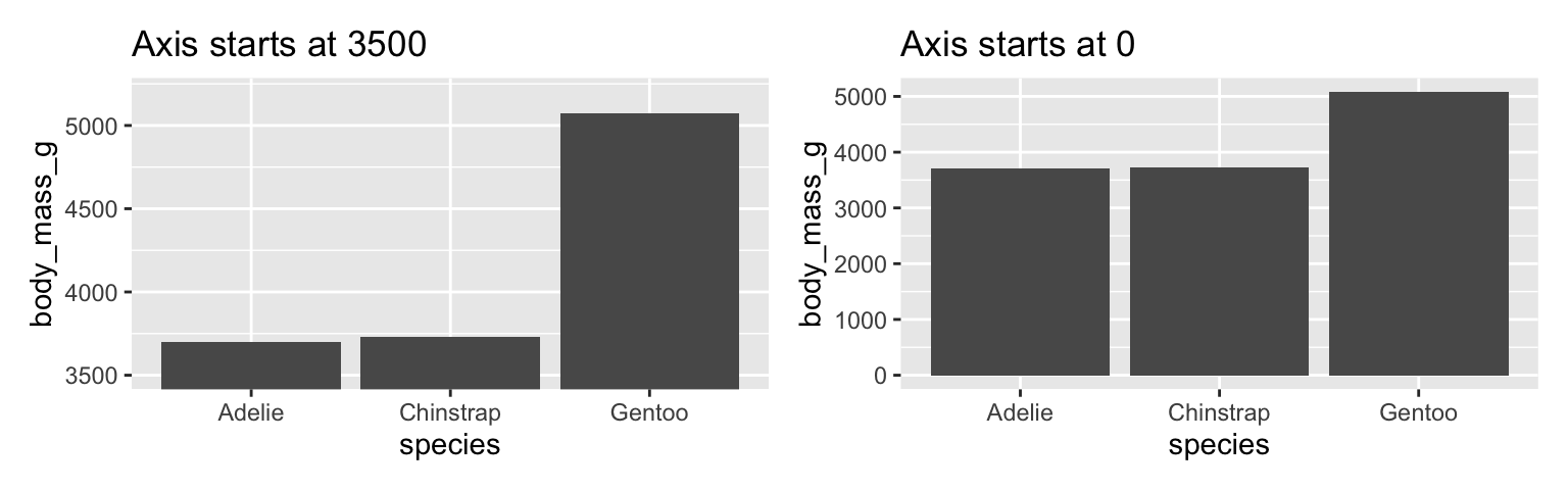
g <-ggplot(sp_means, aes(species, body_mass_g)) +geom_col()(g +coord_cartesian(ylim =c(3500, 5200)) +ggtitle("Axis starts at 3500")) + (g +ggtitle("Axis starts at 0"))
Bars start at zero, because the bar’s length is the value. Points and lines don’t need to.
No dual y-axes: the pattern you see depends on two arbitrary scale choices
Show the data, not only a summary, and report n
Same scale when comparing: free facet scales make a small group look as big as a large one
This is the stability idea from Week 3: if a different bin width, axis range or smoother would change your conclusion, say so.
🎯 Activity 3: Exploratory → explanatory
Partner work (15 minutes). Use the coffee ratings data from HW3:
# Load the coffee ratings datacoffee_ratings <- readr::read_csv('https://raw.githubusercontent.com/rfordatascience/tidytuesday/master/data/2020/2020-07-07/coffee_ratings.csv')# Preview the datahead(coffee_ratings)
Make three quick exploratory plots, about 2 minutes each, with no polishing
Pick the one that shows something worth telling someone
Write that finding as one sentence
Turn the plot into an explanatory figure. The sentence becomes the title, and everything else on the plot should support it
Swap with another team: can they state your finding without you explaining it?
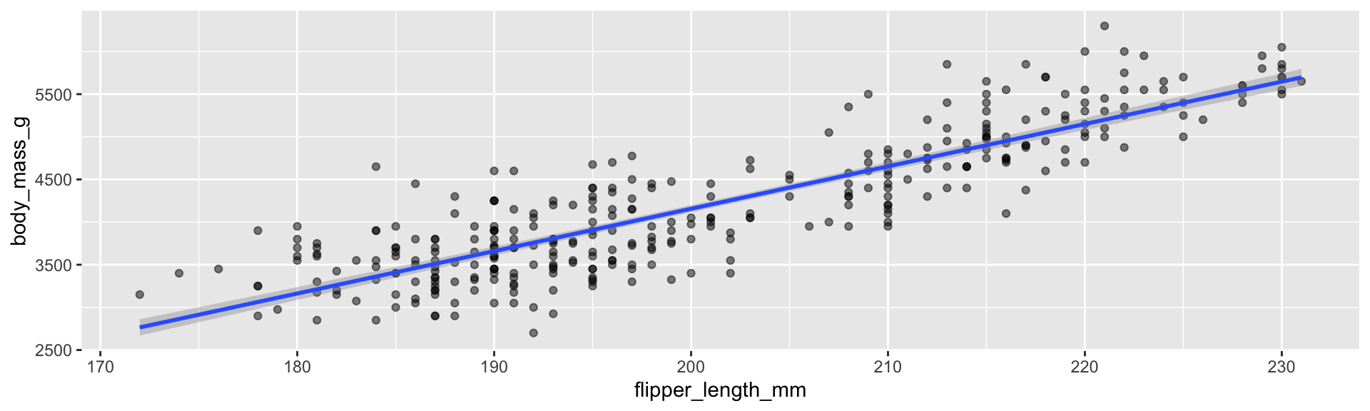
You have been adding this line since Week 3. What is it, how is it computed, what is the grey band, and when should you believe it? That is linear regression.
This elegant formula gives us all coefficient estimates at once!
Condition: \(\mathbf{X}^T\mathbf{X}\) must be invertible (no perfect multicollinearity).
📝 Self-Guided: Derivation and Properties of OLS
Deriving the normal equations, computing \(\hat{\boldsymbol{\beta}}\) with linear algebra, and the properties and variance of the OLS estimators are not covered live. See the Self-Guided Practice section at the end of these slides.
Fitting Simple Linear Regression in R
# Fit a simple linear regression# Predict body mass from flipper lengthmodel1 <-lm(body_mass_g ~ flipper_length_mm, data = penguins)# View the resultssummary(model1)
The lm() function does all the matrix algebra for us!
Interpreting the Coefficients
Example: predicting body mass from flipper length: \[\hat{\text{Body Mass}} = -5780.83 + 49.69 \times \text{Flipper Length}\]
Intercept (\(\hat{\beta}_0 = -5780.83\) g): the expected value of \(Y\) when \(X = 0\), i.e. the expected body mass of a penguin with 0 mm flippers. It has no practical interpretation here: no penguin has 0 mm flippers.
Slope (\(\hat{\beta}_1 = 49.69\) g/mm): the expected change in \(Y\) for a one-unit increase in \(X\). For every 1 mm increase in flipper length, body mass increases by about 49.69 grams on average.
Units matter! Always interpret in context with units.
Multiple Regression in R
# Fit a multiple regression model# Predict body mass from multiple measurementsmodel2 <-lm(body_mass_g ~ flipper_length_mm + bill_length_mm + bill_depth_mm,data = penguins)summary(model2)
Each coefficient is interpreted as the expected change in \(Y\) for a one-unit change in that predictor, holding all other predictors constant.
🎯 Exercise: Multiple Regression
# Fit a multiple regression model with 2-3 predictorsmy_model <-lm(body_mass_g ~ flipper_length_mm + bill_length_mm, data = penguins)summary(my_model)# Questions:# 1. How do you interpret each coefficient?# 2. How do they differ from simple regression?# 3. Which predictor seems most important?
Estimating \(\sigma^2\)
We estimate the error variance using the Mean Squared Error (MSE):
\[\hat{\sigma}^2 = \text{MSE} = \frac{\sum_{i=1}^{n}(Y_i - \hat{Y}_i)^2}{n - p - 1} = \frac{\text{SSR}}{n - p - 1}\]
where \(p\) is the number of predictors.
The denominator \((n - p - 1)\) gives us degrees of freedom.
R-squared: Measuring Model Fit
R-squared (\(R^2\)) measures the proportion of variance in \(Y\) explained by the model:
Use \(R^2_{\text{adj}}\) when comparing models with different numbers of predictors.
Hypothesis Testing for Coefficients
We test: \(H_0: \beta_j = 0\) vs. \(H_a: \beta_j \neq 0\)
Test statistic: \[t = \frac{\hat{\beta}_j}{\text{SE}(\hat{\beta}_j)} \sim t_{n-p-1}\]
p-value: Probability of observing a test statistic of this value or more extreme given that \(H_0\) is true.
Let’s talk about p-values
In 2016, the ASA released an unprecedented statement addressing widespread misunderstanding of p-values
P-values have contributed to a reproducibility crisis in science
While useful, they are frequently misinterpreted and misused
Reference: Wasserstein, R. L., & Lazar, N. A. (2016). The ASA Statement on p-Values: Context, Process, and Purpose. The American Statistician, 70(2), 129-133.
What P-Values Actually Mean
ASA Principle #1
“P-values can indicate how incompatible the data are with a specified statistical model.”
A p-value tells us: The probability of obtaining results at least as extreme as observed, assuming the null hypothesis is true
A p-value does NOT tell us:
The probability that the hypothesis is true
The probability that results were produced by random chance alone
The importance or magnitude of an effect
The Arbitrary Threshold Problem
ASA Principles #2 & #3
P-values do not measure the probability that the studied hypothesis is true. Scientific conclusions should not be based solely on whether a p-value passes a specific threshold.
Problems with p < 0.05:
Dichotomania: Treating p = 0.049 as fundamentally different from p = 0.051
Publication bias: Favoring “significant” results over null findings
P-hacking: Manipulating analyses until significance is achieved
model1 <-lm(body_mass_g ~ flipper_length_mm, data = penguins)model2 <-lm(body_mass_g ~ flipper_length_mm + bill_length_mm + bill_depth_mm,data = penguins)summary(model2)confint(model2)# Questions:# 1. What percentage of the variance in body mass does model2 explain?# Compare summary(model1)$r.squared, summary(model2)$r.squared# and summary(model2)$adj.r.squared. Did adding predictors help?# 2. Which coefficients are statistically significant? Do any# confidence intervals contain zero?# 3. What are the F-statistic and its p-value? What do they tell you?# 4. Can individual predictors be non-significant while the overall# model is significant?
Visualization: Fitted Values
library(ggplot2)# Add predictions to datapenguins_clean <- penguins %>%drop_na(any_of(c("body_mass_g","bill_length_mm","bill_depth_mm")))%>%mutate(fitted =fitted(model2),residuals =residuals(model2))# Plot actual vs fittedggplot(penguins_clean, aes(x = fitted, y = body_mass_g)) +geom_point(alpha =0.5) +geom_abline(slope =1, intercept =0, color ="blue") +labs(title ="Actual vs Fitted Values", x ="Fitted Body Mass (g)",y ="Actual Body Mass (g)")
Categorical Predictors
R automatically creates dummy variables for factors:
# Include species as a categorical predictormodel3 <-lm(body_mass_g ~ flipper_length_mm + species, data = penguins)summary(model3)
The reference category (Adelie) is absorbed into the intercept.
Interaction Terms
Test whether the effect of one predictor depends on another:
# Include an interaction between flipper length and speciesmodel4 <-lm(body_mass_g ~ flipper_length_mm + species + flipper_length_mm:species, data = penguins)# Shorthandmodel4 <-lm(body_mass_g ~ flipper_length_mm * species, data = penguins)summary(model4)
🎯 Exercise: Build Your Best Model
# Try different combinations:# 1. Add/remove predictors (flipper, bill length, bill depth)# 2. Try an interaction term# 3. Include species as a categorical variable# Compare models using R-squared and adjusted R-squared# Which model do you think is best? Why?
Session 2 Wrap-up
Key concepts covered:
The linear model and its assumptions
Least squares estimation
Interpreting coefficients, R-squared, and p-values
Simple and multiple regression in R using lm(), with categorical predictors and interactions
Hypothesis testing for individual coefficients and the overall model
Next week: checking the assumptions (diagnostics) and choosing between models.
Resources for Further Learning
📚 Recommended:
James et al. (2021) - An Introduction to Statistical Learning
Faraway (2014) - Linear Models with R
💻 R packages:
car: Diagnostics and VIF
lmtest: Statistical tests
caret: Cross-validation
MASS: Stepwise selection
📝 Self-Guided Practice (Wednesday Session)
The following slides are not covered live. Work through them on your own, or bring questions to the Wednesday self-guided session.
# Fit a simple linear regression model using LA# Extract the response variable (y)y <- penguins$body_mass_g# Create the design matrix (X)# Include intercept (column of 1s) and predictor variableX <-cbind(1, penguins$flipper_length_mm)# Remove rows with missing values (to match what lm() does)complete_cases <-complete.cases(y, X)y <- y[complete_cases]X <- X[complete_cases, ]# Calculate coefficients using linear algebra: β = (X'X)^(-1)X'ybeta_hat <-## complete the code # Display the resultsbeta_hat# Compare with lm() resultsmodel1 <-lm(body_mass_g ~ flipper_length_mm, data = penguins)coef(model1)# Give names to our manually calculated coefficientsrownames(beta_hat) <-c("(Intercept)", "flipper_length_mm")beta_hat
Properties of OLS Estimators
Under the standard assumptions, OLS estimators are:
Unbiased: \(E[\hat{\beta}_j] = \beta_j\)
Consistent: \(\hat{\beta}_j \xrightarrow{p} \beta_j\) as \(n \to \infty\)
BLUE: Best Linear Unbiased Estimator (Gauss-Markov Theorem)
BLUE means: Among all linear unbiased estimators, OLS has the smallest variance!