Week 8: Design Principles & Telling Stories
STAT 80B - Data Visualization
10 Mar 2026
🎨 Design Principles
Today’s Agenda
- The principle of proportional ink
- Why 3D is (almost always) bad
- Color pitfalls
- Handling overlapping points
- Multi-panel figures and compound visualizations
- Titles, captions, and annotations
- Telling stories with data (Wilke Ch 29)
Reading: Wilke Ch 17 & 29
The Principle of Proportional Ink
“The sizes of shaded areas in a visualization need to be proportional to the data values they represent.” — Wilke, Ch 17
Ink = any visual element that deviates from the background (bars, lines, areas, points).
When shaded area encodes a value, that area must scale with the value. Violating this is one of the most common ways visualizations mislead.
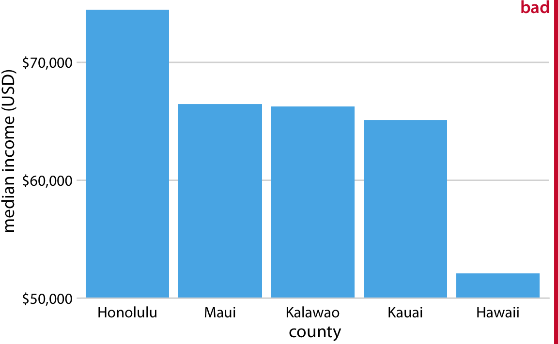
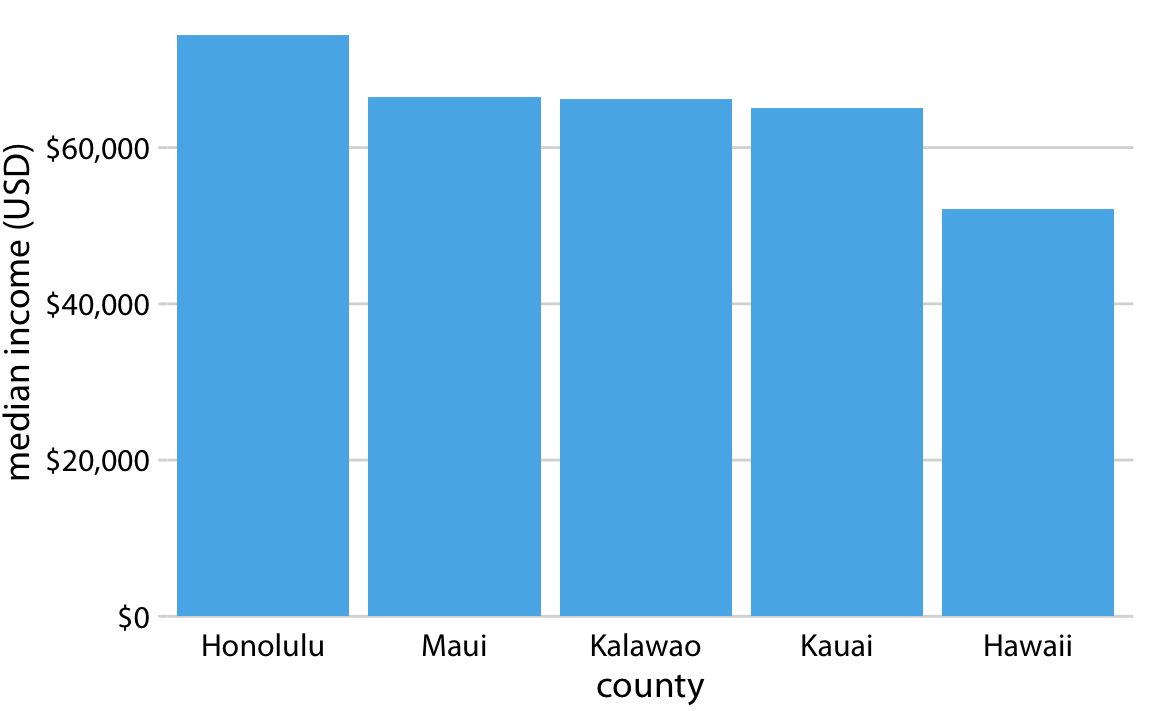
The Truncated Axis: A Classic Violation
The problem: A bar chart with a y-axis starting at $50,000 instead of $0. The bars look dramatically different, but the actual income differences are modest.
Why it misleads: Bar height is no longer proportional to the underlying values. The visual difference is amplified far beyond the data difference.
The fix: Bar charts on a linear scale must always start at zero.
When Can Axes NOT Start at Zero?
Line graphs are different from bar charts — lines encode change and trend, not absolute quantity.
- For bar charts: always start at zero (bars encode magnitude via area)
- For line graphs: starting at zero is not required — but be transparent
- For dot plots: no requirement (position encodes value, not area)
- For log scale plots: the proportional ink principle applies in log space
Rule of thumb
Ask: “Does the reader perceive magnitude from the length/area of a shape?” If yes → start at zero.
🧠 Active Learning: Spot the Violation (6 min)
With a partner, look at these chart descriptions and identify whether the proportional ink principle is violated:
- A pie chart showing budget allocation (5 slices summing to 100%)
- A bar chart of rainfall where the y-axis starts at 200mm
- A bubble chart where bubble radius (not area) is proportional to population
- A line graph of stock prices zoomed in to a narrow y range
- A 3D bar chart where bar “depth” doesn’t encode any data
Why 3D Is (Almost) Always Wrong
3D visualizations add visual complexity without adding information:
- 3D bars have depth that encodes no data → violates proportional ink
- Perspective makes bars in the back appear shorter than equally tall bars in the front
- Pie charts in 3D are particularly bad — the front slices appear larger due to foreshortening
- 3D makes it hard to read values accurately
The only exception
True 3D spatial data (e.g., topographic maps, molecular structures) — but even then, consider 2D alternatives.
3D Bar Chart: A Case Study
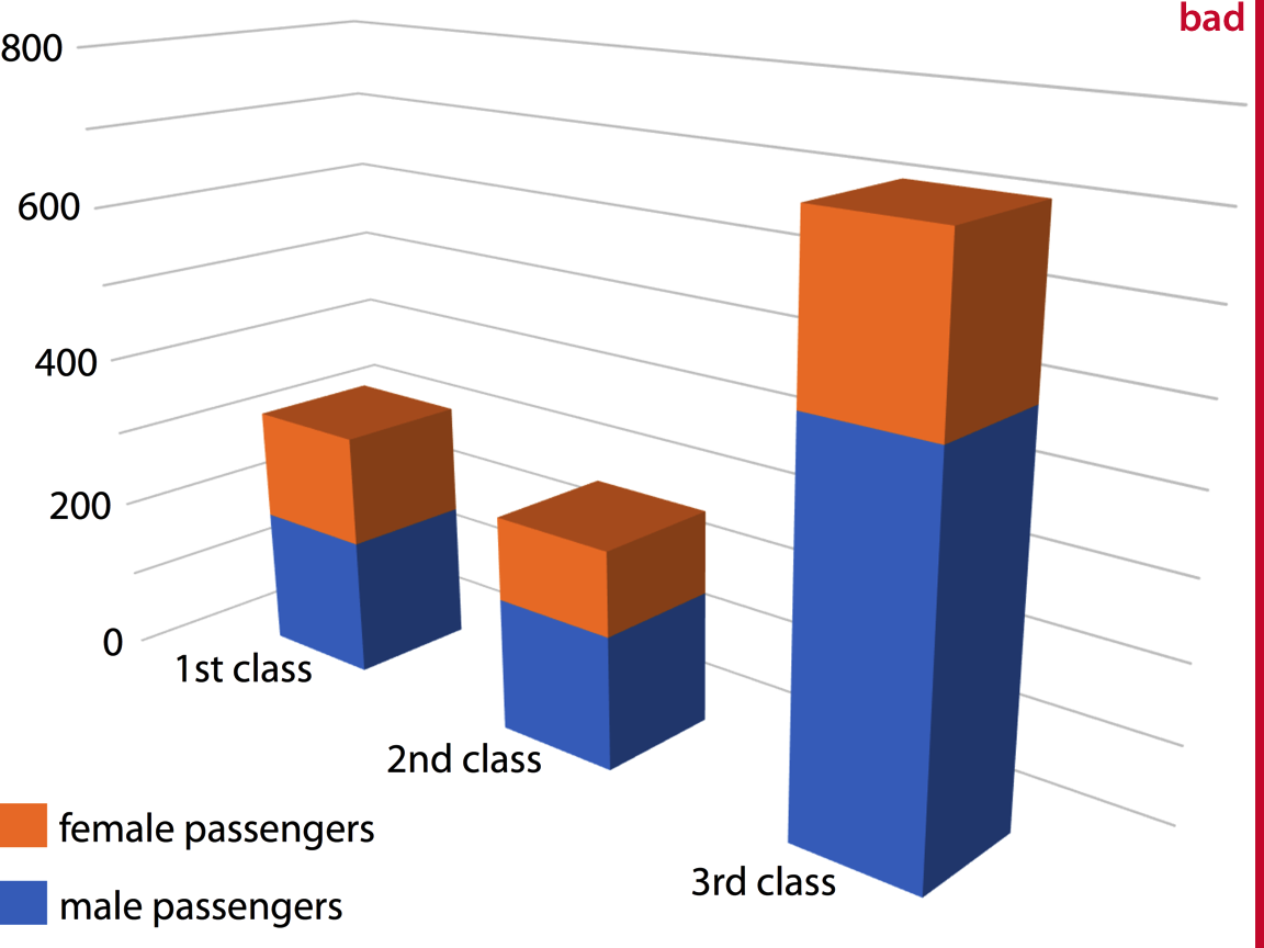
The same data in 2D is almost always clearer, easier to read, and more honest. When someone uses 3D in a presentation, ask: what does the third dimension actually represent?
Color Pitfalls
We covered color theory in Week 2 — here we focus on design errors:
- Using too many colors → readers can’t distinguish categories; legend becomes unusable
- Rainbow/jet colormaps → imply order and magnitude; not perceptually uniform; not colorblind-friendly
- Using color as the only encoding → fails for colorblind readers (up to 8% of men); always add redundant encoding (shape, pattern, label)
- Inconsistent color across panels → same color should always mean the same thing
- Saturated colors for large areas → overwhelming; use lighter tints for fills
Redundant Coding
Redundant coding = encoding the same variable through multiple aesthetics (color + shape, color + line type, etc.)
- Improves accessibility for colorblind readers
- Reinforces the message for all readers
- Allows the figure to work in black-and-white printing
Best practice
When using color to distinguish groups, also use different shapes (for points) or line types (for lines).
Handling Overlapping Points
When many points overlap, individual data is hidden (overplotting). Solutions:
| Problem | Solution | Trade-off |
|---|---|---|
| Moderate overplotting | Transparency (alpha) | Can still create dark blobs |
| Many points | Jittering | Slightly moves points; use carefully |
| Very many points | 2D density / hexbin | Loses individual point identity |
| Categorical x-axis | Sina plot / beeswarm | Preserves distribution shape |
| Time series | Reduce to summary stats | Loses detail |
Multi-Panel Figures: Small Multiples
Small multiples (or facets) show the same visualization repeated for different subgroups or conditions.
- Keep the same axes across panels so comparisons are fair
- Order panels meaningfully (not just alphabetically)
- Use a shared legend to avoid repetition
- Consider showing a reference panel first (simpler), then the full grid
Wilke’s advice (Ch 29)
When building up to a complex multi-panel figure, first show your audience one panel alone so they understand the structure, then reveal the full grid.
Compound Figures
A compound figure combines multiple different plot types into one figure (panel A, panel B, etc.).
Best practices:
- Each panel should be self-contained but contribute to the overall message
- Label panels clearly (A, B, C…) and reference them in the caption
- Align axes across panels when they share a common scale
- Make sure fonts and styles are consistent across panels
- Write a figure caption that explains what the reader should take away from each panel
Titles, Captions, and Annotations
These are often treated as afterthoughts — but they’re critical:
- Title: States the main message, not just the variables plotted
- ❌ “GDP vs. Year by Country”
- ✅ “High-income countries saw sharp GDP growth after 1990”
- Caption: Describes what is shown, the data source, and any important methodological details
- Annotations: Label key points, highlight interesting observations, explain outliers
- Axis labels: Always include units; avoid abbreviations readers may not know
🧠 Active Learning: Title Makeover (6 min)
Rewrite these poor titles as informative ones:
- “Bar chart of responses by group”
- “Temperature over time for three cities”
- “Distribution of salaries”
- “Scatter plot of variables A and B”
Then: write a two-sentence figure caption for one of them that includes (1) what is shown, and (2) the data source.
📖 Telling Stories with Data
What Is a Story?
In data visualization, a story has:
- A clear audience in mind
- A central message (the takeaway)
- A logical structure (setup, conflict, resolution)
- Visualizations that serve the message — not just display the data
“Every time you decide what to include and what to leave out, you are creating a story.”
Make Figures for the Generals
Wilke uses a military analogy: generals need to understand the situation quickly, not memorize every detail. Your audience is usually the same.
- Complex, multi-dimensional figures look impressive but often communicate nothing
- A simple bar chart that answers the question clearly beats a fancy visualization that confuses
- Do not show data dimensions that are tangential to your story
- It’s okay to make multiple simple figures rather than one complex one
The Danger of Over-Complexity
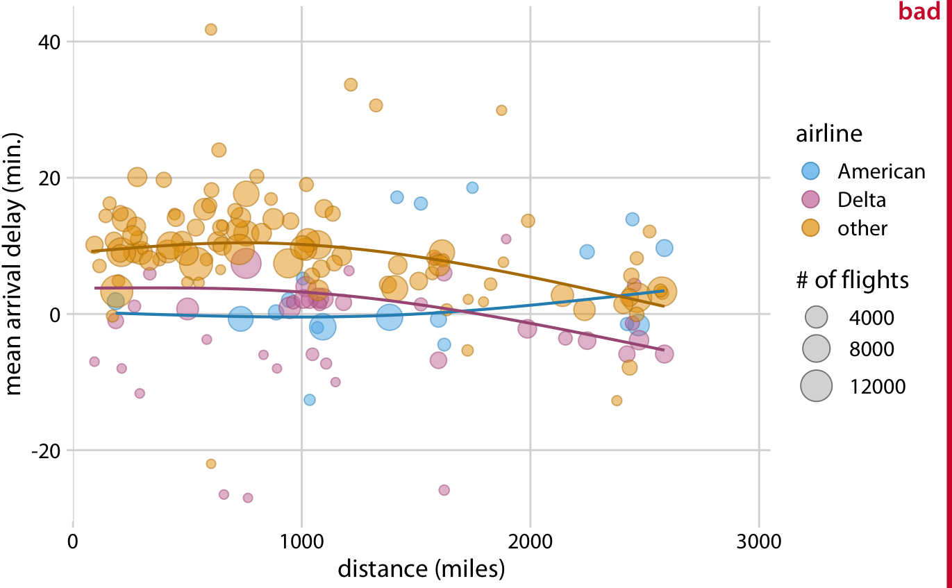
The scatter plot is technically impressive. The bar charts actually tell the story.
Build Up Toward Complex Figures
When you need a complex visualization, earn it:
- First show the simplest version of the story
- Add one dimension at a time
- Show a single facet before the full small-multiples grid
- Let the audience build their mental model incrementally
In a presentation
Never drop a complex figure cold. Walk your audience through it: “This is the structure… here’s what the x-axis shows… here’s what each color means… and here’s what I want you to notice.”
Make Your Figures Memorable
- Use a clear visual focal point — one thing the eye is drawn to
- Use color purposefully — highlight what matters, gray out what doesn’t
- Include a meaningful title that states your conclusion
- Avoid clutter — every element should earn its place
- Consider an unusual but appropriate chart type if it serves the story better
People remember images, not tables.
Be Consistent but Don’t Be Repetitive
- Consistency: Same colors/shapes for the same categories across all your figures
- Avoid repetition: Don’t show the same information twice in the same figure
- If two visualizations would look nearly identical, choose one
- Repetition wastes the reader’s time and attention
🧠 Active Learning: Story Audit (10 min)
Choose one graph from this collection: NYT collection
- What is the story? Can you state it in one sentence?
- Is the complexity justified? Does every element serve the story?
- Does the title state the conclusion or just describe the variables?
- What would you change to make the story clearer?
Share with the class — we’ll discuss 2–3 examples.
Concept Map 3 Preview
Due Week 9: Design Principles Concept Map. Due tomorrow!
You’ll be synthesizing the principles from Wilke Ch 17–26 into a visual concept map. Think about how the ideas from today connect:
- Proportional ink → honest representation
- 3D avoidance → reducing visual distortion
- Color choices → redundant coding → accessibility
- Simplicity → serving the story
- Annotations → guiding the reader
More details in the assignment instructions (ConceptMap3).
Summary: Week 8 Thursday
- Proportional ink: shaded areas must scale with data; bar charts must start at zero
- 3D: almost always misleading — depth adds visual noise without data
- Color pitfalls: too many colors, rainbow maps, missing redundant encoding
- Overlapping points: use transparency, jittering, hexbins, or beeswarms
- Multi-panel figures: consistent axes, meaningful ordering, build up gradually
- Titles and captions: state the message, not just the variables
- Storytelling: simple and clear beats complex and impressive
For Next Week
- Space to work on your Final Project. Come with questions and ready to work with your group.
- Lab on Thursday: we’ll work on pulling all design principles together in a complete visualization critique and redesign
STAT 80B - Winter 2026 | Week 8 - Thursday