Week 8: Geospatial Data & Uncertainty
STAT 80B - Data Visualization
10 Mar 2026
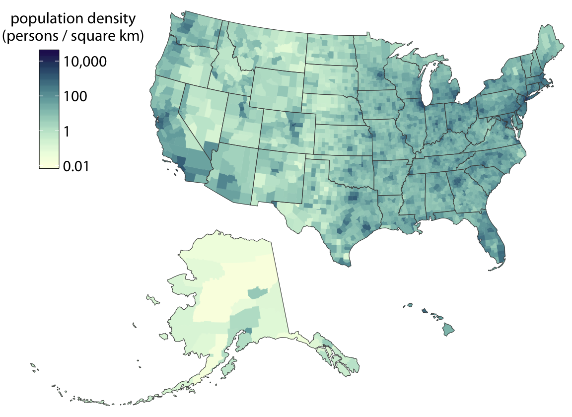
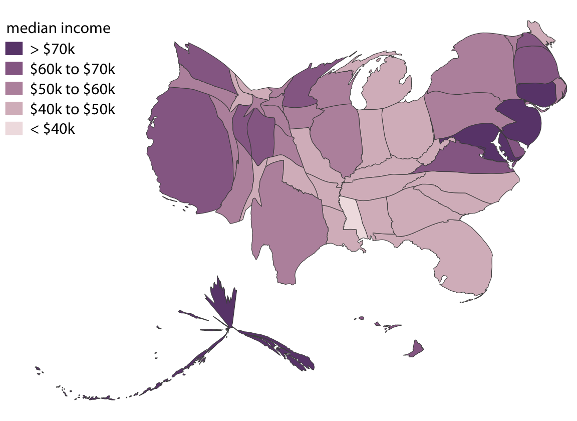
The Big Area Problem
Imagine a choropleth of total votes by U.S. county. Wyoming covers a huge geographic area, but has fewer than 250,000 voters. Los Angeles County is tiny on the map but has ~5 million voters.
The eye is drawn to area, not to the data.
🔍 Another Example

Cartogram Heatmap: A Practical Alternative
The cartogram heatmap (tilegram) gives every region equal visual weight — great when you care equally about all units.
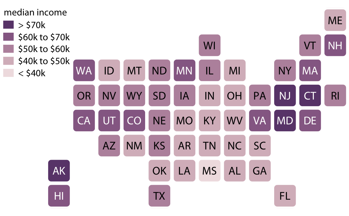
Tradeoff: geographic accuracy is lost, but no region dominates visually.
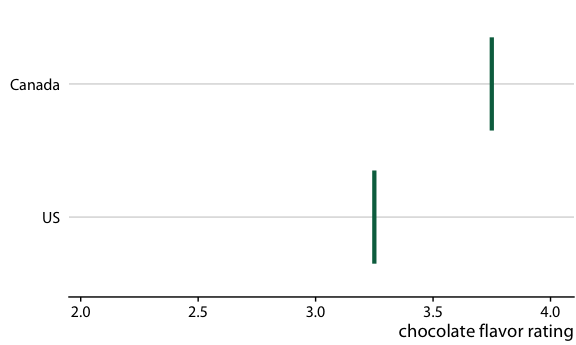
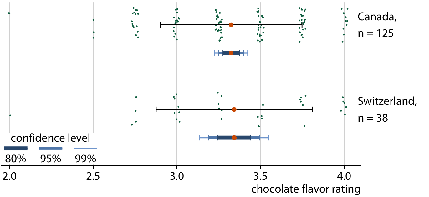
Graded Error Bars
Instead of one confidence level, graded error bars show multiple levels simultaneously (e.g., 50%, 80%, 95% CI).
The thicker inner bar = higher confidence; the thinner outer bar = lower confidence. Readers get a sense of the full range of plausible values.
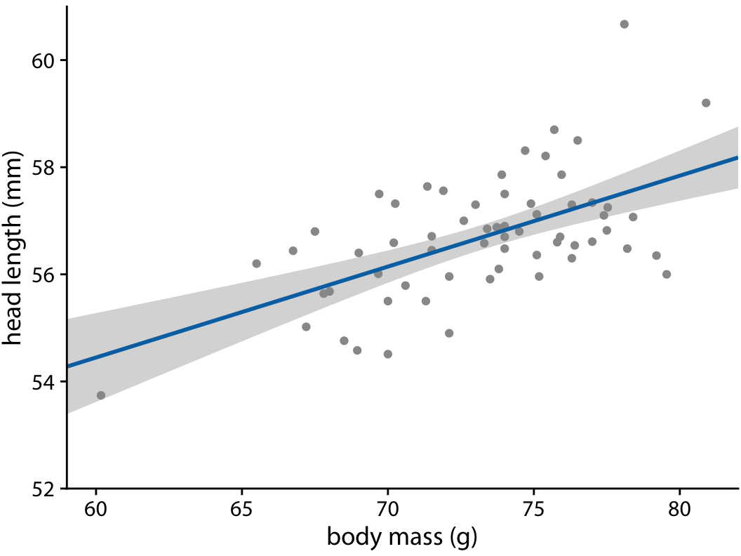
Confidence Bands for Curves
When fitting a model to data, the fitted line itself has uncertainty. We visualize this with a confidence band.
- The band shows the range of lines compatible with the data at a given confidence level
- Confidence bands are curved even for straight-line fits — because the line can both shift up/down and rotate
- Graded confidence bands can show multiple levels simultaneously
Frequency Framing: Making Probability Intuitive
People are bad at reasoning about probabilities. Frequency framing reframes probability as counts out of a concrete group.
Hard to grasp: > “There is a 17% chance of rain.”
Easier: > “In 17 out of 100 days like today, it rained.”
Quantile dot plot — shows a distribution as discrete dots, where each dot = one possible outcome.
Hypothetical Outcome Plots (HOPs)
HOPs animate through multiple possible outcomes, one at a time. Each frame = one draw from the distribution.
- More intuitive than static confidence intervals for lay audiences
- Forces viewer to confront the variability of outcomes
- Important: outcomes must be representative of the true distribution