Week 7: Time Series & Trends
STAT 80B - Data Visualization
Overview
Topics for this week:
- Time series visualization fundamentals
- Multiple time series and comparisons
- Connected scatter plots
- Smoothing techniques (LOESS, moving averages)
- Trend lines and regression visualization
Reading: Wilke Ch 13-14
What is a Time Series?
A time series is a sequence of data points measured at successive time intervals.
- One variable changes over time
- Time imposes a natural order on data
- We care about trends, patterns, and changes
Examples:
- Daily temperature readings
- Stock prices over months
- Monthly preprint submissions
- Annual CO₂ emissions
Why Visualize Time Series?
- Identify trends - Is there an overall increase/decrease?
- Spot patterns - Are there seasonal effects or cycles?
- Detect anomalies - Are there unusual events or outliers?
- Make comparisons - How do multiple series relate?
- Communicate change - Show temporal evolution clearly
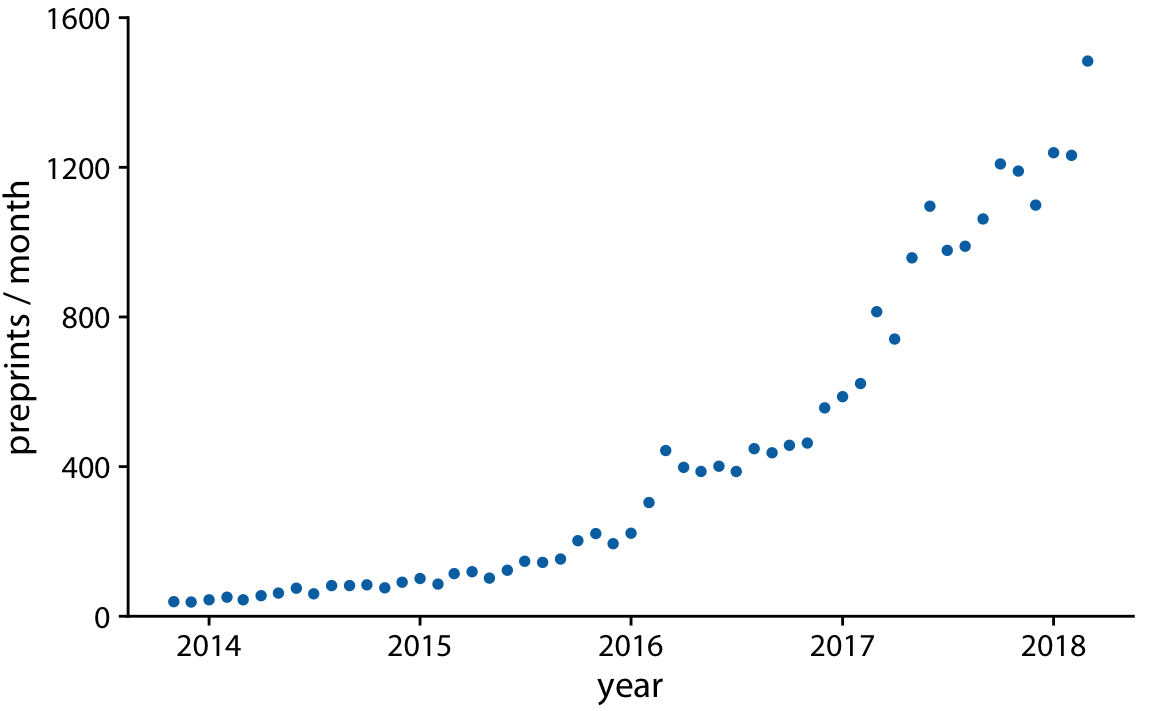
Basic Time Series: Scatter Plot
Approach: Plot time on x-axis, variable on y-axis
When to use
When you want to emphasize individual data points and their exact values
Example: Monthly submissions to bioRxiv preprint server
- Each dot = one month’s submissions
- Shows steady growth over time
- Individual points are visible
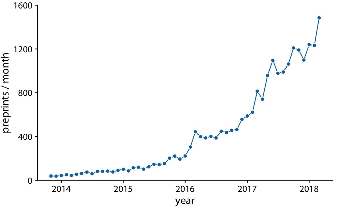
Line Graphs
Connect the dots to emphasize continuity
Key principle
Lines suggest continuous change between time points
When to use line graphs:
- Data collected at regular intervals
- Want to show overall trend/pattern
- Have many time points
- Continuity between points makes sense
Line Graph Best Practices
- Always start y-axis at zero (unless there’s a good reason not to)
- Label axes clearly with units
- Use appropriate time intervals on x-axis
- Don’t overplot - too many lines = confusion
- Consider aspect ratio - affect perception of trends
Common mistake
Manipulating the y-axis range to exaggerate or minimize trends
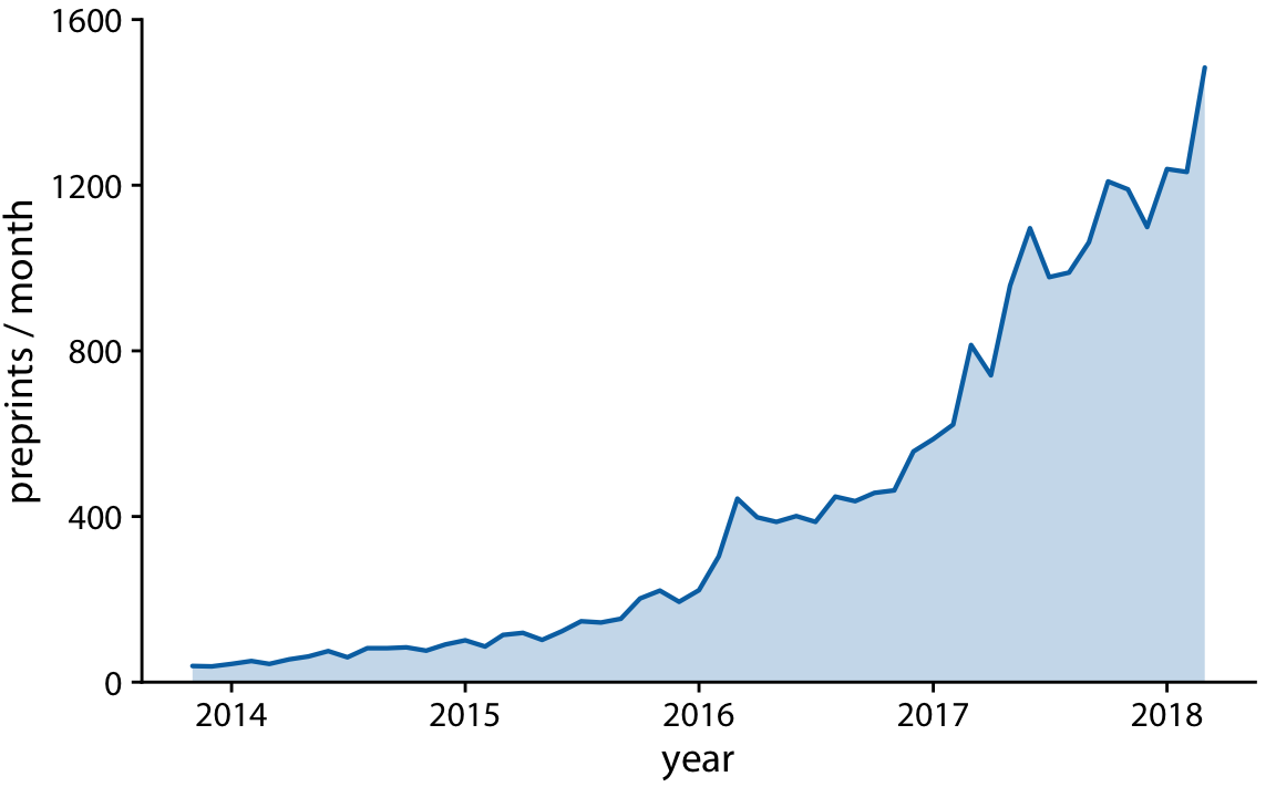
Area Charts
When to use
- Emphasize magnitude/cumulative effect
- Compare proportions over time
- Show “weight” of the trend
Important: Y-axis must start at zero!
Why? The area represents the quantity - if you don’t start at zero, the visual is misleading
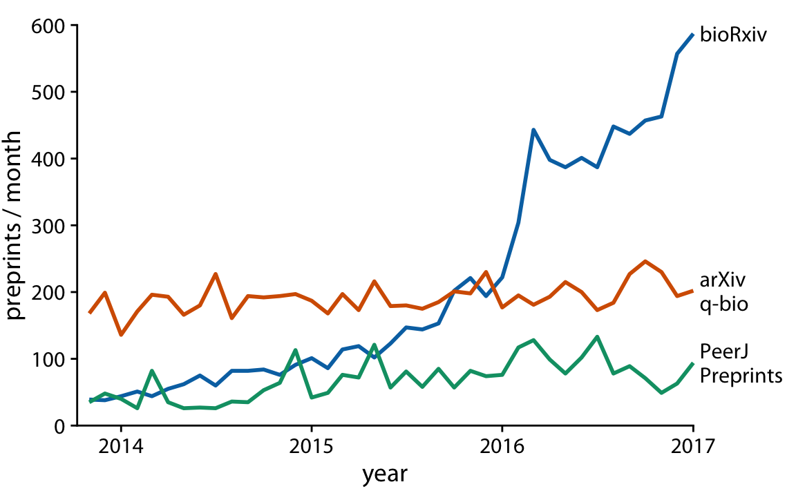
Multiple Time Series
Challenge: How to compare multiple series effectively?
Options:
- Multiple line graphs (same plot)
- Small multiples (facets)
- Stacked areas (for parts of a whole)
Multiple Lines: Design Choices
Direct labeling vs. Legend
- Direct labels (preferred): Place labels near the lines
- Reduces cognitive load
- Easier to match line to label
- More professional appearance
- Legend: Use when space is limited
- Can be far from the data
- Requires back-and-forth eye movement
Multiple Lines: Color Strategy
Use color purposefully:
- Highlight what matters - Make one line stand out
- Use colorblind-friendly palettes
- Consider line types - solid, dashed, dotted
- Limit the number - 3-5 lines maximum for clarity
Pro tip
When comparing many series, consider small multiples (facets) instead
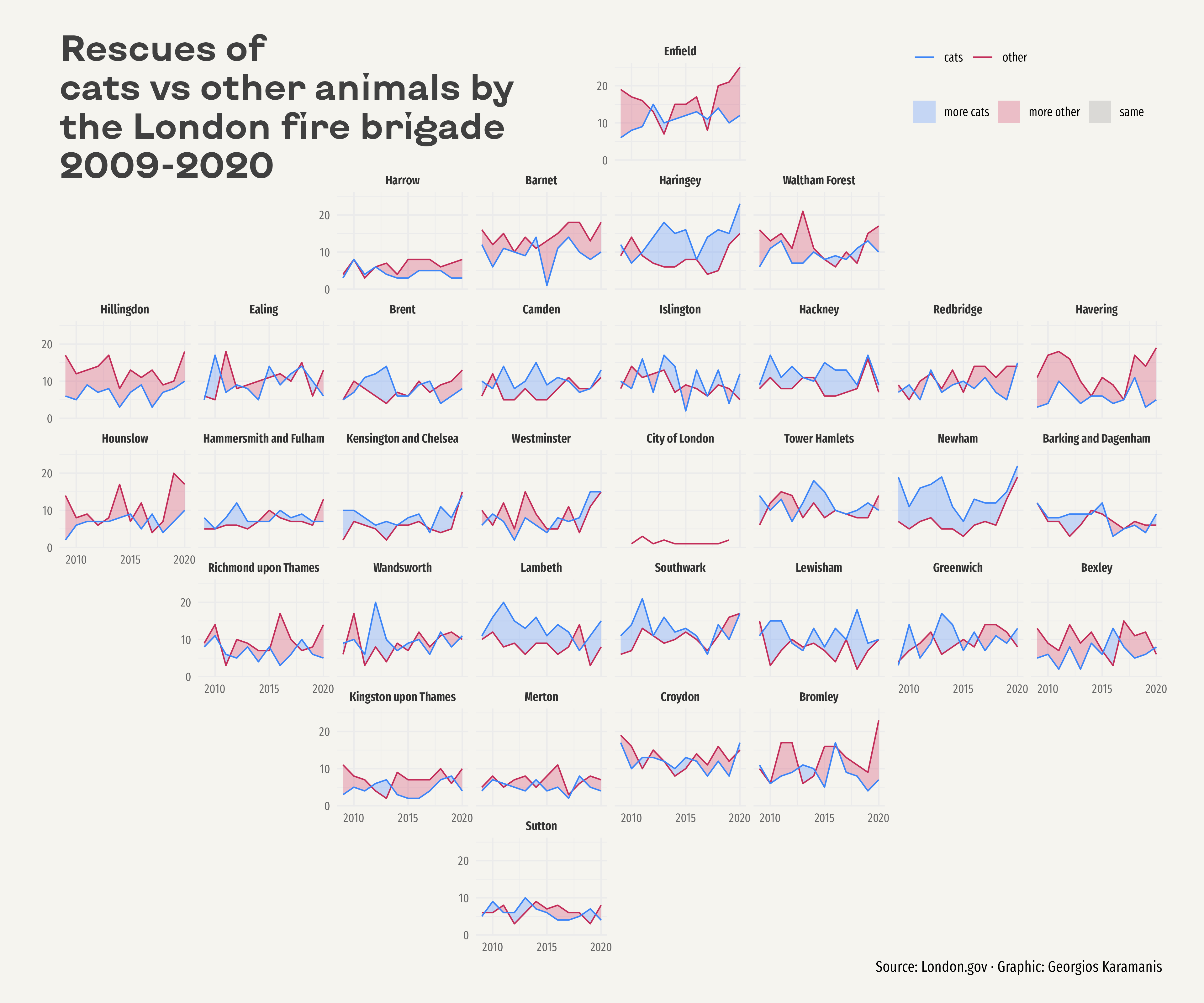
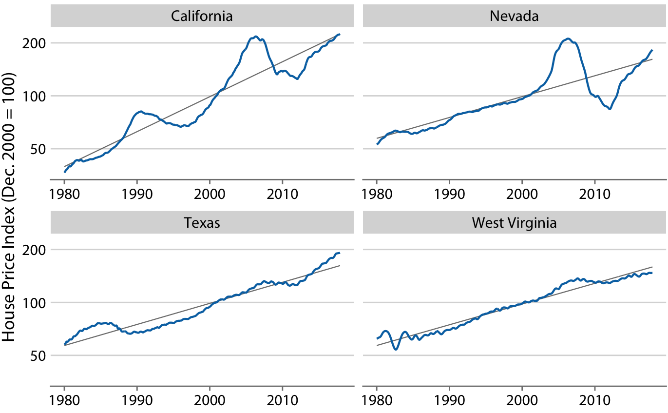
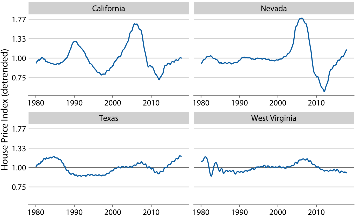
Small Multiples for Time Series
Same scale, different panels
Advantages:
- Easy to compare across categories
- Reduces overplotting
- Each series gets its own space
- Patterns more visible
When to use: 5+ time series to compare
Work in pairs: The Overcrowded Plot
The Problem:
A colleague shows you a draft visualization: 8 countries’ COVID-19 trends on one plot as different colored lines (red, blue, green, orange, purple, yellow, pink, brown) with a legend.
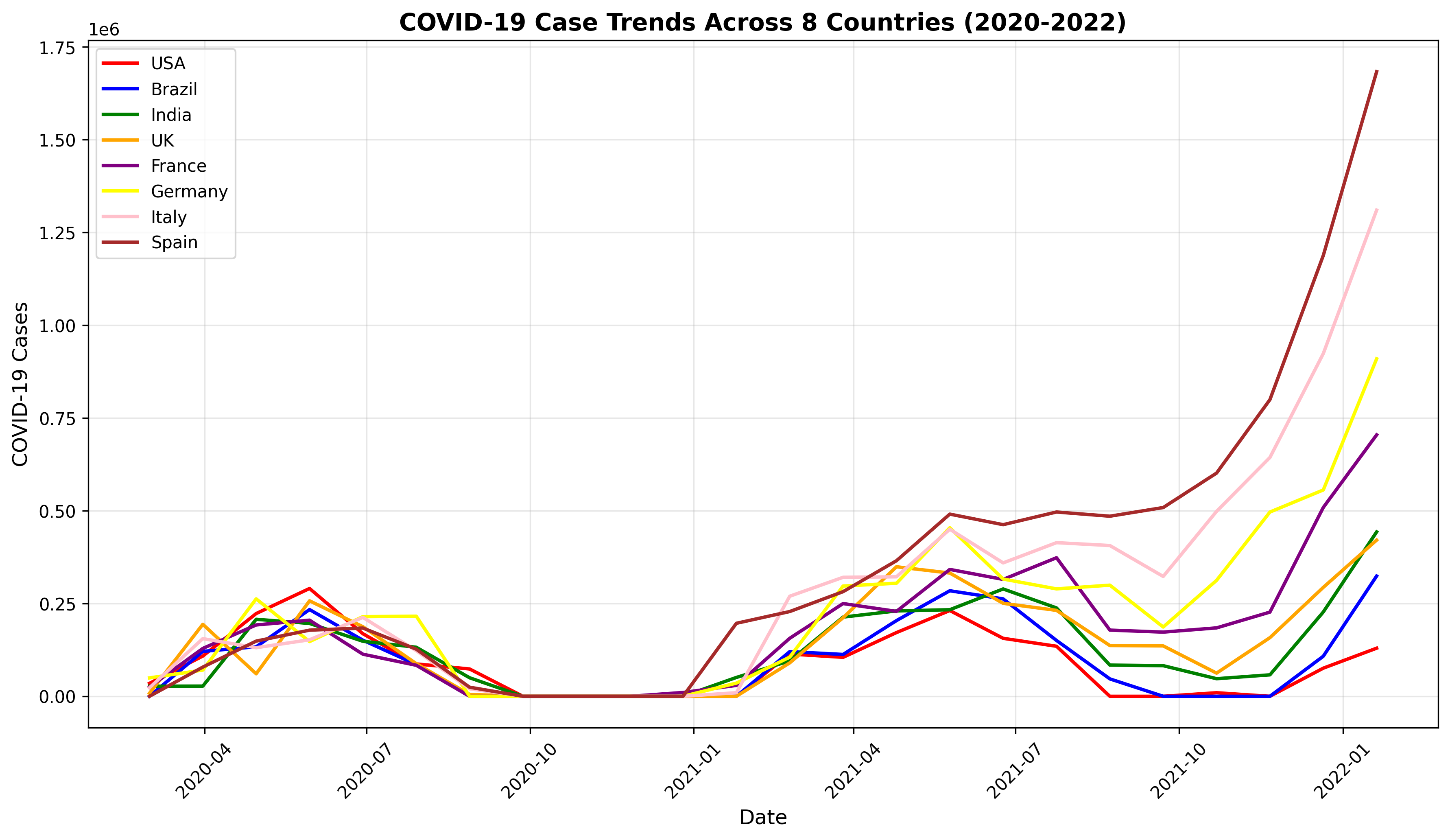
Work in pairs: The Overcrowded Plot
Your task (Part 1)
- Name TWO problems with this design
- What would you do instead? Choose ONE:
- Multiple lines with direct labeling
- Small multiples (facets)
- Highlight one, gray out others
- Other approach?
Post your answers on Ed Discussion
Connected Scatter Plots
Plot two variables against each other, connect points in temporal order
Also called
Phase portrait, trajectory plot
Purpose:
- Show relationship between two variables
- Reveal cyclical patterns
- Display multi-dimensional change over time
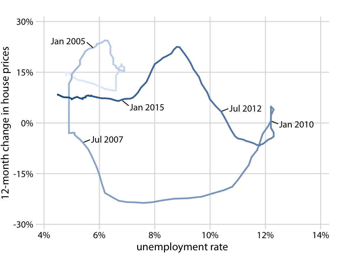
Connected Scatter Plots: Example
House price changes vs. unemployment rate
- Each point = one time period
- Connected in chronological order
- Can use color/size to show time
- Reveals counter-clockwise spiral pattern
Important
Readers more likely to confuse order/direction compared to line graphs, but higher engagement!
When to Use Connected Scatter Plots?
Good for:
- Two variables changing together over time
- Showing cyclical relationships
- Engaging storytelling
- Phase space representations
Not ideal for:
- Reading exact values
- Simple time trends (use line graph)
- More than 2 variables at once
Smoothing Techniques
Goal: Reveal the underlying trend by reducing noise
Why smooth?
- Raw data can be noisy/jumpy
- Want to see the “big picture”
- Identify long-term trends vs. short-term fluctuations
Moving Averages
Technique: Average over a sliding window
Example: 7-day moving average
- Each point = average of that day + surrounding days
- Smooths out day-to-day variability
- Window size affects smoothness
Choosing window size
- Larger window = smoother, loses detail
- Smaller window = retains detail, less smooth
Moving Average Types
- Simple moving average
- Equal weights for all points in window
- Weighted moving average
- Center points weighted more heavily
- Exponential moving average
- Recent data weighted more heavily
- Common in financial analysis
LOESS Smoothing
LOESS = LOcally Estimated Scatterplot Smoothing
How it works:
- For each point, fit a local regression using nearby points
- Use weighted distances (closer points = more weight)
- Produces smooth curve through the data
Parameters:
spanorbandwidth: controls smoothness- Smaller span = more wiggly, follows data closely
- Larger span = smoother, more general trend
LOESS: Strengths and Weaknesses
Strengths:
- No assumption about functional form
- Flexible, adapts to local patterns
- Good for exploratory analysis
Weaknesses:
- Can overfit with too small span
- Computationally intensive for large datasets
- Cannot extrapolate beyond data range
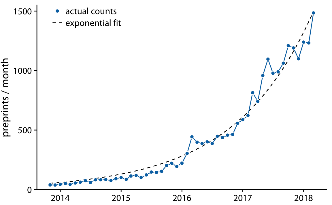
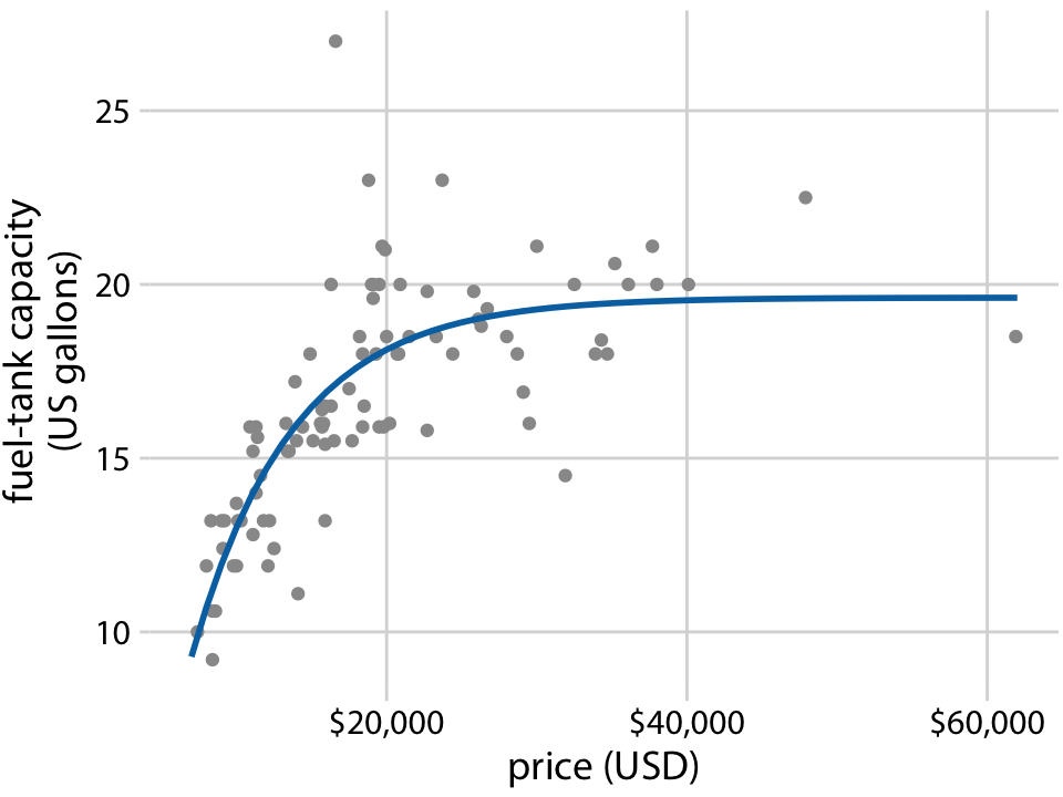
Trend Lines with Defined Functional Form
Alternative to smoothing: Fit a mathematical model
Common forms:
- Linear: \(y = A + mx\)
- Straight line trend
- Constant rate of change
- Exponential: \(y = A \cdot e^{bx}\)
- Exponential growth/decay
- Polynomial: \(y = A + Bx + Cx^2 + ...\)
- Curved trends
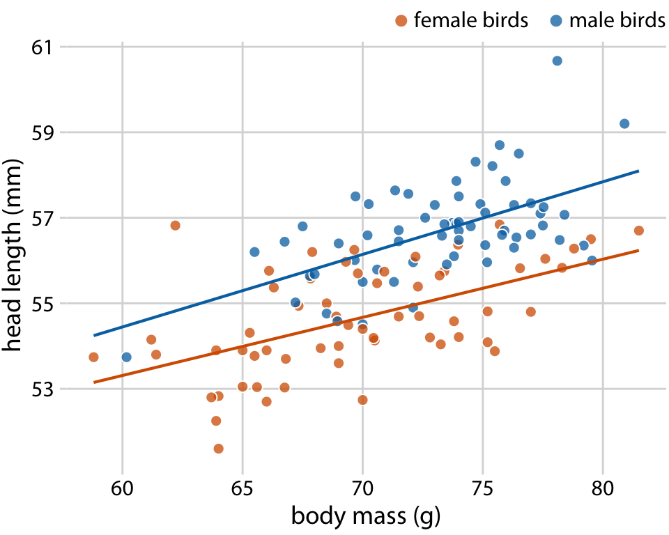
Linear Trend Lines
When to use:
- Relationship appears approximately linear
- Want to quantify rate of change
- Need to make predictions
How to fit:
- Ordinary least squares (OLS) regression
- Minimize sum of squared residuals
- Get slope and intercept
Linear Regression for Trends
In R:
Key options:
se = TRUE: Show confidence bandmethod = "lm": Linear model- Can add
formula = y ~ xfor control
Non-linear Trend Lines
Polynomial regression:
Other options:
- Exponential models (transform or use
nls) - Logistic growth models
- Periodic functions (sine waves for seasonality)
Warning
Be careful of overfitting with high-order polynomials!
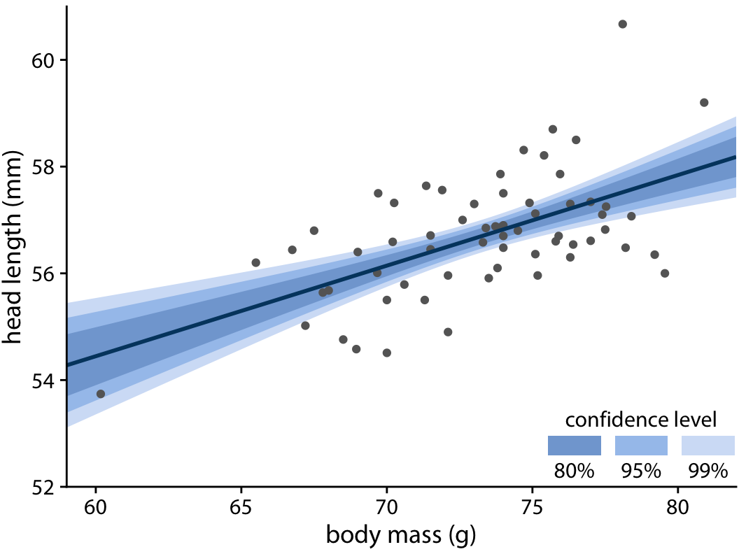
Confidence Bands
Show uncertainty in the trend estimate
- Wider bands = more uncertainty
- Typically 95% confidence interval
- Curve at the edges (more uncertainty far from center)
Graded confidence bands:
- Show multiple confidence levels (50%, 80%, 95%)
- Emphasizes increasing uncertainty
- Forces reader to confront uncertainty
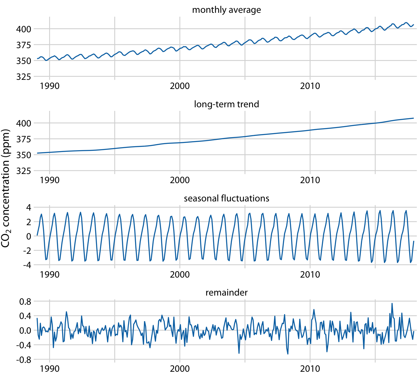
Detrending
Remove the trend to see what’s left
Why?
- Isolate seasonal effects
- Identify anomalies/outliers
- Understand cyclical components
Residuals = Actual values - Trend
Example: The Keeling Curve
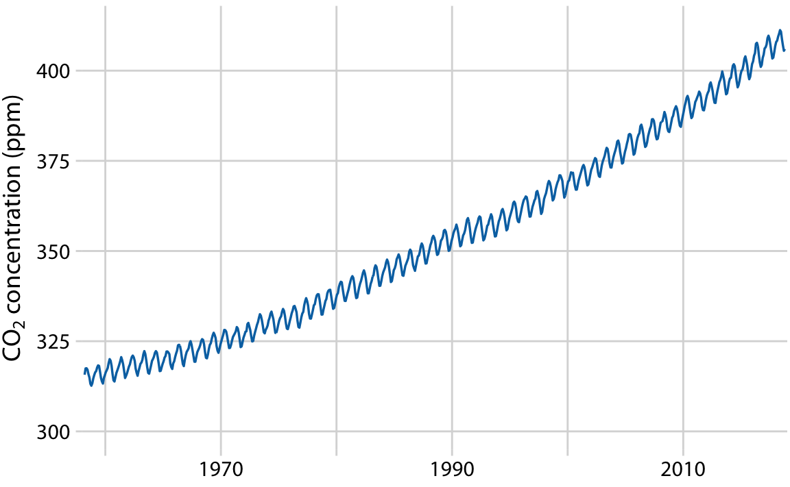
Decomposed into:
- Long-term trend: Steady increase (~50 ppm over 30 years)
- Seasonal fluctuation: Annual cycle (~8 ppm range)
- Remainder: Small random variation (~1.6 ppm)
Shows: Seasonal effects are real but small compared to overall trend
Choosing the Right Visualization
Use line graphs when:
- Single or few time series
- Regular time intervals
- Want to show trends
- Need to compare series
Use connected scatter plots when:
- Two variables over time
- Cyclical relationships
- Engaging narrative
- Phase space analysis
Choosing the Right Visualization (cont.)
Use smoothing when:
- Data is noisy
- Want overall trend
- Exploratory analysis
- Don’t know functional form
Use trend lines when:
- Have theoretical model
- Want to quantify change
- Need to predict
- Relationship is clear
Work in pairs: Choose Your Viz
Scenario 2: Noisy Daily Temperatures
Climate scientist has daily temperature data for one year (very noisy, day-to-day fluctuations). Goal: show if there’s an overall warming trend.
Best choice?
- Simple line graph
- Simple line graph
- LOESS smoothing
- LOESS smoothing
- Linear trend line
Post on Ed Discussion
Common Pitfalls to Avoid
- Truncated y-axis (when area is used)
- Too many lines on one plot
- Poor color choices (not colorblind-safe)
- Ignoring uncertainty
- Overfitting with too complex models
- Wrong smoothing bandwidth
- Forgetting units on axes
Best Practices Summary
✓ Choose appropriate visualization for your story
✓ Use direct labeling when possible
✓ Show uncertainty (confidence bands)
✓ Consider aspect ratio and scale
✓ Keep it simple - avoid chart junk
✓ Test for colorblind accessibility
✓ Label everything clearly
Preparing for Lab 4
This week’s lab will cover:
- Creating scatter plots (bivariate and multivariate)
- Time series with trend lines
- Bubble charts
Important Reminder
This course is NOT about learning tools
The software (Tableau, R, Python) is a tool - a means to an end.
What matters:
- Understanding visualization principles
- Choosing appropriate charts
- Communicating effectively with data
- Critical thinking about design choices
Learning the tool requires practice: trial and error, experimentation, exploration!
Tips for Lab Success
- Don’t just follow instructions - understand WHY
- Experiment - try different chart types
- Ask yourself: “Does this visualization tell the story clearly?”
- Review the material before class come prepared, download the data and examine it on your own
- Learn by doing - make mistakes and fix them
- Compare outputs - how does Tableau differ from R/Python?
- Think before you code/click
Next Class
Thursday: Lab 4
- Hands-on practice with:
- Time series visualizations
- Trend lines in Tableau/R/Python
Come prepared to experiment!
Questions?
Time for discussion and clarification
Office hours: today after class. Bring your questions about the project, class material, or any other concern.
Resources:
- Textbook
- Lab 4 materials
- TidyTuesday datasets
- Tableau How-to videos
STAT 80B - Winter 2026