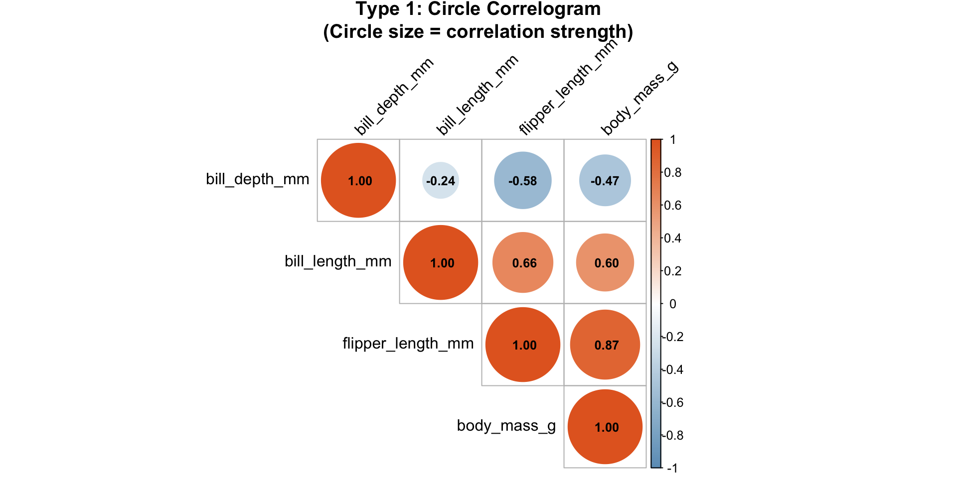
                  bill_length_mm bill_depth_mm flipper_length_mm body_mass_g
bill_length_mm         1.0000000    -0.2350529         0.6561813   0.5951098
bill_depth_mm         -0.2350529     1.0000000        -0.5838512  -0.4719156
flipper_length_mm      0.6561813    -0.5838512         1.0000000   0.8712018
body_mass_g 0.5951098 -0.4719156 0.8712018 1.0000000Visualizing Relationships II
Multiple Variables
The Challenge
What is Overplotting?
Definition: When you have so many points that they overlap and obscure each other
Problems it causes:
- Can’t see individual points
- Can’t judge density
- Patterns get hidden
- True relationship becomes unclear

Solution 2: Jittering
Add small random noise to point positions:
- Separates overlapping points
- Makes all points visible
- Doesn’t change the overall pattern

When to Use Jittering
Good for: Discrete/rounded data (integer values)
Don’t use for: Data where exact position matters (precise measurements)
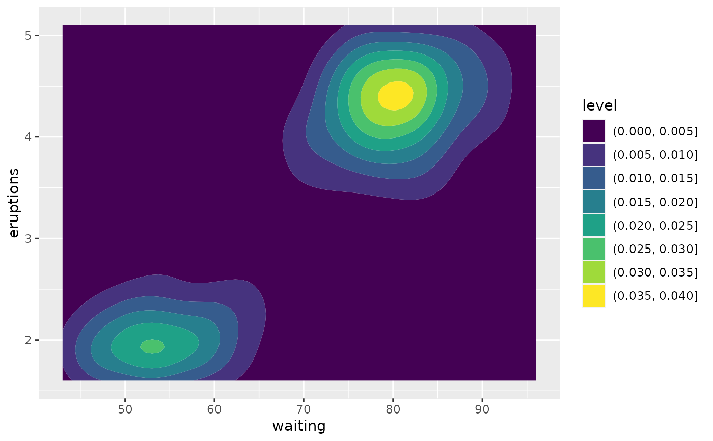
Solution 3: 2D Bins or Contours
Instead of showing individual points:
- Divide plot into grid cells
- Count points in each cell
- Color cells by count (heatmap)
- Or draw contour lines
Good for: Really large datasets (thousands of points)
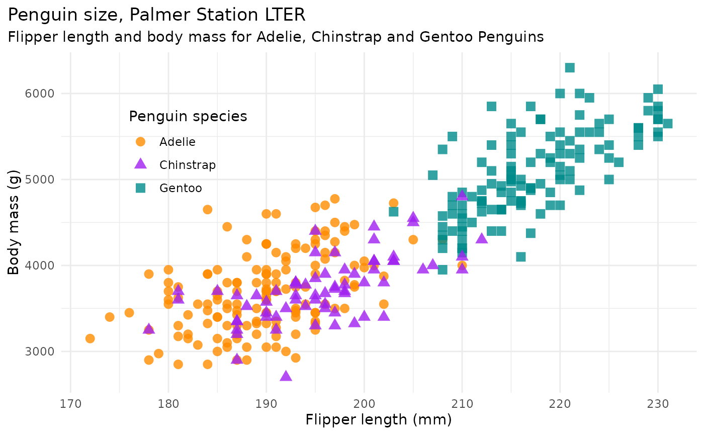
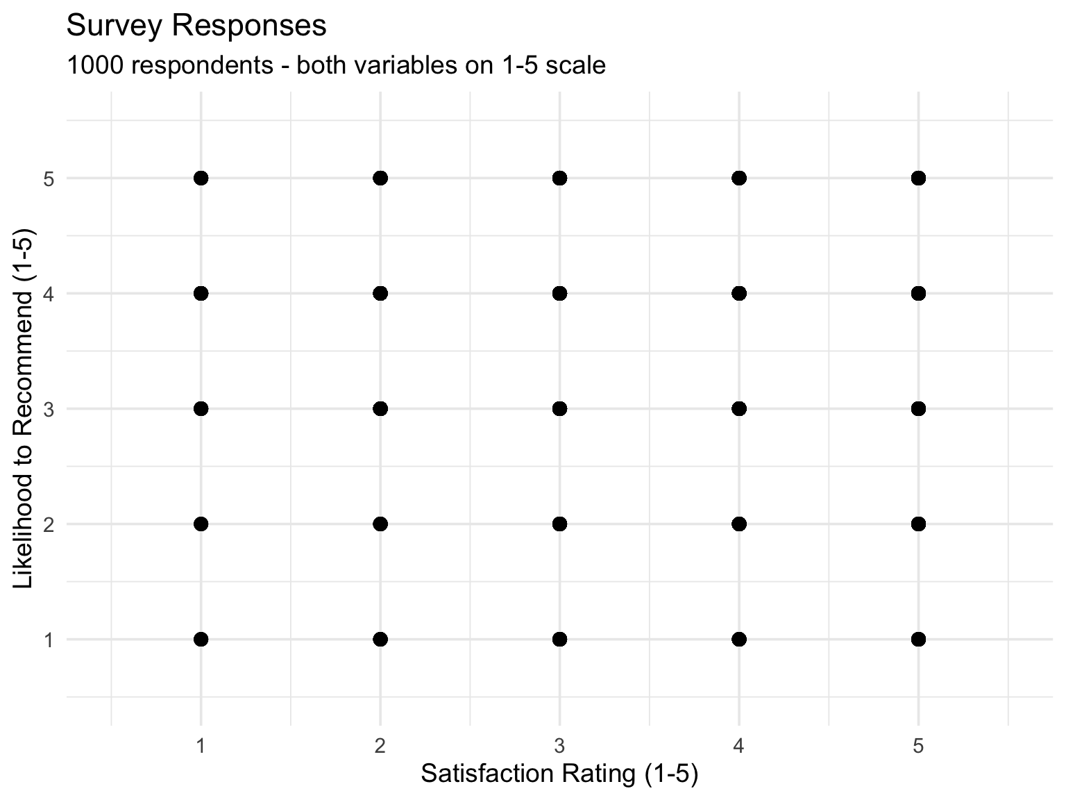
Problem Plot 1
Scenario: Survey data where people rated satisfaction (1-5 scale) and likelihood to recommend (1-5 scale). 1000 responses.
Issue: Since both variables are integers 1-5, many points overlap exactly at grid intersections.
What would you do?
Problem Plot 2
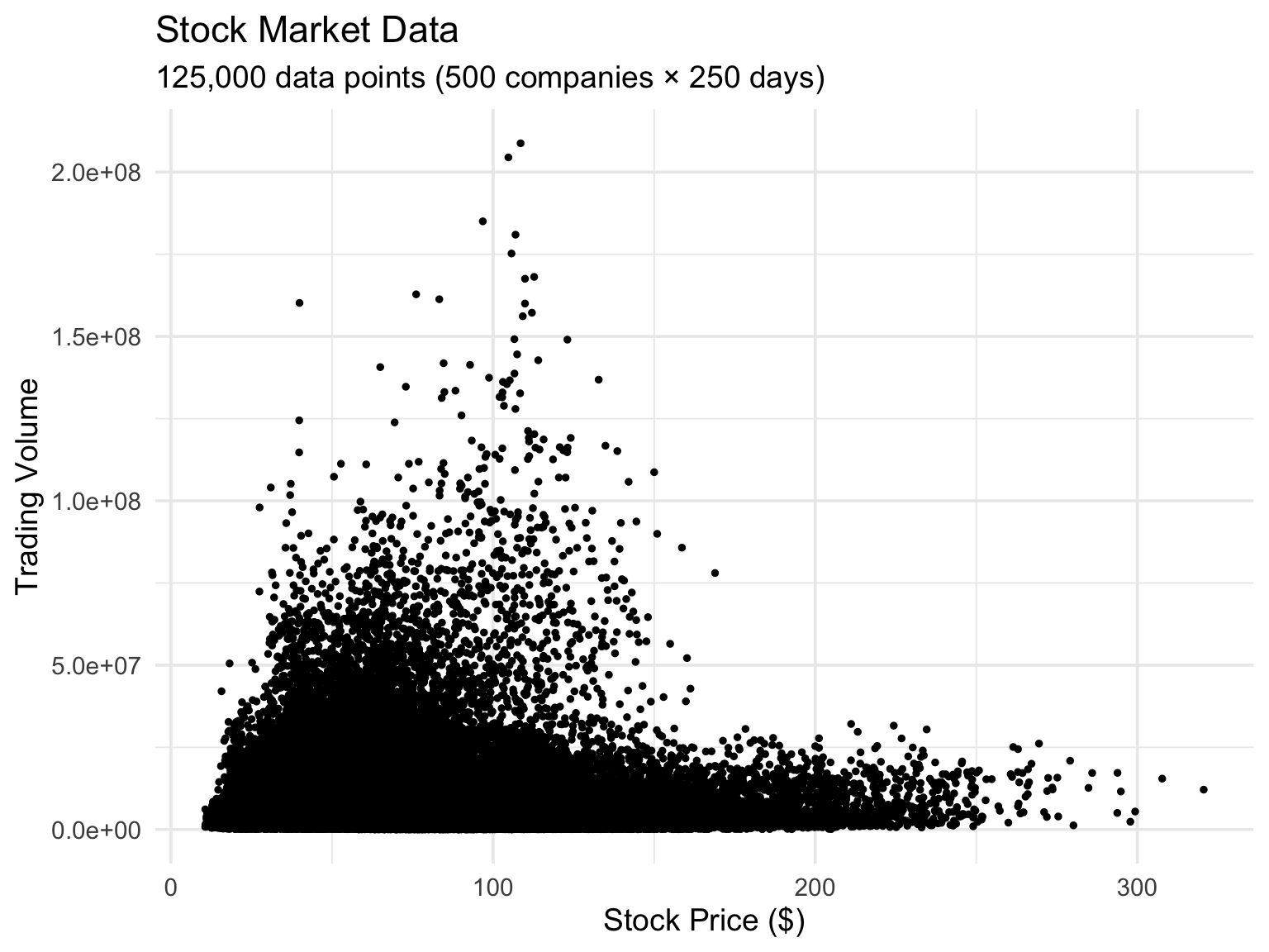
Scenario: Daily stock prices (high precision decimals) for 500 companies over 1 year. Trying to show price vs. trading volume.
Issue: So many points (500 × 250 days = 125,000 points) that the plot is completely black in the middle.
What would you do?
Problem Plot 3
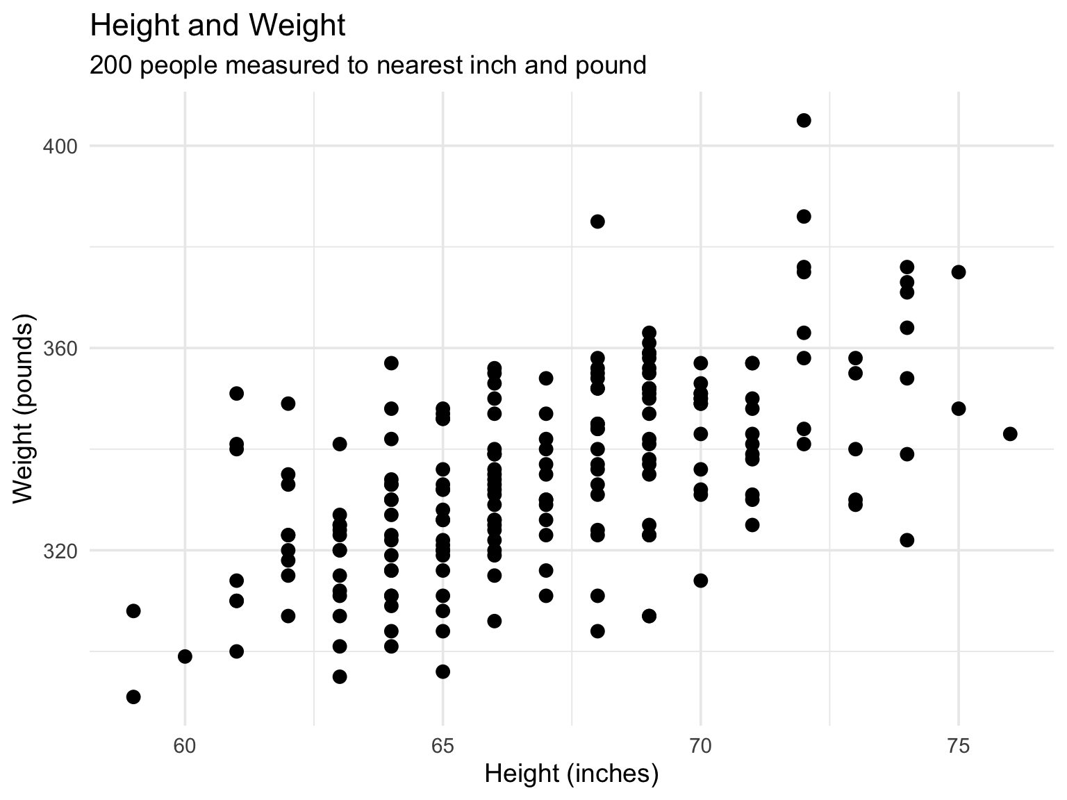
Scenario: Height and weight measurements for 200 people, measured to the nearest inch and pound.
Issue: Multiple people have identical height/weight combinations, but we can only see one point.
What would you do?
Visualizing Correlation: Correlograms
Instead of numbers, use visual encoding:
- Color intensity = correlation strength
- Positive = blue shades
- Negative = red shades
- Near zero = white/light
Sometimes add circle size for redundancy