Rows: 200
Columns: 6
$ common_name     <chr> "Plant 1", "Plant 2", "Plant 3", "Plant 4", "Plant 5",…
$ scientific_name <chr> "Genus species 1", "Genus species 2", "Genus species 3…
$ taxonomy        <chr> "Fabaceae", "Rosaceae", "Cucurbitaceae", "Apiaceae", "…
$ cultivation     <chr> "Legume", "Brassica", "Grain", "Fruit Tree", "Vine Cro…
$ sunlight        <fct> Partial Shade, Full Sun, Partial Shade, Full Sun, Full…
$ water <fct> Medium, High, Low, High, Medium, High, High, Medium, M…Lab 3 Walkthrough: Proportions & Hierarchies
STAT 80B Week 5 - Thursday
2026-03-10
Welcome to Lab 3!
Today’s Plan
Two big topics:
Part 1: Review Hierarchical Data Concepts
- What is hierarchical data?
- Treemaps, Sunburst charts, Mosaic plots
- When to use which
Part 2: Hands-On Lab 3
- Create 4 proportion visualizations
- Build 1 hierarchical visualization
- Write critical evaluation
- Work time with help
Lab 3 Overview
Three main parts:
- Proportions (4 points) - Pie charts, bar charts, stacked bars
- Hierarchies (4 points) - Treemaps, sunburst charts
- Critical Evaluation (2 points) - What works? What doesn’t?
Choose your tool: R, Python, or Tableau
Due: End of class today, submit PDF to Canvas
Part 1: Hierarchical Data Concepts
Review: Simple Proportions
Last class: Parts of a simple whole
- Pie charts: one level of categories
- Bar charts: comparing categories at same level
- Stacked bars: comparing groups at same level
Today: What if categories have subcategories?
Hierarchical Data = Nested Levels
Examples in the real world:
- Taxonomy: Kingdom → Phylum → Class → Family → Genus → Species
- Organization: Company → Department → Team → Person
- Geography: Country → State → City → Neighborhood
- Products: Store → Department → Category → Item
- Files: Drive → Folder → Subfolder → File
Our Lab 3 Data: Edible Plants
Hierarchical structures we can explore:
- Taxonomy → Water: Fabaceae → Low/Medium/High water needs
- Taxonomy → Cultivation: Rosaceae → Fruit Tree, Brassica, etc.
- Taxonomy → Sunlight: Solanaceae → Full Sun, Partial Shade, Shade
- Water → Cultivation: High water → what cultivation types?
The challenge: Show multiple levels simultaneously!
The Problem with Simple Charts
Regular pie/bar charts only show ONE level at a time:
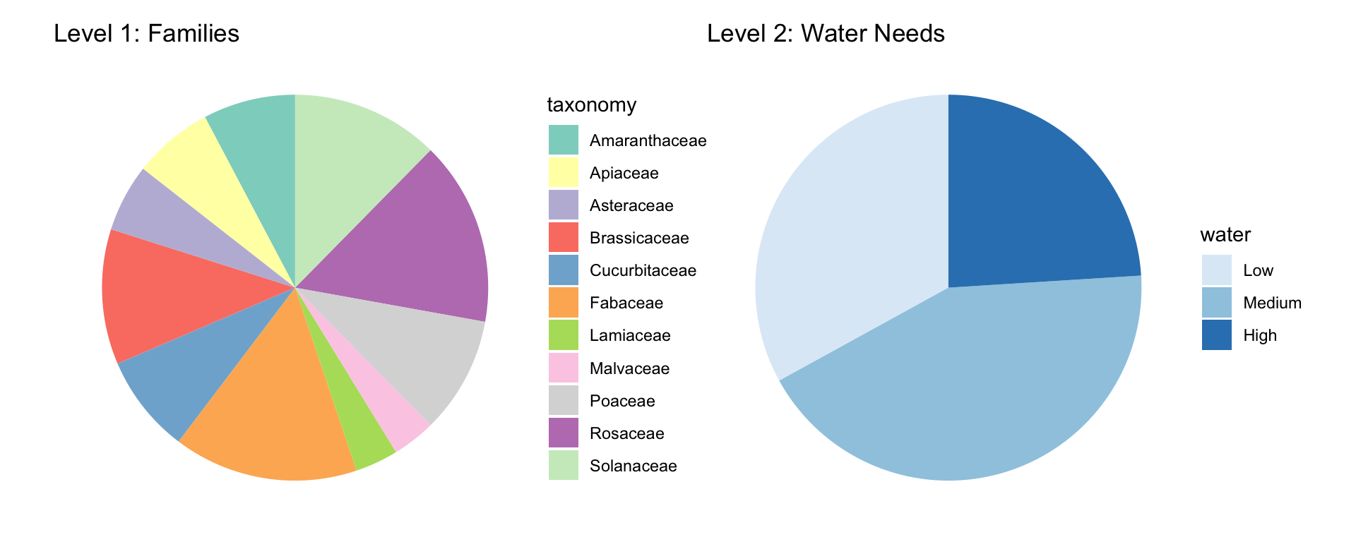
We need TWO separate charts to show both levels!
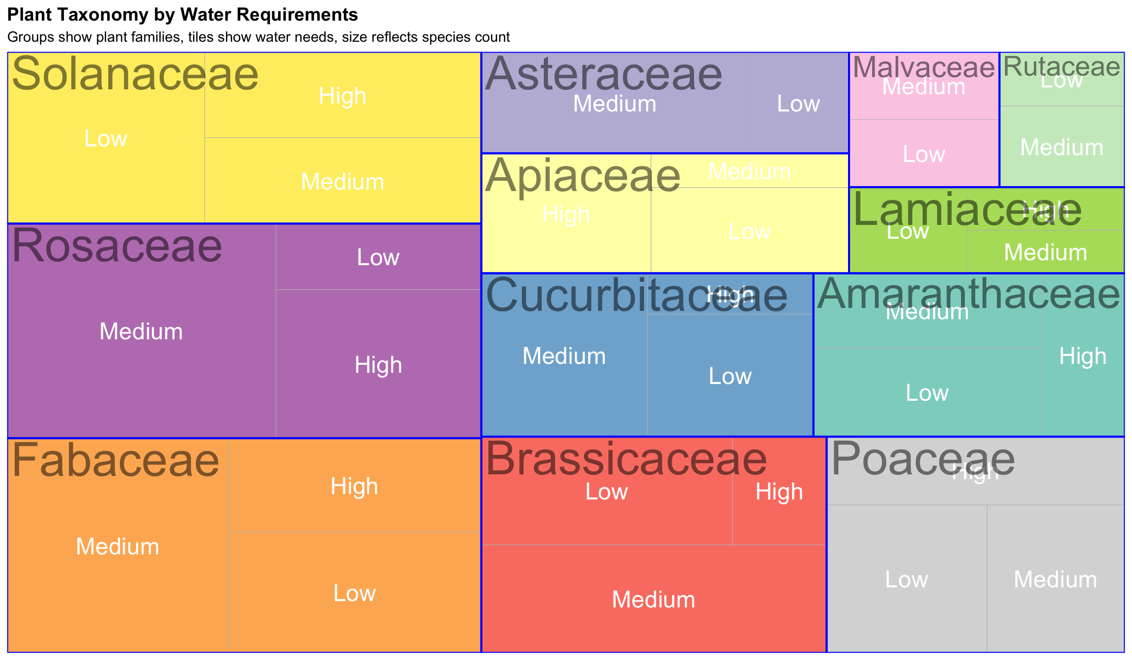
Solution 1: Treemap
Rectangles nested inside rectangles
How to read:
- Size = count/proportion
- Nesting = hierarchy levels
- Color = main categories
- Borders separate groups
Bigger rectangles = more species
Key features:
- Space-efficient
- Shows part-to-whole
- 2-3 levels work best
- Easy size comparisons
Treemap Example: Two Levels
Treemap: Strengths & Weaknesses
✅ Advantages:
- Space-efficient - fits lots of information
- Shows hierarchy clearly through nesting
- Big things are literally big (intuitive)
- Works well with 2-3 levels
- Good for static displays
❌ Limitations:
- Hard to compare similar-sized rectangles
- Some boxes end up awkward shapes
- Labels can be tricky in small boxes
- Gets cluttered beyond 3 levels
- Aspect ratios vary
Solution 2: Sunburst Chart
Nested pies = concentric rings
How to read:
- Center = root/total
- Inner ring = top categories
- Outer rings = subcategories
- Angle = proportion
- Interactive = click to zoom
Best for:
- Beautiful presentations
- Interactive dashboards
- Emphasizing proportions
- Storytelling
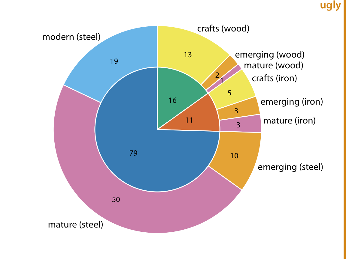
Note: Better as interactive visualization!
Treemap vs. Sunburst
| Feature | Treemap | Sunburst |
|---|---|---|
| Shape | Rectangles | Circles |
| Space use | Very efficient | Less efficient |
| Comparison | Easier | Harder |
| Aesthetics | Functional | Elegant |
| Best for | Dense data | Presentations |
| Interaction | Helpful | Essential |
Both are good for hierarchical data - pick based on audience & medium!
Solution 3: Mosaic Plot
Two categorical variables where width AND height matter
How to read:
- Width ∝ row category size
- Height ∝ column category size
- Area ∝ combination frequency
- Shows relationships!
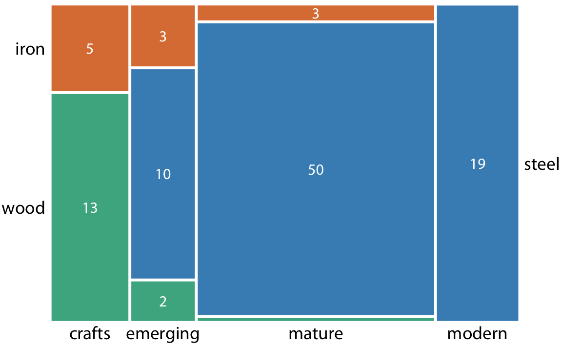
Good for asking:
- “Do categories co-occur?”
- “Are X and Y associated?”
- “Does distribution vary?”
Not for:
- True hierarchies
- Parent-child relationships
Mosaic vs. Treemap
Mosaic Plot:
- Exactly 2 variables
- Shows relationships (are X and Y associated?)
- Not truly hierarchical (no parent-child)
- Better for independence tests
Treemap:
- Multiple levels possible
- Shows hierarchy (parent-child structure)
- True nesting
- Better for composition
Use mosaic when asking: “Do cultivation types vary by water requirement?”
Part 2: Lab 3 Hands-On
The Dataset
TidyTuesday Edible Plants Database
What’s in the data:
- Taxonomy: Plant families (Fabaceae, Rosaceae, Solanaceae, Brassicaceae, etc.)
- Cultivation: Cultivation classes (Brassica, Legume, Root Vegetable, Leafy Green, etc.)
- Water: Water requirements (Low, Medium, High)
- Sunlight: Sun requirements (Full Sun, Partial Shade, Shade)
- Common and scientific names
This is REAL data about edible plants worldwide!
Loading the Data
First Step: Explore!
Always explore before visualizing!
Proportion Visualizations
The Challenge: Part 1
Create FOUR different visualizations of the same data
Choose ONE approach:
- Option A: Plant Family Distribution (taxonomy)
- Option B: Cultivation Types by Water Requirements
All four must show the SAME information, just differently!
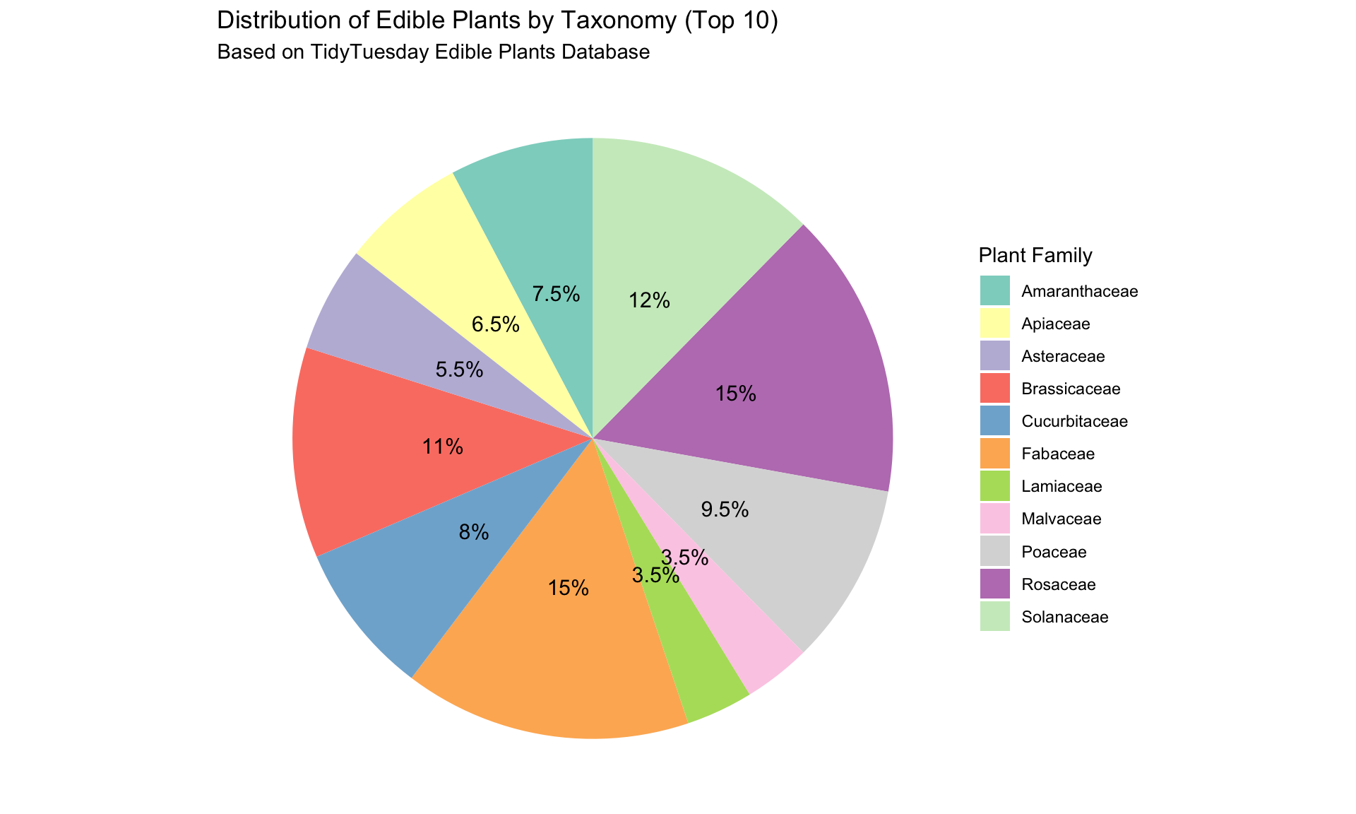
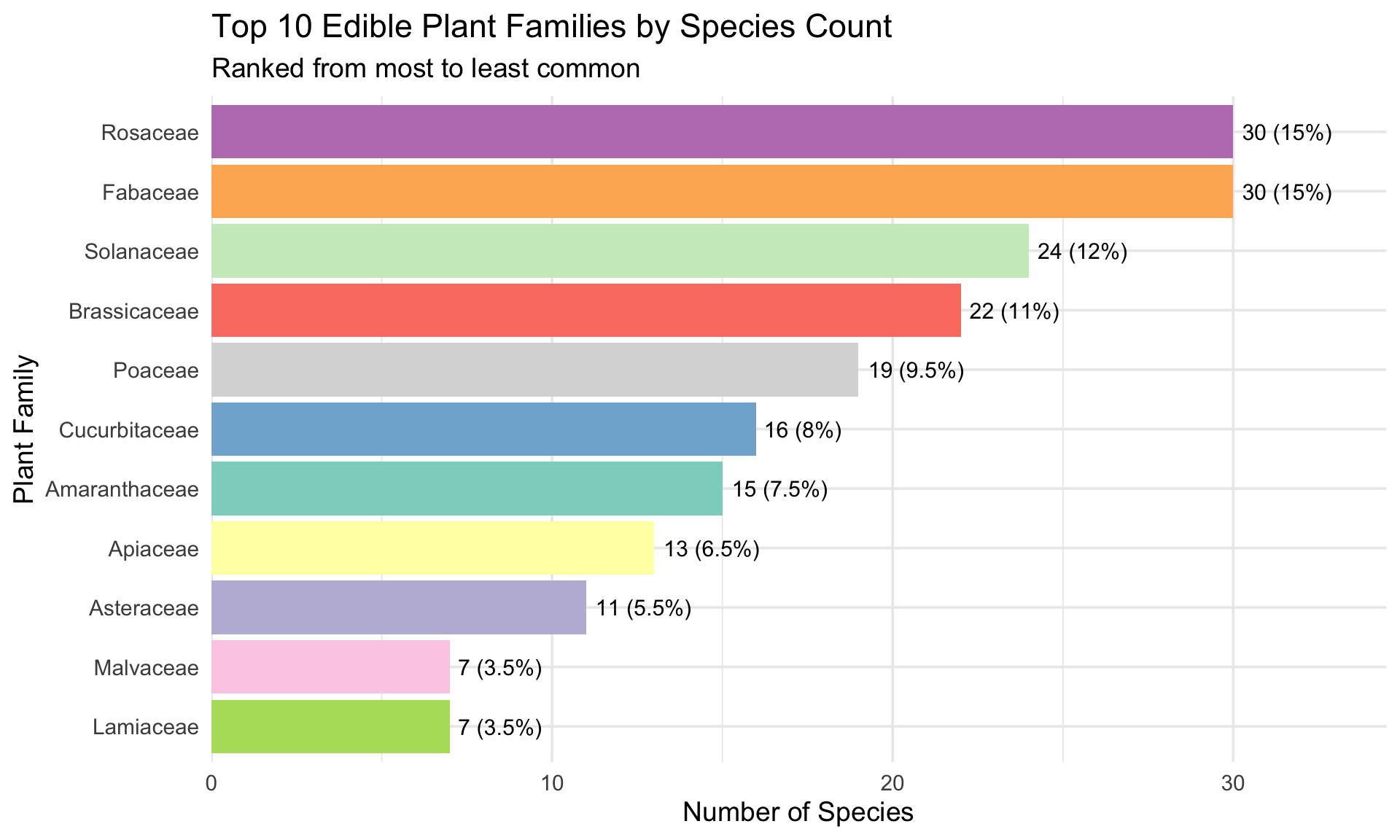
Option A: Taxonomy Distribution
Four required visualizations:
- Pie chart - proportions as slices
- Bar chart - ordered by count
- Bar chart - different ordering (alphabetical)
- Donut chart - alternative circular
Focus: Which plant families dominate? How concentrated is diversity?
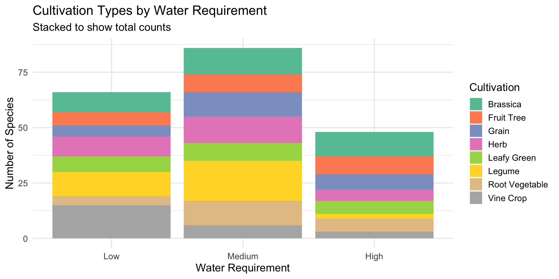
Option B: Water Requirements
Four required visualizations:
- Stacked bar chart - cultivation types by water requirement
- 100% stacked bar - proportional composition
- Side-by-side bars - direct comparison
- Small multiples - separate charts per water category
Focus: Does cultivation type relate to water needs?
Pie Chart Example
Bar Chart: Ordered by Count
Stacked Bar Chart Example
Your Turn: Four Proportion Viz (30 min)
Create your four visualizations:
Option A folks:
- Pie chart of top families
- Bar chart ordered by count
- Bar chart alphabetically
- Donut chart
Option B folks:
- Stacked bar
- 100% stacked bar
- Side-by-side bars
- Small multiples
Each needs: Title, labels, caption with one insight
Hierarchical Visualizations
The Challenge: Part 2
Create ONE hierarchical visualization
Recommended structures:
- Option 1: Taxonomy → Water requirements
- Option 2: Taxonomy → Cultivation classes
- Option 3: Taxonomy → Sunlight requirements
Visualization types:
- Treemap (recommended)
- Sunburst chart
- Icicle plot
- Circle packing
Treemap Example: Simple
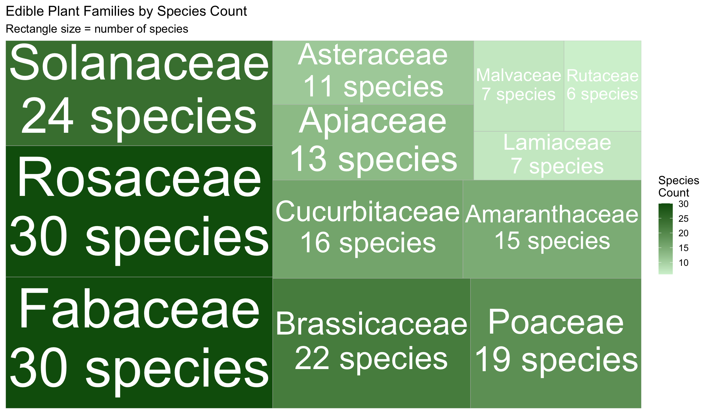
Treemap Example: Two Levels
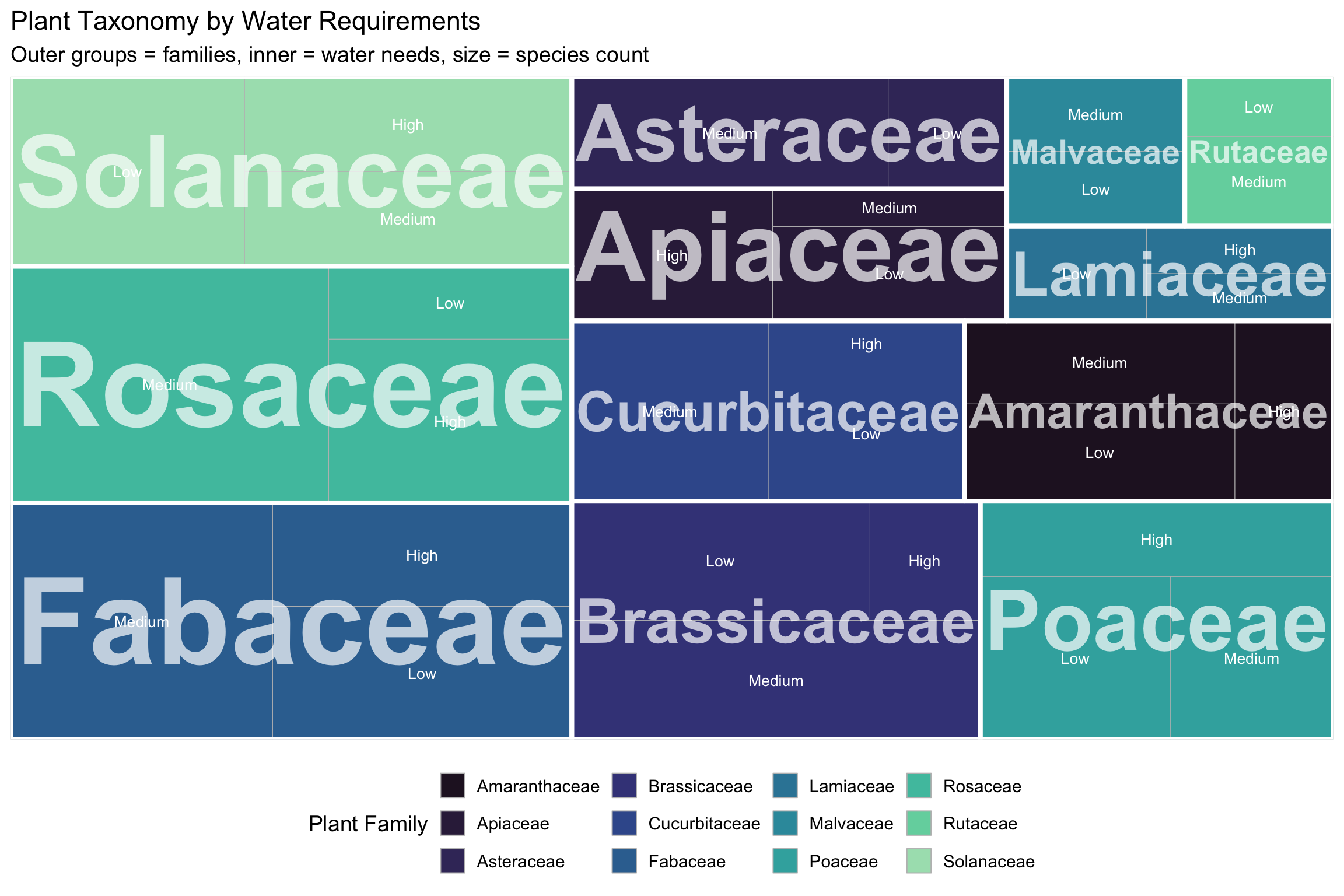
R Code for Treemaps
library(treemapify)

# Simple treemap (one level)
ggplot(data, aes(area = count, fill = count, label = category)) +
  geom_treemap() +
  geom_treemap_text(colour = "white", place = "centre") +
  scale_fill_gradient(low = "lightgreen", high = "darkgreen")

# Two-level hierarchy
hierarchy_data <- edible_plants %>%
  count(taxonomy, water) %>%
  filter(n >= 2)

ggplot(hierarchy_data,
       aes(area = n, fill = taxonomy,
           label = water, subgroup = taxonomy)) +
  geom_treemap() +
  geom_treemap_text(colour = "white", place = "centre") +
  geom_treemap_subgroup_border(colour = "white", size = 3) +
  geom_treemap_subgroup_text(colour = "white", fontface = "bold")
Your Turn: Hierarchical Viz (15 min)
Create ONE treemap showing:
Option 1: Taxonomy → Water requirement
Option 2: Taxonomy → Cultivation class
Option 3: Taxonomy → Sunlight requirement
Requirements:
- At least 2 levels of hierarchy
- Clear labeling (use borders and text layers)
- Strategic color use
- Professional appearance
- 2-3 sentence caption
This is worth 4 points, so invest time here!
Tableau Quick Tutorial
For Tableau Users
Quick steps to create treemap:
- Load data: Connect to edible_plants.csv
- Create hierarchy: Right-click
taxonomy→ Create Hierarchy → Addwaterorcultivation - New worksheet: Change mark type to Square
- Build treemap:
- Drag hierarchy to Detail
- Drag COUNT to Size
- Drag
taxonomyto Color
- Format: Add labels, borders, choose colors
Detailed steps in Lab 3 document!
Critical Evaluation
The Writing Component
Write 1-2 paragraphs (200-300 words) addressing:
Section 1: Comparing Your 4 Proportion Visualizations
- Which is most effective? Why?
- Which is least effective? Why?
- For what audience/purpose would each work?
- What design choices did you make?
Section 2: Evaluating Your Hierarchical Visualization
- What story does it tell about edible plant diversity?
- What works well?
- What could be improved?
- Would a different type be better?
What Makes a Strong Critique?
Good critiques include:
- Specific examples: “The pie chart works well because Fabaceae dominates at 20%, making the largest slice immediately visible”
- Trade-offs: “While the alphabetical bar chart makes families easy to find, it obscures which families are most common”
- Audience thinking: “For botanists, alphabetical might be preferred, but for general audiences, ranked bars communicate better”
- Design rationale: “I used a green gradient for the treemap to match the plant theme and make larger families darker”
Submission & Working Time
What to Submit
ONE PDF file containing:
- Part 1: Four proportion visualizations (1-2 pages)
- Each with 2-3 sentence caption
- Part 2: One hierarchical visualization (1 page)
- With 2-3 sentence caption
- Part 3: Written critique (1 page)
- Addressing both sections
Total: 3-4 pages
Filename: Lab3_YourLastName.pdf
Grading Breakdown
| Component | Points | Key Criteria |
|---|---|---|
| Four proportion visualizations | 1.6 | All four completed, distinct types |
| Design quality (proportions) | 1.2 | Professional, good colors, readable |
| Labels/captions (proportions) | 0.8 | Clear titles, axes, insight in caption |
| Hierarchical viz | 4.0 | Appropriate type, clear hierarchy, professional |
| Written critique | 2.0 | Thoughtful, specific, references concepts |
Total: 10 points
Remaining Class Time
Recommended workflow:
- ✅ Load and explore the data (5 min)
- ✅ Create four proportion visualizations (30 min)
- ✅ Create hierarchical visualization (20 min)
- ✅ Start written critique (15 min)
- ✅ Compile PDF and submit
I’ll circulate to help with:
- Technical issues
- Design decisions
- Interpretation questions
Tips for Success
Data exploration:
- Check column names first!
- Count things before visualizing
- Filter to top 10-15 categories for clarity
Visualization:
- Less is more
- Consistent color schemes
- Clear, large labels
- Tell a story
Writing:
- Be specific and honest
- Use examples from YOUR visualizations
- Reference class concepts
Questions?
Get started on Lab 3!
I’ll be here to help throughout class.
Remember
There’s no single “correct” visualization. Your critique matters as much as your technical execution!
Thank you!
Happy visualizing! 🌱