Visualizing Proportions
Parts of a Whole
STAT 80: Data Visualization
Week 5, Day 1
Visualizing Proportions
Today’s focus:
- What are proportions and why visualize them?
- Pie charts (yes, really!)
- Side-by-side bars
- Stacked bars
- The great pie chart debate
What Are Proportions?
Proportion = parts of a whole
Everyday examples:
- Budget breakdown (rent, food, entertainment)
- Market share (which companies dominate)
- Demographics (age groups, ethnicities)
- Time allocation (work, sleep, leisure)
Key features:
- Values add up to 100% (or 1.0)
- Show how a total is divided
- Answer “how much of the whole?”
Not proportions:
- Quantities that don’t sum to a total
- Separate measurements that happen to be percentages
Why Proportions Matter
Understanding proportions helps us answer:
- Composition: What makes up this total?
- Comparison: Which part is biggest?
- Change: How has the makeup shifted over time?
- Balance: Is it evenly distributed or dominated by one part?
Good proportion visualizations make these answers obvious at a glance
The Infamous Pie Chart
![]()
Most loved and most hated chart in data visualization!
Let’s understand why…
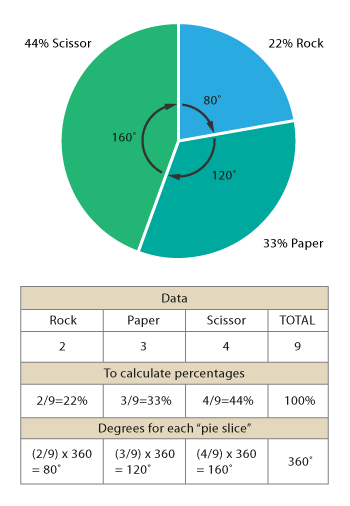
Pie Chart: How It Works
Each slice:
- Represents one category
- Size (angle) = proportion of total
- All slices = 360° = 100%
Reading it:
- Compare slice sizes
- Look at slice labels
- Assess overall breakdown
When Pie Charts Work Well
Pie charts are good when:
- ✅ You have few categories (3-5 ideal, 7 max)
- ✅ One part is clearly dominant (>50%)
- ✅ You want to emphasize parts of a whole
- ✅ Rough comparisons are enough (not precise differences)
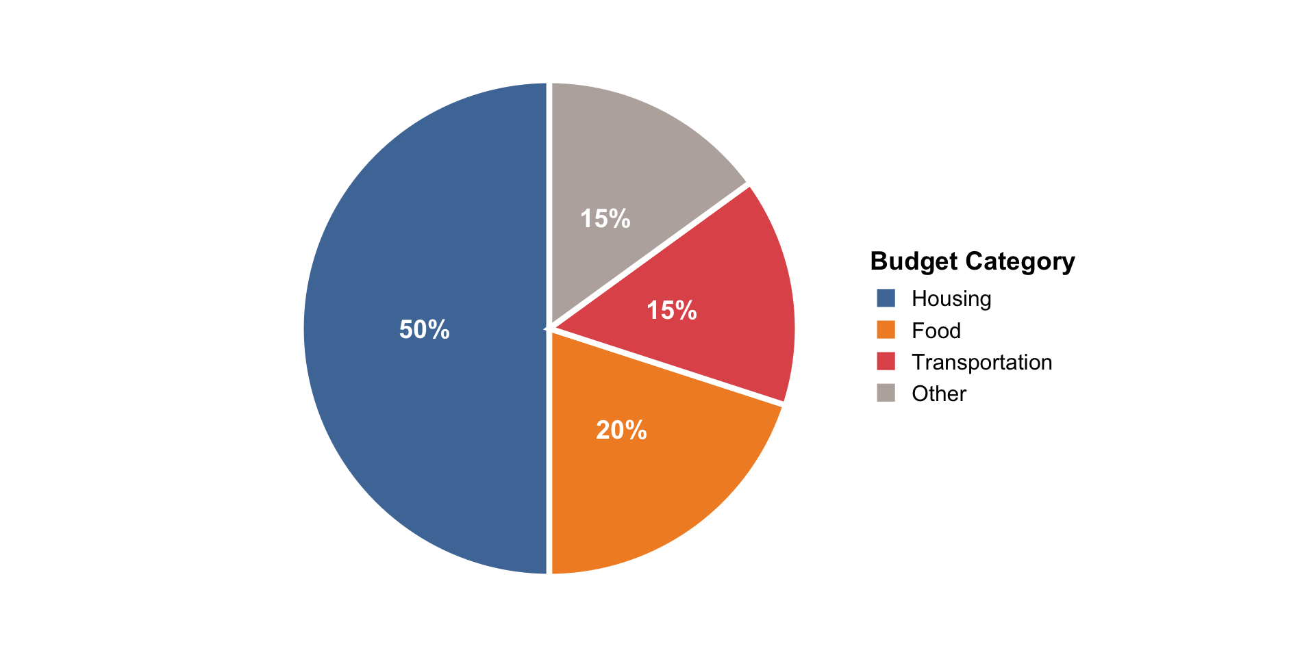
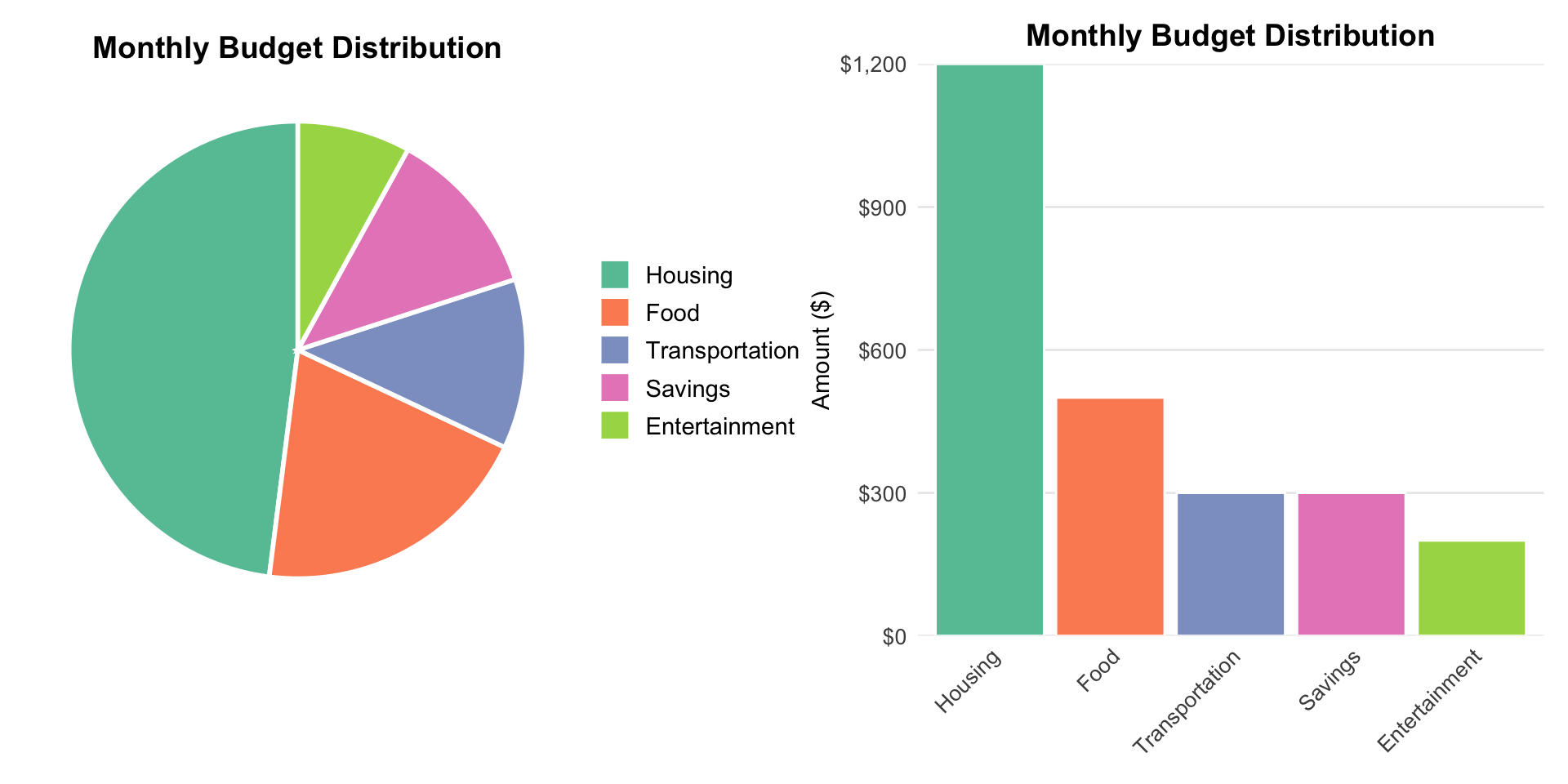
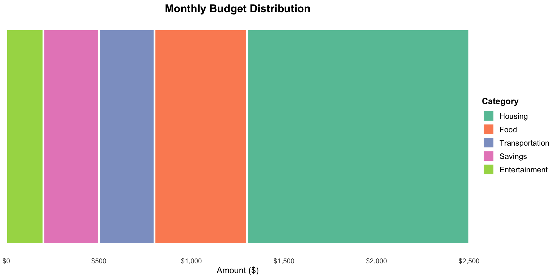
Good Pie Chart Example
![]()
Why it works:
- Only 4 categories
- Housing clearly dominates
- Purpose is showing budget composition
- Easy to see approximate proportions
When Pie Charts Fail
Pie charts are bad when:
- ❌ Too many categories (more than 7)
- ❌ Slices are similar sizes (hard to compare angles)
- ❌ Precision matters (exact percentages needed)
- ❌ Comparing multiple pies side-by-side
- ❌ Small differences are important
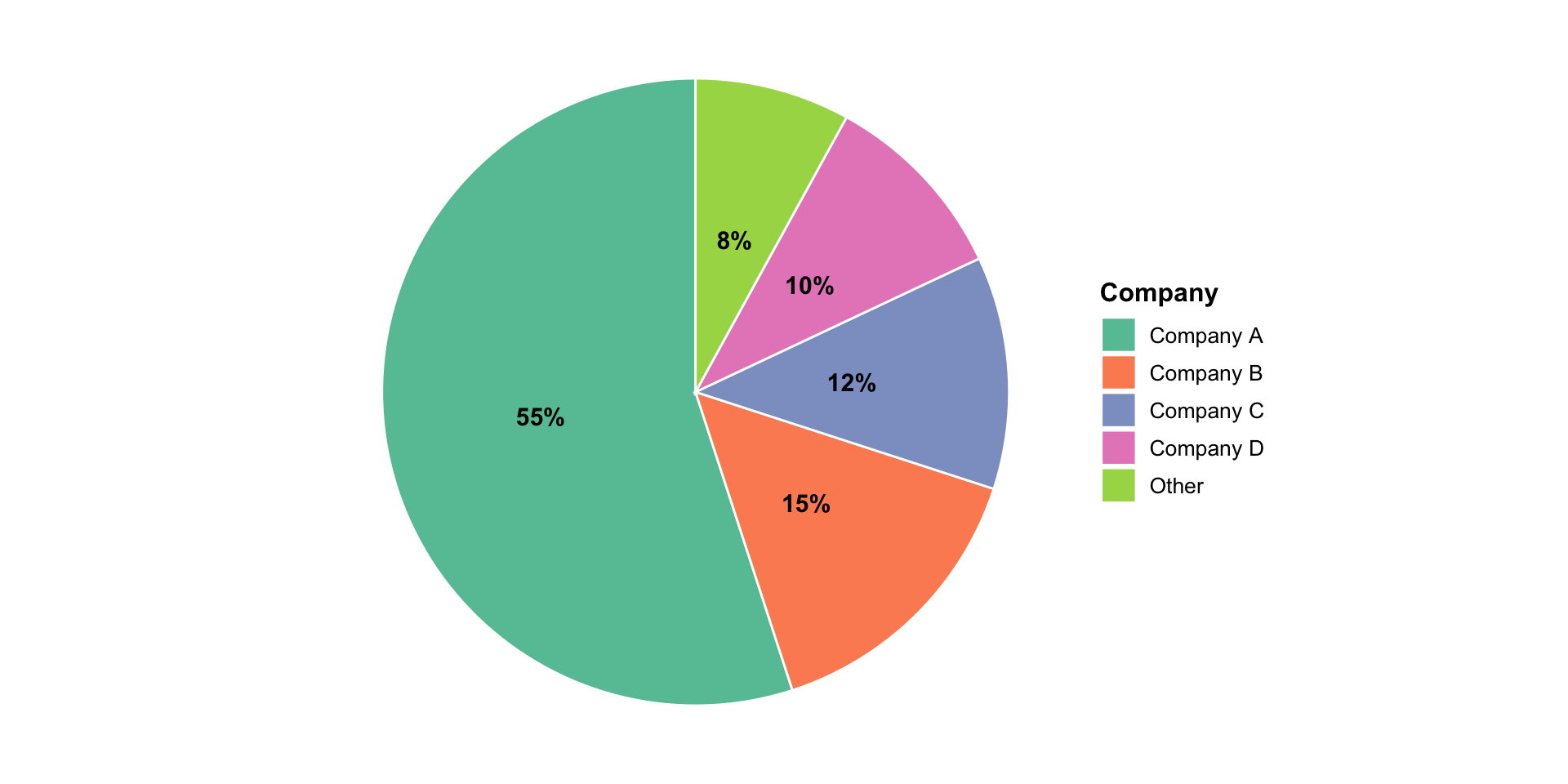
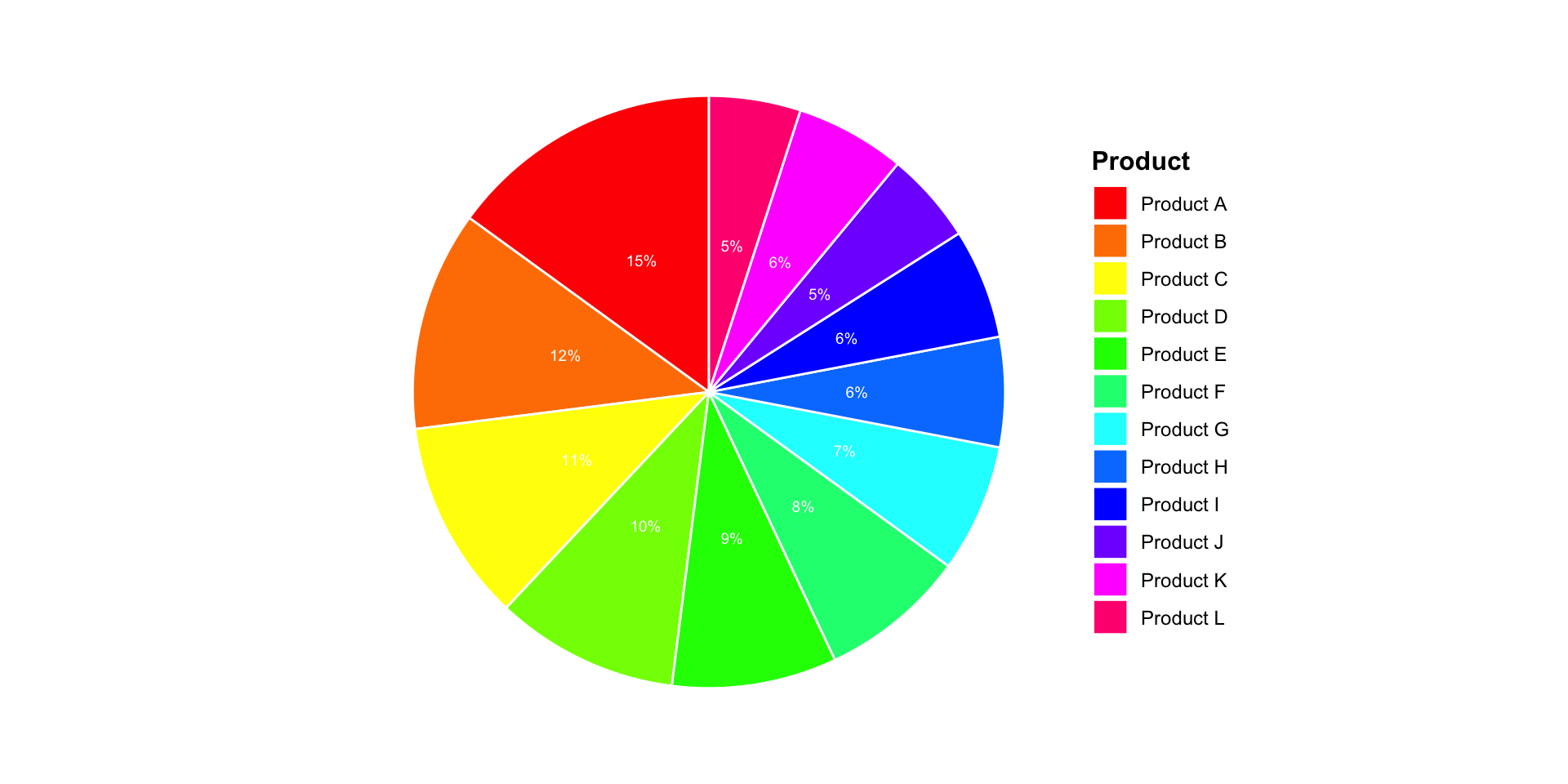
Bad Pie Chart Example 1
![]()
Too many slices!
- Hard to distinguish similar colors
- Tiny slices are unreadable
- Legend is too long
- Can’t compare angles accurately
Bad Pie Chart Example 2
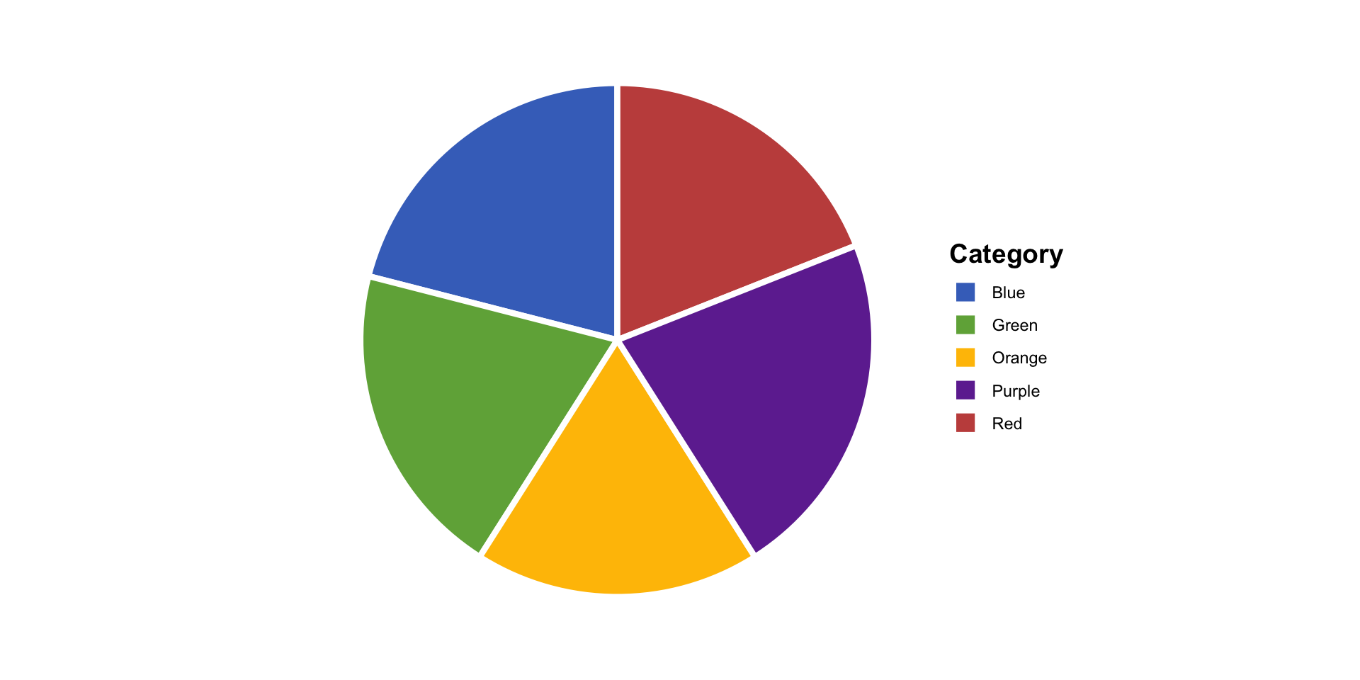
![]()
Slices too similar!
Which is bigger: Blue or Green? Red or Orange?
Angles are hard to compare precisely
Our eyes are bad at judging angles!
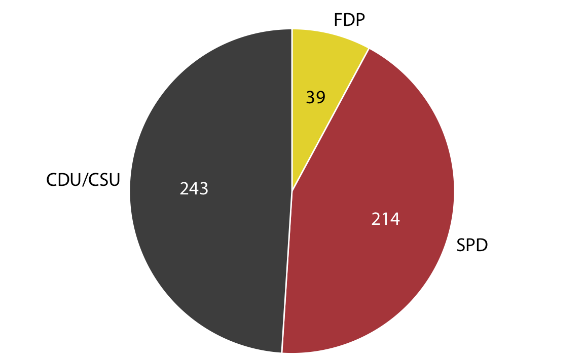
Bad Pie Chart Example 3
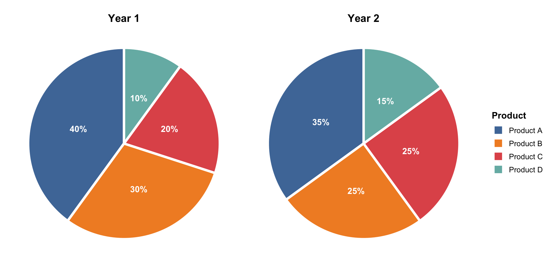
![]()
Comparing multiple pies is terrible!
- Can’t line up slices to compare
- Different sizes make comparison worse
- What changed between Year 1 and Year 2?
The Great Pie Chart Debate
Team Anti-Pie 🥧❌
- Humans bad at judging angles
- Bars are always clearer
- “Friends don’t let friends use pie charts”
- Research shows alternatives are better
Team Pro-Pie 🥧✅
- Everyone understands them
- Good for parts-of-whole
- Sometimes the right tool
- “It depends on the situation”
Marcela’s take: Pie charts have their place, but that place is narrow. When in doubt, try alternatives first! and NEVER, NEVER, NEVER use 3D pies.
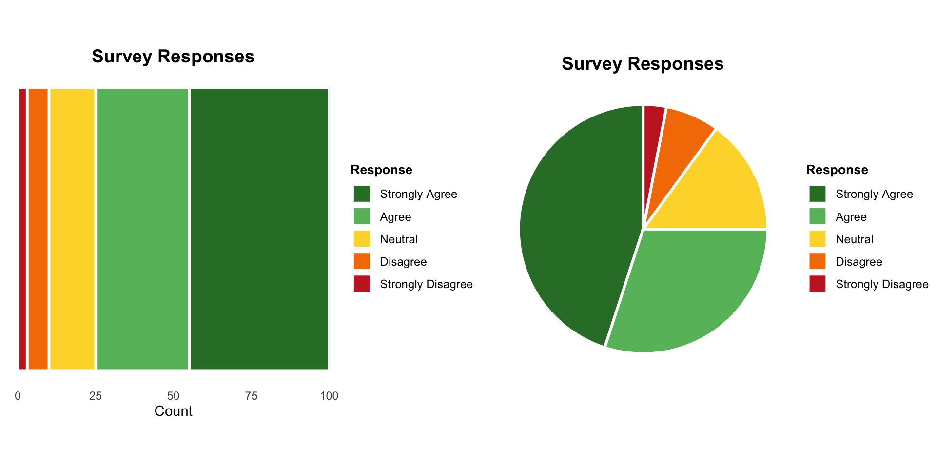
Alternative 1: Simple Bar Chart
Instead of pie, use bars!
![]()
Advantages:
- ✅ Easy to compare lengths
- ✅ Can order by size
- ✅ More precise comparisons
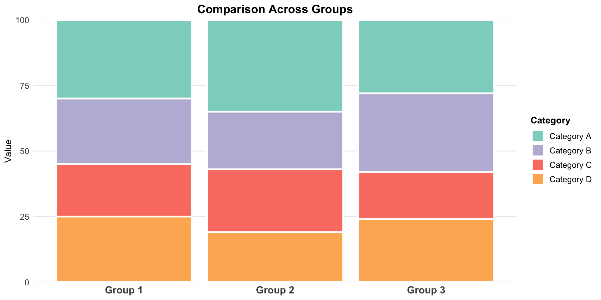
Alternative 2: Stacked Bar Chart
Shows proportions and maintains “parts of a whole” feeling
![]()
- Total bar = 100%
- Segments = categories
- Keeps compositional context
Stacked Bars vs Pie
![]()
Stacked Bar ✅
- Easy to compare to edges
- Can stack multiple bars for comparison
- Linear comparisons
Pie ⚠️
- Harder to compare angles
- Multiple pies get messy
- Circular comparisons
Side-by-Side Bars for Comparison
When comparing proportions across groups:
![]()
Each group gets its own set of bars
Easy to compare categories across groups!
Stacked vs Side-by-Side Bars
Stacked bars:
- Show overall composition
- Emphasize totals
- Compare first category easily (aligned to baseline)
- Hard to compare middle categories
Side-by-side bars:
- Compare categories across groups
- See each value clearly
- Don’t show total as obviously
- Take more space
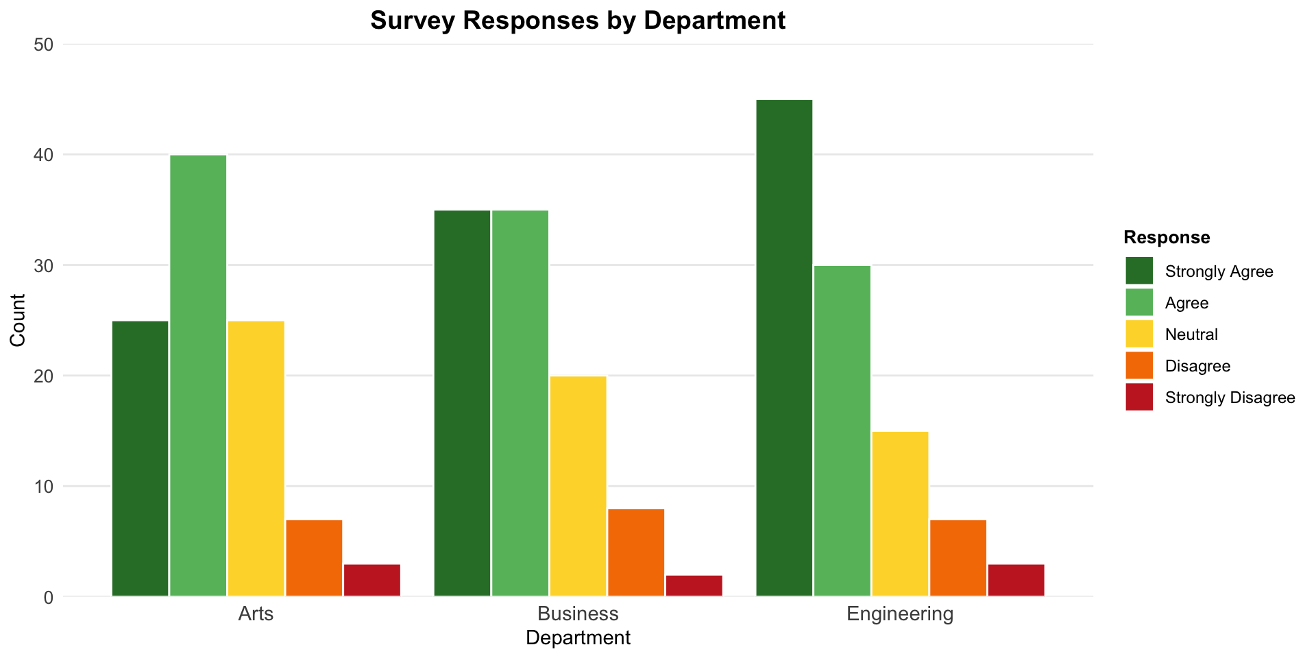
Stacked Bar Challenge
![]()
Question: Which is larger in Group 2: Category B or Category C?
Hard to tell! They don’t share a baseline
This is the main weakness of stacked bars
Design Choices for Proportion Charts
Ordering:
- For pies: Start at 12 o’clock, go clockwise from largest to smallest
- For bars: Order by size (unless natural order exists)
Colors:
- Limit palette to 5-7 distinct colors
- Use color to highlight important categories
- Keep it accessible (colorblind-friendly)
Labels:
- Include percentages when precision matters
- Put labels inside slices/bars when they fit
- Use leader lines sparingly
Pie Chart Design Best Practices
If you must use a pie chart:
- Explode important slices slightly (pull out from center)
- Order slices from largest to smallest
- Start at 12 o’clock position
- Limit to 5-7 categories maximum
- Label directly on slices when possible
- Avoid 3D effects (they distort proportions!)
The Dreaded 3D Pie
![]()
Never. Use. 3D. Pies. 🚫
- Perspective distorts proportions
- Slices in “front” look bigger
- Adds no information, reduces accuracy
- Peak “chartjunk”
Donut Charts
Pie chart variation: hollow center
Same strengths and weaknesses as pie charts, but:
- ✅ Can put text/numbers in the center
- ✅ Slightly less emphasis on “whole”
- ❌ Even harder to compare angles
When Should You Show Proportions?
Good reasons:
- Data naturally represents parts of a whole
- You want to show composition
- Percentages are meaningful
Watch out for:
- Forcing percentages when counts matter more
- Using proportions to hide small sample sizes
- Comparing proportions across very different totals
Example: “90% approval!” sounds great, but what if only 10 people were surveyed?
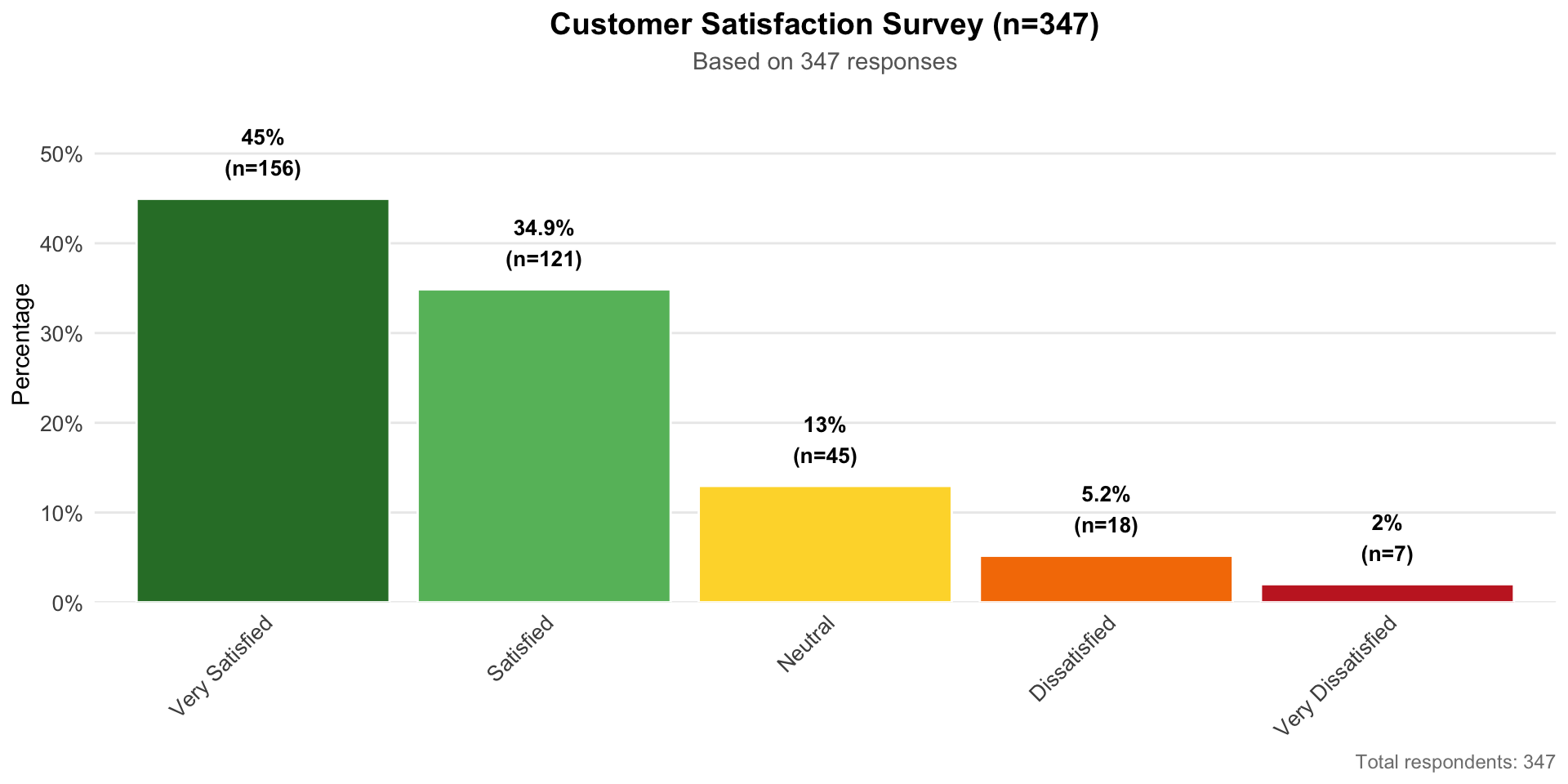
Showing Sample Size
When showing proportions, consider showing the denominator:
![]()
Include sample size:
- In title: “Customer Satisfaction (n=347)”
- In caption: “Based on 1,250 responses”
- In the visualization itself
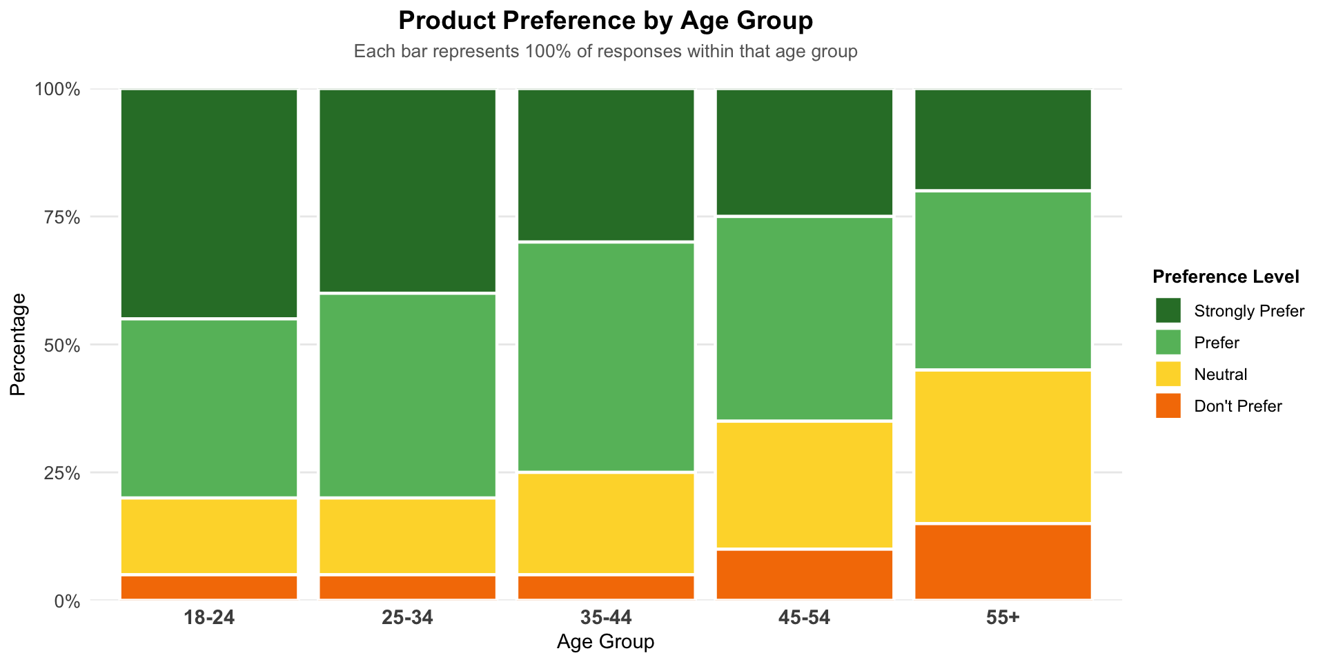
Special Case: 100% Stacked Bars
Comparing proportions across many groups:
![]()
All bars reach 100%, easy to compare composition
Good for: Seeing how proportions change across groups
Bad for: Comparing actual quantities (bars are same height!)
Summary: Choosing Your Chart
| Pie |
3-5 categories, one dominant |
Many categories, precise comparison |
| Donut |
Same as pie + center annotation |
Multiple donuts side-by-side |
| Simple bar |
Precise comparison, ranking |
Need to emphasize “whole” |
| Stacked bar |
Composition over time/groups |
Comparing middle segments |
| Side-by-side |
Comparing across groups |
Space is limited |
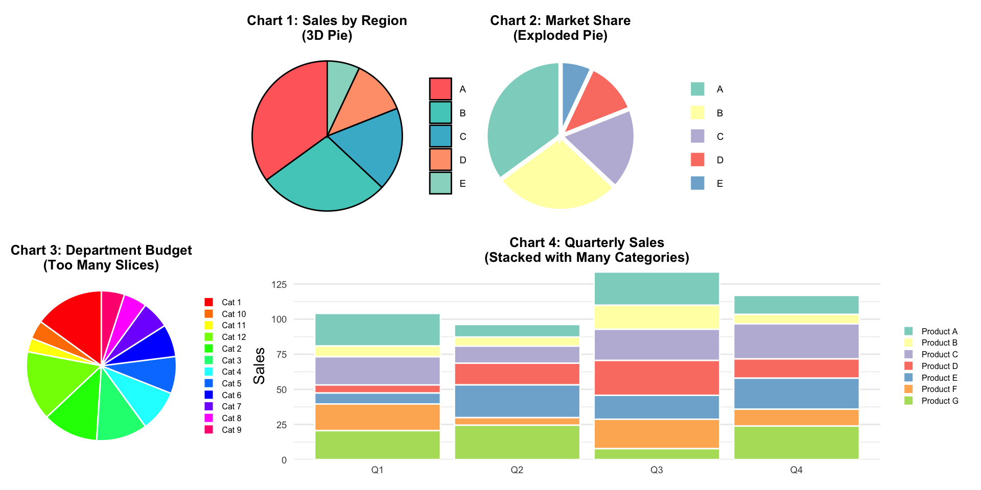
Activity: Critique These Charts
![]()
For each chart:
- What works well?
- What doesn’t work?
- How would you improve it?
- What alternative would you suggest?
Next Class Preview
Thursday: We level up to nested proportions!
- Mosaic plots
- Treemaps
- Nested pies (pies within pies!)
- Parallel sets
- Showing hierarchies and sub-categories
Plus: Tableau guidance on all these techniques!
Remember
“The only thing worse than a pie chart is several of them.”
— Edward Tufte (data visualization expert)
But also remember:
Sometimes a simple pie chart is exactly what your audience needs. Know the rules, then know when to break them thoughtfully!