Visualizing Many Distributions
Boxplots, Violin Plots, Ridgelines, and Small Multiples
STAT 80: Data Visualization
Week 4, Day 2
Comparing Multiple Distributions
Today’s focus:
- Boxplots and box-and-whisker plots
- Violin plots
- Ridgeline plots
- Small multiples (faceting)
The Challenge
You have data for multiple groups and want to compare their distributions:
- Test scores across different classes
- Salaries across different companies
- Temperatures across different cities
- Product ratings across different brands
Problem: Histograms get messy with many groups!
Solution: Specialized comparison plots
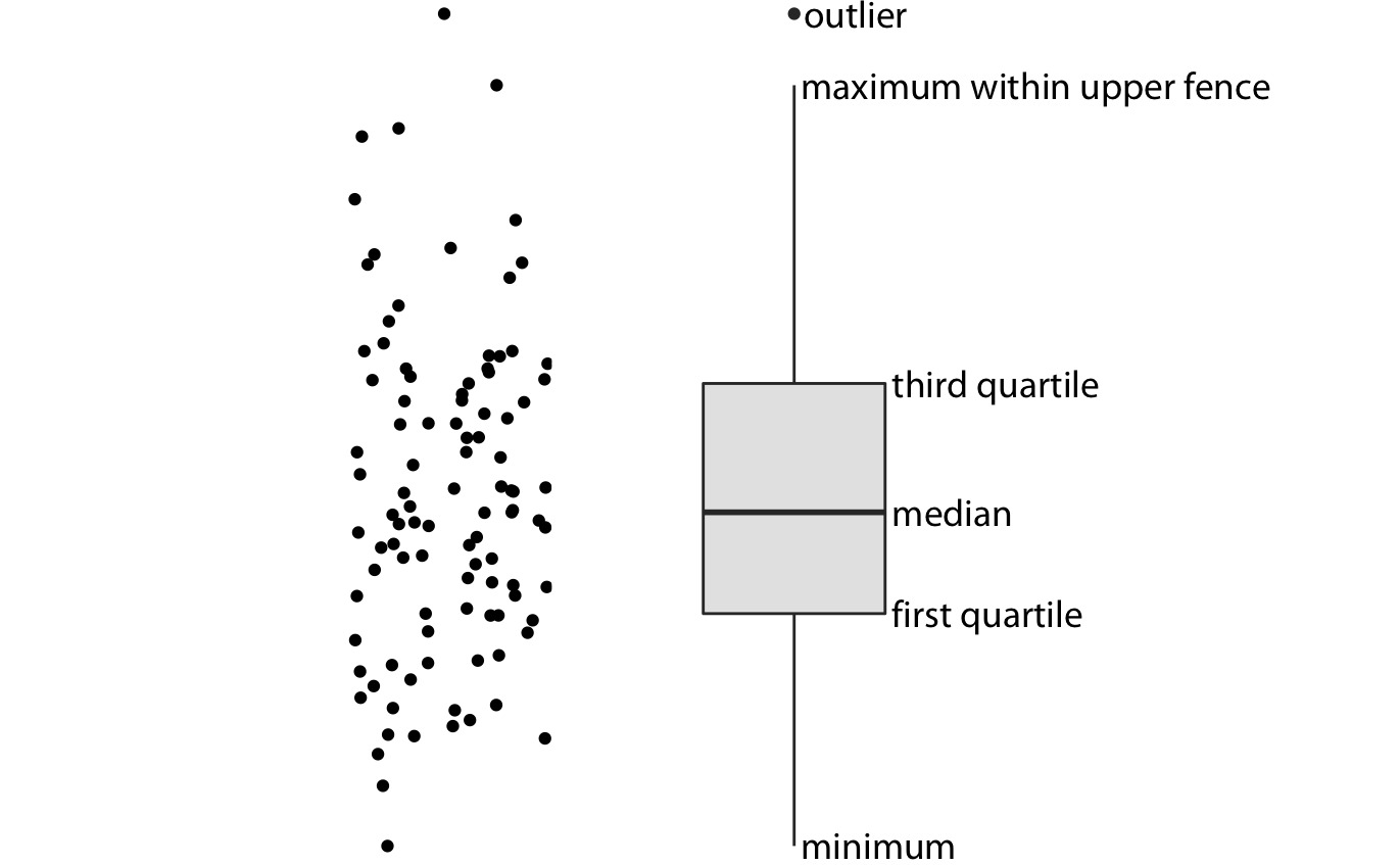
Introducing: The Boxplot
Also called “box-and-whisker plot”
![]()
Shows 5 key numbers in one compact visual
Boxplot Anatomy: The Five Numbers
![]()
- Minimum - smallest value (end of bottom whisker)
- Q1 (25th percentile) - bottom of box
- Median (50th percentile) - line in middle of box
- Q3 (75th percentile) - top of box
- Maximum - largest value (end of top whisker)
The Box = Middle 50%
![]()
The box contains the middle half of your data
- Bottom of box = 25% of data below this
- Top of box = 25% of data above this
- Height of box = “Interquartile Range” (IQR)
Taller box = more spread out
Shorter box = more tightly clustered
Example: Building a Boxplot
Data: Test scores: 55, 62, 68, 72, 75, 78, 80, 82, 85, 88, 92, 95
Step 1: Find the five numbers
- Minimum = 55
- Q1 (25th %ile) = 69
- Median (50th %ile) = 79
- Q3 (75th %ile) = 86.5
- Maximum = 95
Step 2: Draw it! →
Building a Boxplot by Hand
Try it yourself:
- Draw a number line
- Mark the five numbers
- Draw box from Q1 to Q3
- Draw line at median
- Draw whiskers to min and max
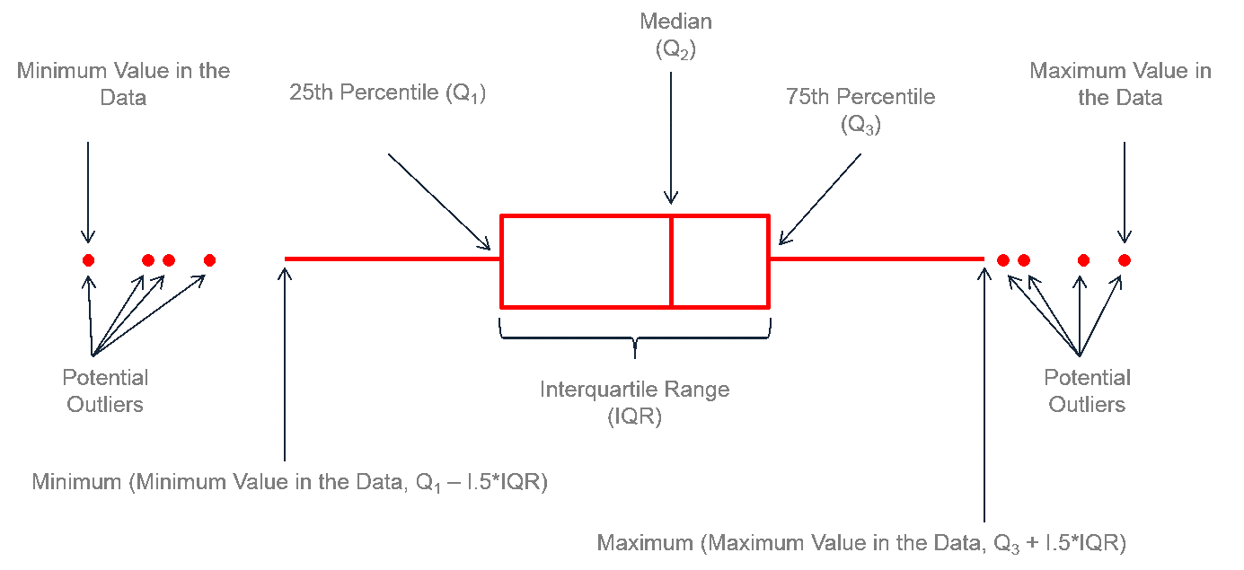
What About Outliers?
Sometimes we have extreme values that don’t fit the pattern…
![]()
Convention: Values more than 1.5 × IQR beyond the box are shown as individual points
Outlier Detection Rule
Step 1: Calculate IQR = Q3 - Q1
Step 2: Calculate fences:
- Lower fence = Q1 - (1.5 × IQR)
- Upper fence = Q3 + (1.5 × IQR)
Step 3: Any values outside the fences are outliers
Whiskers go to: The most extreme value within the fences (not all the way to the fences!)
Example: With Outliers
Data: 12, 15, 16, 18, 19, 21, 22, 24, 25, 28, 55
- Q1 = 16, Q3 = 25, IQR = 9
- Lower fence = 16 - (1.5 × 9) = 2.5
- Upper fence = 25 + (1.5 × 9) = 38.5
- 55 > 38.5, so it’s an outlier!
- Upper whisker goes to 28 (not 55)
- 55 is plotted as a point
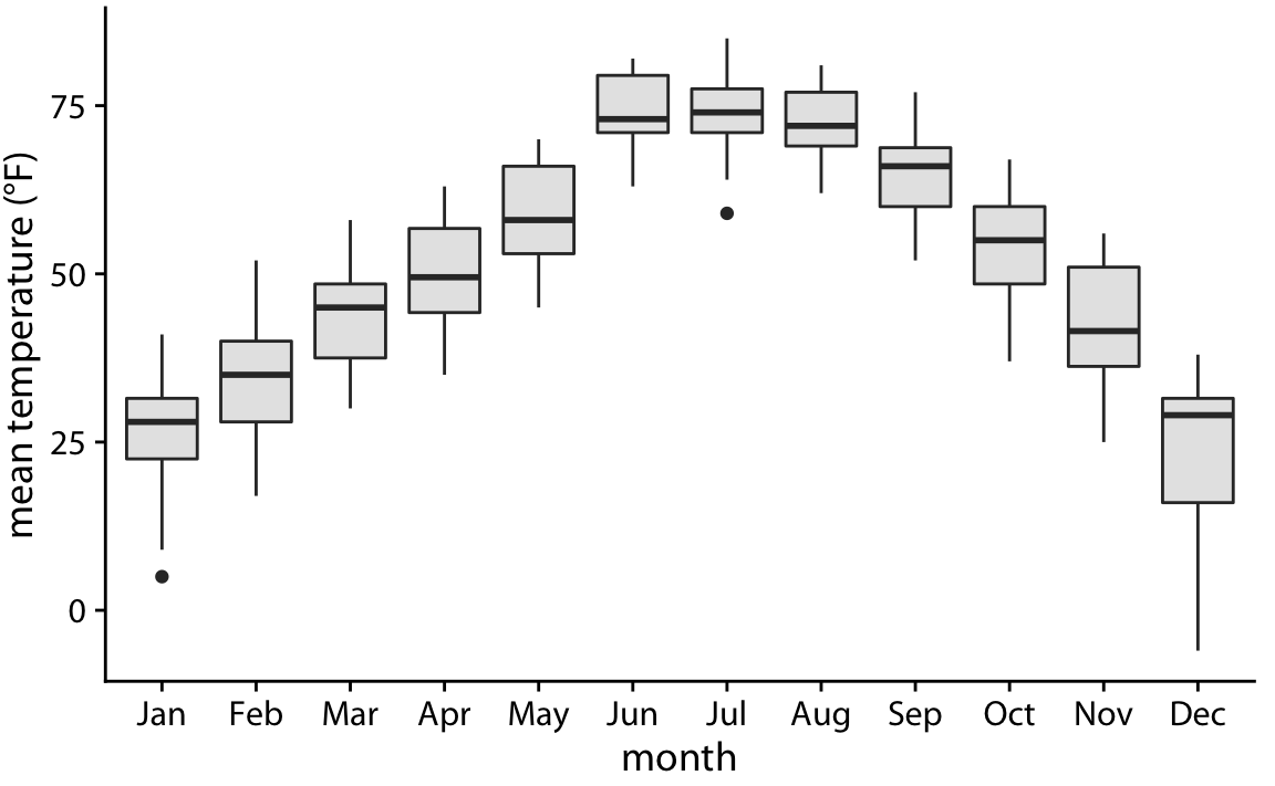
Comparing Groups with Boxplots
This is where boxplots really shine!
![]()
Easy to see:
- Which group has higher median
- Which group has more variability
- Whether there are outliers
Reading Boxplots: Practice
![]()
Questions:
- Which class has the highest median score?
- Which class has the most variability?
- Which class has outliers?
- In which class did 75% of students score above 70?
Boxplot Summary
Advantages
✅ Compact - can show many groups side-by-side
✅ Clear comparison - easy to see medians and spreads
✅ Outliers highlighted - unusual values stand out
✅ Standardized - everyone reads them the same way
✅ Works with small or large datasets
Limitations
❌ Hides the actual shape - can’t see if distribution is bumpy, smooth, symmetric
❌ Can’t see sample size - 10 points vs 1000 points look similar
❌ Oversimplifies - reduces all data to 5 numbers
Solution: Combine with other visualizations!
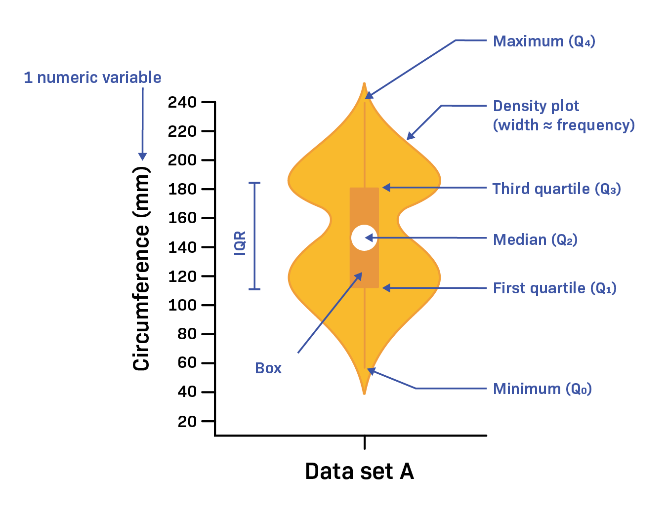
Violin Plots: Best of Both Worlds
![]()
Violin plot = Boxplot + smoothed histogram (rotated and mirrored)
Shows both summary statistics and shape!
Violin Plot Anatomy
![]()
- Width = density (how many values at that level)
- Often includes boxplot inside
- Shape shows full distribution
Wide part = many values
Narrow part = few values
When to Use Violin Plots
Best for:
- When shape matters (is it symmetric? bimodal?)
- Moderate number of groups (2-8)
- Technical or data-savvy audiences
- When you want more detail than boxplot
Avoid when:
- Too many groups (gets cluttered)
- Very small sample sizes (shape is noisy)
- General public audiences (less familiar)
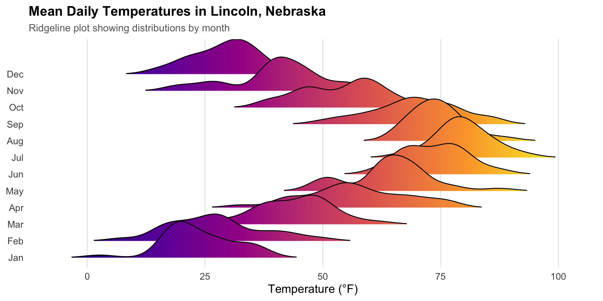
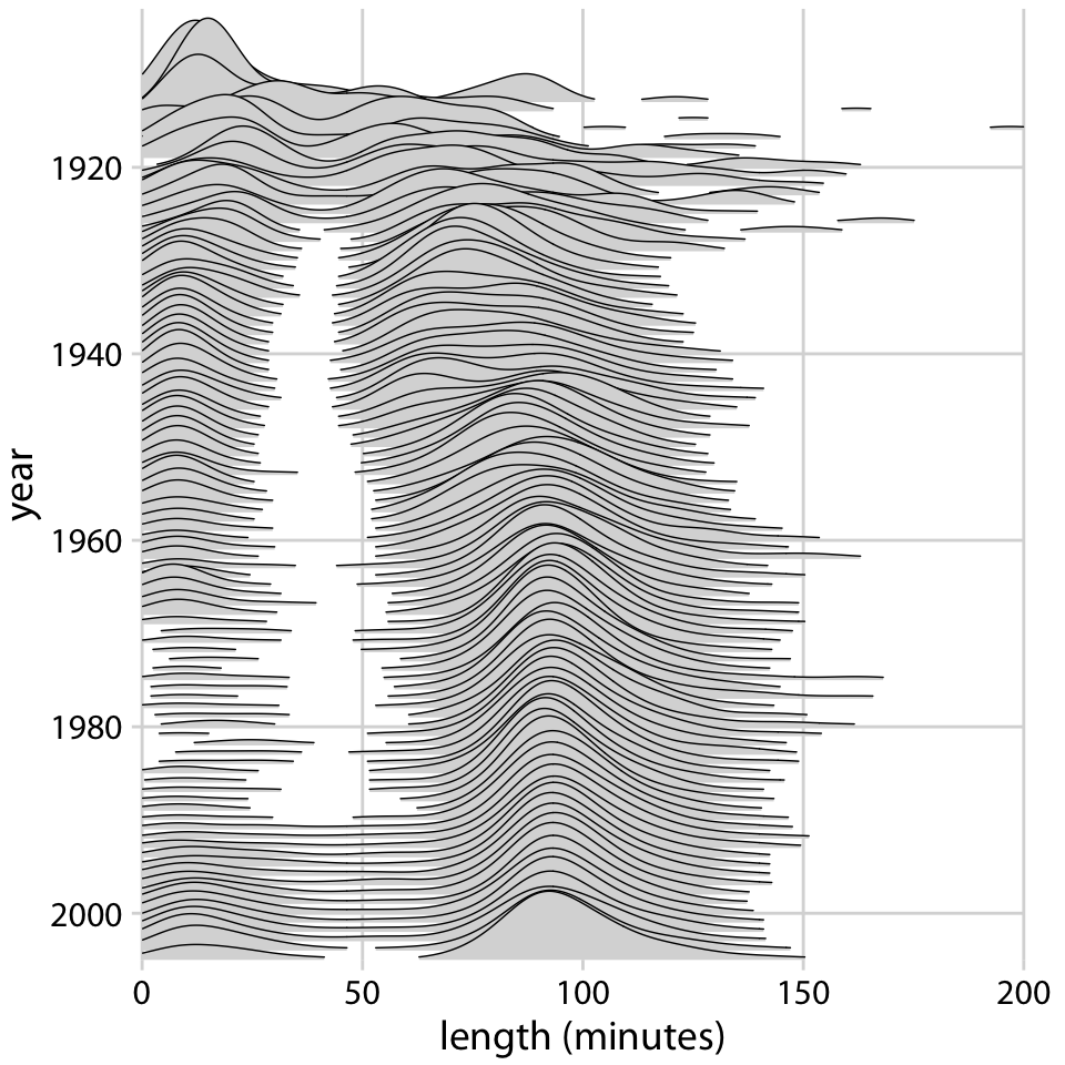
Ridgeline Plots: Elegant Overlaps
Also called “joy plots” (from Joy Division album cover!)
![]()
Shows: Many distributions, slightly overlapped, like mountain ridges
Ridgeline Plot Characteristics
Each “ridge” is:
- A smoothed histogram (density curve)
- Partially transparent
- Offset vertically
Great for:
- Many groups (6+)
- Showing overall patterns
- When order matters (time, ranking)
Ridgelines vs Boxplots vs Violins
Boxplot:
- Most compact
- Best for quick comparison
- Focuses on medians and spreads
Violin:
- Shows shape + summary
- Good for detailed comparison
- 2-8 groups
Ridgeline:
- Most elegant
- Best for many groups
- Emphasizes overall patterns
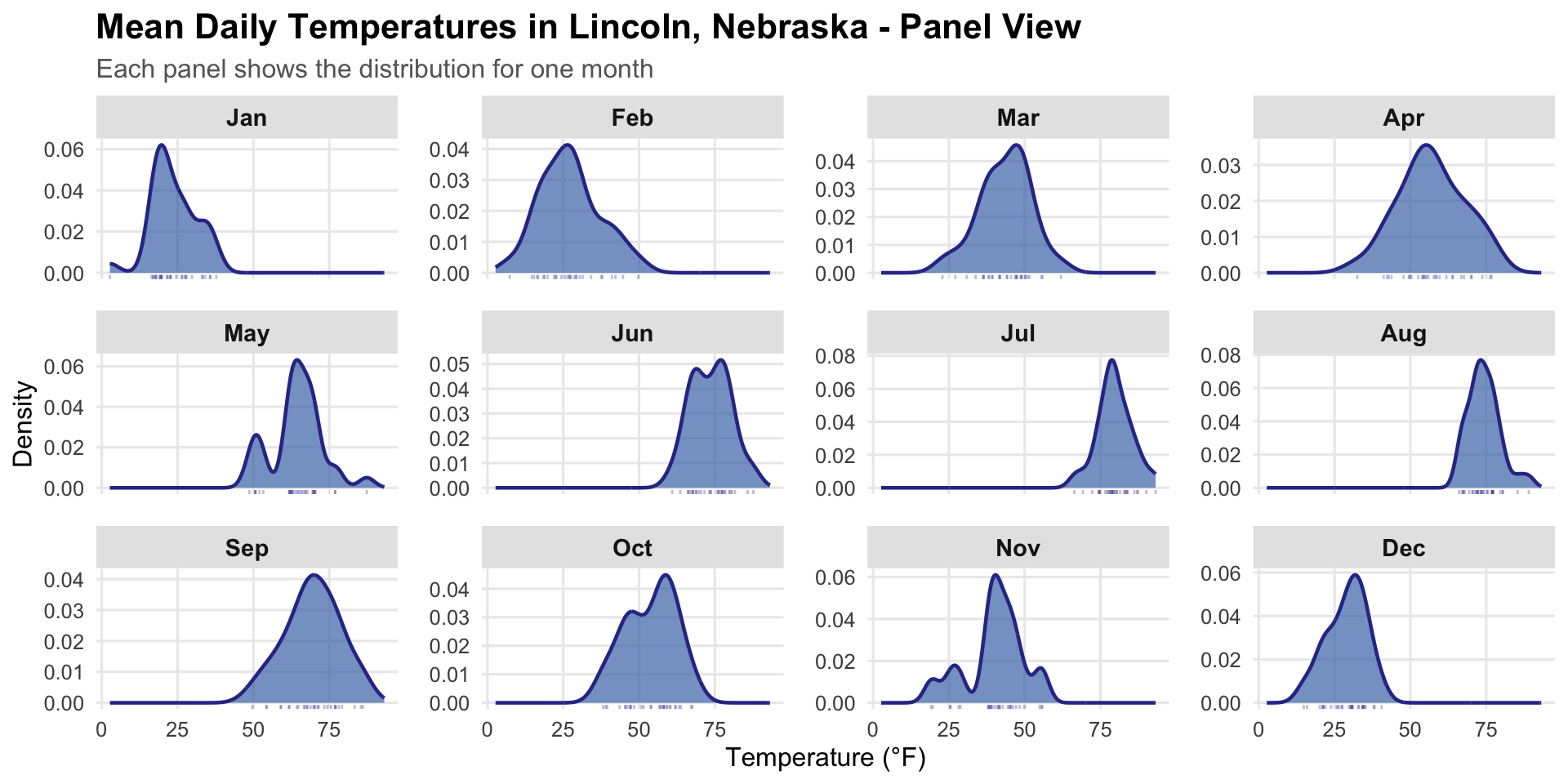
Small Multiples (Faceting)
Idea: Instead of overlaying, make separate mini-charts for each group
![]()
Also called: trellis plots, panel plots, facets
Small Multiples: When and Why
Best for:
- Comparing many groups without overlap
- When each group needs detail
- Complex patterns within groups
- Different types of visualizations per group
Design principles:
- Keep scales consistent (same axes!)
- Arrange logically (alphabetical, by value, by time)
- Make it easy to compare across panels
Small Multiples: Good vs Bad
Good ✅
- Same scales
- Clear labels
- Easy to compare
Bad ❌
- Different scales
- Hard to compare
- Confusing
Choosing Your Comparison Method
How many groups?
- 2-3 groups: Overlaid histograms, ECDFs, or boxplots
- 4-8 groups: Boxplots or violin plots
- 8+ groups: Ridgeline plots or small multiples
What matters most?
- Medians and spreads: Boxplots
- Full shape: Violin plots or ridgelines
- Fine details: Small multiples with histograms
Reference Lines and Bands
Adding context to your distribution plots:
![]()
Reference line = vertical line showing important value (mean, target, threshold)
Reference band = shaded region showing acceptable range
When to Use Reference Lines
Good uses:
- Industry average or benchmark
- Passing threshold or cutoff
- Previous year’s value
- Legal limit or standard
Tips:
- Use a different color/style than data
- Add a label explaining what it represents
- Don’t clutter - 1-2 reference lines max
Combining Multiple Charts: Dashboards
Sometimes you want multiple visualizations side-by-side:
![]()
In Tableau: Use “Dashboard” feature to combine worksheets
Dashboard Design Principles
Do:
- ✅ Have a clear story or comparison goal
- ✅ Use consistent color schemes
- ✅ Align related charts
- ✅ Guide the viewer’s eye
Don’t:
- ❌ Cram too many visualizations
- ❌ Use different scales for same metric
- ❌ Rely on color alone for meaning
- ❌ Forget titles and labels
Using Pages/Filters in Tableau
Pages: Animate through one category at a time (like PowerPoint slides)
Filters: Let viewer choose which categories to show
![]()
Great for: Interactive exploration, presentations
Coming Up
Next class (Tuesday):
- Visualizing proportions
- Pie charts: when they work (and when they don’t!)
- Alternative proportion visualizations
- The great pie chart debate
Don’t forget:
- Project Proposal due tomorrow
- I have office hours today after class