Understanding Distributions
ECDFs and Q-Q Plots
STAT 80: Data Visualization
Week 4, Day 1
Multiple Distributions & Comparisons
Today’s focus:
- What is a distribution?
- ECDFs (Empirical Cumulative Distribution Functions)
- Q-Q plots for comparing distributions
- When to use different tools
- Reminder about your proposal
What Do We Mean by “Distribution”?
Distribution = The pattern of how data values are spread out
Think of it as asking:
- What values appear in my data?
- How often does each value appear?
- Are values clustered together or spread out?
Everyday example:
Heights of students in class:
- Most people: 5’4” - 6’0”
- Some shorter, some taller
- Very few people below 5’0” or above 6’6”
This pattern is the distribution of heights
Why Do Distributions Matter?
Understanding distributions helps you answer questions like:
- What’s typical? (Where are most values?)
- What’s unusual? (Are there outliers?)
- How much variety? (Are values similar or spread out?)
- Are there patterns? (Clusters? Gaps?)
In visualization: Showing the distribution clearly helps viewers understand your data’s story
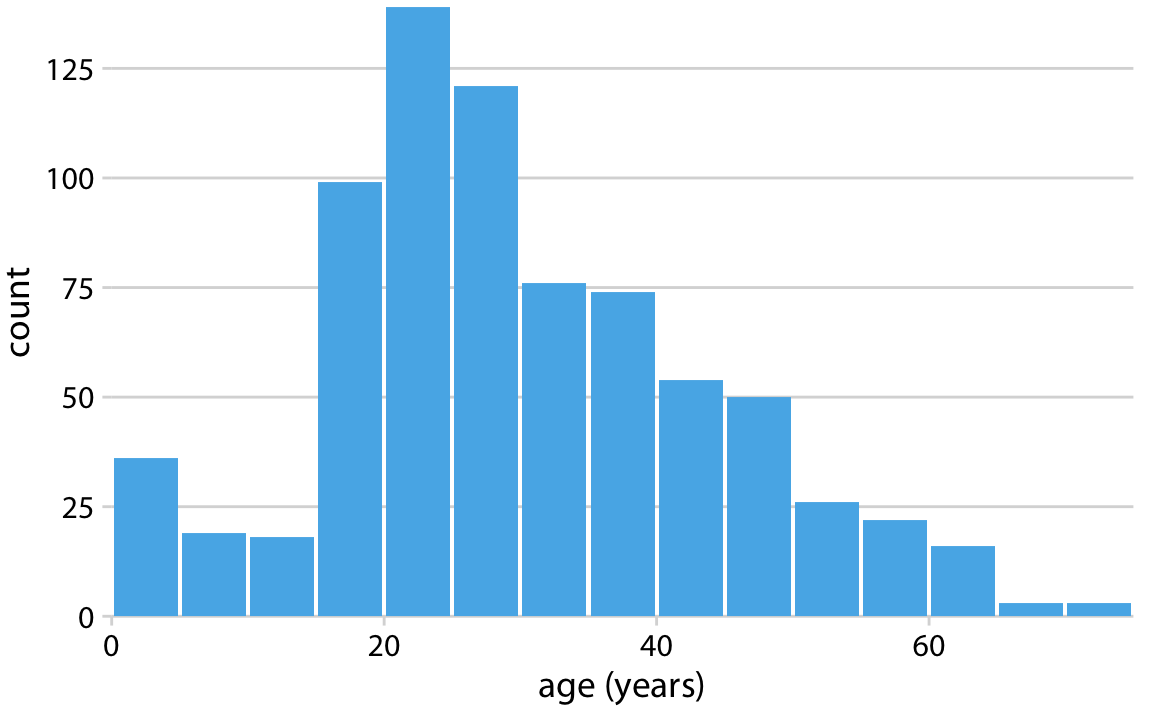
Review: Histogram
You’ve already seen one way to visualize distributions!
![]()
- Height of bars = how many values in each range
- Shows the shape of the distribution
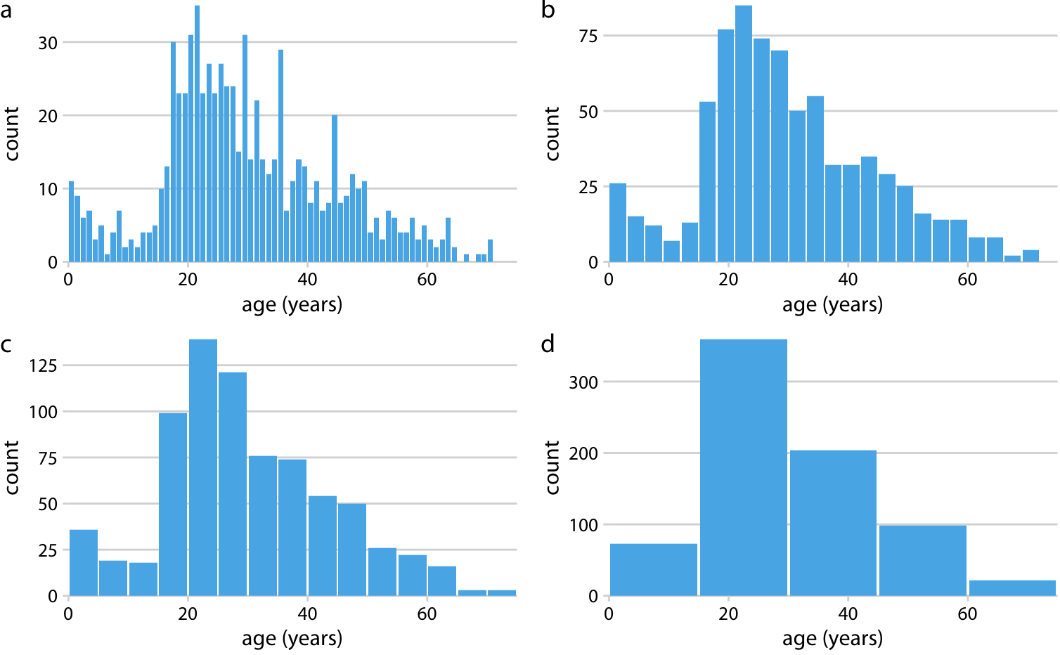
But Histograms Have Limitations…
Problem 1: Bin choices matter
![]()
- Too few bins - lose detail
- Too many bins - looks noisy
Different bin choices → different impressions of the same data!
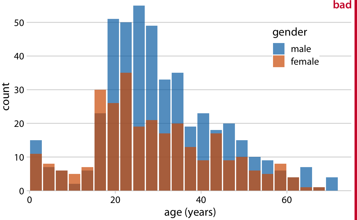
But Histograms Have Limitations…
Problem 2: Hard to Compare Across Groups
When you have multiple groups, histograms get messy:
![]()
- Which group is higher at each point?
- Where do they overlap?
- Hard to see precise differences
Enter: The ECDF
ECDF = Empirical Cumulative Distribution Function
(Don’t worry about the fancy name!)
What it shows:
For any value x, the ECDF tells you:
“What percentage of my data is less than or equal to x?”
Reading an ECDF:
![]()
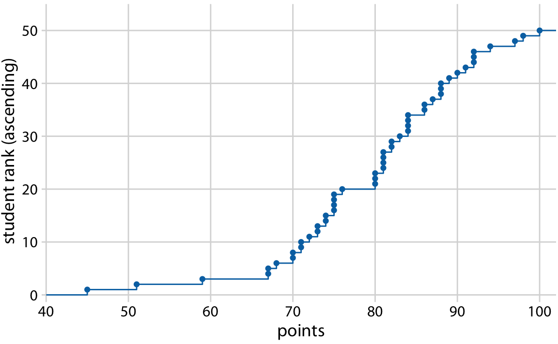
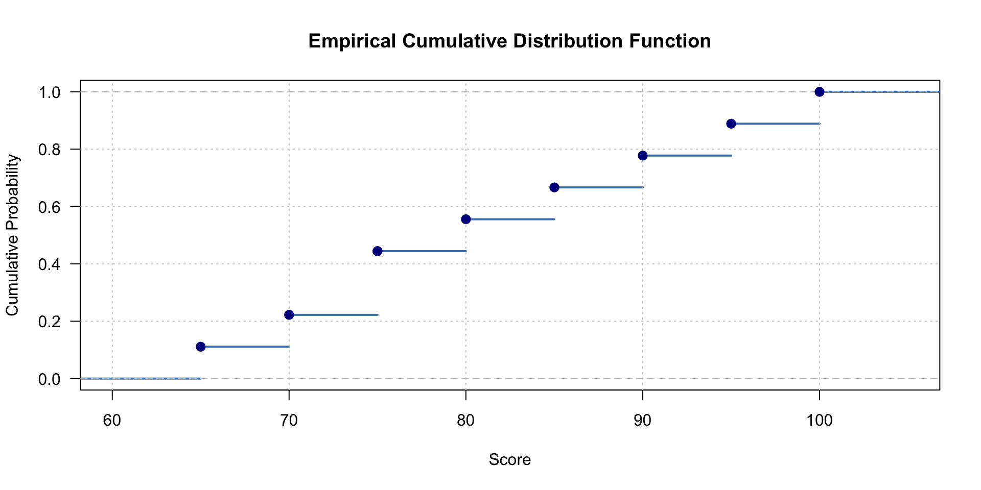
ECDF: Step by Step
Let’s build one together!
Data: Test scores: 90, 70, 75, 65, 75, 80, 85, 95, 100
Step 2: For each value, calculate what % of data is ≤ that value
- 65: 1/9 = 11%
- 70: 2/9 = 22%
- 75: 4/9 = 44% (two students got 75!)
- 80: 5/9 = 56%
- …and so on
ECDF: Plotting It
The line steps up each time we encounter a data point
Data: Test scores: 65, 70, 75,75, 80, 85, 90, 95, 100
![]()
Reading an ECDF: Examples
![]()
Question: What % scored 80 or below?
Answer: Find 80 on x-axis, go up to the line, read y-axis ≈ 56%
Reading an ECDF: Examples
![]()
Question: What score is at the 75th percentile? (75% scored this or lower)
Answer: Find 0.75 on y-axis, go across to line, read x-axis ≈ 87
ECDF vs Histogram: Advantages
ECDF Advantages:
- ✅ No arbitrary choices (no bins to choose!)
- ✅ Shows exact percentiles
- ✅ Easy to overlay multiple groups
- ✅ Shows all the data (every point matters)
Histogram Advantages:
- ✅ Easier for most people to read initially
- ✅ Shows density/“peakiness” more clearly
- ✅ More familiar to general audiences
When to Use ECDFs
Best for:
- Comparing two or more distributions
- Finding exact percentiles
- When you want to avoid bin choices
- Technical/scientific audiences
Avoid when:
- Your audience isn’t familiar with them
- You want to emphasize the “shape” (peaks, valleys)
- You’re showing very simple distributions
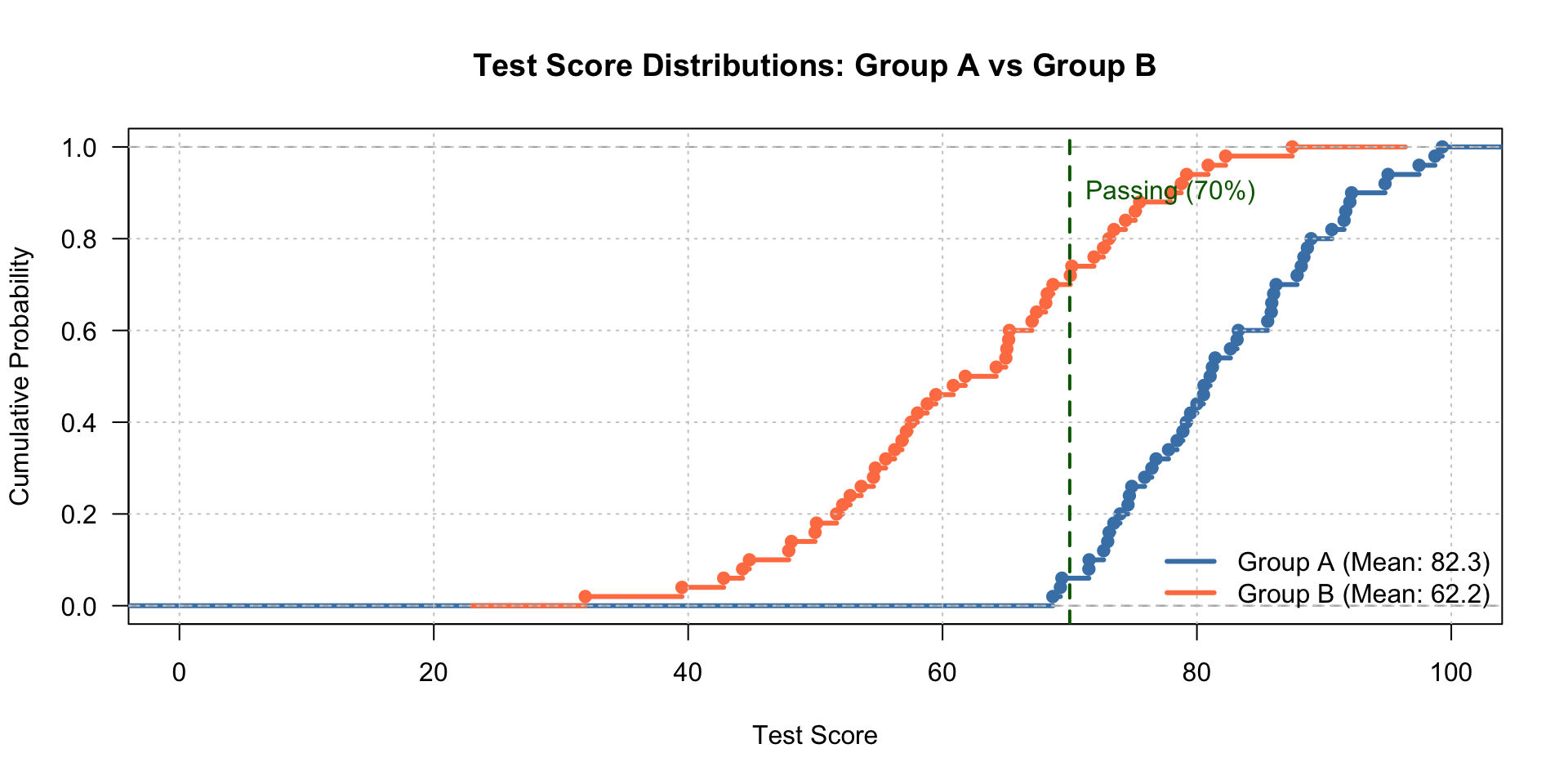
Activity: Reading ECDFs
![]()
- What percentage of Group A scored below 70?
- What percentage of Group B scored below 70?
- Which group performed better overall?
- At what score do the groups have the same cumulative percentage?
Q-Q Plots: Comparing Distributions
Q-Q = Quantile-Quantile
(Another fancy name for a simple idea!)
Purpose: Compare two distributions to see if they have the same shape
Key idea: If two distributions are the same shape, their percentiles should match
What’s a Quantile/Percentile?
Percentile = a value below which a certain % of data falls
Examples you know:
- 25th percentile = 25% of data is below this value
- 50th percentile = median (half below, half above)
- 75th percentile = 75% of data is below this value
Quantile = just another word for percentile (but written as 0.25, 0.50, 0.75 instead of 25%, 50%, 75%)
How Q-Q Plots Work
For each percentile:
- Find that percentile in Distribution A
- Find that percentile in Distribution B
- Plot them against each other
If distributions match: points fall on a straight diagonal line
If distributions differ: points deviate from the line
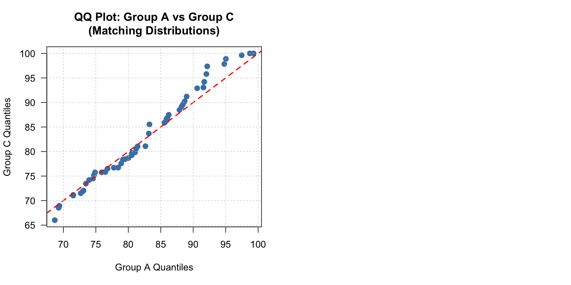
Q-Q Plot: Perfect Match
![]()
Points on the diagonal = distributions are identical!
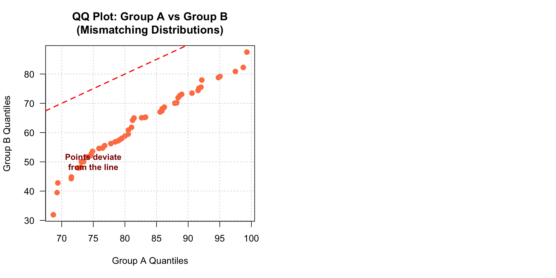
Q-Q Plot: Different Locations
![]()
Parallel to diagonal but shifted = same shape, different average
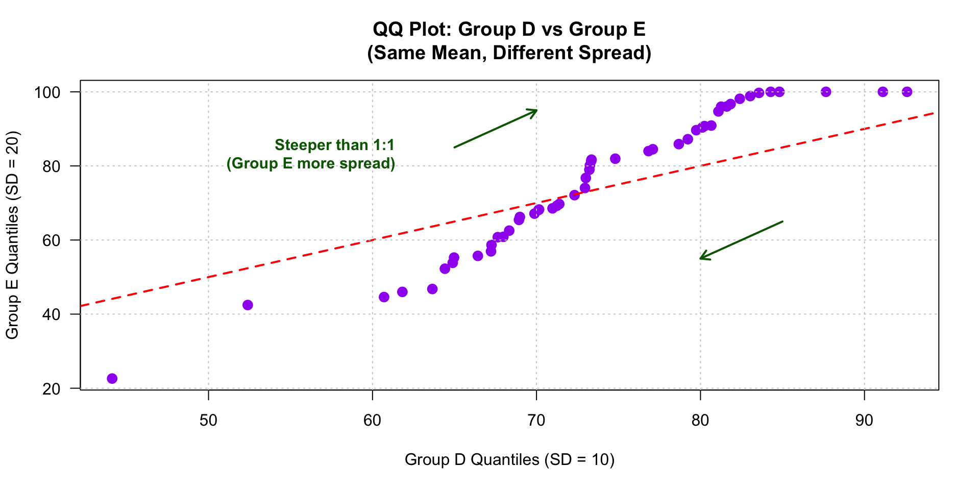
Q-Q Plot: Different Spreads
![]()
Steeper or flatter = one distribution is more/less spread out
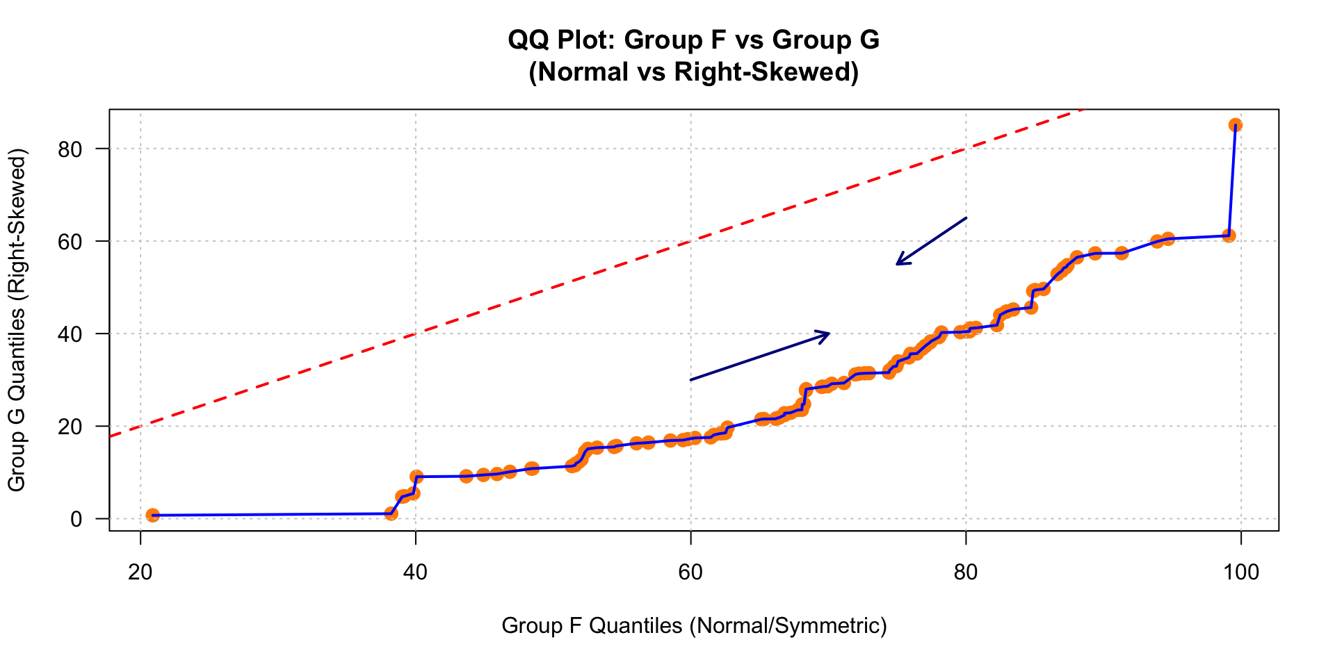
Q-Q Plot: Different Shapes
![]()
Curved pattern = distributions have fundamentally different shapes
When to Use Q-Q Plots
Best for:
- Checking if two datasets have similar distributions
- Statistical analysis (checking assumptions)
- Identifying specific differences in shape
- Technical audiences
Avoid when:
- You just want to know “which group is higher” (use ECDF or boxplot)
- Your audience is general public
- You have more than 2 distributions to compare
Summary: ECDFs
What: Cumulative percentage plot
Reads: “What % of data is ≤ this value?”
Best for:
- Comparing 2+ groups
- Finding exact percentiles
- Avoiding arbitrary bin choices
Watch out:
- Can be unfamiliar to general audiences
- Doesn’t show “peakiness” as clearly as histogram
Summary: Q-Q Plots
What: Percentile-to-percentile comparison
Reads: “Do these distributions have the same shape?”
Best for:
- Comparing exactly 2 distributions
- Identifying how distributions differ
- Technical/statistical work
Watch out:
- Requires explanation for non-technical audiences
- Only compares 2 distributions at once
Pair and solve on paper
Constructing a QQ Plot by Hand
Two groups of students took different versions of a test:
Group X (Morning Section):
52, 58, 61, 65, 68, 70, 72, 74, 76, 78,
80, 82, 84, 86, 88, 90, 92, 94, 96, 98
Group Y (Afternoon Section):
48, 54, 60, 62, 66, 68, 72, 74, 76, 78,
80, 82, 84, 86, 90, 92, 94, 96, 98, 100
Pair and solve on paper
Task: Both datasets are already sorted. Verify you have 20 observations in each group.
- Step 2: Pair the Quantiles
Task: Match corresponding quantiles from each group.
| 1st (5th percentile) |
52 |
48 |
| 2nd (10th percentile) |
58 |
54 |
| 3rd |
61 |
60 |
| … |
… |
… |
| 10th (50th percentile) |
78 |
78 |
| … |
… |
… |
| 20th (100th percentile) |
98 |
100 |
Pair and solve on paper
- What does the dashed line in the middle represent? What would it mean if all points fell exactly on this line?
- Describe the pattern you see. Do the points follow the reference line closely, or do they deviate systematically?
- Look at the lower quantiles (left side) and upper quantiles (right side). Which group tends to have lower scores at the low end? Which has higher scores at the high end?
When you are done, please submit your work making sure both of your names are included, you have a QQ plot, and you answered all 3 questions
Next Class Preview
We’ll look at even more ways to compare distributions:
- Boxplots - compact summaries
- Violin plots - shape + density
- Ridgeline plots - elegant overlays
- Small multiples - comparing many groups
Before that, make sure you are working on your project proposal, it’s due this Friday. I have office hours today after class, in case you have questions.