Part 2: Visualizing Amounts
What Are “Amounts”?
Definition: Numerical values for different categories
Examples:
- Sales by product type
- Population by country
- Test scores by student
- Revenue by quarter
The common thread: One number per category
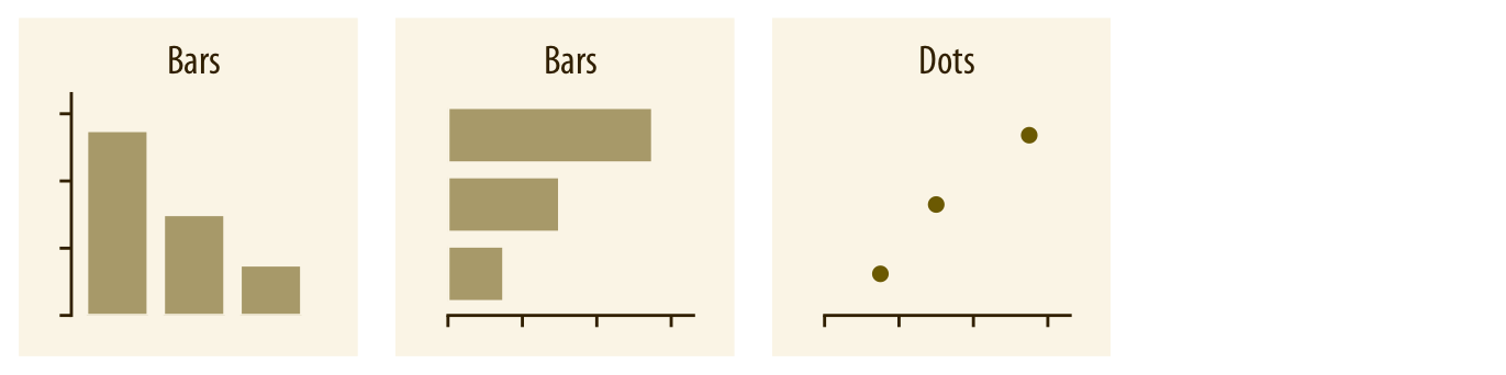
Method 1: Bar Charts
The workhorse of data visualization
- Bars start at zero
- Height = amount
- Can be vertical or horizontal
When to use vertical: Few categories (2-8), category names are short
When to use horizontal: Many categories (8+), category names are long
Think-Pair-Share (4 minutes)
Scenario: Visualizing the 50 US states by population
Option A: Vertical bars
- 50 skinny bars across the page
- State names at 45° angle
Option B: Horizontal bars
- 50 bars going down
- State names on left, easy to read
Discuss: Which would you use? Why?
What We Just Discovered
Horizontal bars win when:
- Many categories (hard to fit horizontally)
- Long category names (rotating text is hard to read)
- You want to sort/rank easily
💡 Pro tip: If your vertical bars need rotated labels, consider going horizontal!
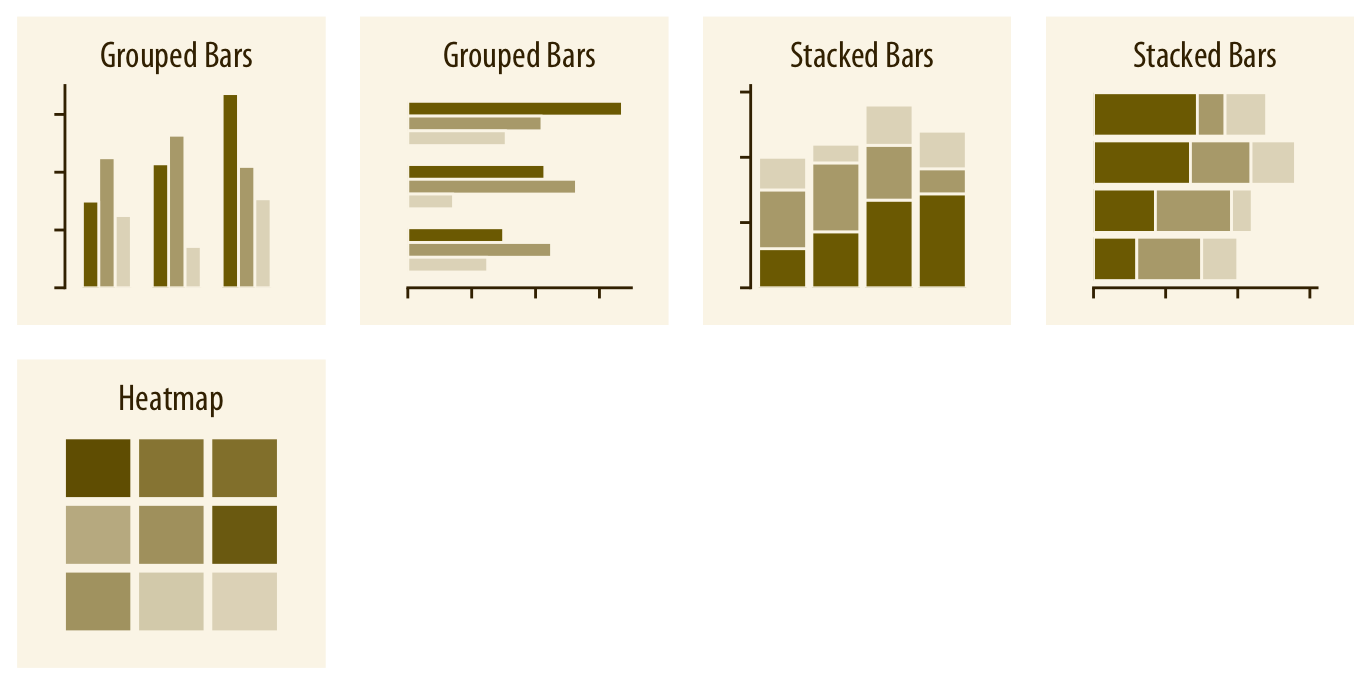
Method 2: Grouped vs. Stacked Bars
New challenge: You have TWO sets of amounts
Example: Sales by product AND by quarter
Grouped bars:
Bars side-by-side
Easy to compare within category
Stacked bars:
Bars on top of each other
Shows total + parts
Think-Pair-Share (4 minutes)
You’re comparing:
- Apple vs. Samsung sales
- Across 4 quarters
Question 1: Which is easier with grouped bars?
Question 2: Which is easier with stacked bars?
![]()
What We Just Discovered
Grouped bars: Great for comparing specific values
- “How did Apple do in Q2 vs Q3?”
- “Who sold more in Q4, Apple or Samsung?”
Stacked bars: Great for seeing totals
- “What was total market size in Q2?”
- “What proportion of sales was Samsung?”
Trade-off: You can’t optimize for both comparisons at once!
Method 3: Dot Plots
A minimalist alternative to bars
- Just the endpoint, no bar
- Often easier to read precise values
- Less “ink” on the page
When dots work better than bars:
- When precise values matter
- When you have many categories
- When bars would be too “heavy”
Method 4: Heatmaps
Showing amounts with color instead of position
- Categories on both axes (x and y)
- Color intensity = amount
- Creates a grid/matrix view
Best for:
- Many categories (10+ on each axis)
- Finding patterns across 2 dimensions
- Example: Sales by product (rows) AND region (columns)
Quick Comparison
| Vertical bars |
Few categories, short names |
Many categories, long names |
| Horizontal bars |
Many categories, long names |
Very few categories |
| Grouped bars |
Comparing specific values |
Need to see totals |
| Stacked bars |
Need to see totals |
Comparing middle segments |
| Dot plots |
Precise values matter |
Need to emphasize magnitude |
| Heatmaps |
2D patterns, many categories |
Small datasets |
Part 3: Visualizing Distributions
What Is a “Distribution”?
Instead of one number per category, we have MANY values:
- Heights of all students in class
- Daily temperatures across a year
- Response times for 1000 website visits
The question: How are these values spread out?
Why Distributions Matter
Understanding spread helps you answer:
- What’s typical? (Where’s the center?)
- How much variation? (Are values clustered or spread out?)
- Are there outliers? (Unusual values?)
- Is it symmetric? (Or skewed one direction?)
Real impact: This affects everything from quality control to medical diagnoses!
Method 1: Histograms
The classic approach:
- Divide range into “bins” (buckets)
- Count how many values fall in each bin
- Draw bars showing counts
Example: Student heights
- Bin 1: 5’0”-5’2” (3 students): 5’0.5”, 5’1.2”, 5’1.8”
- Bin 2: 5’2”-5’4” (8 students): 5’2.3”, 5’2.7”, 5’3.1”, 5’3.4”, 5’3.6”, 5’3.8”, 5’3.9”, 5’4.0”
- Bin 3: 5’4”-5’6” (12 students): 5’4.2”, 5’4.5”, 5’4.8”, 5’5.0”, 5’5.2”, 5’5.3”, 5’5.5”, 5’5.6”, 5’5.7”, 5’5.8”, 5’5.9”, 5’6.0”
The Bin Width Problem
Same data, different stories:
Too few bins (wide bins):
- Looks smooth
- Hides interesting details
- Might miss important patterns
Too many bins (narrow bins):
- Looks jagged
- Random noise dominates
- Hard to see overall shape
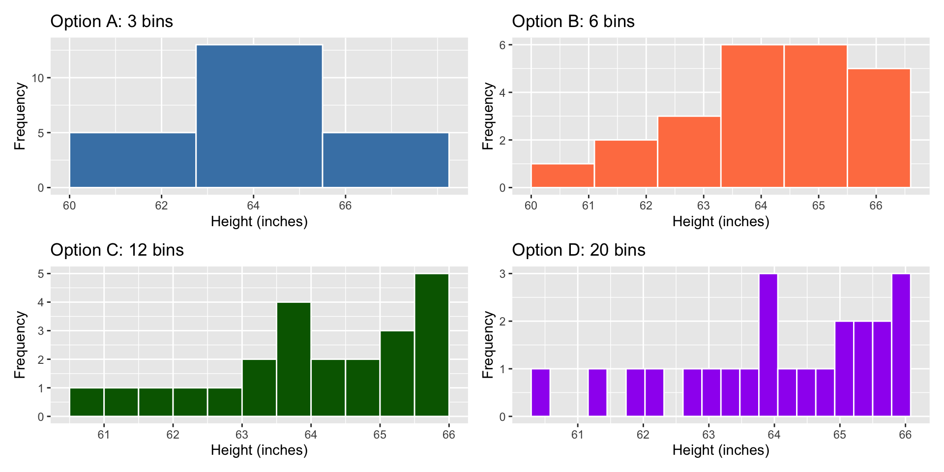
Think-Pair-Share (5 minutes)
Take the heights data we had before. Now, draw different histrograms:
Option A: Use 3 bins
Option B: Use 6 bins
Option C: Use 12 bins
Discuss: What would each show/hide? Which would you choose?
What We Just Discovered
The right bin width depends on:
- How much data you have (more data → can use narrower bins)
- What patterns you’re looking for
- Your audience’s needs
![]()
💡 Best practice: Try 3-5 different bin widths and see what story emerges!
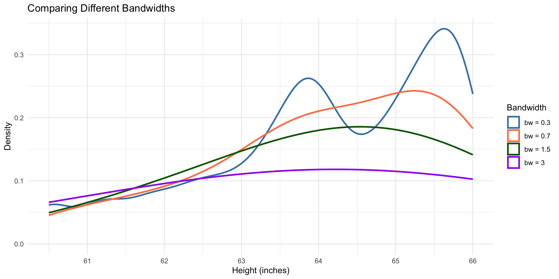
Method 2: Density Plots
A smooth version of histograms:
- Instead of bins, draw a smooth curve
- Area under curve = 100%
- Shows the “shape” of data
Advantage: No arbitrary bins!
Disadvantage: The smoothness itself is arbitrary (bandwidth parameter)
Bandwidth: The Smoothness Knob
Same issue as bin width, different name:
Large bandwidth:
- Very smooth curve
- May oversimplify
Small bandwidth:
- Wiggly curve
- May show noise as signal
The solution: Try multiple bandwidths, just like bin widths!
![]()
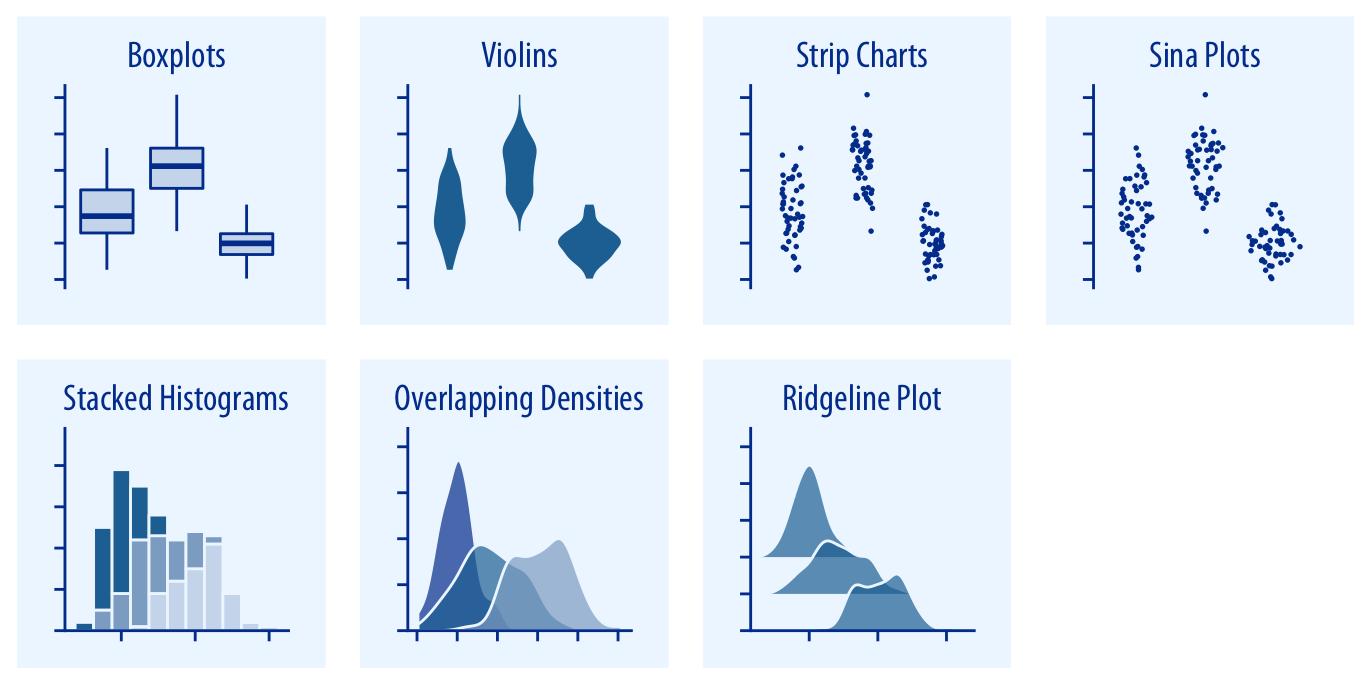
Comparing Distributions
Common scenarios:
- Men vs. women heights
- Treatment vs. control group
- This year vs. last year
Three approaches:
- Side-by-side histograms
- Overlapping density plots
- Stacked histograms (generally avoid!)
Examples
Think-Pair-Share (4 minutes)
You’re comparing:
- Exam scores in two sections of the same course
- Section A (Tuesday/Thursday) vs Section B (Monday/Wednesday)
Sketch or describe: How would you show both distributions?
What makes your choice better than alternatives?
What We Just Discovered
For comparing distributions:
Side-by-side works when:
- You want clear separation
- Comparing 2-3 distributions max
Overlapping works when:
- You want to see where they differ most
- Using transparency to show overlap
Avoid stacked histograms: Only the bottom distribution is easy to read!