Color in Data Visualization
STAT 80B Week 2 - Thursday
10 Mar 2026
Introduction
A Tale of Two Maps
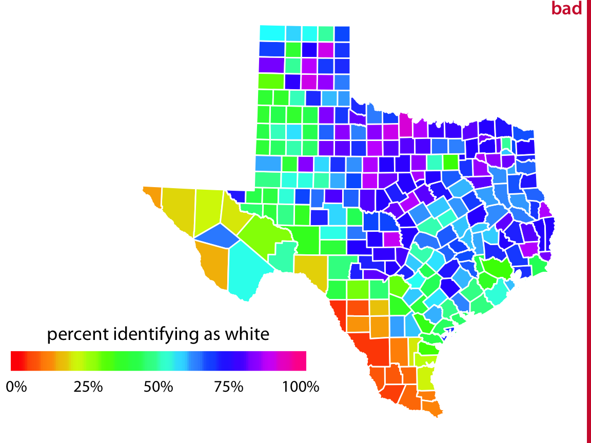
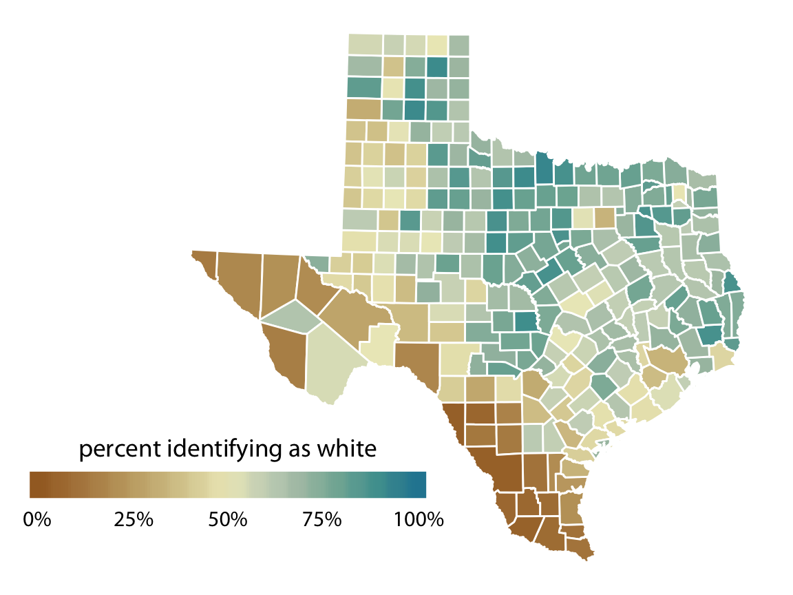
Same data. Different colors. Which is easier to read?
Why Color Matters
Bad color choices can:
- Hide important patterns
- Create patterns that aren’t there
- Exclude 8% of your audience (colorblind viewers!)
- Make your graph ugly 😅
Good news: There are simple rules to follow!
Today’s Mission
Learn three types of color scales:
- Qualitative: For categories (apples vs. oranges)
- Sequential: For “more” and “less” (cold to hot)
- Diverging: For opposites (profit vs. loss)
Plus: How to make sure colorblind people can see your work!
Part 1: Categories = Different Colors
Qualitative Scales
The Job: Tell Things Apart
Scenario: You’re showing favorite pets in a survey.
- Dogs
- Cats
- Birds
- Fish
You need colors that are obviously different from each other.
Rules for Qualitative Colors
- Distinct: Easy to tell apart at a glance
- Equal: No color screams “LOOK AT ME!” more than others
- No order implied: Don’t go light → dark (that suggests more/less)
Good examples: Red, blue, green, orange
Bad examples: Light blue, medium blue, dark blue (that’s ordering!)
ColorBrewer is Your Friend
ColorBrewer2.org has tested palettes!

ColorBrewer qualitative palettes
The top section shows qualitative palettes (all equal, all different).
Think-Pair-Share (3 minutes)
You’re making a map of U.S. states colored by region: - West - Midwest
- South - Northeast
Which color combination would you choose?
A. Light green, medium green, dark green, darkest green
B. Red, blue, yellow, purple
C. Red, light red, orange, light orange
Discuss: Which follows the “no implied order” rule? Why are the others problematic?
What We Discovered
- Option A: NO! Suggests ordering (West is “best”?)
- Option B: YES! All distinct, no hierarchy
- Option C: NO! Red/orange are related, implies groups
Remember: Use contrasting colors for categories, not shades of the same color!
Part 2: Showing “More” and “Less”
Sequential Scales
When Numbers Have Direction
Some data naturally goes from low to high:
- Temperature (cold → hot)
- Income (poor → wealthy)
- Test scores (low → high)
- Population density (sparse → crowded)
Now you WANT colors that show order: light → dark
Sequential Color Scales
Light to dark = low to high
Light colors = low values
Light yellow = few people
Dark colors = high values
Dark blue = many people
Your brain instinctively reads this: “More color = more stuff”
One Color vs. Multiple Colors
Single hue:
Light blue → Dark blue- Simple
- Less contrast
- Very intuitive
Multi-hue:
Yellow → Orange → Red
or
Purple → Blue → Green → Yellow- More contrast
- Easier to distinguish values
- More interesting
Popular Sequential Palettes
- Viridis: Purple → green → yellow (colorblind-safe!)
- Blues: Light blue → dark blue (classic)
- YlOrRd: Yellow → orange → red (heat map)
All of these work great for showing quantities that go from low to high.
Think-Pair-Share (5 minutes)
You’re mapping average income by county.
Option A: Rainbow colors (red, orange, yellow, green, blue, purple)
Option B: Light yellow → dark blue
Option C: Red, green, blue, purple (random distinct colors)
Discuss: Which option clearly shows “low income to high income”? What’s wrong with the rainbow?
What We Discovered
- Option A (Rainbow): CONFUSING! Is green “more” than yellow? Hard to tell!
- Option B (Light → Dark): PERFECT! Clear direction
- Option C (Random colors): NO! These are for categories, not amounts
Golden rule: If your data has order, your colors should too!
5 Minute Break ☕
Stretch, check your phone, grab water!
Part 3: Showing Opposites
Diverging Scales
When There’s a Meaningful Middle
Some data has a critical center point:
- Temperature relative to freezing (above/below 32°F)
- Profit/loss (above/below $0)
- Political lean (Democrat ← middle → Republican)
- Agreement scales (strongly disagree ← neutral → strongly agree)
You need colors that show TWO directions from the middle.
Diverging Color Scales
Light in the middle, dark at both ends, different colors for each direction.
Dark Blue ← Light Blue ← WHITE → Light Red → Dark Red
   (very cold)    (cold)  (neutral)  (hot)   (very hot)
The pattern: Two sequential scales stuck together at a shared middle!
When to Use Diverging Scales
Perfect for:
- Positive vs. negative numbers
- Above vs. below an average
- Agree vs. disagree
- Gain vs. loss
Key question: Is there a meaningful zero/middle point? If yes → diverging scale!
Popular Diverging Palettes
From ColorBrewer:
- RdBu: Red ↔︎ white ↔︎ Blue (classic, but problematic for colorblind!)
- BrBG: Brown ↔︎ white ↔︎ Blue-Green (better!)
- PiYG: Pink ↔︎ white ↔︎ Yellow-Green (colorblind-safe!)
- PuOr: Purple ↔︎ white ↔︎ Orange (good contrast)
Think-Pair-Share (5 minutes)
You’re showing election results: Percent voting for Candidate A.
- 0% = everyone voted for Candidate B
- 50% = tied
- 100% = everyone voted for Candidate A
Which color scale?
A. Light gray → dark gray (sequential)
B. Red ↔︎ white ↔︎ Blue (diverging)
C. Red, blue, green, yellow (qualitative)
Discuss: Why does the 50% midpoint matter here?
What We Discovered
- Option A: Misses the point! Can’t see who won
- Option B: PERFECT! Clearly shows majority one way or the other
- Option C: Wrong tool—these are for categories
The white middle makes 50-50 splits obvious!
Part 4: The Colorblindness Challenge
Designing for Everyone
The Reality
About 8% of men (1 in 12) have colorblindness.
In a class of 30 students, ~2 can’t see certain color combinations!
Most common: Red-green colorblindness (can’t easily distinguish red from green)
What Colorblind People See
What you see: - Red vs. Green = obvious
What they see: - Both look brownish/yellowish - Maybe can’t tell them apart at all
The Red-Green Problem
Never use these combinations:
- Red vs. Green for binary choices
- Traffic light metaphors (red = bad, green = good)
- Red-green diverging scales
Better alternatives:
- Blue vs. Orange
- Purple vs. Green
- Pink vs. Yellow-green
Good News: Some Scales Just Work!
Colorblind-safe by design:
- Viridis family: Purple → yellow (changes in both color AND brightness)
- Okabe-Ito palette: Specifically designed for colorblindness
- Single-hue sequential: Light → dark works for everyone
- Blues/purples: Generally safe
The “Add Redundancy” Trick
Don’t rely on color alone! Add a second cue:
- Shapes: Circle vs. square vs. triangle
- Line types: Solid vs. dashed vs. dotted
- Labels: Directly label important elements
- Patterns: Stripes, dots, crosshatch
Example: In a line graph with 3 groups, use color AND different line types.
Activity Time! (15 minutes)
Real hands-on practice:
- Open ColorBrewer2.org
- I’ll show you 2 different plots (scenarios)
- For each plot:
- Decide: Qualitative? Sequential? Diverging?
- Choose a palette from ColorBrewer
- Check the “colorblind safe” box
- Write down: Your palette name and why you chose it
Work in pairs. We’ll share answers together afterward!
Scenario 1
Map showing: Average rainfall by state (ranges from 5 inches to 60 inches per year)
Your tasks:
- What type of scale? (Qualitative / Sequential / Diverging)
- Go to ColorBrewer → pick that scale type
- Select “colorblind safe”
- Choose a palette (write down the name)
- Why is this a good choice?
Scenario 2
Chart showing: Change in employment from 2023 to 2024 by industry
- Some gained jobs (positive %)
- Some lost jobs (negative %)
- Values range from -15% to +20%
Your tasks:
- What type of scale? (Qualitative / Sequential / Diverging)
- Go to ColorBrewer → pick that scale type
- Select “colorblind safe”
- Choose a palette (write down the name)
- Why does the zero point matter?
Let’s Discuss!
Scenario 1 - Rainfall:
- Scale type: Sequential (low to high rainfall)
- Good choices: Blues, YlGnBu, YlOrRd
- Why: Shows clear direction from dry to wet
Let’s Discuss!
Scenario 2 - Employment Change:
- Scale type: Diverging (loss vs. gain, with zero in middle)
- Good choices: BrBG, PiYG, PuOr (NOT RdBu!)
- Why: Need to see negative vs. positive clearly, with neutral middle
Closing
What We Learned Today
- Qualitative scales: Different colors for categories (no order)
- Sequential scales: Light → dark for low → high values
- Diverging scales: Two directions from a meaningful middle
- Colorblindness: 8% of men affected, avoid red-green!
- Always test at ColorBrewer or with simulators
The Three Questions
Before choosing colors, ask yourself:
- Am I showing categories OR amounts?
- If amounts, is there a meaningful middle point?
- Will colorblind people be able to see this?
Answer these → you’ll pick the right scale every time!
Tutorial Today
We’ll practice in code:
- Applying these color scales to real data
- Switching between scale types
- Testing visualizations for colorblindness
- Changing coordinate systems (recap from Tuesday!)
Assignment Reminder
Due next Tuesday: Concept Map #1
Connect these ideas:
- Data types (quantitative, categorical)
- Visual encodings (position, color, size, shape)
- Scales (linear, log, color scales)
- Coordinate systems (Cartesian, polar, maps)
Hand-drawn, 1 page. See Canvas for details!
Questions?
I’ll be here if you need me!
![]()
STAT 7 – Winter 2026