Coordinate Systems & Scales

STAT 80B Week 2 - Tuesday

10 Mar 2026

Introduction

Why Do Coordinates Matter?

Quick question: What makes a good map?

Greenland looks HUGE on some maps but tiny on others. Why?

Today’s Journey

We’re learning the “rules of the grid”:

  • How do we place data on a graph? (Coordinate systems)
  • When should numbers be evenly spaced vs. bunched? (Linear vs. log scales)
  • What about circles and maps? (Polar coordinates & projections)

Real consequences: These choices change what story your data tells!

Part 1: The Grid System

Cartesian Coordinates

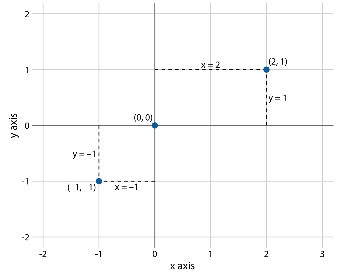
Remember Graphing in K12?

The x-y grid you learned is called a Cartesian coordinate system.

  • x-axis: Goes left-right →
  • y-axis: Goes up-down ↑
  • Every point has two numbers: (x, y)
  • Grid lines are evenly spaced

Think-Pair-Share (3 minutes)

Aspect Ratio Matters

Scenario: You’re visualizing monthly temperature over a year.

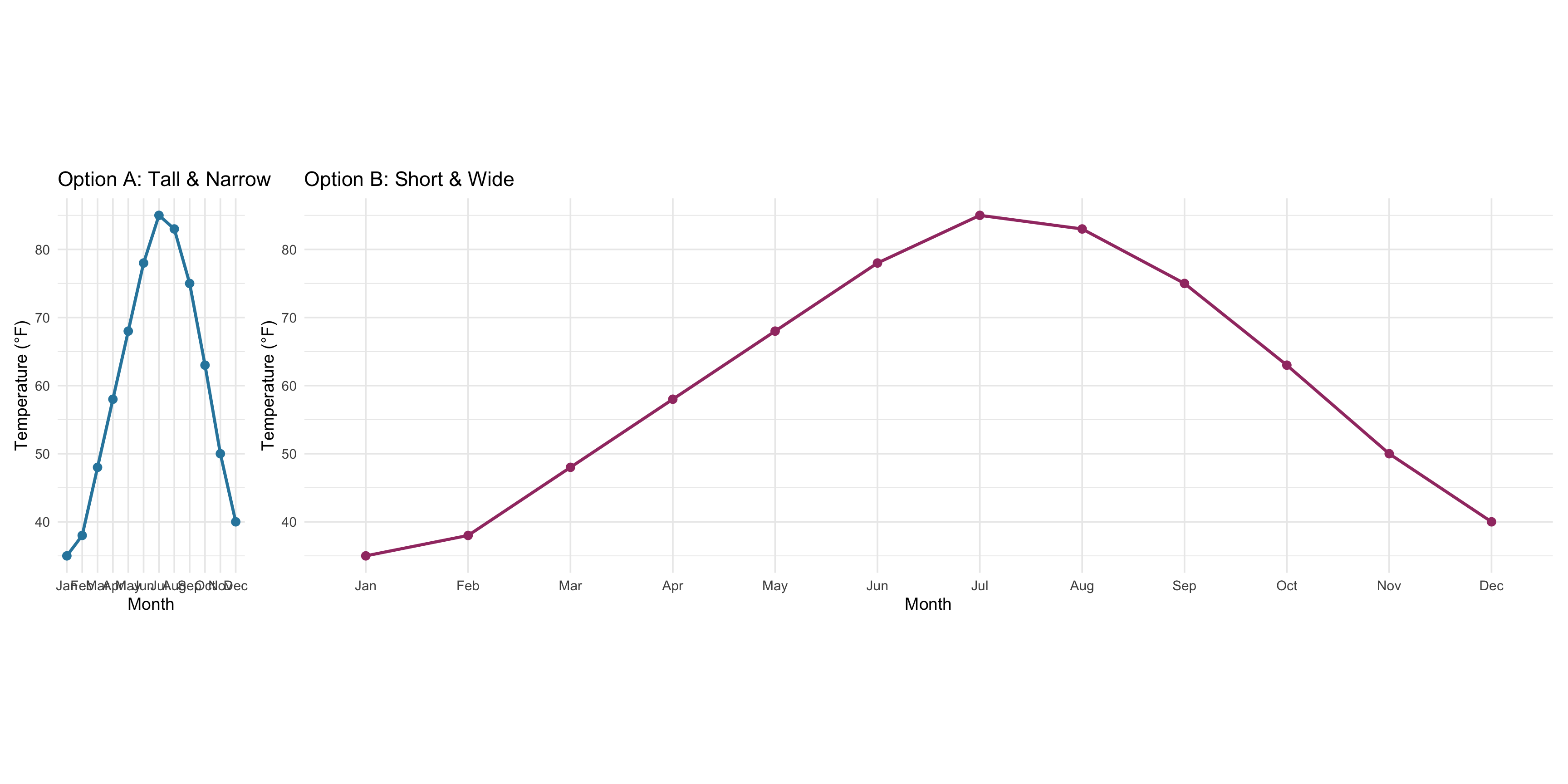
Discuss: What story does each shape tell? Which would you use and why?

What We Just Discovered

Aspect ratio (height vs. width) affects the message:

  • Tall: Emphasizes dramatic temperature changes
  • Wide: Minimizes changes, shows gradual trends
  • Both show the SAME DATA but feel different!

💡 Key lesson: There’s no single “correct” shape—choose based on your message.

Part 2: When Numbers Get Huge

Linear vs. Logarithmic Scales

A Problem: Wildly Different Sizes

Imagine plotting city populations:

  • Small town: 500 people
  • Medium city: 50,000 people
  • Large city: 5,000,000 people

On a regular grid, the small town would be invisible! 😟

Two Ways to Space Numbers

Linear (Regular) Scale:

0 — 1,000,000 — 2,000,000 — 3,000,000

Equal differences are equal distances

Adding 1M always moves the same distance →

Logarithmic (Log) Scale:

1 — 10 — 100 — 1,000 — 10,000

Equal ratios are equal distances

Multiplying by 10 always moves the same distance →

Think-Pair-Share (3 minutes)

You’re comparing:

  • Company A profit: $5,000$10,000 (doubled!)
  • Company B profit: $100,000$105,000 (gained $5,000)

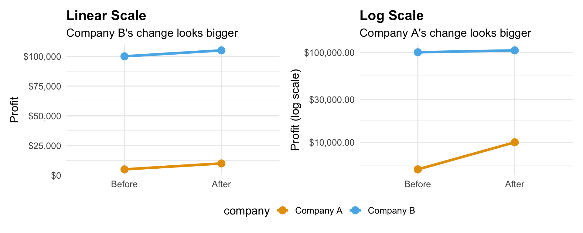
Discuss: Which scale is “fairer” for comparing growth? Why?

When to Use Each Scale

Use LINEAR when:

  • Differences matter (e.g., “I saved $100 more than you”)
  • Values are in a similar range
  • Example: Daily temperatures in a city (60°F to 90°F)

Use LOG when:

  • Ratios/percentages matter (e.g., “I doubled my savings”)
  • Values span 100×, 1000×, or more
  • Example: Country populations (thousands to billions)

⚠️ Log Scale Warning!

You CANNOT put zero or negative numbers on a log scale.

  • What’s 10 × 10? = 100 ✓
  • What’s 10 × 10 × 10? = 1,000 ✓
  • What do you multiply to get 0? = ??? 😵

If your data has zeros, use a linear scale (or add a tiny amount like 0.001).

5 Minute Break ☕

Stand up, stretch, grab water!

Part 3: Going in Circles

Polar Coordinates

Not Everything Fits on a Grid Some data is naturally circular:

  • Time of day (midnight comes after 11:59 PM, loops back!)
  • Compass directions (North is 0° and 360°)
  • Seasons (winter → spring → summer → fall → winter)

Polar coordinates use angle + distance instead of x and y.

How Polar Coordinates Work

Instead of (x, y), you specify:

  • Angle (θ): Which direction? (like compass heading)
  • Radius (r): How far from center?

Example:

  • (45°, 5 units) = “Go Northeast, walk 5 steps”
  • (180°, 3 units) = “Go South, walk 3 steps”

This creates circular plots! Perfect for cyclical patterns.

Think-Pair-Share (5 minutes)

Scenario: You track when you feel most productive during the day.

Data: 6 AM (low), 10 AM (high), 2 PM (medium), 6 PM (low), 10 PM (medium)

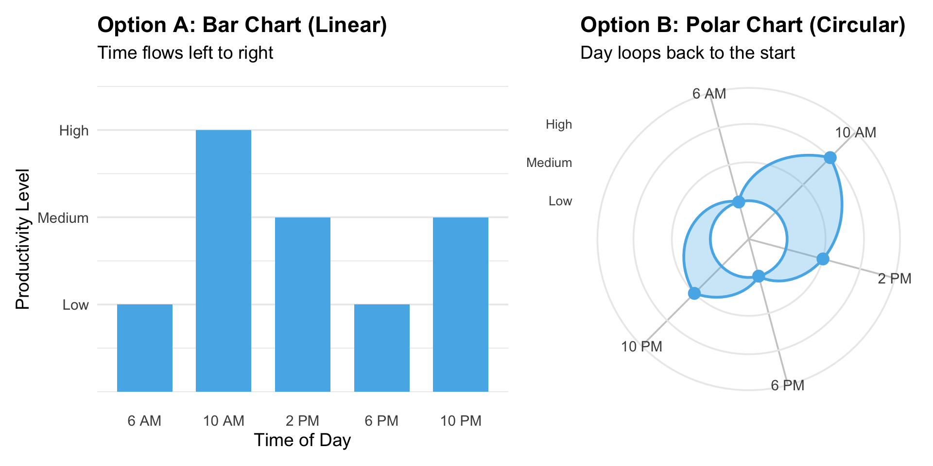
Discuss: Which shows that your day “loops” back to the start? Why might polar be better here?

When to Use Polar Coordinates

Great for:

  • Time of day / seasonal patterns
  • Wind direction frequencies
  • Parts of a whole (pie charts!)
  • Anything that “wraps around”

Avoid when:

  • Your data has a clear start and end
  • You’re comparing exact values (angles can be hard to judge)

Part 4: Flattening the Earth

Map Projections

The Impossible Challenge

Problem: Earth is a 3D sphere. Paper/screens are 2D.

To make a flat map, you have to distort something:

  • Distort sizes (areas)
  • Distort shapes (angles)
  • Distort distances
  • YOU CAN’T AVOID IT! 🌍 → 📄

The Mercator Problem

The most common world map (Mercator) preserves angles but distorts size:

  • Greenland looks as big as Africa
  • Reality: Africa is 14× larger!
  • Alaska looks huge
  • Reality: It’s about the size of Libya
  • https://truesizeofcountries.com/ to explore

This projection was designed for ship navigation, NOT for comparing areas!

Think-Pair-Share (5 minutes)

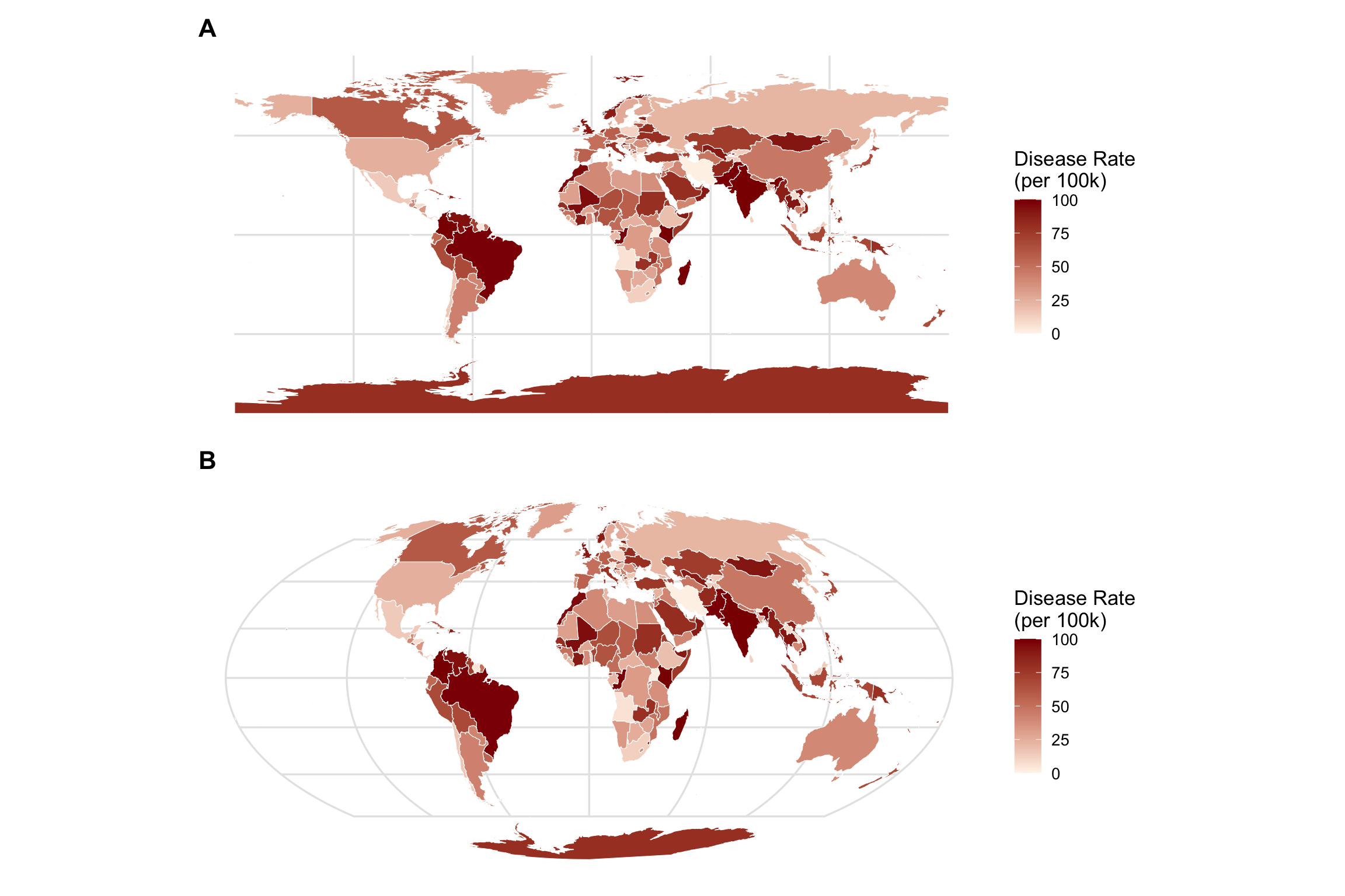
Here are two maps showing:

  • Where diseases are most common worldwide

Think-Pair-Share (4 minutes)

Identify which one is:

  1. Mercator (preserves shapes, distorts areas)
  2. Equal-area projection (preserves areas, distorts shapes)

You can use ALL resources available online. Don’t try to draw the map based only on your memory :)

Discuss: Which would mislead your audience? Why does it matter if Greenland looks huge when it has few people?

Choosing Map Projections

For data visualization:

  • Use equal-area projections when comparing quantities (population, disease rates, etc.)
  • Use Mercator only for navigation or preserving local shapes
  • Consider your region: Smaller areas have less distortion

💡 Bottom line: Don’t accidentally make Greenland look more important than it is!

Closing

What We Learned Today

  1. Cartesian coordinates are the standard x-y grid (but shape matters!)
  2. Linear scales show absolute differences (1, 2, 3, 4…)
  3. Log scales show relative ratios (1, 10, 100, 1000…)
  4. Polar coordinates work for circular/cyclical data
  5. Map projections all distort something—choose wisely!

The Big Picture

Every choice you make changes the story:

  • Tall vs. wide → dramatic vs. gradual
  • Linear vs. log → absolute vs. relative
  • Grid vs. circle → sequence vs. cycle
  • Map projection → what gets emphasized

You’re not just making graphs—you’re making arguments with data!

For Thursday

Read: Wilke Chapter 4 (Color)

Preview question to think about:
Why do some color combinations work better than others? What colors would you never use together?

Questions?

I’ll be here if you have any questions :)