STAT 80B: Data Visualization
Week 1 - Introduction & Course Overview
01 Dec 2025
Welcome to STAT 80B! 🎨📊
Data Visualization: The Art and Science of Telling Stories with Data
By the end of this quarter, you’ll be able to:
- Create compelling, publication-quality visualizations
- Tell stories that drive decisions
- Critique and improve any chart you see
- Build a portfolio of visual analytics work
Today’s mission: Get to know each other, understand the course, and discover what makes visualizations powerful! 🚀
Getting to Know Each Other
Meet Your Teaching Team 👋
Your instructor
Associate Professor of Teaching - Statistics
Stats & Data Science Educator and Education researcher
Applied statistician (environmental & biological problems)
- 🍃 15+ years teaching statistics
- Background: Statistical & Data Science Education + Applied Stats
- Originally from Costa Rica 🌊
- Pronunciation: [mahr-sahl-ah]
R programming
stats
environmental statistics
biological data analysis
open and reproducible science
Office Hours = Student Hours!
📅 When Can You Find Me?
In Person: - After EVERY class (Tu & Th, starting ~3:05 PM) - Right outside the classroom - stay and chat!
By Appointment: - Check my Google Calendar for available times - If you cannot find a time, post on Ed Discussion to request extra OH.
💡 Pro tip: Don’t wait until you’re struggling! Come early and often. Office hours are YOUR time to:
- Clarify concepts
- Review assignments before it’s due
- Discuss study strategies
- Ask “silly” questions (there are none!)
Your Teaching Team

Jason Teng
TA - PhD Student
jteng9@ucsc.edu

Dominick Rangel
Tutor
docrange@ucsc.edu
Communication
📢 How to Reach Us
Option 1: Ed Discussion (BEST!)
- Post questions about course content, assignments, logistics
- Answered same day during weekdays
- Weekends: expect response by Monday
- Your classmates can help too!
- Remember you can use the private setting in Ed Dicussion for private matters.
Option 2: Email
- Response time: 2-3 business days
- Not recommended for urgent matters! my inbox get really clogged every day.
⚡ Quick response = Ed Discussion | Please don’t use Canvas messages, you will get an automatic reply telling you to go to Ed
🎯 YOUR TURN: Introduce Yourself!
Find someone you don’t know and spend 3 minutes sharing:
- Name and pronouns (if you’d like to share)
- Major/Year - what brings you to this class?
- One data visualization you’ve seen recently (good or bad!)
- What you hope to learn in this course
- One fun fact about yourself
We’ll do a few share-outs after 3 minutes! 👥
Share Out! 🎤
Let’s hear from a few pairs:
- What’s one interesting thing you learned about your partner?
- What visualization did they mention?
- What are they hoping to learn?
Course Overview
What Makes This Course Special?
Tool Agnostic: Choose YOUR software
- Tableau (drag-and-drop, great for beginners)
- R with ggplot2 (reproducible, publication-quality)
- Python (matplotlib, seaborn, plotly)
Project-Based: Real data, real questions, real impact
Design-Focused: Not just “how” but “why”
Portfolio Building: Create work you’re proud to show
Course Structure
| Component | Weight | What You’ll Do |
|---|---|---|
| Participation | 9% | Engage in class activities & polls |
| Labs (5) | 40% | Hands-on practice (top 4 count) |
| Concept Maps (3) | 6% | Synthesize key ideas (top 2 count) |
| Term Project | 45% | Your showcase piece! |
Total: 100%
The Term Project (45%)
Work in pairs to create a complete visual analysis:
| Milestone | Due | Weight |
|---|---|---|
| Proposal | Week 4 | 10% |
| EDA | Week 10 | 10% |
| Presentation | Week 10 | 10% |
| Final Report | Finals Week | 15% |
You’ll pick a dataset, ask real questions, and create publication-quality visualizations to answer them! 📊✨
Learning Outcomes
By the end of this course, you will:
- Master the fundamentals: Data types, aesthetics, scales, coordinates
- Know your charts: When to use what, and why
- Apply color theory: Make accessible, beautiful visualizations
- Handle complexity: Multi-panel figures, time series, geospatial data
- Critique like a pro: Identify what’s ugly, bad, or wrong
- Tell stories: Sequence visualizations for maximum impact
- Build reproducible work: Create publication-ready graphics
Weekly Flow
Before Class: Read assigned chapters (Wilke, free online!)
Tuesday: Theory, principles, design concepts
Thursday: Hands-on practice - Tableau demos (follow along in R/Python if you prefer)every other week
Labs: Due same day (Thursday), 8% each, top 4 count
Concept Maps: Due Friday (Weeks 2, 6, 8), top 2 count
Course Policies - The Important Stuff
Attendance: Expected and necessary
- Recordings available on Yuja (via Canvas)
- 85% attendance = perfect (flexibility for emergencies)
No Late Work: But we drop lowest lab & concept map
LLM Policy (R/Python users):
- ✅ CAN use ChatGPT/Claude to help with code
- ✅ MUST understand every line you submit
- ✅ MUST cite LLM use in comments
- ❌ CANNOT submit code you can’t explain
Required Materials
Textbook (FREE online!):
- Wilke, Fundamentals of Data Visualization
- https://clauswilke.com/dataviz/
Software (Choose ONE):
- Tableau Desktop (free student license)
- R with RStudio
- Python with Jupyter
Computer: Laptop/desktop required for all work
Communication & Support
Primary: Ed Discussion
- Ask questions, help classmates, build community
- Teaching team monitors regularly
Office Hours:
- Walk in Tue/Thu after class (no appointment needed)
- Schedule other times via calendar link
Canvas: Grades, recordings, announcements
💡 Pro tip: Don’t suffer in silence! We’re here to help.
The Power of Visualization
📊 OPENING ACTIVITY: Visualization Gallery Walk
Your Mission (10 minutes):
- Browse Tableau’s Viz of the Day Gallery
- Find ONE visualization that catches your eye
- Take a screenshot or note the URL
Think about:
- What makes it interesting/effective?
- What story does it tell?
- What do you like or dislike about it?
We’ll share in pairs, then discuss as a class!
Pair Share: Your Chosen Visualization 💬
Turn to a neighbor (3 minutes each):
- Show your chosen visualization
- Explain why you picked it
- Discuss: What makes it work (or not work)?
Then we’ll hear from a few volunteers!
Class Discussion: What Did We Notice?
Let’s share out! 🎤
Some prompts to consider:
- What made certain visualizations stand out?
- What elements drew your attention first?
- Which visualizations told a clear story?
- Did any confuse you or mislead you?
- What emotions did visualizations evoke?
What Makes Visualizations Effective?
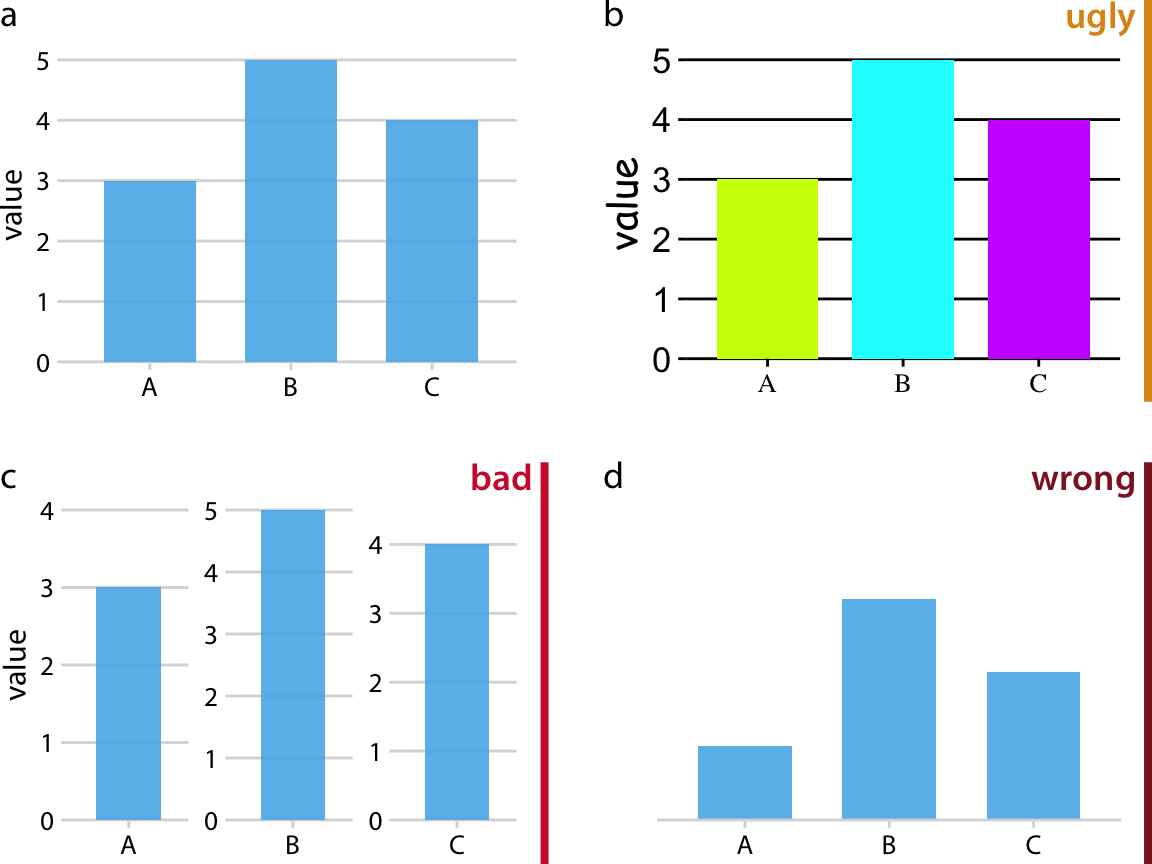
The Three Levels of Bad (Wilke Ch 1)
Ugly 😬 - Aesthetic problems, but data is clear
- Poor color choices, cluttered design
- You can still understand it
Bad 😕 - Design problems obscure the message
- Wrong chart type, confusing layout
- Hard to extract the truth
Wrong 😱 - Visualization lies about the data
- Misleading scales, cherry-picked data
- Actively deceives the viewer
Examples: Ugly, Bad, Wrong
UGLY
- Comic Sans font
- Neon colors
- Cluttered labels
Still accurate!
Our goal: Create visualizations that are beautiful, clear, AND honest! ✨
The Grammar of Graphics
Think of building visualizations like constructing sentences:
Data = Your vocabulary (what you’re talking about)
Aesthetics = Grammar rules (how to arrange words)
Geoms = Sentence types (statements, questions, exclamations)
Scales = Punctuation (adds clarity and emphasis)
Themes = Writing style (formal vs. casual)
Just like in writing, you need all these elements to communicate effectively! 📝
What Are Aesthetics?
Aesthetics = Visual properties that represent data
Common aesthetics:
- Position (x, y coordinates)
- Color (hue, saturation)
- Size (area, radius)
- Shape (circles, squares, triangles)
- Transparency (alpha)
- Line type (solid, dashed, dotted)
Key idea: We MAP data values to visual properties
Mapping Data to Aesthetics
Example: Visualizing car data
| Variable | Data Type | Aesthetic |
|---|---|---|
| Weight | Continuous | x-position |
| MPG | Continuous | y-position |
| Cylinders | Discrete | color |
| Origin | Categorical | shape |
Result: A scatter plot where position shows weight vs. MPG, color indicates cylinders, and shape shows country of origin!
🔄 THINK-PAIR-SHARE #1 (5 minutes)
Scenario: You’re visualizing student survey data about course satisfaction.
Variables:
- Course name (e.g., “STAT 80B”, “CSE 20”)
- Satisfaction rating (1-5 scale)
- Number of respondents
- Department (Stats, CS, Engineering, etc.)
Your Task:
- Individual (2 min): Sketch how you’d visualize this
- Pair (3 min): Compare approaches - what aesthetics did you use?
Be ready to share!
Share Your Ideas! 📊
Let’s see what you came up with:
- What aesthetics did you choose?
- Why those choices?
- What alternatives did you consider?
Key learning: There’s often more than one good way to visualize data - the best choice depends on what story you want to tell!
Discussion: Your Visualization Goals 🎯
Quick poll (respond in Ed Discussion):
What do you hope to create visualizations for?
- Academic research papers?
- Professional reports/presentations?
- Personal projects/blog posts?
- Data journalism?
- Social media/infographics?
- Job portfolio?
- Just for fun and learning?
Understanding Data Types
Why Data Types Matter
The fundamental rule of visualization:
Different types of data require different visual representations
Example:
- Showing average temperature over time? → Line chart
- Comparing sales across regions? → Bar chart
- Showing relationship between two variables? → Scatter plot
Choose the wrong representation = confuse your audience! 😵
Three Main Data Types
Quantitative
Numbers that measure amount or quantity
Examples:
- Temperature
- Income
- Height
- Time
Categorical
Labels or groups with no inherent order
Examples:
- Gender
- Color
- Department
- Country
Ordinal
Ordered categories that can be ranked
Examples:
- Education level
- Satisfaction (low/med/high)
- Grade (A/B/C/D/F)
- T-shirt size (S/M/L/XL)
Quantitative Data: Two Subtypes
Continuous (Measured)
Can take any value within a range
- Temperature: 72.4°F, 72.5°F, 72.6°F…
- Time: 3.2 seconds, 3.27 seconds…
- Weight: 145.7 lbs
Discrete (Counted)
Whole numbers only
- Number of students: 42 (not 42.5!)
- Cars in a parking lot: 27
- Goals scored: 3
Categorical Data: Important Distinctions
Nominal (No Order)
Categories are just different, not better/worse
- Favorite color: red, blue, green
- Major: Biology, CS, Math
- Country of origin
Binary (Special Case)
Only two categories
- Yes/No
- Pass/Fail
- True/False
Ordinal Data: The In-Between
Has clear ordering but unequal spacing
Example 1: Education Level
- High School < Bachelor’s < Master’s < PhD
- But the “distance” between HS→Bachelor’s ≠ Bachelor’s→Master’s
Example 2: Likert Scale
- Strongly Disagree < Disagree < Neutral < Agree < Strongly Agree
- The gaps between levels aren’t necessarily equal
Visualization implication: Be careful using ordinal data as if it were truly quantitative!
🔄 THINK-PAIR-SHARE #1 (5 minutes)
Classify each variable:
- Customer age: __________
- Shirt size (S/M/L/XL): __________
- Smartphone brand (Apple/Samsung/Google): __________
- Customer satisfaction (1-5 stars): __________
- Number of purchases last month: __________
- Total purchase amount ($127.43): __________
- Payment method (Credit/Debit/Cash): __________
- Member status (Bronze/Silver/Gold/Platinum): __________
Individual (2 min) → Pair (3 min) → Share!
Share Your Answers! 📊
Let’s discuss:
- Customer age: Continuous Quantitative
- Shirt size (S/M/L/XL): Ordinal
- Smartphone brand: Categorical (Nominal)
- Customer satisfaction (1-5 stars): Ordinal (debatable!)
- Number of purchases: Discrete Quantitative
- Total purchase amount: Continuous Quantitative
- Payment method: Categorical (Nominal)
- Member status: Ordinal
#4 Discussion: Stars can be treated as ordinal OR quantitative depending on context!
Looking Ahead
What’s Coming This Week
Thursday’s Class:
- Data types in detail (quantitative, categorical, ordinal)
- Aesthetic mappings and scales
- Software Tutorial: Installing and using Tableau (or R/Python alternative)
- Live Demo: Your first visualization!
Due before Friday (Week 1):
- ✓ Syllabus Acknowledgment (Canvas quiz)
- ✓ Initial Survey
- ✓ Lab 1: Getting Started (due Thursday in class!)
Lab 1 Preview: Getting Started
What you’ll do:
- Install your chosen software (Tableau, R, or Python)
- Connect to a provided dataset
- Create 3 basic visualizations using different aesthetics
- Example: bar chart with color, scatter plot with size, line chart
- Export each visualization
- Submit: PDF with your 3 visualizations + brief descriptions
Purpose: Ensure everyone has working software and can create basic charts. Thursday’s tutorial will walk you through everything!
Weekly Reading & Preparation
Before Thursday:
- Read Wilke Chapters 1-2 (quick read, very accessible!)
- Bring your laptop to class
- Think about which software you want to use
Before Next Tuesday:
- Read Wilke Chapters 3-4 (Color & Coordinate Systems)
💡 Reading tip: The textbook is online, bookmark it! It’s full of beautiful examples.
Tips to Succeed in STAT 80B
- Attend & participate - visualization is a practice, not just theory
- Start labs early - iteration takes time!
- Build a study group - learn together, critique together
- Play with your software - explore beyond assignments
- Look critically at visualizations everywhere - news, social media, reports
- Ask questions - on Ed Discussion, in office hours, in class
- Keep a portfolio - save your best work!
Academic Integrity & LLM Policy
Working Together: ✅ Collaborate, discuss, help each other
Your Submission: Must be YOUR OWN WORK
For R/Python users - LLM Policy:
✅ CAN use ChatGPT/Claude to help generate code
✅ MUST: - Understand every line you submit - Be able to explain what it does - Cite LLM use in comments: # Generated with ChatGPT, modified for X
❌ CANNOT: - Submit code you don’t understand - Use LLMs for concept maps or written work
Support Resources
Academic Support:
- Ed Discussion (primary!)
- Office hours (walk-in or by appointment)
- Learning Support Services
Personal Wellbeing:
- CAPS: (831) 459-2628 (confidential counseling)
- CARE: (831) 502-2273 (support for harassment/violence)
- Slug Support: help@ucsc.edu (basic needs support)
Accessibility:
- DRC: drc@ucsc.edu, (831) 459-2089
- Submit accommodation letters early!
Questions? 🤔
About the syllabus? Let’s discuss now!
About logistics? Check Canvas or ask on Ed Discussion
About visualizations? We’ll get into those on Thursday!
About anything else? Office hours start today after class!
Your To-Do List for Week 1
Before you leave today:
Quick Confidence Check ✅
Rate your confidence (1-20) on Ed Discussion:
- I understand the course structure and expectations ⭐⭐⭐⭐⭐
- I know what aesthetics and mappings are ⭐⭐⭐⭐⭐
- I can identify ugly, bad, and wrong visualizations ⭐⭐⭐⭐⭐
- I’m excited to learn data visualization! ⭐⭐⭐⭐⭐
If you rated anything 10 or below: Perfect time to ask questions or stay for office hours! 🤝
Thank you! Get excited! 📊✨
Questions?
Stay for office hours if you’d like to chat!
See you Thursday for hands-on software tutorials!
![]()
STAT 80B – Winter 2026
![]()
STAT 7 – Winter 2026