🗓️ Week 03
Exploratory Data Analysis

STAT 204 – Introduction to Statistical Data Analysis

08 Oct 2026

📜 Learning Pledge (reminder)

Programming is a systematic way to think about a problem — turning a fuzzy question into precise definitions and a chain of answers. Learning R is how we build that mental model.

There’s no point using AI if you’re trying to build that mental model yourself.

This week

  • Project mixer: meet your classmates and their project ideas
  • Numerical Summaries (univariate, bivariate, multivariate)
  • Categorical Data + Chi Square Test
  • Statistics vs. data mining: where does the hypothesis go?
  • Exploratory Data Analysis, the modern way (PCS)
  • Graphical Summaries (base + ggplot2)

🤝 Project Mixer

Stand up and move around (10 minutes)

Three rounds of 3 minutes. Each round, find someone you haven’t talked to yet, ideally someone sitting on the other side of the room.

Each of you shares (about 1 minute each):

  1. Your name, program, and one thing you do when you’re not doing statistics
  2. A topic, dataset, or paper you’re thinking about for the final project (half-formed is fine)
  3. One skill you bring: a domain you know, a dataset you have access to, coding, writing, …

Then ask each other: “What question would you want to answer with that data?”

Last minute: write down the names of the people you met and whose ideas overlap with yours.

Tip

Track 2 (pairs): this is a good time to find a partner. Track 1 (PhD, individual): find someone whose paper uses methods close to yours; they can be your sounding board. Proposals are due in Week 6.

Numerical Summaries

Data Types

A variable may be classified as:

  • Quantitative: numeric or integer
  • Ordinal: an ordered categorical variable (e.g., low/medium/high)
  • Qualitative: categorical, nominal, or factors

A dataframe may contain variables of different types.

Data may have additional structure as well. For example, when data are collected over time, we have time series data which is indexed by time. Similarly, when data are collected over a spatial domain, we have spatial data which is indexed by a location.

Data Summary

Example: body and brain size of mammals (two quantitative variables)

data(mammals, package = "MASS")  # loads the data without attaching MASS
head(mammals) # you can use ?MASS::mammals to get more info
                   body brain
Arctic fox        3.385  44.5
Owl monkey        0.480  15.5
Mountain beaver   1.350   8.1
Cow             465.000 423.0
Grey wolf        36.330 119.5
Goat             27.660 115.0
summary(mammals) # very skewed data
      body              brain        
 Min.   :   0.005   Min.   :   0.14  
 1st Qu.:   0.600   1st Qu.:   4.25  
 Median :   3.342   Median :  17.25  
 Mean   : 198.790   Mean   : 283.13  
 3rd Qu.:  48.203   3rd Qu.: 166.00  
 Max.   :6654.000   Max.   :5712.00  

Basic Graphical Summaries

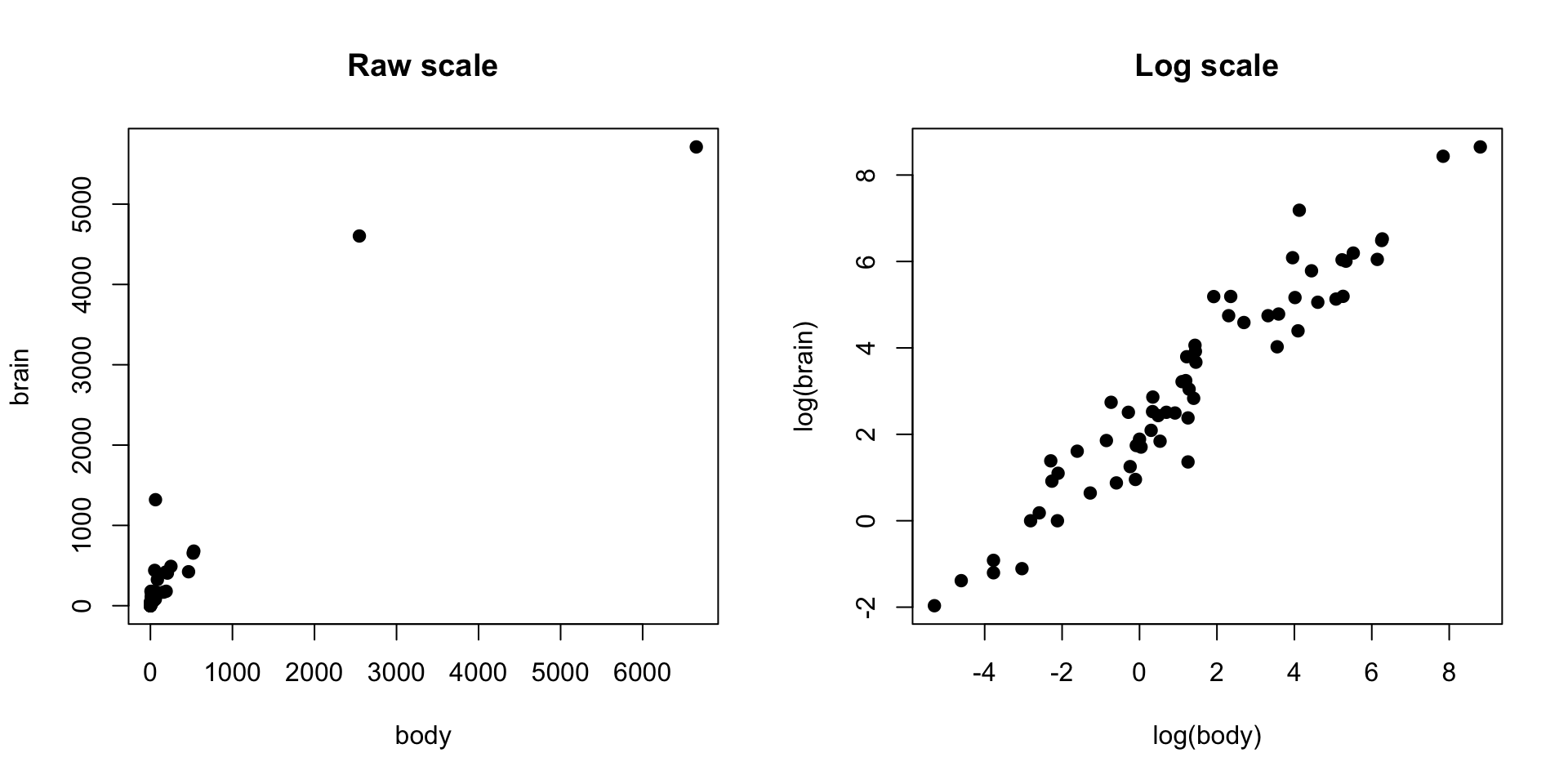
The raw data are very skewed; on the log scale the pattern appears:

par(mfrow=c(1,2))
plot(mammals$body, mammals$brain, pch=19,
     xlab="body", ylab="brain", main="Raw scale")
plot(log(mammals$body), log(mammals$brain), pch=19,
     xlab="log(body)", ylab="log(brain)", main="Log scale")

Correlation

\[\rho_{X,Y} = \frac{\text{Cov}(X, Y)}{\text{SD}(X) \times \text{SD}(Y)} = \frac{E[(X - \mu_X)(Y - \mu_Y)]}{\sigma_X \sigma_Y}\]

\[r_{xy} = \frac{S_{xy}}{\sqrt{S_{xx}S_{yy}}}\]

where:

  • \(S_{xx} = \sum_{i=1}^{n}(x_i - \bar{x})^2\), \(\bar{x} = \frac{\sum_{i=1}^{n} x_i}{n}\)
  • \(S_{xy} = \sum_{i=1}^{n}(x_i - \bar{x})(y_i - \bar{y})\)
  • \(S_{yy} = \sum_{i=1}^{n}(y_i - \bar{y})^2\), \(\bar{y} = \frac{\sum_{i=1}^{n} y_i}{n}\)

Correlation Example

cor(mammals)
           body     brain
body  1.0000000 0.9341638
brain 0.9341638 1.0000000
cor(log(mammals))
           body     brain
body  1.0000000 0.9595748
brain 0.9595748 1.0000000

Bivariate Data by Group

Example: Palmer penguins — 344 penguins of three species measured on three islands in Antarctica

# palmerpenguins is loaded in the setup chunk; ?palmerpenguins::penguins for details
# bill_length_mm, bill_depth_mm: bill (culmen) dimensions
# species: Adelie, Chinstrap, or Gentoo
head(penguins)
# A tibble: 6 × 8
  species island    bill_length_mm bill_depth_mm flipper_length_mm body_mass_g
  <fct>   <fct>              <dbl>         <dbl>             <int>       <int>
1 Adelie  Torgersen           39.1          18.7               181        3750
2 Adelie  Torgersen           39.5          17.4               186        3800
3 Adelie  Torgersen           40.3          18                 195        3250
4 Adelie  Torgersen           NA            NA                  NA          NA
5 Adelie  Torgersen           36.7          19.3               193        3450
6 Adelie  Torgersen           39.3          20.6               190        3650
# ℹ 2 more variables: sex <fct>, year <int>

Example

Numeric Summary

summary(penguins[, c("species", "bill_length_mm",
                     "bill_depth_mm")])
      species    bill_length_mm  bill_depth_mm  
 Adelie   :152   Min.   :32.10   Min.   :13.10  
 Chinstrap: 68   1st Qu.:39.23   1st Qu.:15.60  
 Gentoo   :124   Median :44.45   Median :17.30  
                 Mean   :43.92   Mean   :17.15  
                 3rd Qu.:48.50   3rd Qu.:18.70  
                 Max.   :59.60   Max.   :21.50  
                 NAs    :2       NAs    :2      

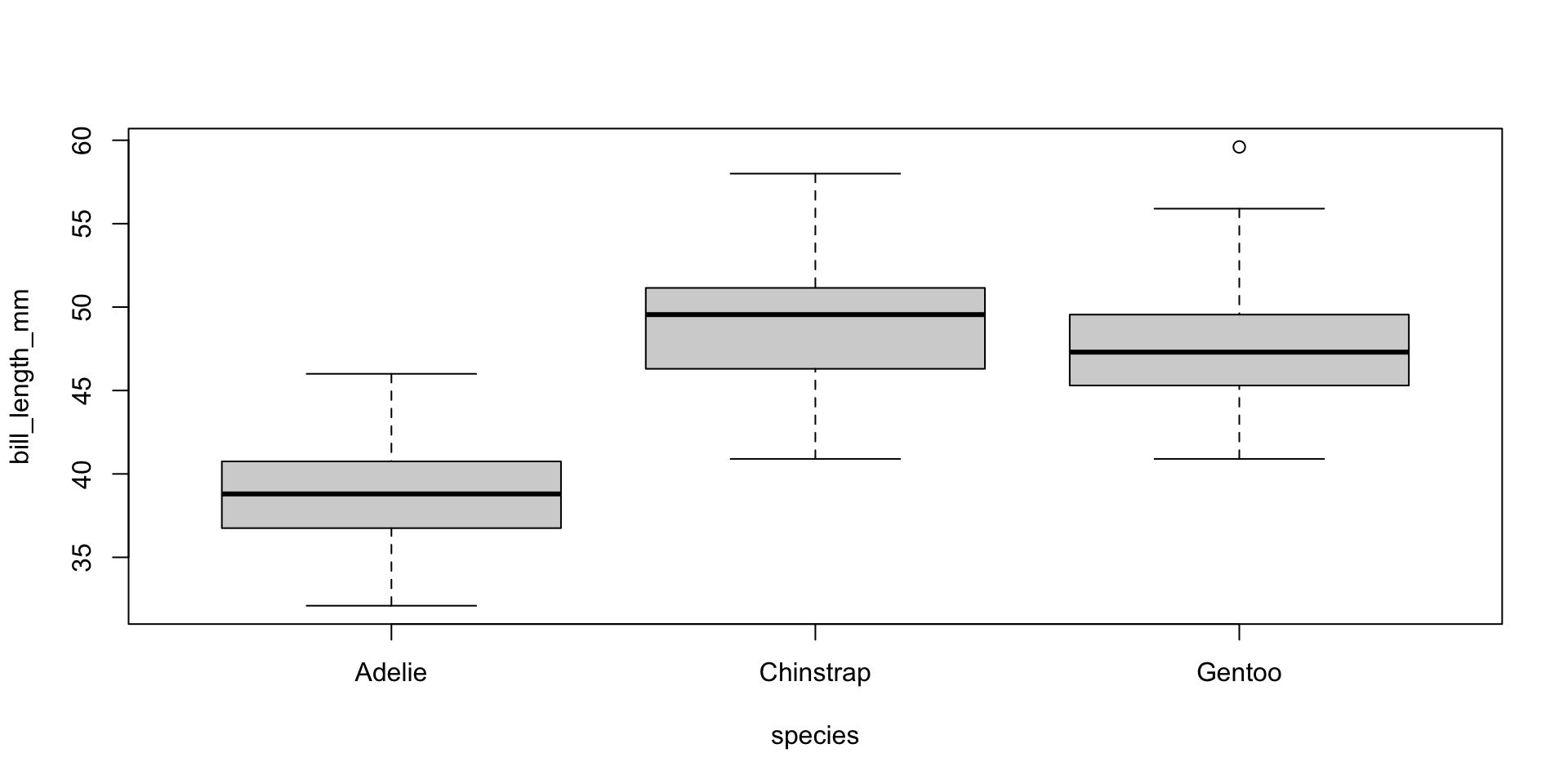
Boxplots of bill length by species

boxplot(bill_length_mm ~ species, penguins)

Example Continued

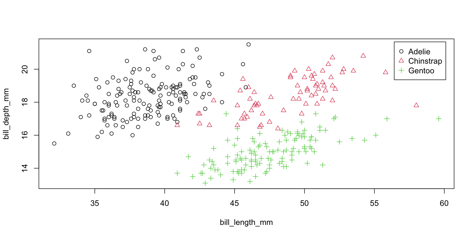
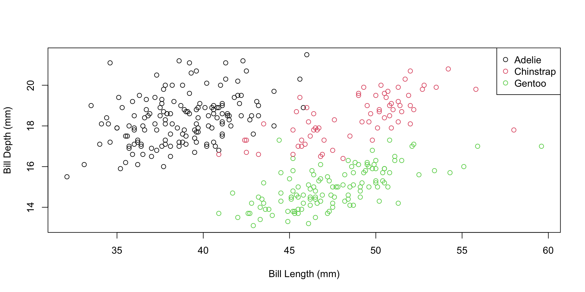
Another way to display this data is through a scatterplot

with(penguins, plot(x=bill_length_mm, y=bill_depth_mm,
                    pch=as.integer(species), col=as.integer(species)))
legend("topright", levels(penguins$species), pch=1:3,
       col=1:3, inset=.02)

Example Continued

Ignoring species, longer bills go with shallower bills. Within every species, the relationship is positive:

cor(penguins$bill_length_mm, penguins$bill_depth_mm, use="complete.obs")
[1] -0.2350529
by(data=penguins[, c("bill_length_mm", "bill_depth_mm")],
   INDICES=penguins$species,
   FUN=function(d) cor(d, use="complete.obs")[1, 2])
penguins$species: Adelie
[1] 0.3914917
------------------------------------------------------------ 
penguins$species: Chinstrap
[1] 0.6535362
------------------------------------------------------------ 
penguins$species: Gentoo
[1] 0.6433839

This reversal is Simpson’s paradox: a summary of the pooled data can point the opposite way from every group inside it. Always ask whether a grouping variable is hiding in your data.

📝 Self-Guided: Conditional Plots

Conditional plots with coplot() and lattice::xyplot() are not covered live — see the Self-Guided Practice section at the end of these slides.

Activity 1: Exploring Penguin Body Mass

Working with your neighbor (8 minutes)

Let’s explore the penguins dataset from the palmerpenguins package:

library(palmerpenguins)

Your tasks:

  1. Calculate the mean and standard deviation of body_mass_g (what do you need to do about missing values?)
  2. Create side-by-side boxplots of body_mass_g by species
  3. Calculate the mean body mass for each species using by() or tapply()
  4. What percentage of Gentoo penguins are heavier than the heaviest Adelie?

Post your findings on Ed Discussion!

Multivariate Data

Example: the same penguins data, now looking at all four body measurements at once; 344 penguins; 7 variables

Variable Description
species Adelie, Chinstrap, or Gentoo
island Biscoe, Dream, or Torgersen
bill_length_mm Bill length (mm)
bill_depth_mm Bill depth (mm)
flipper_length_mm Flipper length (mm)
body_mass_g Body mass (g)
year Study year (2007–2009)

Example

Note the missing values in the measurements

peng <- as.data.frame(penguins)
peng$sex <- NULL  # not used in this course
summary(peng)
      species          island    bill_length_mm  bill_depth_mm  
 Adelie   :152   Biscoe   :168   Min.   :32.10   Min.   :13.10  
 Chinstrap: 68   Dream    :124   1st Qu.:39.23   1st Qu.:15.60  
 Gentoo   :124   Torgersen: 52   Median :44.45   Median :17.30  
                                 Mean   :43.92   Mean   :17.15  
                                 3rd Qu.:48.50   3rd Qu.:18.70  
                                 Max.   :59.60   Max.   :21.50  
                                 NAs    :2       NAs    :2      
 flipper_length_mm  body_mass_g        year     
 Min.   :172.0     Min.   :2700   Min.   :2007  
 1st Qu.:190.0     1st Qu.:3550   1st Qu.:2007  
 Median :197.0     Median :4050   Median :2008  
 Mean   :200.9     Mean   :4202   Mean   :2008  
 3rd Qu.:213.0     3rd Qu.:4750   3rd Qu.:2009  
 Max.   :231.0     Max.   :6300   Max.   :2009  
 NAs    :2         NAs    :2                    

Example Continued

Missing values:

The by function allows us to consider summaries by group

mean(peng$body_mass_g)
[1] NA
mean(peng$body_mass_g, na.rm=T)
[1] 4201.754
by(data=peng$flipper_length_mm, INDICES = peng$species, FUN=mean, na.rm=T)
peng$species: Adelie
[1] 189.9536
------------------------------------------------------------ 
peng$species: Chinstrap
[1] 195.8235
------------------------------------------------------------ 
peng$species: Gentoo
[1] 217.187

Example Continued

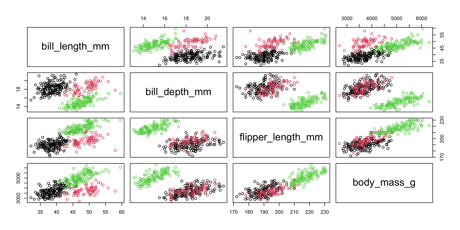
The pairs function can be used to display scatterplots for all pairs of (numeric) variables

meas <- peng[, c("bill_length_mm", "bill_depth_mm",
                 "flipper_length_mm", "body_mass_g")]
pairs(meas, col=as.integer(peng$species))

Example Continued

Flipper length and body mass have a strong positive correlation

round(cor(meas), 2)
                  bill_length_mm bill_depth_mm flipper_length_mm body_mass_g
bill_length_mm                 1            NA                NA          NA
bill_depth_mm                 NA             1                NA          NA
flipper_length_mm             NA            NA                 1          NA
body_mass_g                   NA            NA                NA           1
round(cor(meas, use="pairwise.complete.obs"), 2)
                  bill_length_mm bill_depth_mm flipper_length_mm body_mass_g
bill_length_mm              1.00         -0.24              0.66        0.60
bill_depth_mm              -0.24          1.00             -0.58       -0.47
flipper_length_mm           0.66         -0.58              1.00        0.87
body_mass_g                 0.60         -0.47              0.87        1.00

Example Continued

Controlling for body size (measured as body mass): Identifying missing data:

bill_per_mass <- peng$bill_length_mm/peng$body_mass_g
cor(peng$flipper_length_mm, bill_per_mass, use="pairwise.complete.obs")
[1] -0.5030272
which(is.na(meas), arr.ind=T)
     row col
[1,]   4   1
[2,] 272   1
[3,]   4   2
[4,] 272   2
[5,]   4   3
[6,] 272   3
[7,]   4   4
[8,] 272   4
peng[c(4, 272),]
    species    island bill_length_mm bill_depth_mm flipper_length_mm
4    Adelie Torgersen             NA            NA                NA
272  Gentoo    Biscoe             NA            NA                NA
    body_mass_g year
4            NA 2007
272          NA 2009

Activity 2: Penguin Flippers and Body Size

Partner work (10 minutes)

Investigate the relationship between flipper length and body mass:

peng <- as.data.frame(palmerpenguins::penguins)

Your tasks:

  1. Create a scatterplot of body_mass_g (x-axis) vs flipper_length_mm (y-axis)
  2. Calculate the correlation between body_mass_g and flipper_length_mm (remember to handle missing values!)
  3. Color points by species: plot(..., col=as.integer(species))
  4. Add a legend to distinguish the three species
  5. Calculate the correlation separately for each species using by()

Bonus: Is the pooled correlation stronger or weaker than the within-species ones? Compare with what happened to bill length vs. bill depth. What does this tell you about pooling groups?

Share your insights on Ed Discussion!

Categorical Data Analysis

Working with Categorical Variables

Categorical data represents groups or categories rather than numerical measurements.

Examples:

  • Survey responses (Yes/No, Agree/Disagree)

  • Demographics (Race, Education Level, Country)

  • Classifications (Disease status, Product type, Species)

Today’s goals:

  1. Create and visualize categorical data

  2. Test if observed frequencies match expected frequencies (goodness of fit)

  3. Test if two categorical variables are independent (contingency tables)

Creating Categorical Data in R

# A factor is R's categorical type
class(penguins$species)
[1] "factor"
levels(penguins$island)
[1] "Biscoe"    "Dream"     "Torgersen"
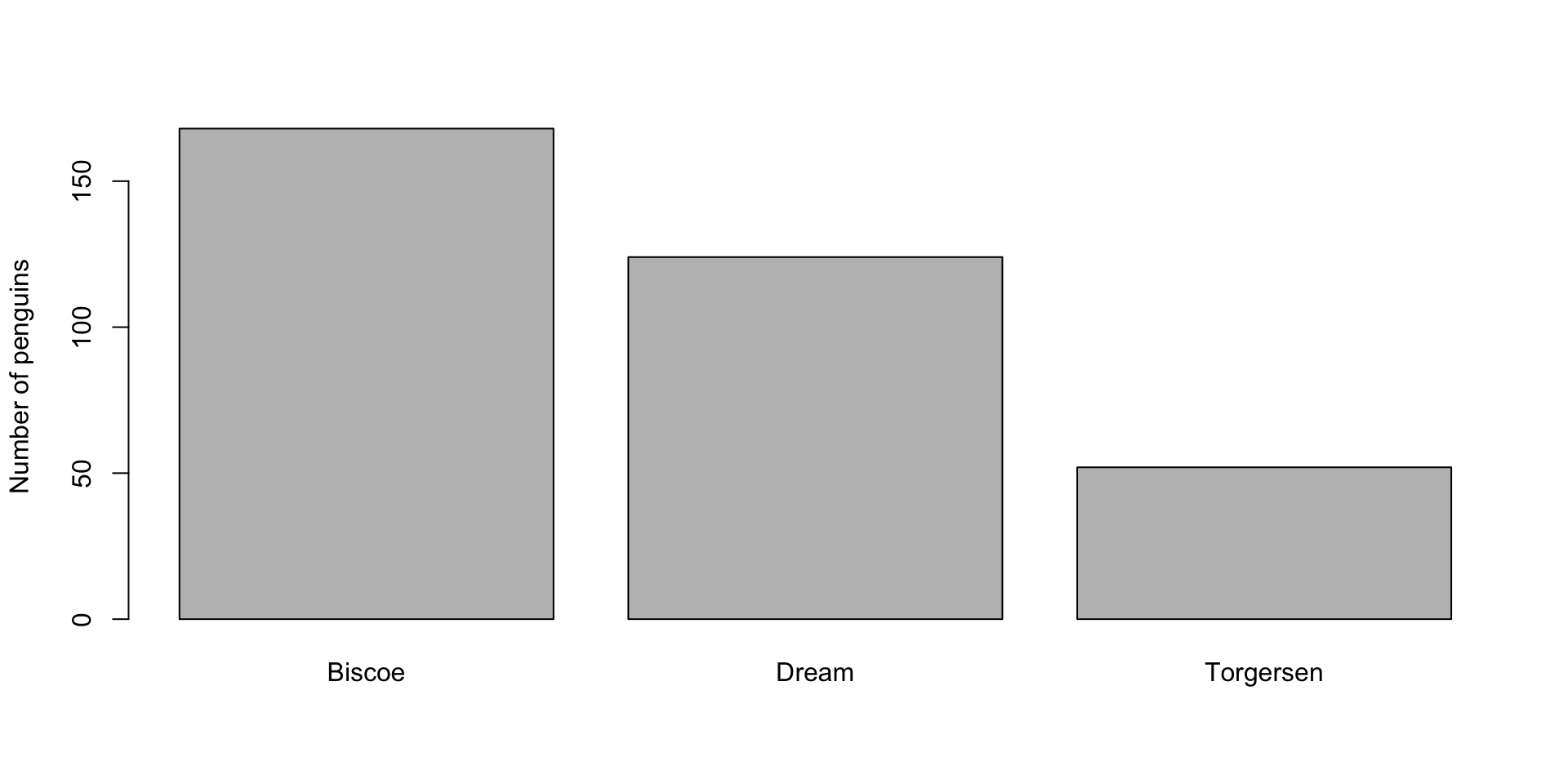
table(penguins$island)

   Biscoe     Dream Torgersen 
      168       124        52 
prop.table(table(penguins$island))

   Biscoe     Dream Torgersen 
0.4883721 0.3604651 0.1511628 
barplot(table(penguins$island), ylab = "Number of penguins")

Basic functions:

  • table() – counts frequencies

  • barplot() – visualizes frequencies

  • prop.table() – converts counts to proportions

Part 1: Chi-Square Goodness of Fit Test

Question: Are Events Equally Likely?

Example: Do car crashes occur on different days with the same frequency?

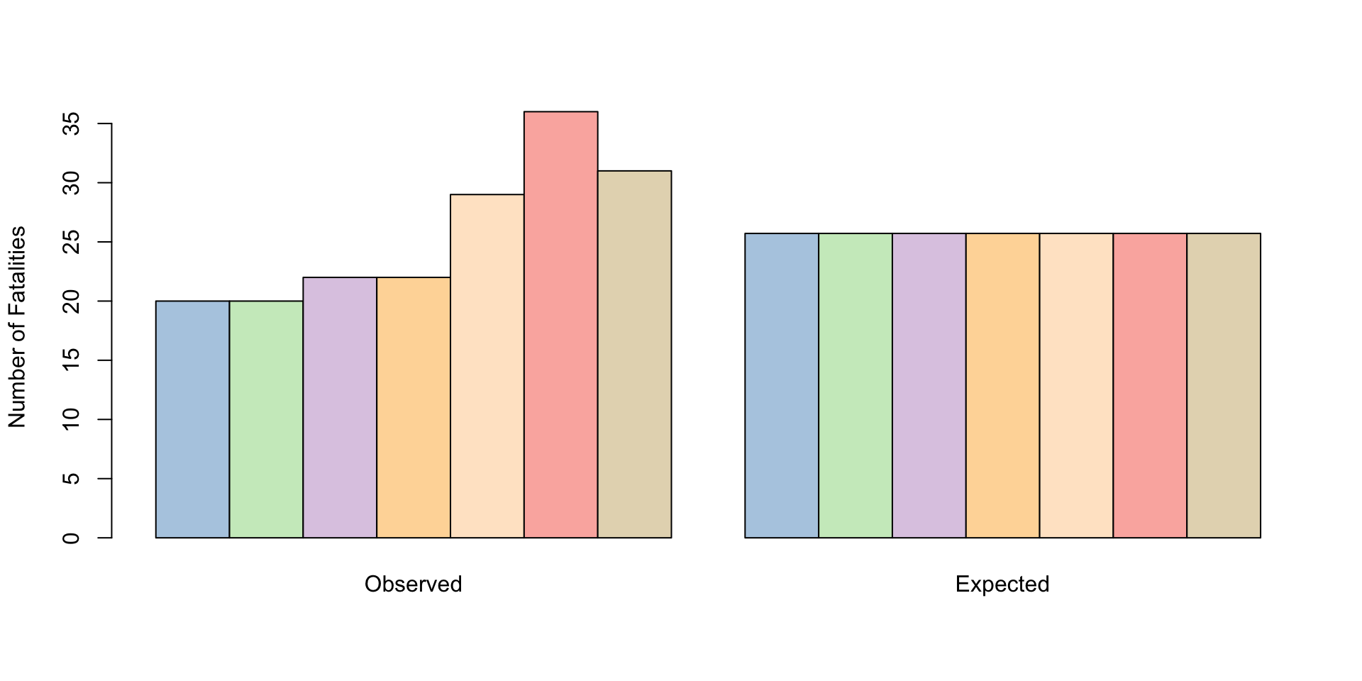
Day Mon Tue Wed Thu Fri Sat Sun
Fatalities 20 20 22 22 29 36 31

Hypothesis:

  • \(H_0\): Crashes are equally likely on all days (uniform distribution)

  • \(H_A\): Some days have more crashes than others

Performing the Test

accidents <- c(20, 20, 22, 22, 29, 36, 31)
sum(accidents)  # Total: 180
[1] 180
# Expected counts under null hypothesis (equal distribution)
expected_accidents <- rep(180/7, 7)
expected_accidents
[1] 25.71429 25.71429 25.71429 25.71429 25.71429 25.71429 25.71429
# Chi-square test
chisq.test(accidents)

    Chi-squared test for given probabilities

data:  accidents
X-squared = 9.2333, df = 6, p-value = 0.1609

Interpretation: very small p-value indicates evidence to reject \(H_0\). We will talk about p-values later in the quarter :).

Visualizing Observed vs Expected

Code
d_matrix <- cbind(accidents, expected_accidents)
rownames(d_matrix) <- c("Mon", "Tue", "Wed", "Thu", "Fri", "Sat", "Sun")
colnames(d_matrix) <- c("Observed", "Expected")
weekday_colors_pastel <- c(
  Mon = "#B3CDE3",  # Light blue
  Tue = "#CCEBC5",  # Light green
  Wed = "#DECBE4",  # Light purple
  Thu = "#FED9A6",  # Light orange
  Fri = "#FFE6CC",  # Light peach
  Sat = "#FBB4AE",  # Light coral
  Sun = "#E5D8BD"   # Light tan
)
barplot(d_matrix, beside=TRUE,
        col = weekday_colors_pastel,
        ylab = "Number of Fatalities")

Weekend days show the largest deviations from expected values

Activity 3: Goodness of Fit Practice

Partner work (10 minutes)

A die is rolled 60 times with the following results:

Face 1 2 3 4 5 6
Count 8 12 9 11 13 7

Your tasks:

  1. Create a vector with the observed counts
  2. What are the expected counts if the die is fair?
  3. Perform a chi-square goodness of fit test
  4. Create a barplot comparing observed vs. expected
  5. Interpret the results: Is the die fair?
# Starter code:
die_rolls <- c(8, 12, 9, 11, 13, 7)
# Your code here...

Discuss: What p-value would convince you the die is unfair?

Part 2: Contingency Tables

Testing Independence Between Two Variables

Question: Is there an association between two categorical variables?

Example: Using the penguins data

  • Species (Adelie, Chinstrap, Gentoo)

  • Island (Biscoe, Dream, Torgersen)

Do the three species live on the same islands, or does knowing the island tell you something about the species?

Building a Contingency Table

# Cross-tabulate two factors
spec_island <- table(penguins$species, penguins$island,
                    dnn = c("Species", "Island"))
spec_island
           Island
Species     Biscoe Dream Torgersen
  Adelie        44    56        52
  Chinstrap      0    68         0
  Gentoo       124     0         0
# Add the margins (row and column totals)
addmargins(spec_island)
           Island
Species     Biscoe Dream Torgersen Sum
  Adelie        44    56        52 152
  Chinstrap      0    68         0  68
  Gentoo       124     0         0 124
  Sum          168   124        52 344

The zeros are already a strong hint: Chinstraps were only sampled on Dream, Gentoos only on Biscoe.

Visualizing Contingency Tables

# Proportions by row (where does each species live?)
round(prop.table(spec_island, margin = 1), 2)
           Island
Species     Biscoe Dream Torgersen
  Adelie      0.29  0.37      0.34
  Chinstrap   0.00  1.00      0.00
  Gentoo      1.00  0.00      0.00
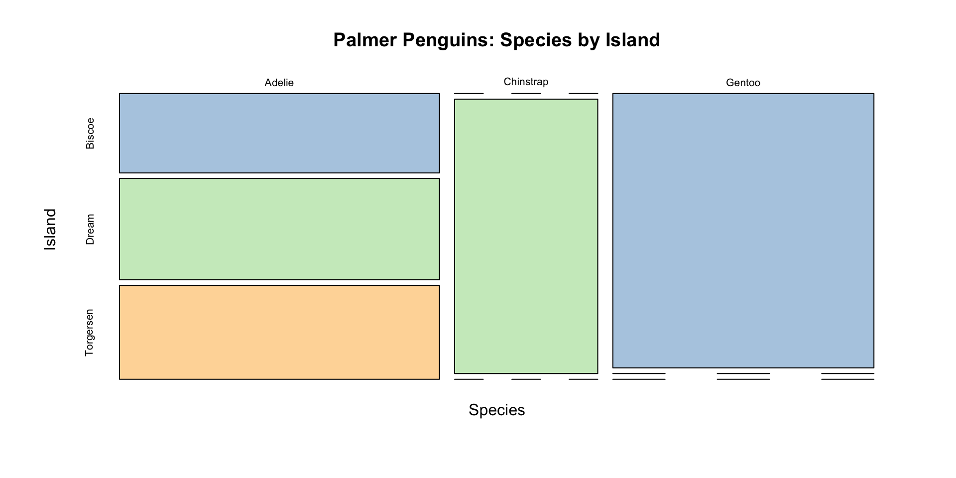
# Mosaic plot
mosaicplot(spec_island, color = c("#B3CDE3", "#CCEBC5", "#FED9A6"),
           main = "Palmer Penguins: Species by Island",
           xlab = "Species", ylab = "Island")

Reading mosaic plots:

  • Width = proportion of total in that category

  • Height = conditional proportion

Chi-Square Test of Independence

Hypotheses: - \(H_0\): Species and Island are independent - \(H_A\): There is an association between Species and Island

Test statistic: \[X^2 = \sum_{\text{all cells}} \frac{(\text{observed} - \text{expected})^2}{\text{expected}}\]

Under \(H_0\), this follows \(\chi^2_{(r-1)(c-1)}\) distribution

Performing the Test

chi_result <- chisq.test(spec_island)
chi_result

    Pearson's Chi-squared test

data:  spec_island
X-squared = 299.55, df = 4, p-value < 2.2e-16
# Expected counts under independence
round(chi_result$expected, 1)
           Island
Species     Biscoe Dream Torgersen
  Adelie      74.2  54.8      23.0
  Chinstrap   33.2  24.5      10.3
  Gentoo      60.6  44.7      18.7

Interpretation: Very strong association between species and island. The test confirms what the mosaic plot already showed, so always look first.

Understanding Residuals

Residuals show which cells differ most from independence:

\[\text{Residual} = \frac{\text{observed} - \text{expected}}{\sqrt{\text{expected}}}\]

round(chi_result$residuals, 1)
           Island
Species     Biscoe Dream Torgersen
  Adelie      -3.5   0.2       6.1
  Chinstrap   -5.8   8.8      -3.2
  Gentoo       8.2  -6.7      -4.3

Large positive residual: More than expected under independence
Large negative residual: Fewer than expected under independence

Activity 4: Titanic Survival Analysis

Partner work (12 minutes)

Use the built-in Titanic dataset to examine survival by class:

data(Titanic)
# Create a table: Class vs Survived
titanic_data <- margin.table(Titanic, c(1, 4))
titanic_data
      Survived
Class   No Yes
  1st  122 203
  2nd  167 118
  3rd  528 178
  Crew 673 212

Your tasks:

  1. Calculate the proportion who survived in each class
  2. Create a mosaic plot with shading: mosaicplot(..., shade = TRUE)
  3. Perform a chi-square test of independence
  4. Examine the residuals to see which cells are most unusual
  5. Interpret: Was survival independent of passenger class?

Discuss: What do the residuals tell you about survival patterns?

Mosaic Plots with Shading

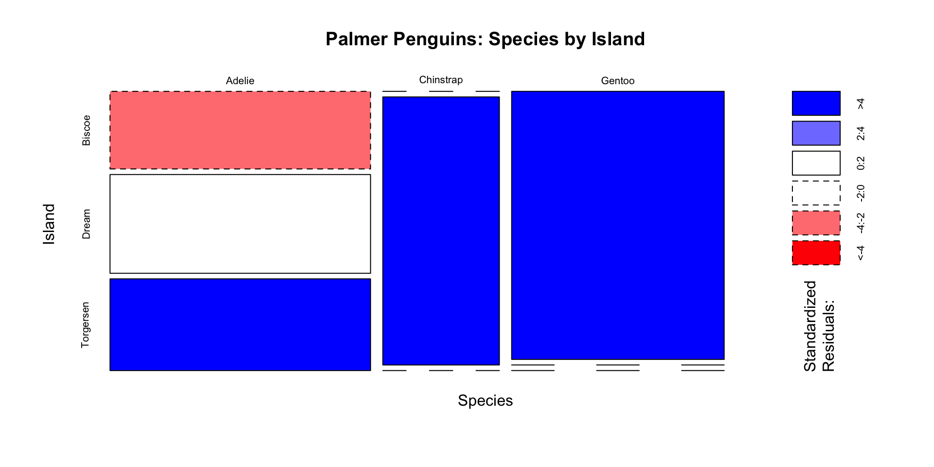
Shading enhances mosaic plots by showing residuals:

mosaicplot(spec_island, shade = TRUE,
           main = "Palmer Penguins: Species by Island",
           xlab = "Species", ylab = "Island")

Color coding:

  • Blue shades: More than expected (positive residuals)

  • Red shades: Fewer than expected (negative residuals)

  • Darker colors = larger residuals

Detailed Example: Body Size by Species

From a Number to a Category

cut() turns a numeric variable into an (ordered) factor. Here: split body mass into thirds.

cuts <- quantile(penguins$body_mass_g, c(0, 1/3, 2/3, 1), na.rm = TRUE)
cuts
       0% 33.33333% 66.66667%      100% 
     2700      3700      4550      6300 
penguins$size <- cut(penguins$body_mass_g, breaks = cuts,
                    labels = c("light", "medium", "heavy"),
                    include.lowest = TRUE, ordered_result = TRUE)

spec_size <- table(penguins$species, penguins$size,
                  dnn = c("Species", "Size"))
spec_size
           Size
Species     light medium heavy
  Adelie       81     63     7
  Chinstrap    36     31     1
  Gentoo        0     18   105

Where to cut is a judgment call: thirds, fixed kg thresholds, or per-species cut points would each give a different table.

Analyzing Species and Body Size

# Chi-square test
chisq.test(spec_size)

    Pearson's Chi-squared test

data:  spec_size
X-squared = 244.49, df = 4, p-value < 2.2e-16
# Visualize
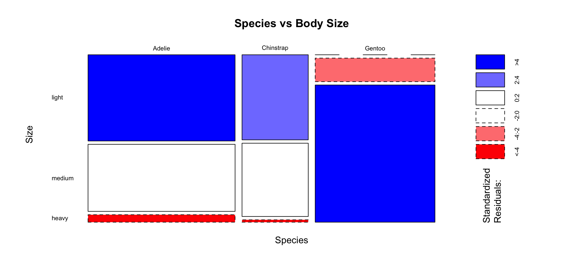
mosaicplot(spec_size, shade = TRUE,
           main = "Species vs Body Size",
           las = 1)

Observation: Strong association: Gentoo penguins fill the “heavy” class; Adelie and Chinstrap are mostly “light” or “medium”

Activity 5: Complete Categorical Analysis

Partner work (15 minutes)

Adelie is the only species sampled on all three islands. Use it to answer:

Is the island where Adelie penguins were sampled associated with the study year? With their body size?

adelie <- subset(penguins, species == "Adelie")
island_year <- table(adelie$island, adelie$year)
island_size <- table(adelie$island, adelie$size)

Your tasks:

  1. Create shaded mosaic plots for both tables
  2. Perform chi-square tests for each
  3. Check the expected counts (chisq.test(...)$expected). Are any below 5? If so, try fisher.test()
  4. Calculate the proportions: prop.table(island_year, margin = 1)

Discussion questions: - Which table shows evidence of association, and which doesn’t? - What does a large p-value let you conclude, and what doesn’t it? - How would you report these findings?

📝 Self-Guided: Manual Chi-Square Calculation & Assumptions

The math behind chisq.test() and validity assumptions are already marked “Self-study guide” in the original material — see the Self-Guided Practice section at the end of these slides.

Summary: Categorical Data Analysis

Test Type Question R Function Key Output
Goodness of Fit Do observed frequencies match expected? chisq.test(x) p-value
Independence Are two variables associated? chisq.test(table) p-value, residuals
Visualization See patterns mosaicplot(..., shade=T) Color-coded residuals

Workflow:

  1. Create table with table() or use built-in dataset

  2. Visualize with barplot() or mosaicplot()

  3. Test with chisq.test()

  4. Examine residuals to understand patterns

  5. Report findings with context

Practical Tips

Good practices:

✓ Always visualize before testing
✓ Check expected counts (should be ≥ 5)
✓ Examine residuals to understand where associations exist
✓ Report both statistical and practical significance

Common mistakes:

✗ Ignoring small expected counts
✗ Testing without looking at the data first
✗ Only reporting p-values without interpretation
✗ Treating ordinal categories as nominal

Statistics, Data Mining, and Where the Hypothesis Goes

Two things you can do with a dataset

Before we explore any data, we need to be clear about what kind of question we’re asking. Breiman put it like this:

There are two goals in analyzing the data:

  • Prediction. To be able to predict what the responses are going to be to future input variables;
  • Inference. To infer how nature is associating the response variables to the input variables.

— Breiman (2001), Statistical Modeling: The Two Cultures, as quoted in Donoho (2017)

Donoho (2017), 50 Years of Data Science, organizes the field around these two cultures: generative modeling (classical statistics: assume a model, make inferences about the mechanism) and predictive modeling (machine learning, data mining: stay silent about the mechanism, judge by accuracy).

Same data. Two completely different jobs, and two different places where the hypothesis lives.

So where is the hypothesis?

Statistics (generative) Data science / data mining (predictive)
When the hypothesis appears First. Stated before the data are seen Last, or never. The pattern is found in the data
What you commit to up front A model, a null hypothesis, a design A target to predict and a loss function
What counts as success Evidence against the null; an interpretable parameter Accuracy on data you have never seen
Who adjudicates A probability calculation under the assumed model A held-out test set
Core risk The model is wrong The pattern doesn’t generalize
Typical output “The effect is 14 points, 95% CI [11, 17.5]” “This rule predicts with 87% accuracy”

The key asymmetry: classical inference is valid because the hypothesis came first. Data mining gives that up, and buys its credibility back a different way, with a test set. If a pattern came out of the data, testing it on those same data is not a test. That is what EDA + PCS (next) are for.

Exploratory Data Analysis, the Modern Way

What EDA is for

EDA is where you generate hypotheses, find anomalies, and learn what the data actually contain — before any model.

We’ll follow Yu & Barter, Veridical Data Science (MIT Press, 2024), which is free online at vdsbook.com. “Veridical” means truthful: the book’s whole question is how to tell which of your findings are real.

Their vocabulary, which we’ll use for the rest of the quarter:

  • the DSLC — the data science life cycle, the actual sequence of steps
  • exploratory vs. explanatory analysis
  • the question-and-answer workflow
  • PCS — predictability, computability, stability

The Data Science Life Cycle (DSLC)

The DSLC “starts with problem formulation, data collection, and data cleaning and traverses through multiple types of data analyses to arrive at an assessment of some data-derived results, which is then communicated to a domain audience.”

— Yu & Barter (2024), Ch. 2

   domain question
        ↓
   data collection  ←──────────────┐
        ↓                          │
   data cleaning & preparation     │  every arrow is a
        ↓                          │  JUDGMENT CALL you
   EDA  ←───────────┐              │  must write down
        ↓           │ iterate      │
   analysis / model ┘              │
        ↓                          │
   PCS evaluation ─────────────────┘
        ↓
   communication → updated domain knowledge

EDA is not a stage you finish. You come back to it every time the model surprises you.

Exploratory vs. explanatory

Exploratory

“…preliminary data visualizations… produced fairly quickly and roughly.”

  • Audience: you
  • Dozens of them per session
  • Default settings are fine
  • Most of them will be boring — that’s the point

Explanatory

“…the process of producing polished presentation-quality figures that will be used to communicate… particularly interesting patterns and trends.”

  • Audience: everyone else
  • One or two per report
  • One clear takeaway message each
  • Worth an hour of work

Yu & Barter (2024), Ch. 5

Don’t polish while exploring, and don’t ship a default plot. Knowing which one you’re making saves hours.

The question-and-answer workflow

Not: “plot everything and stare at it.”

Instead: use domain knowledge to ask a specific question, answer it with one summary or figure, and let the answer suggest the next question.

Q: How do graduation rates differ between private and public colleges?
     ↓
A: Private colleges' median is about 14 points higher.
     ↓
Q: Wait -- is a 118% graduation rate possible?
     ↓
A: No. One college is an error. Does it change the 14 points?
     ↓
Q: Are these schools even comparable in size?
     ↓ ...

Keep the project goal in view, or the chain never ends. Each answer should either change what you’d do next, or get written down and dropped.

Q&A in action: the College data

library(tidyverse)
library(ISLR)
college <- as_tibble(College, rownames = "name")
dim(college)
[1] 777  19

Q1: How do graduation rates differ between private and public colleges?

college |>
  group_by(Private) |>
  summarize(n = n(), median = median(Grad.Rate), mean = mean(Grad.Rate),
            IQR = IQR(Grad.Rate))
# A tibble: 2 × 5
  Private     n median  mean   IQR
  <fct>   <int>  <dbl> <dbl> <dbl>
1 No        212     55  56.0    19
2 Yes       565     69  69.0    23

A median gap of 14 percentage points. Now: should we believe it?

Q2: Are any of these values impossible?

Always ask this. Always.

college |>
  filter(Grad.Rate > 100) |>
  select(name, Private, Grad.Rate, Apps, Accept, Enroll)
# A tibble: 1 × 6
  name              Private Grad.Rate  Apps Accept Enroll
  <chr>             <fct>       <dbl> <dbl>  <dbl>  <dbl>
1 Cazenovia College Yes           118  3847   3433    527

A graduation rate of 118% is not a value, it’s an error.

Now you face a judgment call, and there is no automatically correct answer:

  • drop the row?
  • cap it at 100?
  • set it to NA?
  • leave it, since one row out of 777 can’t matter much?

The veridical move is not to pick the “right” one. It’s to try several and report whether your conclusion moved. We do that in a few slides.

Q3: Am I comparing comparable things?

Raw counts are almost never comparable across units of different size:

college <- college |>
  mutate(accept_rate = Accept / Apps,
         yield = Enroll / Accept)

college |>
  group_by(Private) |>
  summarize(median_accepted = median(Accept),
            median_accept_rate = median(accept_rate))
# A tibble: 2 × 3
  Private median_accepted median_accept_rate
  <fct>             <dbl>              <dbl>
1 No                2930.              0.744
2 Yes                859               0.789

Public universities accept far more students but are slightly more selective by rate. The raw count and the rate tell opposite stories.

Rule: rates per capita, per applicant, per student — not raw totals — whenever the denominators differ.

Describing a single variable

Center

  • mean() — sensitive to outliers
  • median() — robust to outliers

Spread

  • sd(), var() — around the mean
  • IQR() — 75th minus 25th percentile
  • range(), quantile()
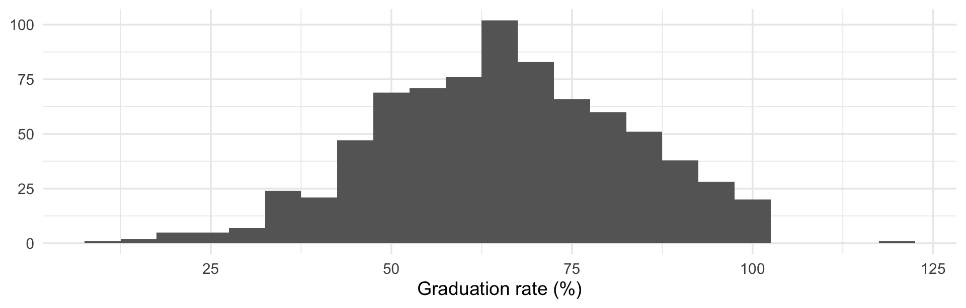
ggplot(college, aes(Grad.Rate)) +
  geom_histogram(binwidth = 5, fill = "grey40") +
  labs(x = "Graduation rate (%)", y = NULL) +
  theme_minimal(base_size = 14)

When mean and median disagree, the distribution is telling you something — go look at the histogram before you report either one.

Describing a relationship between two variables

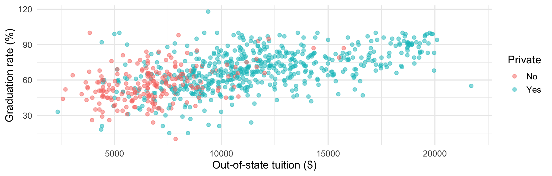
ggplot(college, aes(Outstate, Grad.Rate, color = Private)) +
  geom_point(alpha = 0.5) +
  labs(x = "Out-of-state tuition ($)", y = "Graduation rate (%)") +
  theme_minimal(base_size = 14)
college |> summarize(cov = cov(Outstate, Grad.Rate),
                     cor = cor(Outstate, Grad.Rate))
# A tibble: 1 × 2
     cov   cor
   <dbl> <dbl>
1 39480. 0.571

Covariance is scale-dependent (that huge number means nothing on its own). Correlation is standardized to \([-1, 1]\) — and only summarizes the linear part. Always plot first.

Activity 6: A question-and-answer EDA

Partner work (15 minutes)

Using college, run three rounds of the Q&A workflow on this domain question:

Do colleges that spend more per student graduate more students?

For each round, write down (a) the question, (b) the one summary or plot that answers it, (c) the next question it raised.

Suggested starting points — Expend, S.F.Ratio, PhD, perc.alumni, Top10perc, and the rates you create yourself.

Required in your three rounds:

  • at least one check for impossible or suspicious values
  • at least one comparison that needs a rate, not a count
  • one sentence at the end: “This is an exploratory finding. To confirm it I would need ______.”

Is the Finding Real? The PCS Framework

Three principles

Yu & Barter’s answer to “which of my findings are real”:

Predictability

Does the result reemerge in new or held-out data, and is it consistent with what the domain already knows?

Computability

Can someone else rerun it? Is the code, the workflow, and every judgment call documented and feasible to execute?

Stability

Does the result survive the choices you made — in cleaning, in sampling, in modeling, in plotting?

“You can show that your results are predictable by computationally demonstrating that they reemerge in relevant future data and are in line with domain knowledge” and stable “by computationally demonstrating that they do not change dramatically when appropriate changes are made throughout the DSLC.” — Yu & Barter (2024), Ch. 1

Predictability in action

The cheapest possible version: split the data, find the pattern in one half, check it in the other. (This is the CTF idea, shrunk to fit one afternoon.)

set.seed(204)
college$half <- sample(rep(c("explore", "hold out"), length.out = nrow(college)))

college |>
  group_by(half, Private) |>
  summarize(median_grad = median(Grad.Rate), .groups = "drop") |>
  pivot_wider(names_from = Private, values_from = median_grad) |>
  mutate(gap = Yes - No)
# A tibble: 2 × 4
  half        No   Yes   gap
  <chr>    <dbl> <dbl> <dbl>
1 explore     55    68    13
2 hold out    55    70    15

13 points in the half we explored, 15 in the half we held back. The finding reemerged. If it had vanished, we’d have found a pattern in noise.

Tip

Do the split before you start exploring, and don’t look at the held-out half until you’re done. That’s the whole discipline.

Computability in action

Boring, and the reason your result exists at all tomorrow:

  • Every number in your report comes from code in the document, not from something you typed in by hand
  • set.seed() before anything random
  • Raw data read, never edited — all cleaning happens in code
  • Every judgment call is a line of code with a comment saying why
  • sessionInfo() or renv so the package versions are on the record
# JUDGMENT CALL: Cazenovia College reports Grad.Rate = 118, which is
# impossible. We drop it. See the stability table below -- the 14-point
# gap is unchanged whether we drop, cap, or keep this row.
college_clean <- filter(college, Grad.Rate <= 100)

This is what you’re graded on in the project.

Stability: three kinds of perturbation

Perturb this Concretely Asks
The data bootstrap, drop a subgroup, add noise would another sample have shown this?
Your judgment calls drop vs. cap vs. NA; mean vs. median; which rows to include did I find this, or did I choose it?
The visualization binwidth, axis limits, chart type, color scale am I seeing this, or drawing it?

“Investigate stability through reasonable alternative visualization choices… design choices significantly impact conclusions.”

— Yu & Barter (2024), Ch. 5

“Reasonable” is doing a lot of work here. A perturbation counts only if you would have been willing to make that choice before seeing where it led.

Stability in action: judgment calls

One function, so every row of the table is computed the same way:

gap <- function(d, stat = median) {
  s <- tapply(d$Grad.Rate, d$Private, stat)
  unname(s["Yes"] - s["No"])
}

tibble(
  choice = c("all data, median", "drop Grad.Rate > 100", "cap at 100",
             "all data, mean", "only colleges with 1000+ undergrads"),
  gap = c(gap(college),
          gap(filter(college, Grad.Rate <= 100)),
          gap(mutate(college, Grad.Rate = pmin(Grad.Rate, 100))),
          gap(college, mean),
          gap(filter(college, F.Undergrad >= 1000)))
)
# A tibble: 5 × 2
  choice                                gap
  <chr>                               <dbl>
1 all data, median                     14  
2 drop Grad.Rate > 100                 14  
3 cap at 100                           14  
4 all data, mean                       13.0
5 only colleges with 1000+ undergrads  17  

Reading that table

  • The impossible value did not matter at all — 14 points either way. Write that down and stop worrying about it.
  • Mean instead of median: 13 instead of 14. Stable.
  • Restrict to larger colleges: 17 points. Not stable — and that is the most interesting line in the table.

An unstable result is not a failure, it’s an important finding. The gap depends on size, which means “private vs. public” was partly standing in for “small vs. large”. That could be your next question.

This is exactly what a single p-value would have hidden from you.

Stability in action: perturbing the data

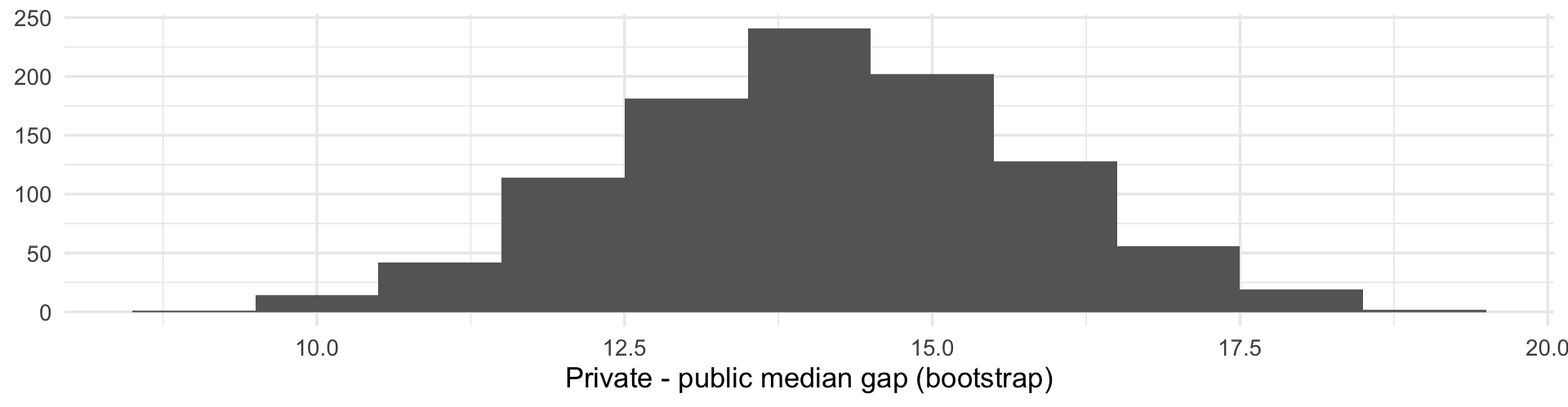
Resample the colleges 1,000 times and recompute the gap each time:

set.seed(204)
boot_gap <- replicate(1000, gap(college[sample(nrow(college), replace = TRUE), ]))
quantile(boot_gap, c(0.025, 0.5, 0.975))
 2.5%   50% 97.5% 
 11.0  14.0  17.5 
ggplot(tibble(boot_gap), aes(boot_gap)) +
  geom_histogram(binwidth = 1, fill = "grey40") +
  labs(x = "Private - public median gap (bootstrap)", y = NULL) +
  theme_minimal(base_size = 13)

11 to 17.5 points. Never zero — the sign of the effect is not in doubt, even though its size is only known to within about 6 points.

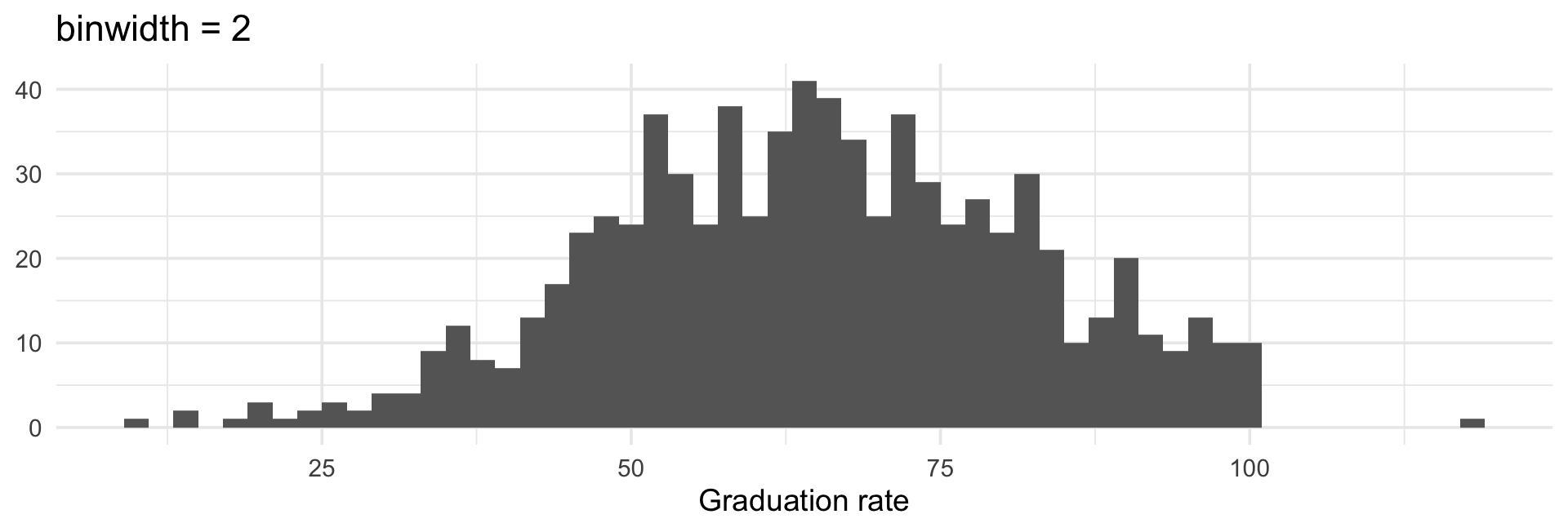
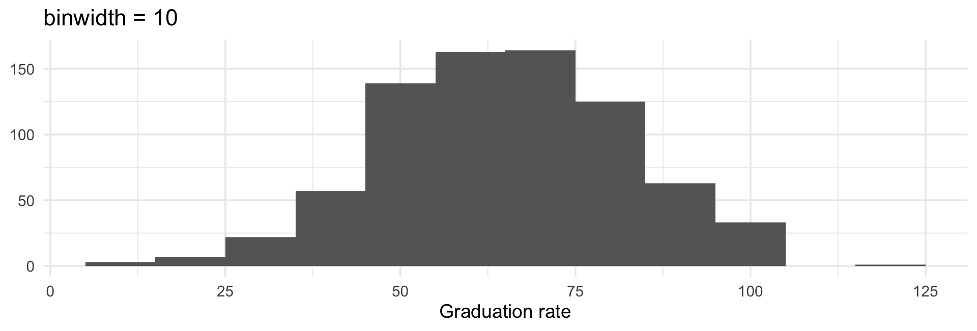
Stability in action: perturbing the plot

Same variable, same data, two defensible binwidths:

ggplot(college, aes(Grad.Rate)) +
  geom_histogram(binwidth = 2, fill = "grey40") +
  labs(title = "binwidth = 2", x = "Graduation rate", y = NULL) +
  theme_minimal(base_size = 14)
ggplot(college, aes(Grad.Rate)) +
  geom_histogram(binwidth = 10, fill = "grey40") +
  labs(title = "binwidth = 10", x = "Graduation rate", y = NULL) +
  theme_minimal(base_size = 14)

Is the distribution bumpy or smooth? The data didn’t decide that, you did. Any feature that appears at one binwidth and not another should not be a finding.

Activity 7: Run a stability check

Partner work (15 minutes)

Take the finding from your Activity 6 Q&A chain — whatever it was — and put it through PCS.

  1. State it in one sentence, with a number in it.
  2. Stability (judgment calls): list the choices you made (rows excluded, mean vs. median, how you handled missing values, any cutoff). Recompute your number under three alternative choices. Build the table.
  3. Stability (data): bootstrap it 1,000 times and report the 2.5% and 97.5% quantiles.
  4. Predictability: recompute it in the "hold out" half. Does it reemerge?
  5. Verdict: stable, unstable, or unstable in an interesting way?

Report back in one slide-worth of words. If your finding fell apart, say so — that’s a successful stability check, not a failed analysis.

The EDA workflow we’ll use all quarter

1. STATE the domain question
        ↓
2. SPLIT the data (explore / hold out)*
        ↓
3. CLEAN -- and write down every judgment call
        ↓
4. ASK a specific question  ──┐
        ↓                     │
5. ANSWER with one summary    │  repeat
   or rough exploratory plot  │
        ↓                     │
6. LET the answer raise the  ─┘
   next question
        ↓
7. PCS the finding: predictable? computable? stable?
        ↓
8. POLISH one explanatory figure and say plainly
   whether this is exploratory or confirmed

EDA comes before formal hypothesis testing — and it determines whether that test means anything.

Activity 8: Complete EDA challenge

Partner work (15 minutes)

data(mtcars)

Domain question: does engine power cost you fuel efficiency, and by how much?

  1. Question: phrase it as something mtcars can answer with hp and mpg
  2. Explore: scatterplot, correlation, and one grouped summary (try cyl)
  3. Impossible values / anomalies: anything suspicious? (rownames(mtcars) is worth a look)
  4. Comparability: is mpg comparable across cars of very different wt? What would you compare instead?
  5. Stability: does your headline number survive (a) dropping the single most extreme car, (b) median instead of mean, (c) a bootstrap?
  6. One sentence: exploratory finding, or something you’d defend?

Present: your number, and the one perturbation that moved it most.

Resources for EDA

Books:

  • Yu, B. & Barter, R. (2024). Veridical Data Science. MIT Press — vdsbook.com (Ch. 1–2 for PCS and the DSLC, Ch. 5 for EDA)

  • Wickham, Çetinkaya-Rundel & Grolemund. R for Data Science (2e) — r4ds.hadley.nz

  • Tukey, J. (1977). Exploratory Data Analysis — the original

Papers worth your afternoon:

  • Donoho, D. (2017). “50 Years of Data Science.” JCGS 26(4), 745–766
  • Breiman, L. (2001). “Statistical Modeling: The Two Cultures.” Statistical Science 16(3)
  • Tukey, J. (1962). “The Future of Data Analysis.” Ann. Math. Statist. 33(1)

R functions to remember:

  • Look: str(), summary(), dim(), colSums(is.na()), table()
  • Summarize: group_by() |> summarize(), median(), IQR(), quantile(), cor()
  • Plot roughly: ggplot() + geom_histogram()/geom_point()/geom_boxplot()
  • Check stability: replicate(), sample(), set.seed()

Graphical Summaries

Overview: Two Approaches to Graphics in R

Today we’ll cover:

  1. Base R Graphics (brief overview - reference material provided)
  2. ggplot2 (our main focus - modern, powerful approach)

In-class focus: We’ll spend most time on ggplot2 as it’s more intuitive and widely used in modern data science.

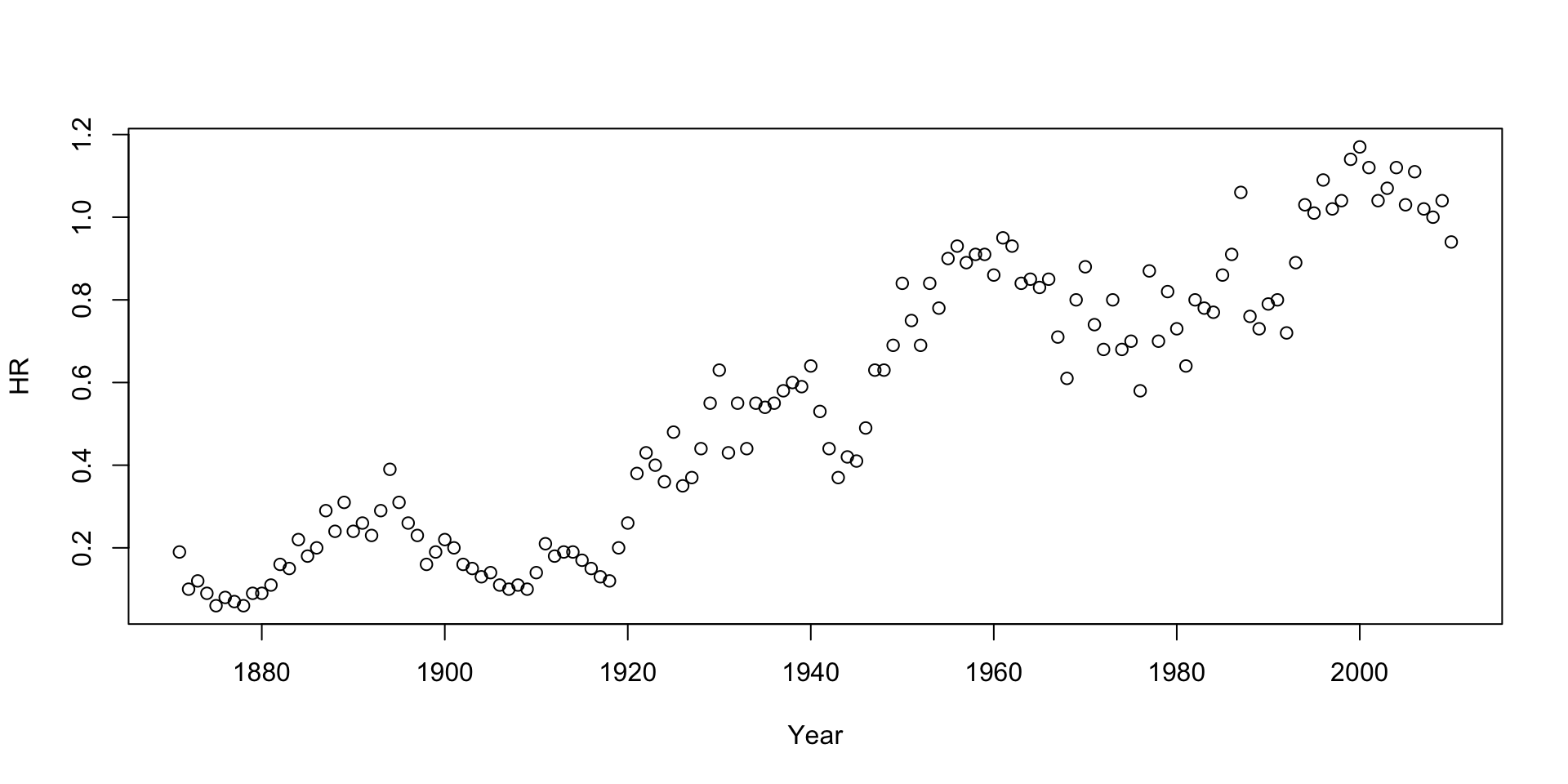
Base R Graphics: Quick Introduction

Basic Plotting with Base R

hitting.data <- read.table("data/batting.history.txt", header=TRUE, sep="\t")
attach(hitting.data)
plot(Year, HR)

Key function: plot() creates basic visualizations

We’ll see a few examples, but detailed customization is in the reference slides.

Activity 9: Base R Plotting Practice

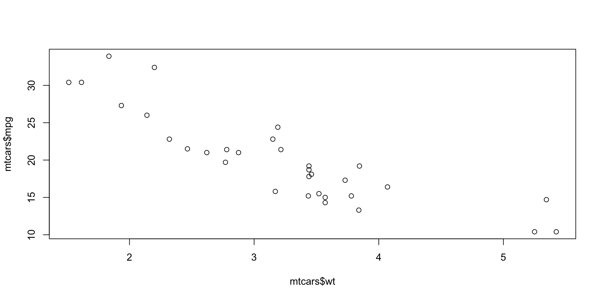
Partner work (10 minutes)

Using the mtcars dataset:

  1. Create a scatterplot of mpg vs wt (weight)
  2. Add axis labels: “Weight (1000 lbs)” and “Miles per Gallon”
  3. Add a title: “Fuel Efficiency vs Car Weight”
  4. Change the plotting symbol to filled circles (pch = 19)

Bonus: Add a lowess smoothing line in red

# Starter code:
data(mtcars)
plot(mtcars$wt, mtcars$mpg)

Discuss: What relationship do you observe?

📝 Self-Guided: Base R Graphics Reference Material

This entire reference block is already marked “Self-study guide” in the original material — see the Self-Guided Practice section at the end of these slides.

ggplot2: Modern Data Visualization

Why ggplot2?

Advantages over base R:

  • Consistent syntax across plot types
  • Layered approach builds plots incrementally
  • Automatic legends and color schemes
  • Better defaults for publication-quality graphics
  • Easier faceting (multiple subplots)

Philosophy: Grammar of Graphics - build plots by combining data, aesthetics, and geometric objects

The ggplot2 Framework

Three essential components:

  1. Data – your dataset
  2. Aesthetics (aes()) – map variables to visual properties
  3. Geoms (geom_*()) – how to display the data
library(ggplot2)

library(readr)
pums <- read_csv('data/psam_p41.csv')
pumsReduced <- pums %>% 
  select(PUMA, SALARY=WAGP, WEIGHT=PWGTP, AGE=AGEP, RACE=RAC1P, HICOV, NATIVITY)

pumsFinal <- pumsReduced %>% select(-NATIVITY)
str(pumsFinal)
tibble [42,080 × 6] (S3: tbl_df/tbl/data.frame)
 $ PUMA  : chr [1:42080] "00705" "01301" "00200" "01321" ...
 $ SALARY: num [1:42080] 12000 5700 0 0 0 0 30000 0 0 1800 ...
 $ WEIGHT: num [1:42080] 5 68 81 36 66 34 144 88 50 48 ...
 $ AGE   : num [1:42080] 18 19 37 20 18 85 32 63 37 19 ...
 $ RACE  : num [1:42080] 1 1 1 1 6 1 1 1 3 9 ...
 $ HICOV : num [1:42080] 1 1 1 1 1 1 1 1 2 1 ...
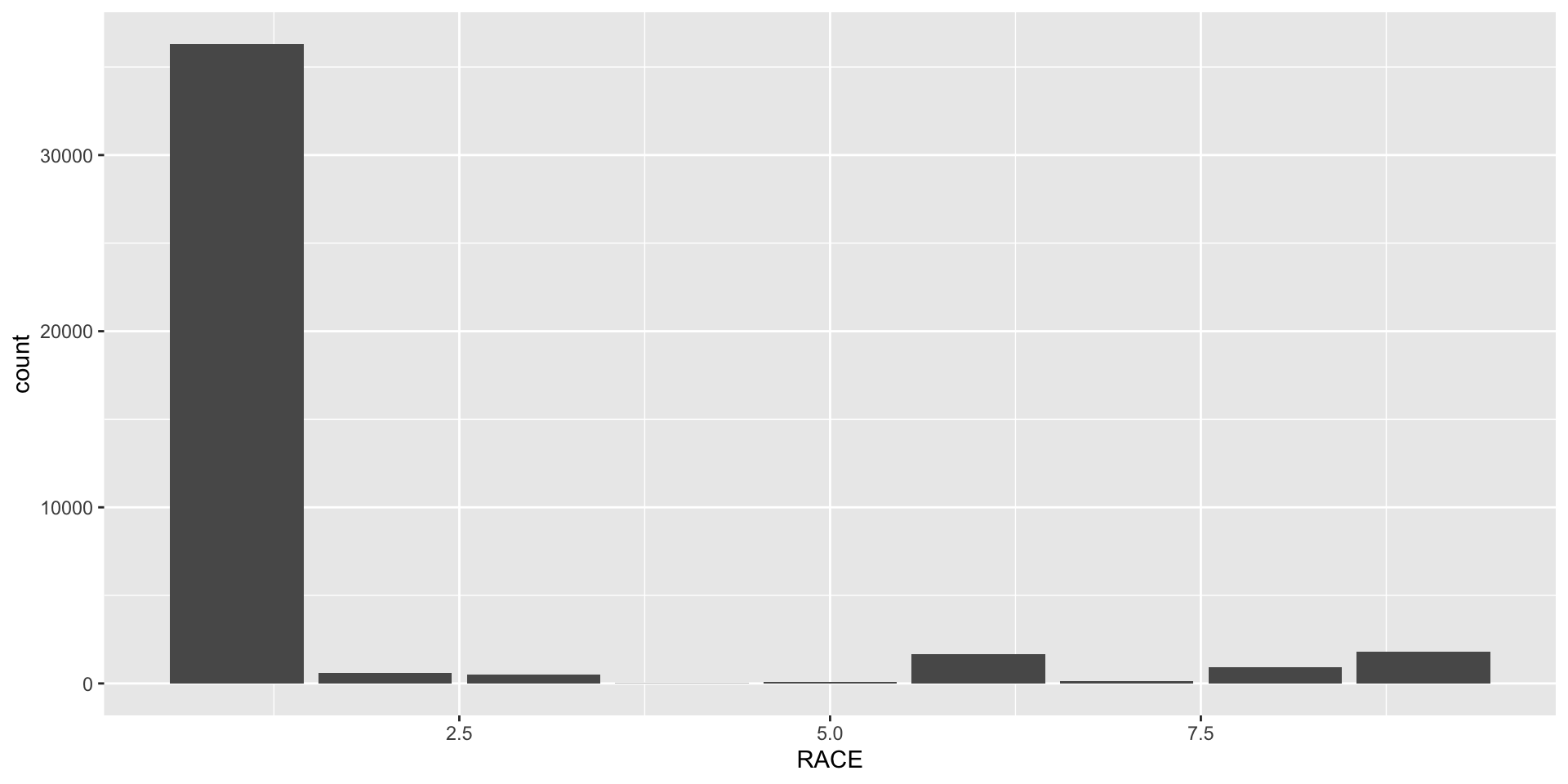
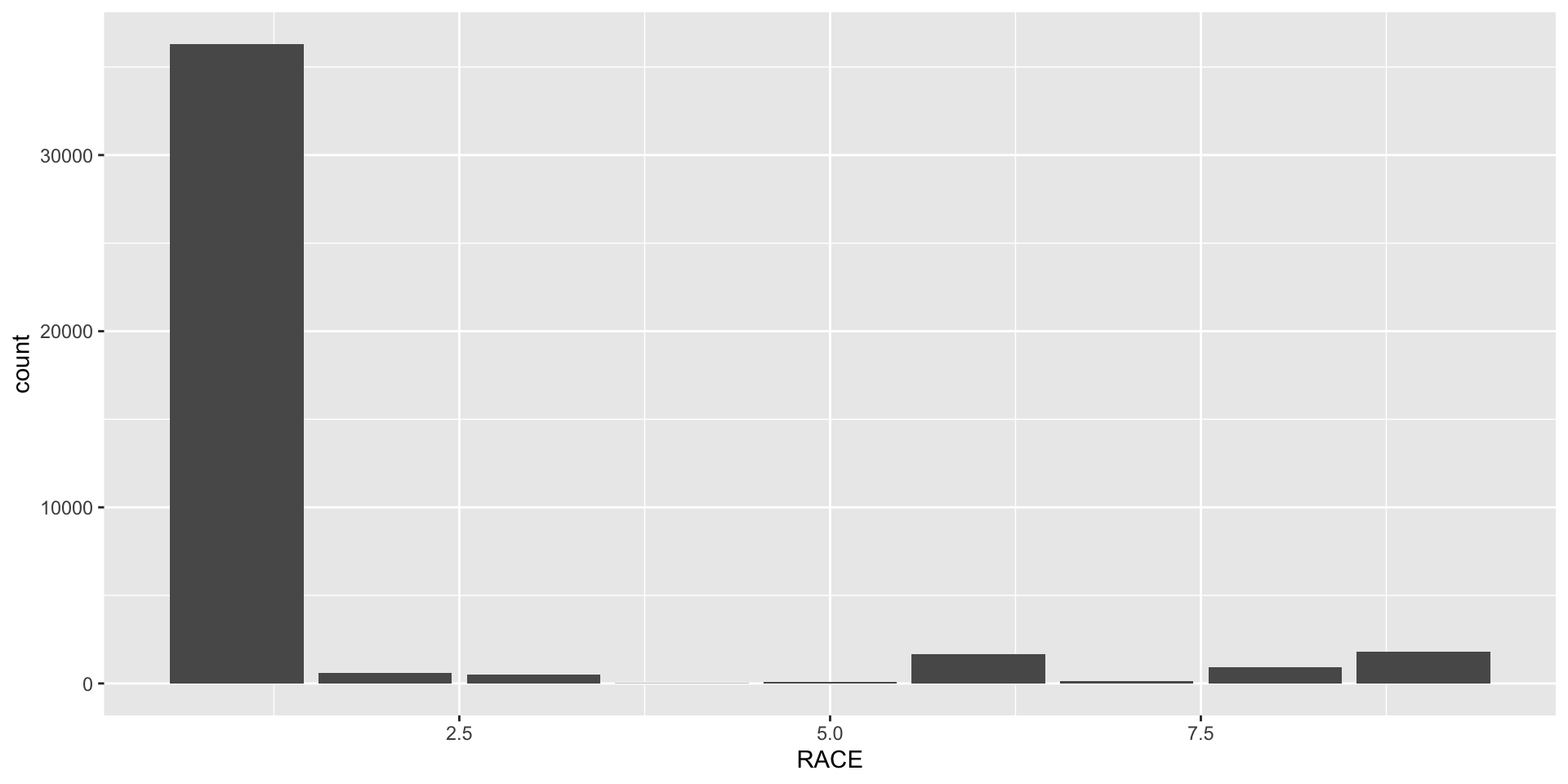
ggplot(data = pumsFinal, aes(x = RACE)) +
  geom_bar()

Building Plots Layer by Layer

# Start with data and aesthetics
ggplot(pumsFinal, aes(x = SALARY))

# Add a geometric layer
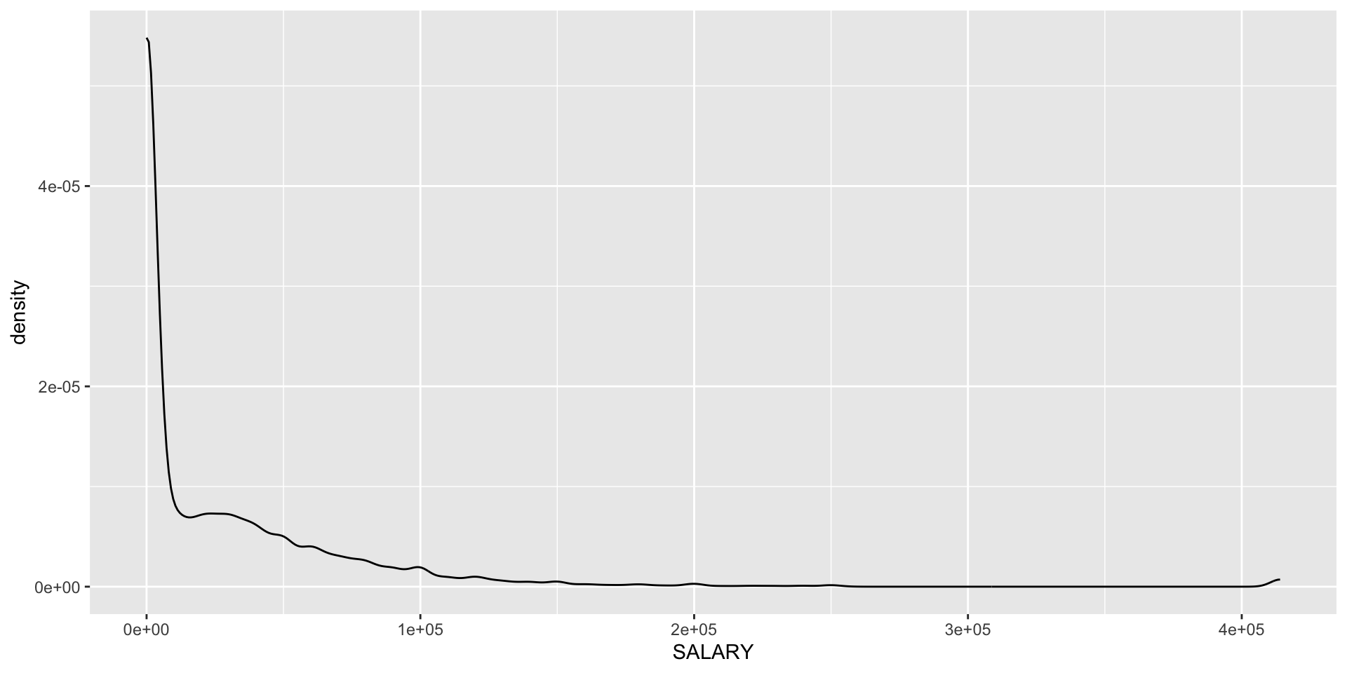
ggplot(pumsFinal, aes(x = SALARY)) +
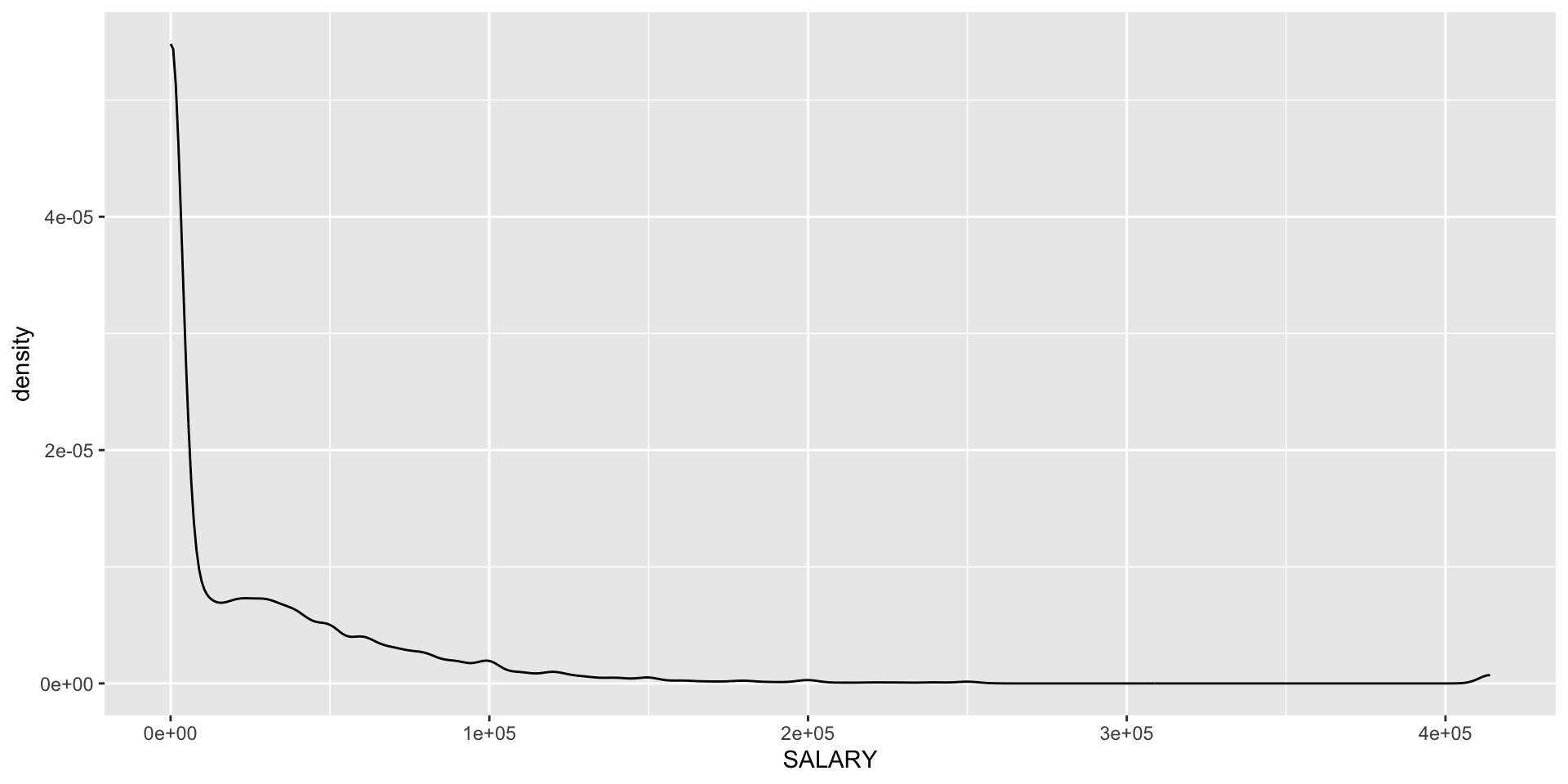
  geom_density()

# Add labels
ggplot(pumsFinal, aes(x = SALARY)) +
  geom_density() +
  labs(title = "Distribution of Salaries",
       x = "Annual Salary",
       y = "Density")

Common Geoms: One Variable

Categorical variable:

ggplot(pumsFinal, aes(x = RACE)) +
  geom_bar()

Continuous variable:

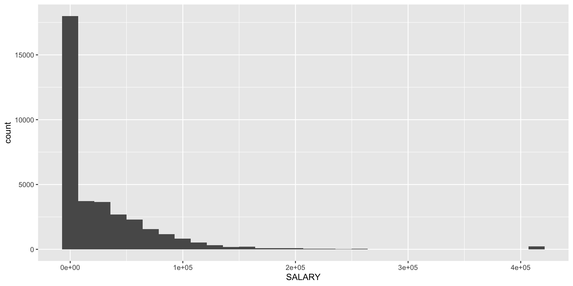
# Histogram
ggplot(pumsFinal, aes(x = SALARY)) +
  geom_histogram(bins = 30)

# Density plot
ggplot(pumsFinal, aes(x = SALARY)) +
  geom_density()

Common Geoms: Two Variables

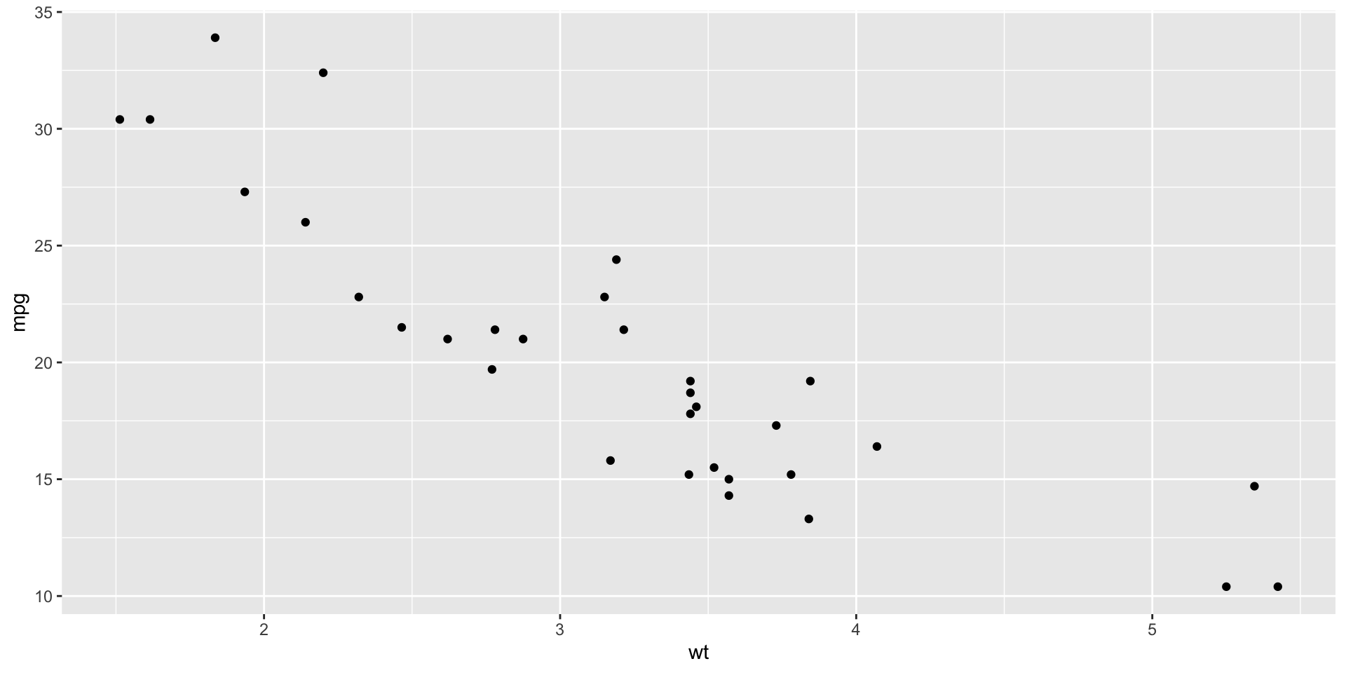
Scatterplot:

ggplot(mtcars, aes(x = wt, y = mpg)) +
  geom_point()

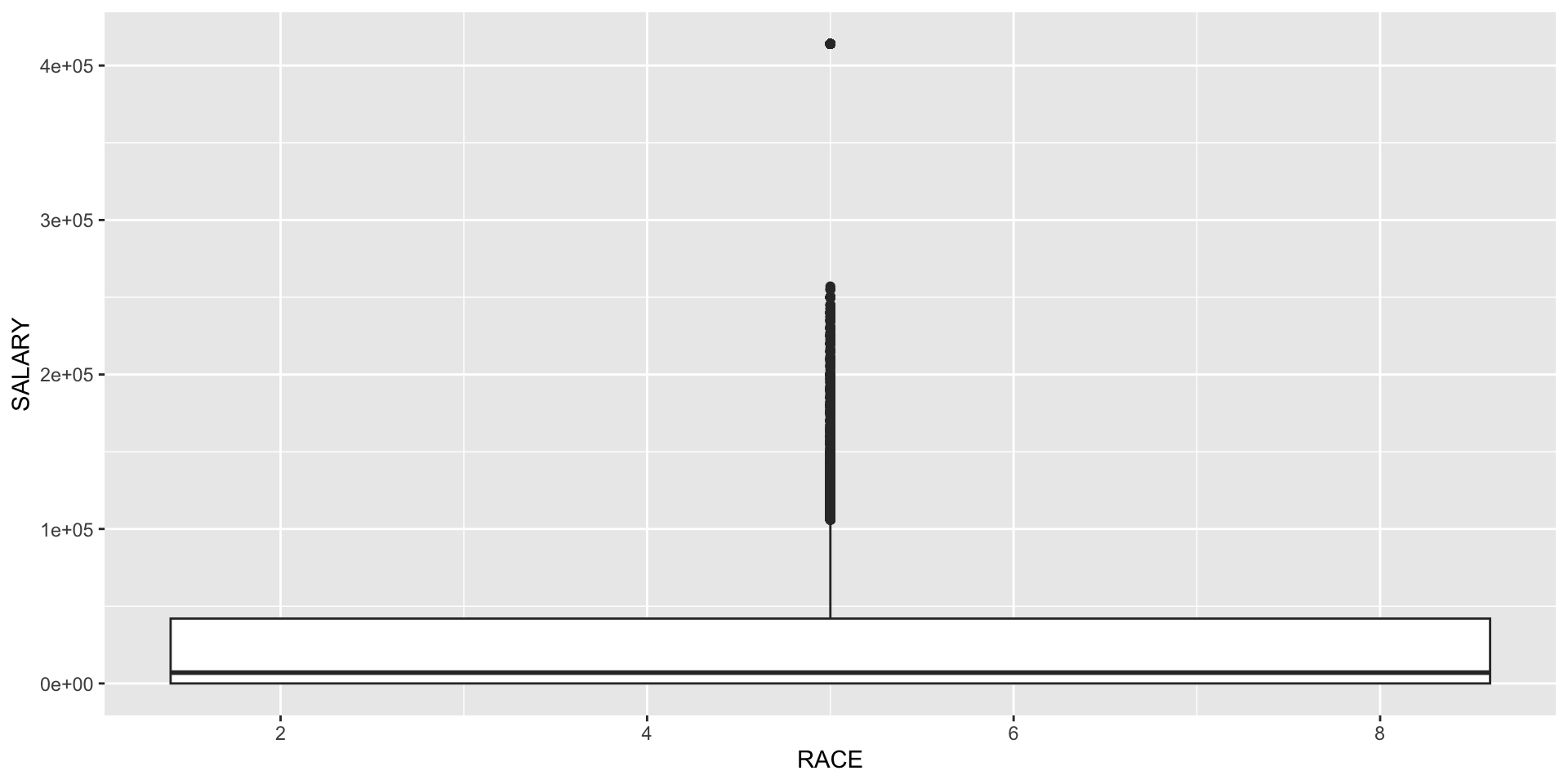
Boxplot by group:

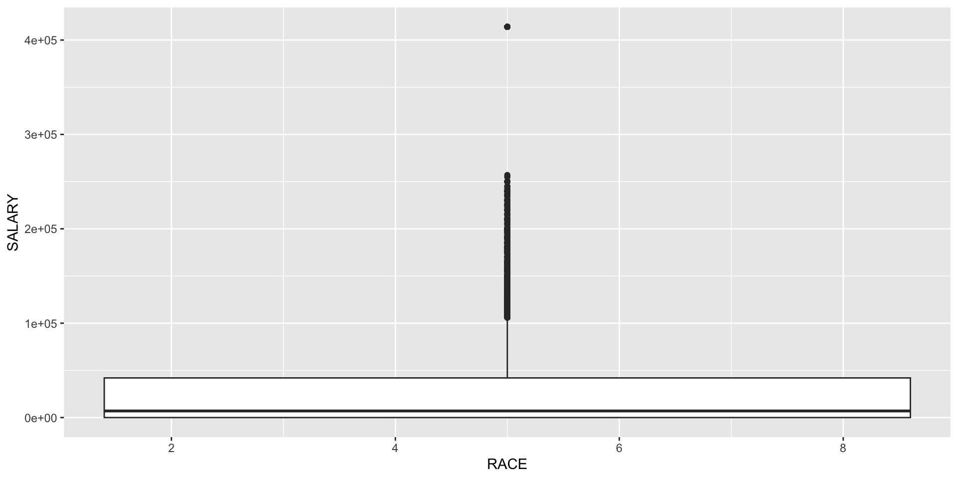
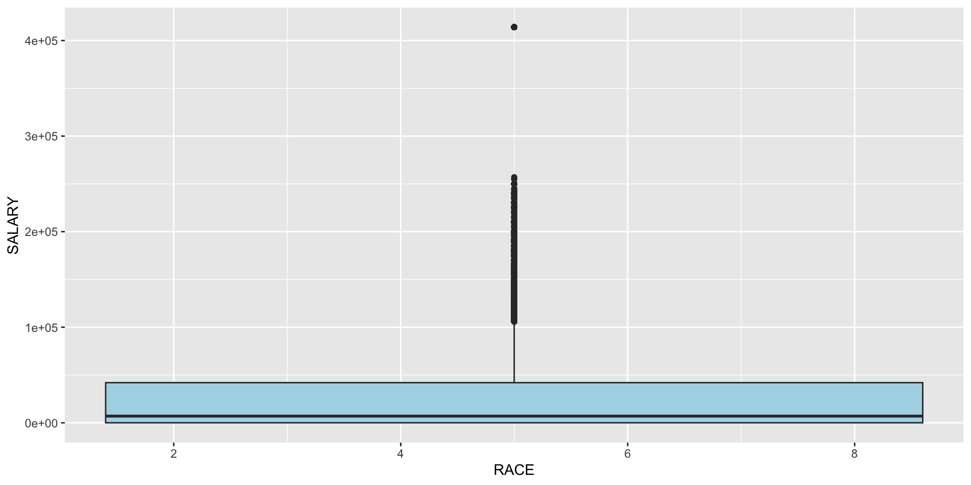
ggplot(pumsFinal, aes(x = RACE, y = SALARY)) +
  geom_boxplot()

Bar plot (summary statistic):

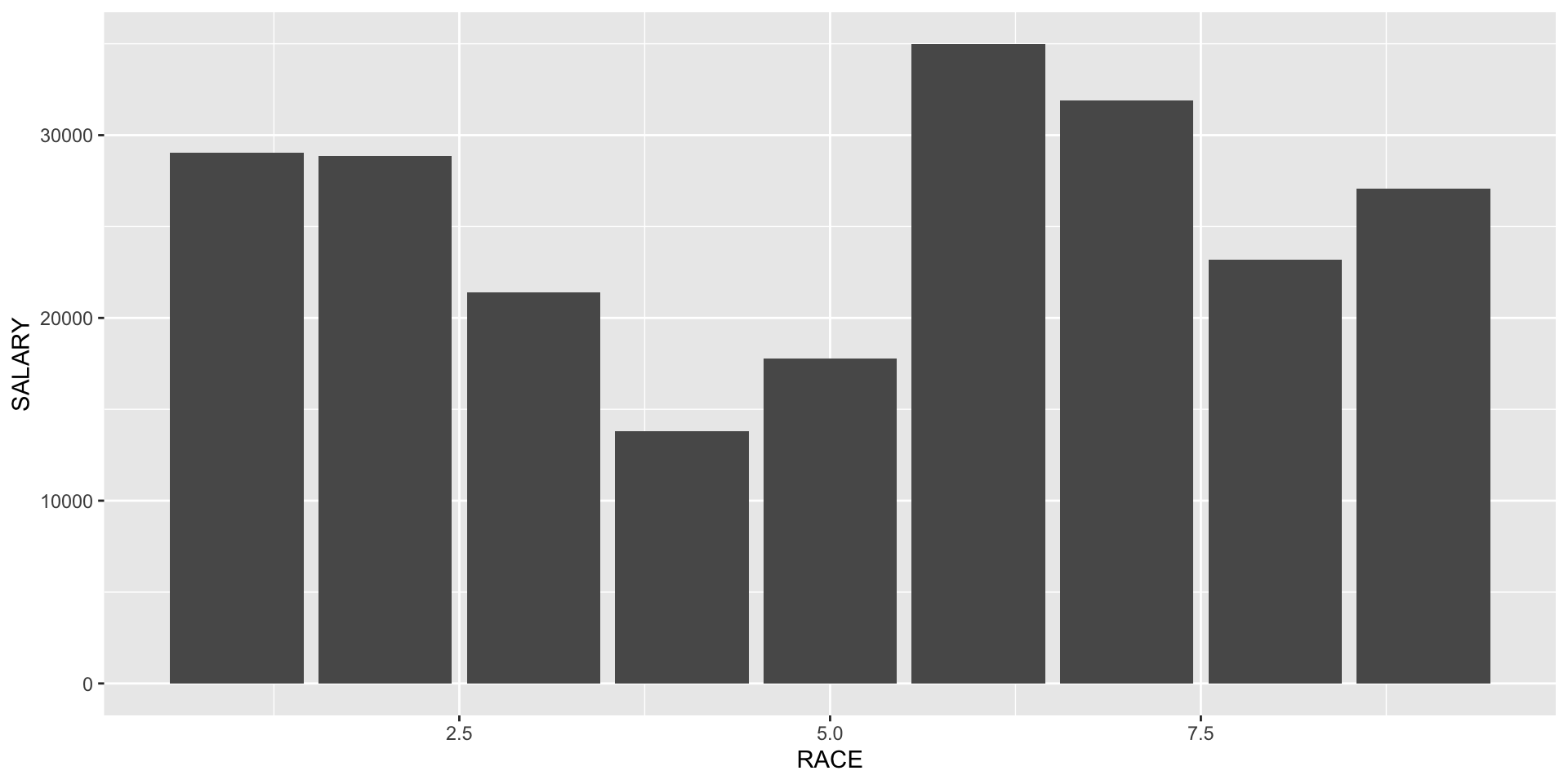
ggplot(pumsFinal, aes(x = RACE, y = SALARY)) +
  geom_bar(stat = "summary", fun = "mean")

Activity 10: Basic ggplot2 Practice

Partner work (10 minutes)

Using the palmerpenguins::penguins dataset:

  1. Create a histogram of bill_length_mm
  2. Create a scatterplot of bill_length_mm vs bill_depth_mm
  3. Add appropriate axis labels and a title
  4. Change the point color to “steelblue”
# Load the data
library(palmerpenguins)
data(penguins)

# Your code here:

Discuss: What patterns do you notice in bill dimensions?

Understanding Aesthetics (aes())

Inside aes() - maps data to visuals:

ggplot(pumsFinal, aes(x = RACE, y = SALARY, fill = RACE)) +
  geom_boxplot()

Outside aes() - fixed values:

ggplot(pumsFinal, aes(x = RACE, y = SALARY)) +
  geom_boxplot(fill = "lightblue")

Critical distinction: Use aes() when mapping to variables, set directly when using constants

Customizing Axes and Labels

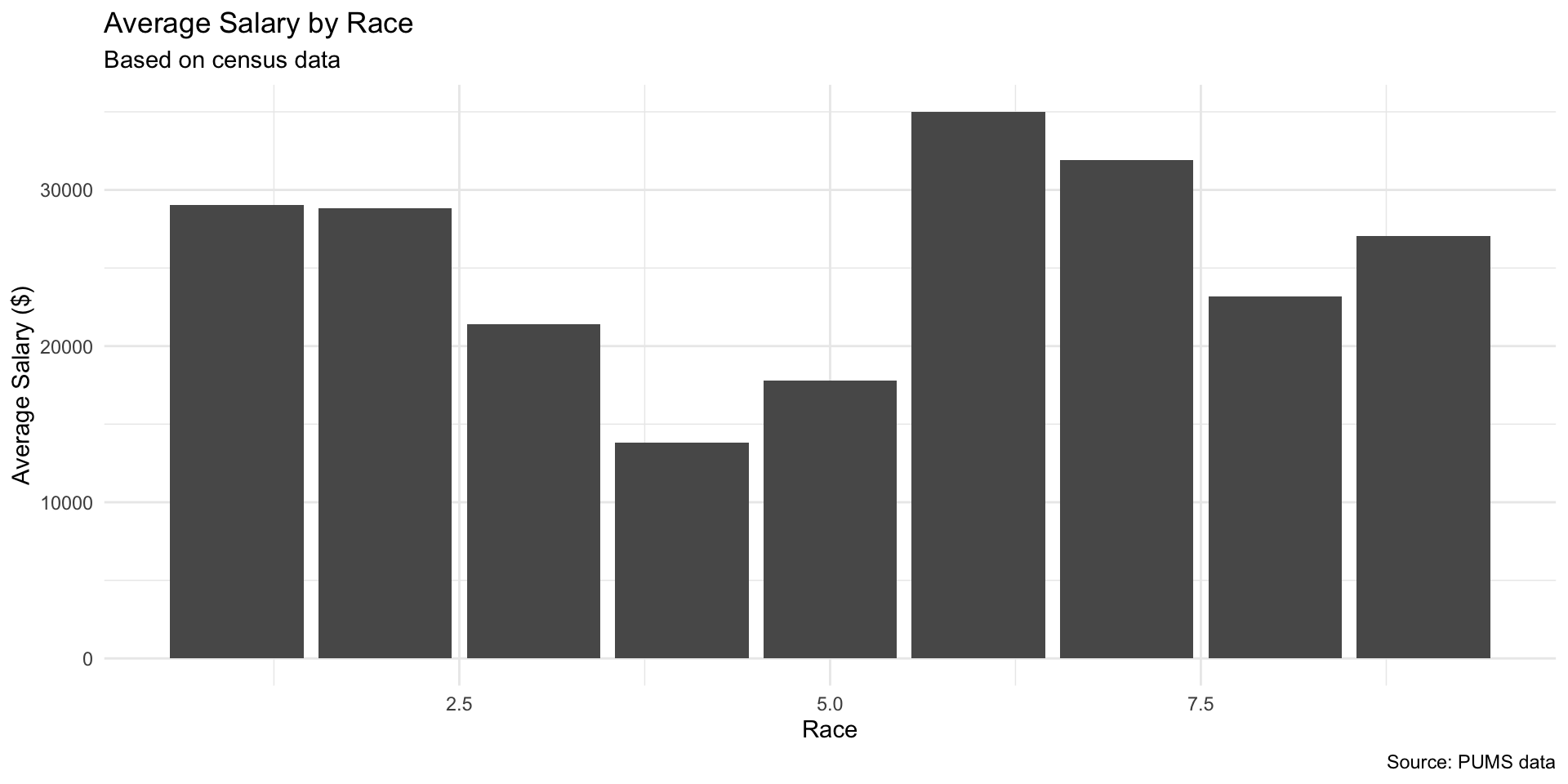
ggplot(pumsFinal, aes(x = RACE, y = SALARY)) +
  geom_bar(stat = "summary", fun = "mean") +
  labs(
    title = "Average Salary by Race",
    subtitle = "Based on census data",
    x = "Race",
    y = "Average Salary ($)",
    caption = "Source: PUMS data"
  ) +
  theme_minimal()

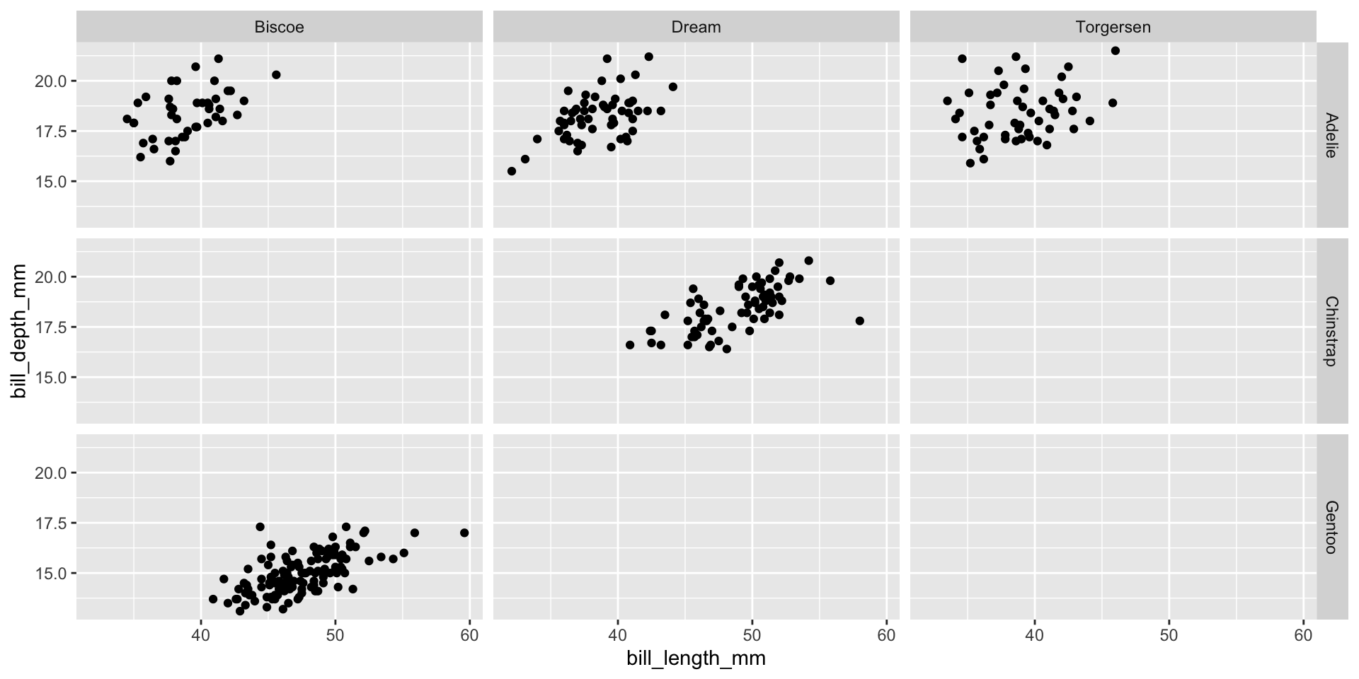
Faceting: Multiple Subplots

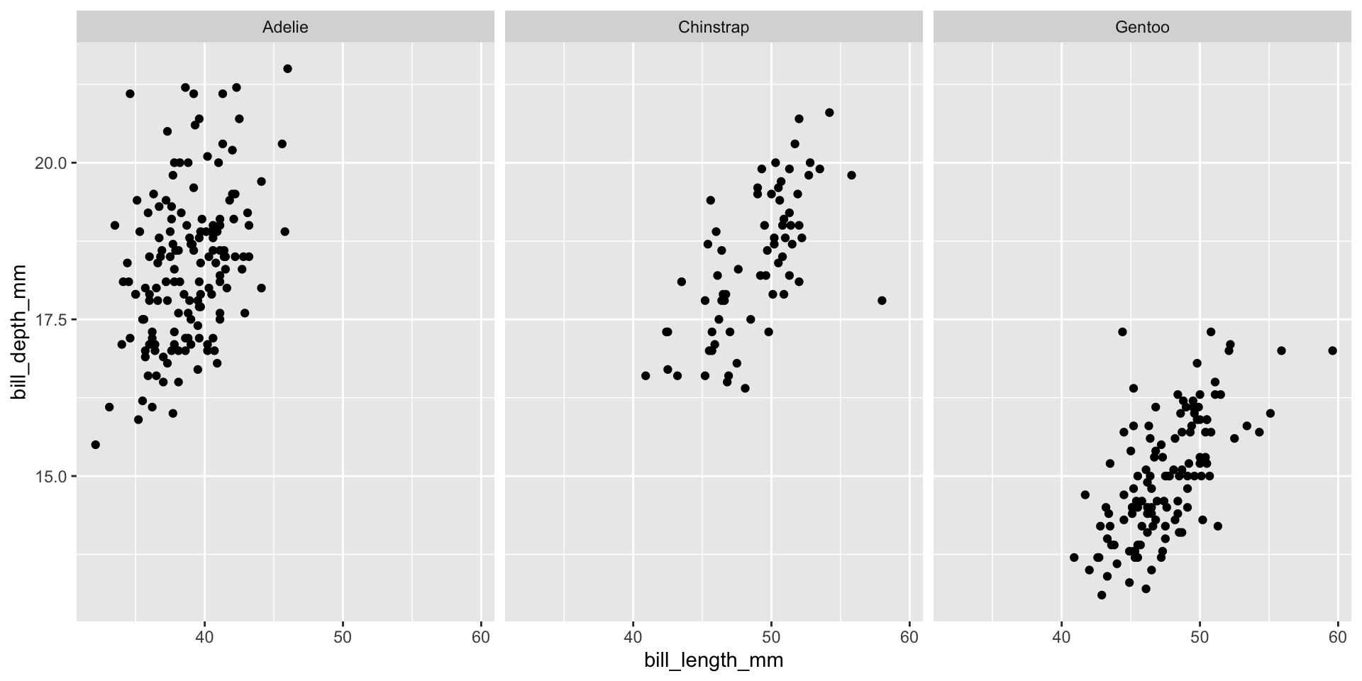
By one variable:

ggplot(penguins, aes(x = bill_length_mm, y = bill_depth_mm)) +
  geom_point() +
  facet_wrap(~ species)

By two variables:

ggplot(penguins, aes(x = bill_length_mm, y = bill_depth_mm)) +
  geom_point() +
  facet_grid(species ~ island)

Activity 11: Advanced ggplot2

Partner work (10 minutes)

Using penguins data, create a visualization that:

  1. Shows the relationship between flipper length and body mass
  2. Colors points by species
  3. Uses facet_wrap() to create separate panels by island
  4. Adds a smooth trend line with geom_smooth()
  5. Uses an appropriate theme (try theme_bw() or theme_minimal())
# Your code here:

Discuss: - How do the relationships differ across islands? - Which species tends to be largest?

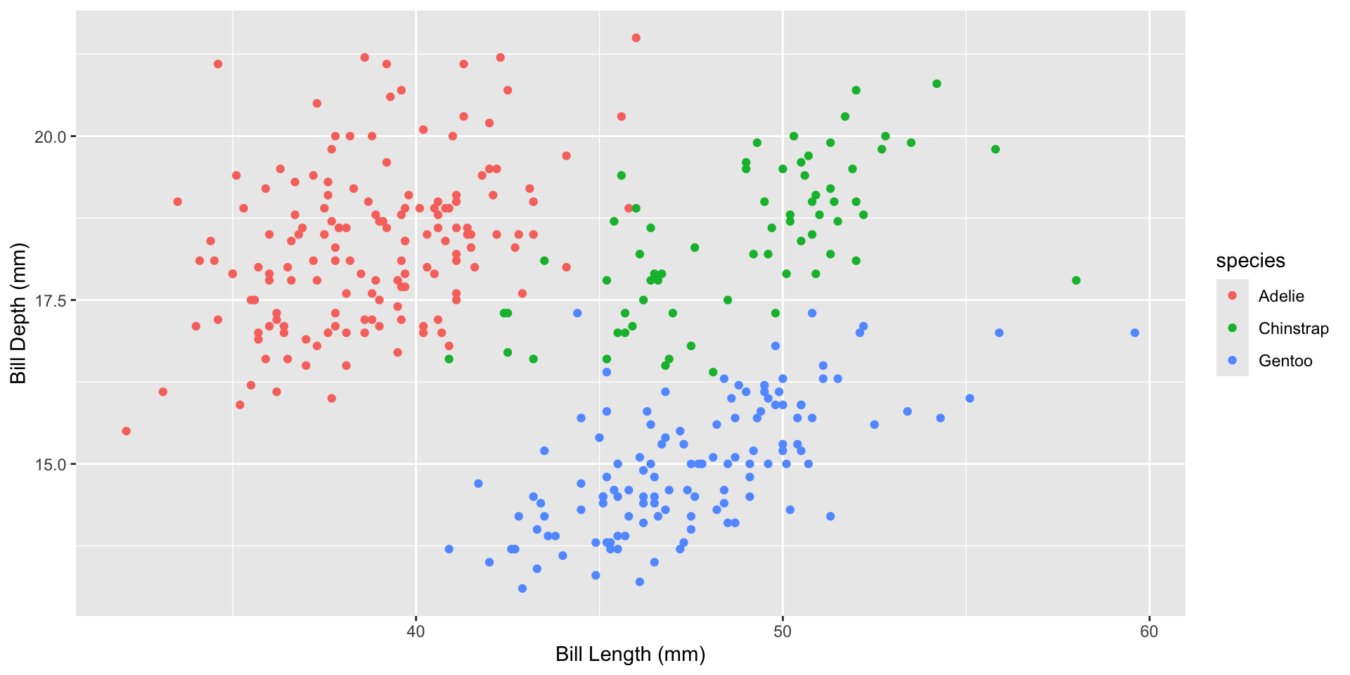
Comparing Base R vs ggplot2

Same plot, different approaches:

Base R:

plot(penguins$bill_length_mm, penguins$bill_depth_mm,
     col = as.numeric(penguins$species),
     xlab = "Bill Length (mm)", ylab = "Bill Depth (mm)")
legend("topright", legend = levels(penguins$species),
       col = 1:3, pch = 1)

ggplot2:

ggplot(penguins, aes(x = bill_length_mm, y = bill_depth_mm, 
                     color = species)) +
  geom_point() +
  labs(x = "Bill Length (mm)", y = "Bill Depth (mm)")

Summary: Graphical Summaries

Key takeaways:

  • Base R graphics are quick and simple but require more code for customization (see reference slides for details)
  • ggplot2 uses a layered grammar:
    • Data + Aesthetics + Geoms
    • Easy to customize and extend
    • Better for complex visualizations

Recommendation: Use ggplot2 for most tasks, especially for publication-quality graphics

Resources for Graphics

General - Data Visualization Catalogue - Veridical Data Science, Ch. 5 — the figure-choice flow chart

ggplot2: - ggplot2 documentation - R Graphics Cookbook - ggplot2 cheat sheet

Base R: - See reference slides (gray background) - ?plot, ?par for help

Practice: The best way to learn is by creating many plots!

📝 Self-Guided Practice (Wednesday Session)

The following slides are not covered live. Work through them on your own, or bring questions to the Wednesday self-guided session.

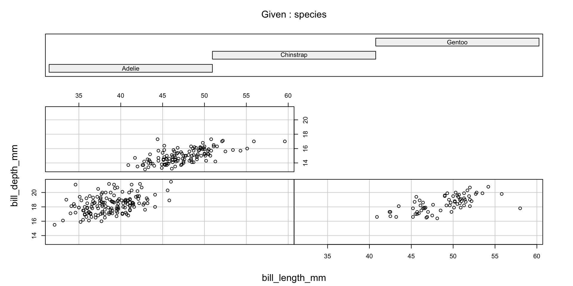
Conditional Plots

The function coplot displays several plots on the same scale. The syntax y~x|a means plots of y vs. x are conditional on a (order from bottom and from left)

coplot(bill_depth_mm ~ bill_length_mm|species, data=penguins)

 Missing rows: 4, 272 

Conditional Plots

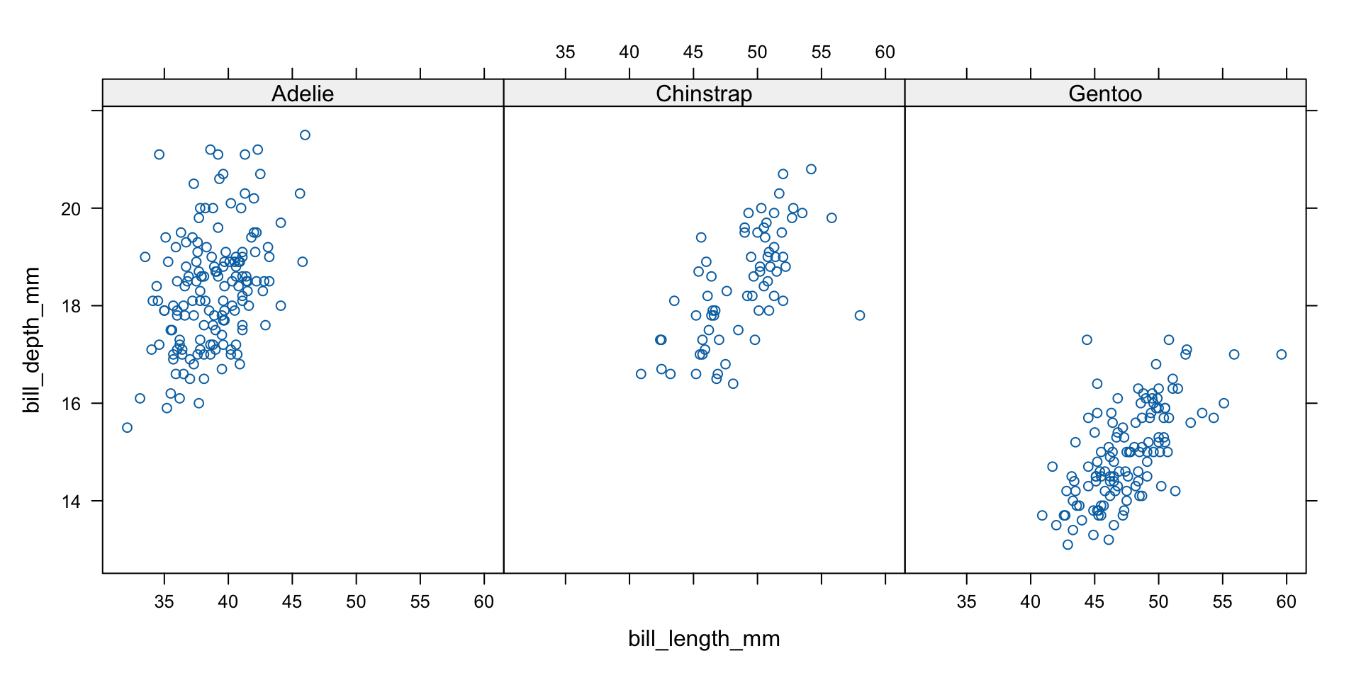
the lattice library also allows us to make conditional plots, which may be easier to read

lattice::xyplot(bill_depth_mm ~ bill_length_mm|species, data=penguins)

Advanced: Manual Chi-Square Calculation

Self-study guide

Understanding the math behind chisq.test():

# Example with spec_island
T <- spec_island

# Step 1: Calculate expected frequencies
row_totals <- rowSums(T)
col_totals <- colSums(T)
grand_total <- sum(T)

Expected <- outer(row_totals, col_totals) / grand_total
Expected
            Biscoe    Dream Torgersen
Adelie    74.23256 54.79070  22.97674
Chinstrap 33.20930 24.51163  10.27907
Gentoo    60.55814 44.69767  18.74419
# Step 2: Calculate chi-square statistic
chi_stat <- sum((T - Expected)^2 / Expected)
chi_stat
[1] 299.5503
# Step 3: Calculate p-value
df <- (nrow(T) - 1) * (ncol(T) - 1)
p_value <- 1 - pchisq(chi_stat, df)
p_value
[1] 0

Key Assumptions for Chi-Square Tests

Self-study guide

When chi-square tests are valid:

  1. Independence: Observations must be independent
  2. Sample size:
    • Each expected count should be ≥ 5
    • If some expected counts < 5, use Fisher’s exact test instead
  3. Random sampling: Data should come from random samples

Warning signs: - Small expected counts → Fisher’s exact test - Non-independent observations → Different methods needed

# Fisher's exact test for small samples
fisher.test(matrix(c(3, 1, 1, 5), nrow = 2))

    Fisher's Exact Test for Count Data

data:  matrix(c(3, 1, 1, 5), nrow = 2)
p-value = 0.1905
alternative hypothesis: true odds ratio is not equal to 1
95 percent confidence interval:
   0.40161 930.24692
sample estimates:
odds ratio 
  10.29391 

Extracting Outliers

Self-study guide

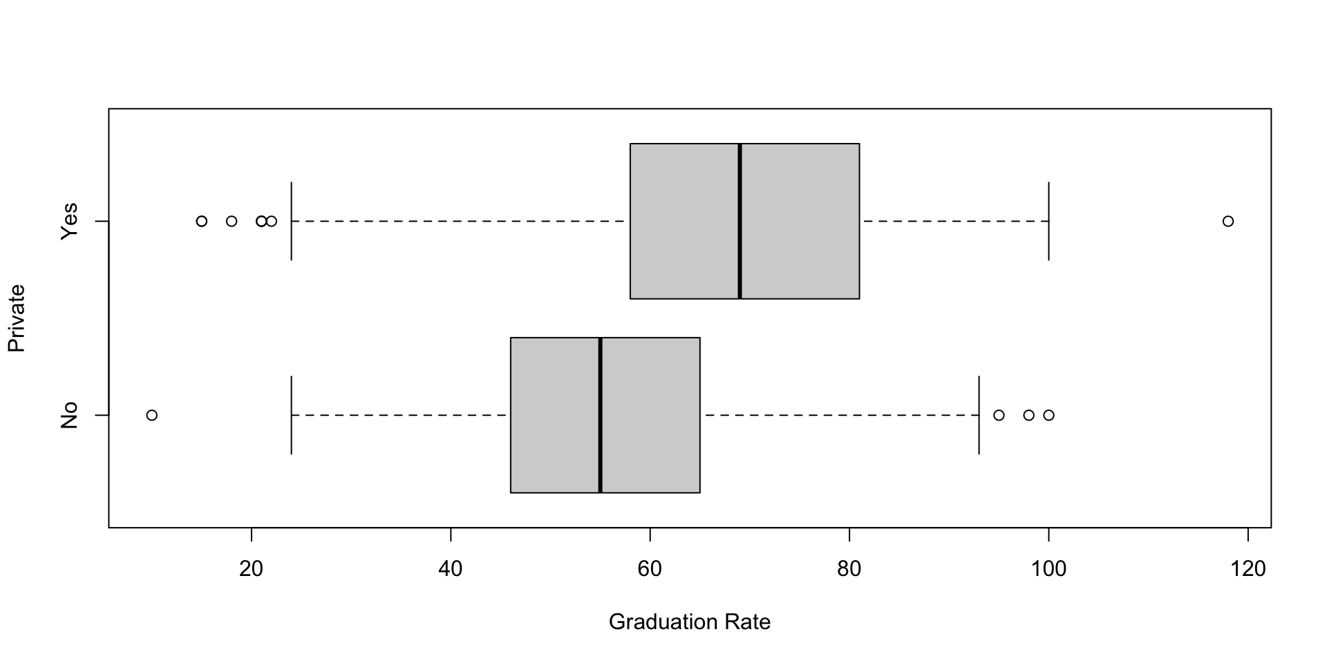
boxplot() returns everything it drew, so you can get the outliers back:

b.output <- boxplot(Grad.Rate ~ Private, data = College,
                    horizontal = TRUE, ylab = "Private",
                    xlab = "Graduation Rate")
# Outlier values
b.output$out
 [1]  98 100  10  95  15  18 118  21  22  21  15  21
# Which group they belong to (1 = No, 2 = Yes for Private)
b.output$group
 [1] 1 1 1 1 2 2 2 2 2 2 2 2

Boxplots identify outliers as values beyond 1.5 × IQR from the quartiles. b.output$stats holds the quartiles and medians, one column per group.

Common Transformations

Self-study guide

Different relationships need different transformations:

Pattern Transformation When to Use
Exponential growth log(y) Data growing multiplicatively
Power relationship log(x) and log(y) Both variables span large ranges
Square root sqrt(y) Count data with increasing variance
Inverse 1/x or 1/y Asymptotic relationships

Rule of thumb: If residuals show patterns, try transforming!

Base R Graphics: Reference Material

⚠️ Self-Study Guide - Not Covered in Detail in Class

The following slides contain useful reference material for customizing base R graphics. Review these on your own time.

Reference: Adjusting Plot Attributes

Self-study guide

Parameters in the function plot:

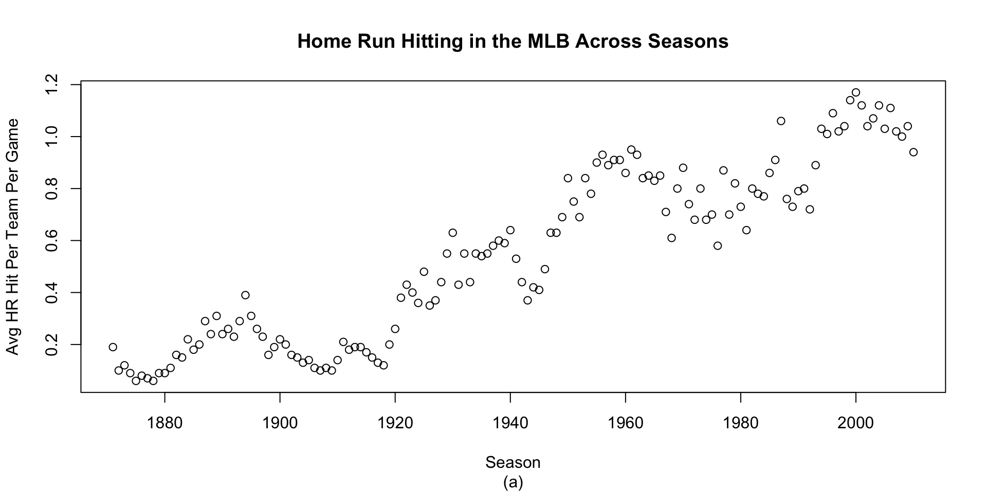
plot(Year, HR, xlab = "Season",
     ylab = "Avg HR Hit Per Team Per Game",
     main = "Home Run Hitting in the MLB Across Seasons",
     sub = " (a) ")

Reference: Changing Plot Type and Symbols

Self-study guide

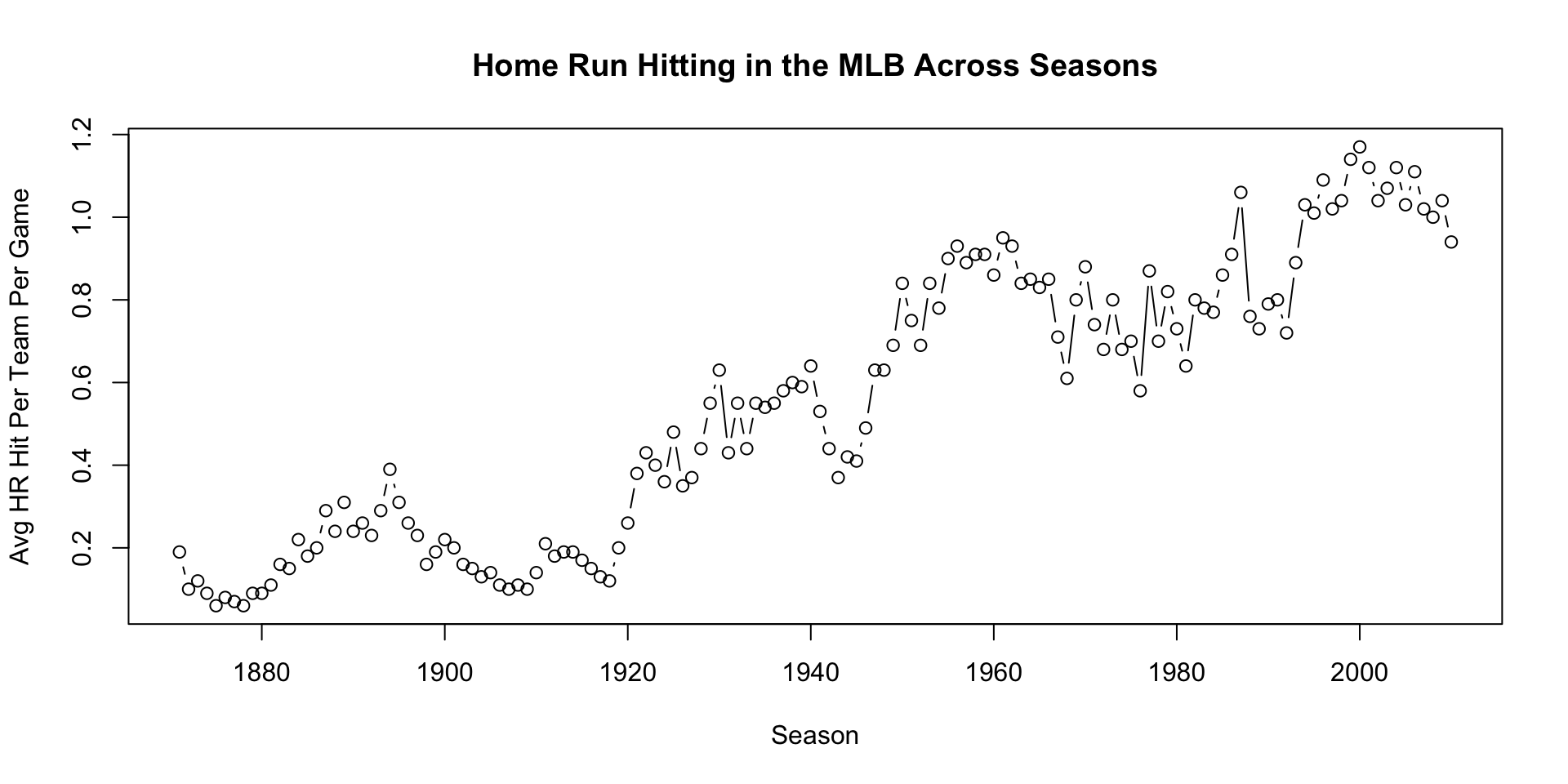
plot(Year, HR, xlab = "Season", type = "b",
     ylab = "Avg HR Hit Per Team Per Game",
     main = "Home Run Hitting in the MLB Across Seasons")

Common type values: - "p" for points (default) - "l" for lines - "b" for both - "h" for histogram-like vertical lines

Reference: Adding Layers

Self-study guide

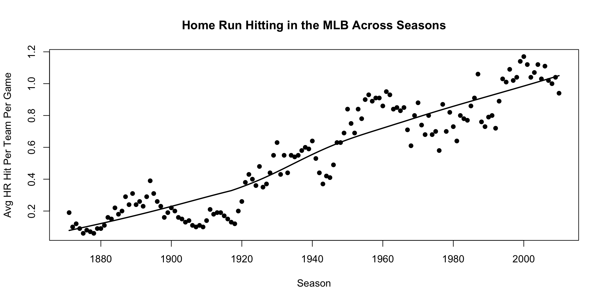
plot(Year, HR, xlab = "Season", pch = 19, cex = 0.9,
     ylab = "Avg HR Hit Per Team Per Game",
     main = "Home Run Hitting in the MLB Across Seasons")
lines(lowess(Year, HR), lwd = 2)

Reference: Multiple Plots with Lattice

Self-study guide

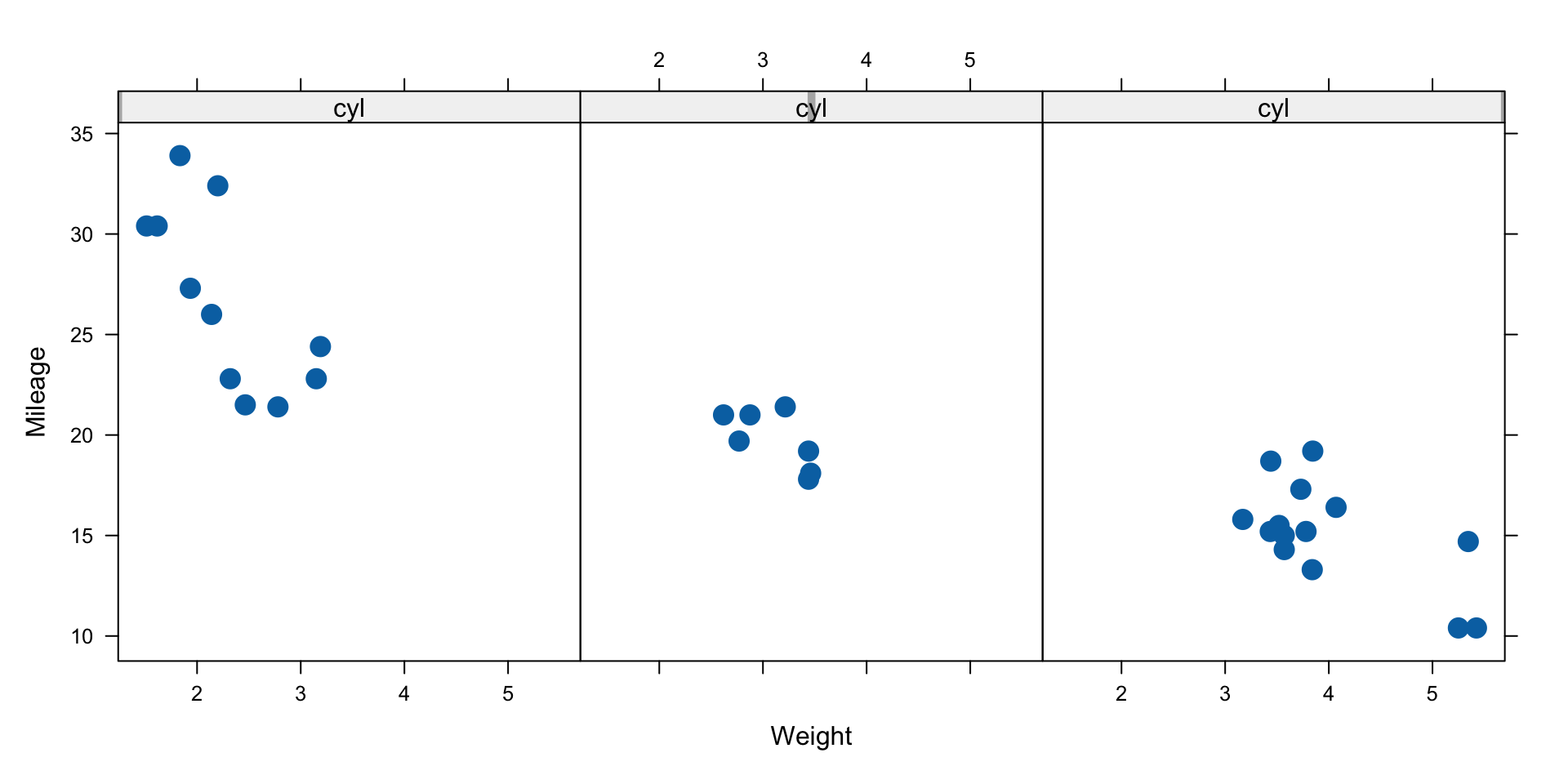
Mileage depends on the number of cylinders:

library(lattice)
xyplot(mpg ~ wt | cyl, data = mtcars,
       xlab = "Weight", ylab = "Mileage",
       pch = 19, cex = 1.5)

Reference: Density Plots with Lattice

Self-study guide

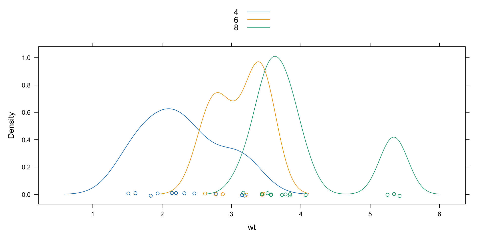
densityplot(~ wt, groups = cyl, data = mtcars, 
            auto.key = list(space = "top"))

Reference: Low-Level Functions

Self-study guide

Creating custom plots from scratch:

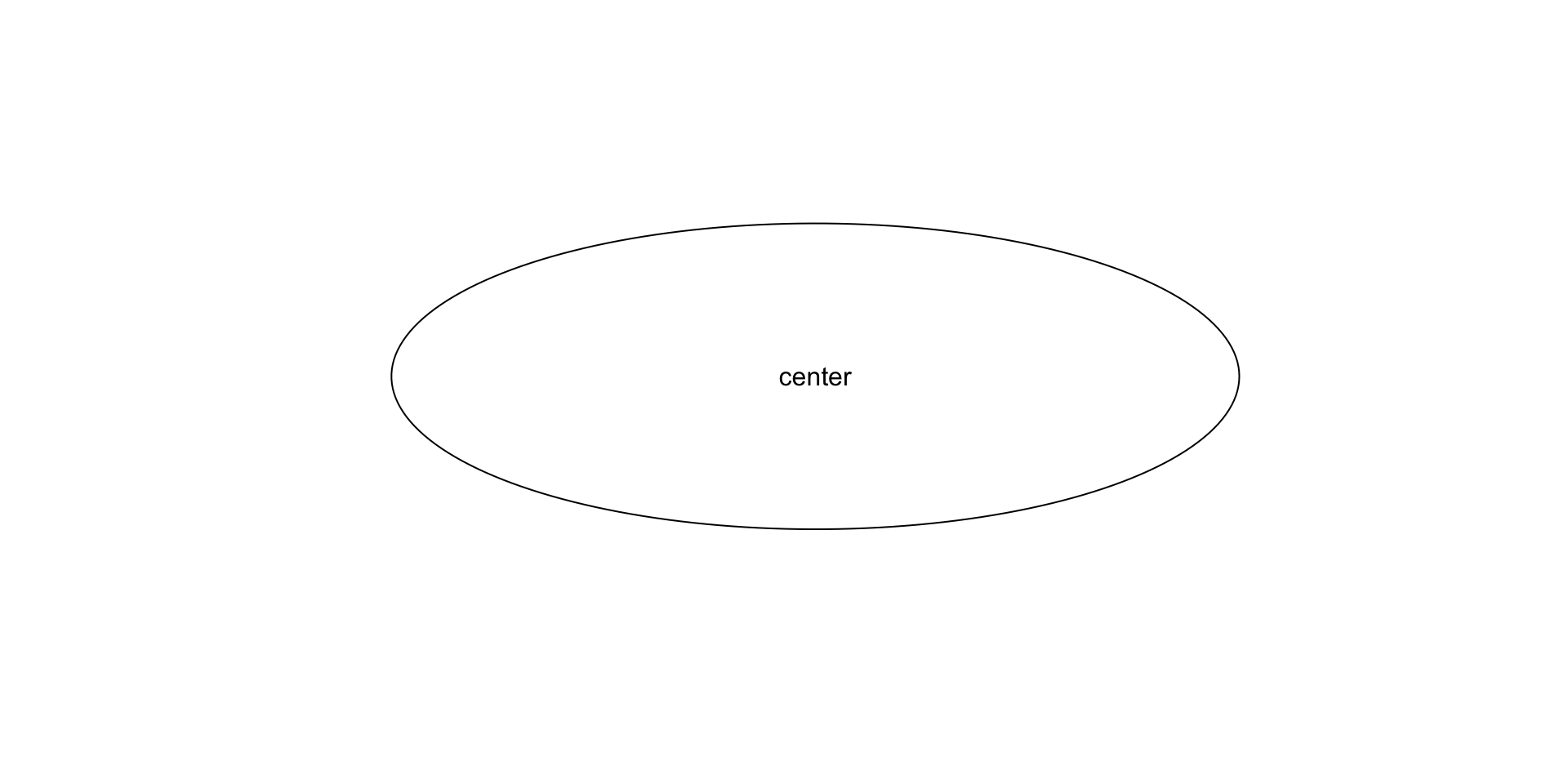
plot.new()
plot.window(xlim = c(-1.5,1.5), ylim = c(-1.5,1.5), pty = "s")
theta <- seq(0, 2*pi, length = 200)
x <- cos(theta); y <- sin(theta)
lines(x, y)
text(0, 0, "center")

Reference: Multiple Figures

Self-study guide

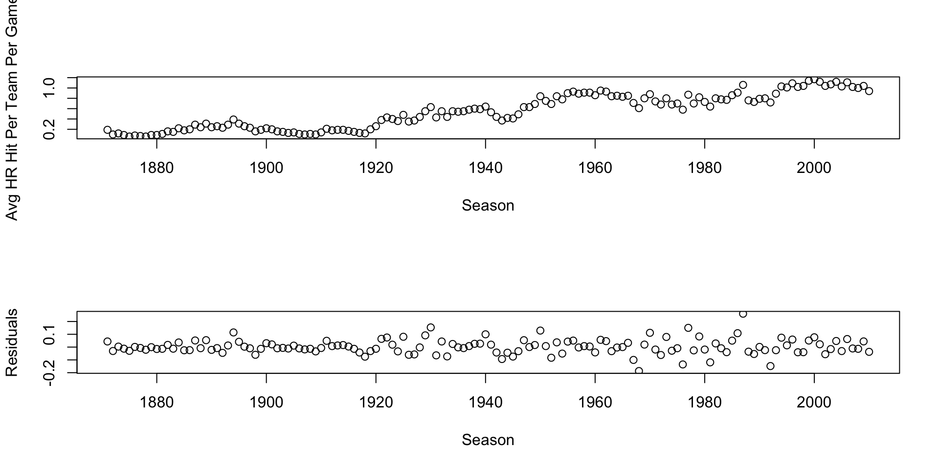
par(mfrow = c(2,1))
fit <- lowess(Year, HR, f = 1/12)
Residual <- HR - fit$y
plot(Year, HR, xlab = "Season",
     ylab = "Avg HR Hit Per Team Per Game")
plot(Year, Residual, xlab = "Season", ylab = "Residuals")
Reference: Customization Options

Self-study guide

Common parameters:

  • xlim and ylim – axis ranges
  • xaxt="n" and yaxt="n" – suppress axes
  • pch – plotting symbols (1-25)
  • cex – size of symbols
  • lwd – line width
  • col – colors
  • lty – line types (1-6)

Reference: Colors and Text

Self-study guide

# View available colors
colors()
  [1] "white"                "aliceblue"            "antiquewhite"        
  [4] "antiquewhite1"        "antiquewhite2"        "antiquewhite3"       
  [7] "antiquewhite4"        "aquamarine"           "aquamarine1"         
 [10] "aquamarine2"          "aquamarine3"          "aquamarine4"         
 [13] "azure"                "azure1"               "azure2"              
 [16] "azure3"               "azure4"               "beige"               
 [19] "bisque"               "bisque1"              "bisque2"             
 [22] "bisque3"              "bisque4"              "black"               
 [25] "blanchedalmond"       "blue"                 "blue1"               
 [28] "blue2"                "blue3"                "blue4"               
 [31] "blueviolet"           "brown"                "brown1"              
 [34] "brown2"               "brown3"               "brown4"              
 [37] "burlywood"            "burlywood1"           "burlywood2"          
 [40] "burlywood3"           "burlywood4"           "cadetblue"           
 [43] "cadetblue1"           "cadetblue2"           "cadetblue3"          
 [46] "cadetblue4"           "chartreuse"           "chartreuse1"         
 [49] "chartreuse2"          "chartreuse3"          "chartreuse4"         
 [52] "chocolate"            "chocolate1"           "chocolate2"          
 [55] "chocolate3"           "chocolate4"           "coral"               
 [58] "coral1"               "coral2"               "coral3"              
 [61] "coral4"               "cornflowerblue"       "cornsilk"            
 [64] "cornsilk1"            "cornsilk2"            "cornsilk3"           
 [67] "cornsilk4"            "cyan"                 "cyan1"               
 [70] "cyan2"                "cyan3"                "cyan4"               
 [73] "darkblue"             "darkcyan"             "darkgoldenrod"       
 [76] "darkgoldenrod1"       "darkgoldenrod2"       "darkgoldenrod3"      
 [79] "darkgoldenrod4"       "darkgray"             "darkgreen"           
 [82] "darkgrey"             "darkkhaki"            "darkmagenta"         
 [85] "darkolivegreen"       "darkolivegreen1"      "darkolivegreen2"     
 [88] "darkolivegreen3"      "darkolivegreen4"      "darkorange"          
 [91] "darkorange1"          "darkorange2"          "darkorange3"         
 [94] "darkorange4"          "darkorchid"           "darkorchid1"         
 [97] "darkorchid2"          "darkorchid3"          "darkorchid4"         
[100] "darkred"              "darksalmon"           "darkseagreen"        
[103] "darkseagreen1"        "darkseagreen2"        "darkseagreen3"       
[106] "darkseagreen4"        "darkslateblue"        "darkslategray"       
[109] "darkslategray1"       "darkslategray2"       "darkslategray3"      
[112] "darkslategray4"       "darkslategrey"        "darkturquoise"       
[115] "darkviolet"           "deeppink"             "deeppink1"           
[118] "deeppink2"            "deeppink3"            "deeppink4"           
[121] "deepskyblue"          "deepskyblue1"         "deepskyblue2"        
[124] "deepskyblue3"         "deepskyblue4"         "dimgray"             
[127] "dimgrey"              "dodgerblue"           "dodgerblue1"         
[130] "dodgerblue2"          "dodgerblue3"          "dodgerblue4"         
[133] "firebrick"            "firebrick1"           "firebrick2"          
[136] "firebrick3"           "firebrick4"           "floralwhite"         
[139] "forestgreen"          "gainsboro"            "ghostwhite"          
[142] "gold"                 "gold1"                "gold2"               
[145] "gold3"                "gold4"                "goldenrod"           
[148] "goldenrod1"           "goldenrod2"           "goldenrod3"          
[151] "goldenrod4"           "gray"                 "gray0"               
[154] "gray1"                "gray2"                "gray3"               
[157] "gray4"                "gray5"                "gray6"               
[160] "gray7"                "gray8"                "gray9"               
[163] "gray10"               "gray11"               "gray12"              
[166] "gray13"               "gray14"               "gray15"              
[169] "gray16"               "gray17"               "gray18"              
[172] "gray19"               "gray20"               "gray21"              
[175] "gray22"               "gray23"               "gray24"              
[178] "gray25"               "gray26"               "gray27"              
[181] "gray28"               "gray29"               "gray30"              
[184] "gray31"               "gray32"               "gray33"              
[187] "gray34"               "gray35"               "gray36"              
[190] "gray37"               "gray38"               "gray39"              
[193] "gray40"               "gray41"               "gray42"              
[196] "gray43"               "gray44"               "gray45"              
[199] "gray46"               "gray47"               "gray48"              
[202] "gray49"               "gray50"               "gray51"              
[205] "gray52"               "gray53"               "gray54"              
[208] "gray55"               "gray56"               "gray57"              
[211] "gray58"               "gray59"               "gray60"              
[214] "gray61"               "gray62"               "gray63"              
[217] "gray64"               "gray65"               "gray66"              
[220] "gray67"               "gray68"               "gray69"              
[223] "gray70"               "gray71"               "gray72"              
[226] "gray73"               "gray74"               "gray75"              
[229] "gray76"               "gray77"               "gray78"              
[232] "gray79"               "gray80"               "gray81"              
[235] "gray82"               "gray83"               "gray84"              
[238] "gray85"               "gray86"               "gray87"              
[241] "gray88"               "gray89"               "gray90"              
[244] "gray91"               "gray92"               "gray93"              
[247] "gray94"               "gray95"               "gray96"              
[250] "gray97"               "gray98"               "gray99"              
[253] "gray100"              "green"                "green1"              
[256] "green2"               "green3"               "green4"              
[259] "greenyellow"          "grey"                 "grey0"               
[262] "grey1"                "grey2"                "grey3"               
[265] "grey4"                "grey5"                "grey6"               
[268] "grey7"                "grey8"                "grey9"               
[271] "grey10"               "grey11"               "grey12"              
[274] "grey13"               "grey14"               "grey15"              
[277] "grey16"               "grey17"               "grey18"              
[280] "grey19"               "grey20"               "grey21"              
[283] "grey22"               "grey23"               "grey24"              
[286] "grey25"               "grey26"               "grey27"              
[289] "grey28"               "grey29"               "grey30"              
[292] "grey31"               "grey32"               "grey33"              
[295] "grey34"               "grey35"               "grey36"              
[298] "grey37"               "grey38"               "grey39"              
[301] "grey40"               "grey41"               "grey42"              
[304] "grey43"               "grey44"               "grey45"              
[307] "grey46"               "grey47"               "grey48"              
[310] "grey49"               "grey50"               "grey51"              
[313] "grey52"               "grey53"               "grey54"              
[316] "grey55"               "grey56"               "grey57"              
[319] "grey58"               "grey59"               "grey60"              
[322] "grey61"               "grey62"               "grey63"              
[325] "grey64"               "grey65"               "grey66"              
[328] "grey67"               "grey68"               "grey69"              
[331] "grey70"               "grey71"               "grey72"              
[334] "grey73"               "grey74"               "grey75"              
[337] "grey76"               "grey77"               "grey78"              
[340] "grey79"               "grey80"               "grey81"              
[343] "grey82"               "grey83"               "grey84"              
[346] "grey85"               "grey86"               "grey87"              
[349] "grey88"               "grey89"               "grey90"              
[352] "grey91"               "grey92"               "grey93"              
[355] "grey94"               "grey95"               "grey96"              
[358] "grey97"               "grey98"               "grey99"              
[361] "grey100"              "honeydew"             "honeydew1"           
[364] "honeydew2"            "honeydew3"            "honeydew4"           
[367] "hotpink"              "hotpink1"             "hotpink2"            
[370] "hotpink3"             "hotpink4"             "indianred"           
[373] "indianred1"           "indianred2"           "indianred3"          
[376] "indianred4"           "ivory"                "ivory1"              
[379] "ivory2"               "ivory3"               "ivory4"              
[382] "khaki"                "khaki1"               "khaki2"              
[385] "khaki3"               "khaki4"               "lavender"            
[388] "lavenderblush"        "lavenderblush1"       "lavenderblush2"      
[391] "lavenderblush3"       "lavenderblush4"       "lawngreen"           
[394] "lemonchiffon"         "lemonchiffon1"        "lemonchiffon2"       
[397] "lemonchiffon3"        "lemonchiffon4"        "lightblue"           
[400] "lightblue1"           "lightblue2"           "lightblue3"          
[403] "lightblue4"           "lightcoral"           "lightcyan"           
[406] "lightcyan1"           "lightcyan2"           "lightcyan3"          
[409] "lightcyan4"           "lightgoldenrod"       "lightgoldenrod1"     
[412] "lightgoldenrod2"      "lightgoldenrod3"      "lightgoldenrod4"     
[415] "lightgoldenrodyellow" "lightgray"            "lightgreen"          
[418] "lightgrey"            "lightpink"            "lightpink1"          
[421] "lightpink2"           "lightpink3"           "lightpink4"          
[424] "lightsalmon"          "lightsalmon1"         "lightsalmon2"        
[427] "lightsalmon3"         "lightsalmon4"         "lightseagreen"       
[430] "lightskyblue"         "lightskyblue1"        "lightskyblue2"       
[433] "lightskyblue3"        "lightskyblue4"        "lightslateblue"      
[436] "lightslategray"       "lightslategrey"       "lightsteelblue"      
[439] "lightsteelblue1"      "lightsteelblue2"      "lightsteelblue3"     
[442] "lightsteelblue4"      "lightyellow"          "lightyellow1"        
[445] "lightyellow2"         "lightyellow3"         "lightyellow4"        
[448] "limegreen"            "linen"                "magenta"             
[451] "magenta1"             "magenta2"             "magenta3"            
[454] "magenta4"             "maroon"               "maroon1"             
[457] "maroon2"              "maroon3"              "maroon4"             
[460] "mediumaquamarine"     "mediumblue"           "mediumorchid"        
[463] "mediumorchid1"        "mediumorchid2"        "mediumorchid3"       
[466] "mediumorchid4"        "mediumpurple"         "mediumpurple1"       
[469] "mediumpurple2"        "mediumpurple3"        "mediumpurple4"       
[472] "mediumseagreen"       "mediumslateblue"      "mediumspringgreen"   
[475] "mediumturquoise"      "mediumvioletred"      "midnightblue"        
[478] "mintcream"            "mistyrose"            "mistyrose1"          
[481] "mistyrose2"           "mistyrose3"           "mistyrose4"          
[484] "moccasin"             "navajowhite"          "navajowhite1"        
[487] "navajowhite2"         "navajowhite3"         "navajowhite4"        
[490] "navy"                 "navyblue"             "oldlace"             
[493] "olivedrab"            "olivedrab1"           "olivedrab2"          
[496] "olivedrab3"           "olivedrab4"           "orange"              
[499] "orange1"              "orange2"              "orange3"             
[502] "orange4"              "orangered"            "orangered1"          
[505] "orangered2"           "orangered3"           "orangered4"          
[508] "orchid"               "orchid1"              "orchid2"             
[511] "orchid3"              "orchid4"              "palegoldenrod"       
[514] "palegreen"            "palegreen1"           "palegreen2"          
[517] "palegreen3"           "palegreen4"           "paleturquoise"       
[520] "paleturquoise1"       "paleturquoise2"       "paleturquoise3"      
[523] "paleturquoise4"       "palevioletred"        "palevioletred1"      
[526] "palevioletred2"       "palevioletred3"       "palevioletred4"      
[529] "papayawhip"           "peachpuff"            "peachpuff1"          
[532] "peachpuff2"           "peachpuff3"           "peachpuff4"          
[535] "peru"                 "pink"                 "pink1"               
[538] "pink2"                "pink3"                "pink4"               
[541] "plum"                 "plum1"                "plum2"               
[544] "plum3"                "plum4"                "powderblue"          
[547] "purple"               "purple1"              "purple2"             
[550] "purple3"              "purple4"              "red"                 
[553] "red1"                 "red2"                 "red3"                
[556] "red4"                 "rosybrown"            "rosybrown1"          
[559] "rosybrown2"           "rosybrown3"           "rosybrown4"          
[562] "royalblue"            "royalblue1"           "royalblue2"          
[565] "royalblue3"           "royalblue4"           "saddlebrown"         
[568] "salmon"               "salmon1"              "salmon2"             
[571] "salmon3"              "salmon4"              "sandybrown"          
[574] "seagreen"             "seagreen1"            "seagreen2"           
[577] "seagreen3"            "seagreen4"            "seashell"            
[580] "seashell1"            "seashell2"            "seashell3"           
[583] "seashell4"            "sienna"               "sienna1"             
[586] "sienna2"              "sienna3"              "sienna4"             
[589] "skyblue"              "skyblue1"             "skyblue2"            
[592] "skyblue3"             "skyblue4"             "slateblue"           
[595] "slateblue1"           "slateblue2"           "slateblue3"          
[598] "slateblue4"           "slategray"            "slategray1"          
[601] "slategray2"           "slategray3"           "slategray4"          
[604] "slategrey"            "snow"                 "snow1"               
[607] "snow2"                "snow3"                "snow4"               
[610] "springgreen"          "springgreen1"         "springgreen2"        
[613] "springgreen3"         "springgreen4"         "steelblue"           
[616] "steelblue1"           "steelblue2"           "steelblue3"          
[619] "steelblue4"           "tan"                  "tan1"                
[622] "tan2"                 "tan3"                 "tan4"                
[625] "thistle"              "thistle1"             "thistle2"            
[628] "thistle3"             "thistle4"             "tomato"              
[631] "tomato1"              "tomato2"              "tomato3"             
[634] "tomato4"              "turquoise"            "turquoise1"          
[637] "turquoise2"           "turquoise3"           "turquoise4"          
[640] "violet"               "violetred"            "violetred1"          
[643] "violetred2"           "violetred3"           "violetred4"          
[646] "wheat"                "wheat1"               "wheat2"              
[649] "wheat3"               "wheat4"               "whitesmoke"          
[652] "yellow"               "yellow1"              "yellow2"             
[655] "yellow3"              "yellow4"              "yellowgreen"         
# Adding text
plot(0, 0, type = "n", xlim = c(-1,1), ylim = c(-1,1))
text(0, 0.5, "Example text", col = "blue", cex = 1.5)

Tip: Use RColorBrewer package for colorblind-safe palettes

Reference: Exporting Graphs

Self-study guide

### Save as PDF
pdf(file = "plot.pdf")
plot(mtcars$wt, mtcars$mpg)
dev.off()
quartz_off_screen 
                2 
### Other formats: png(), jpeg(), etc.