STAT 17: Statistical Methods for Business and Economics
08 Jun 2026
The Netflix Data Challenge 📈
After solving the recommendation mystery, Sarah now faces a new challenge…
She has 50,000 user survey responses with:
- Weekly watch times
- Satisfaction ratings (1-5 scale)
- Preferred genres
- Age demographics
The Problem: Raw numbers everywhere! How can she make sense of it all? 🤔
Today’s mission: Learn to visualize data and calculate measures of center!
What We’ll Accomplish Today
By the end of this lecture, you will be able to:
- ✅ Create and interpret histograms, box plots, and charts using Google Sheets
- ✅ Calculate and interpret measures of central tendency (mean, median, mode)
- ✅ Use sigma notation and calculate arithmetic mean properly
- ✅ Choose the right measure of central tendency for different scenarios
Why Visualize Data?
Raw Numbers 😵
12, 15, 8, 22, 18, 9, 14,
16, 20, 11, 13, 17, 19, 10,
15, 21, 14, 16, 18, 12, 15,
19, 13, 17, 20, 25, 8, 14,
16, 22, 11...
Hard to see patterns!
Visualized Data 😊
Patterns emerge immediately!
Key insight: Human brains process visual information 60,000x faster than text!
Types of Data Displays
Three Main Categories
- Histograms - Show distribution of continuous numerical data
- Bar Charts - Compare categories
- Pie Charts - Show proportions of a whole
Let’s explore each one with Sarah’s Netflix data! 🎬
Histograms: Showing Distributions 📊
- What is a Histogram?
- A bar chart showing the frequency distribution of continuous numerical data by grouping values into bins (ranges)
Key Features:
- Bars touch each other (no gaps!)
- X-axis: ranges of values (bins)
- Y-axis: frequency or count
- Shows the shape of the data
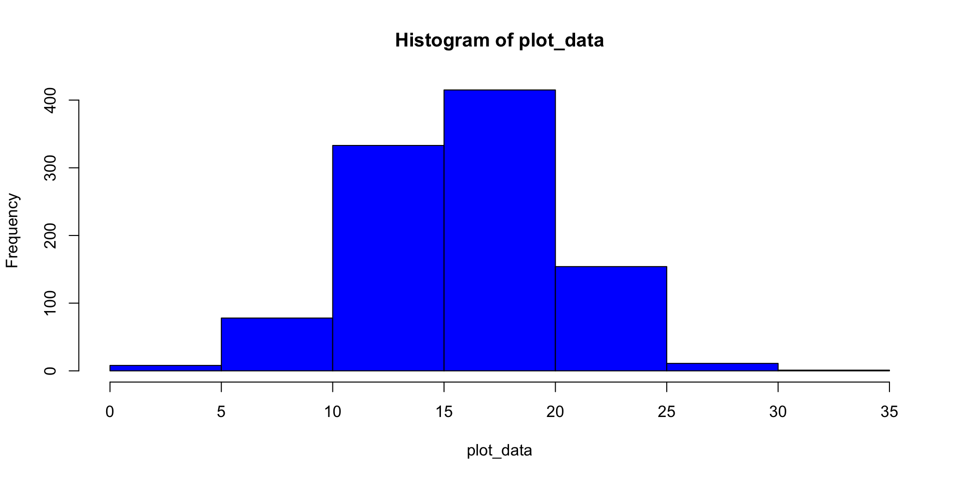
Histogram Example
Sarah’s Data: Weekly watch time (hours) for 100 users
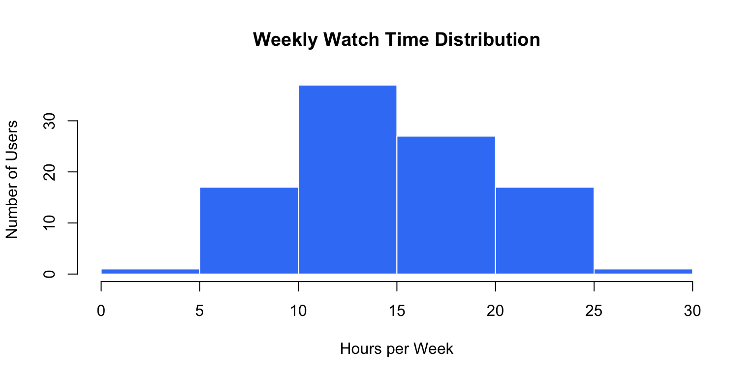
What do you notice? Most users watch 10-15 hours weekly!
Creating Histograms in Google Sheets 💻
Steps:
- Enter your data in a column (e.g., A1:A100)
- Select the data range
- Click Insert → Chart
- In Chart Editor, choose Chart type → Histogram
- Customize:
- Add chart title
- Label axes
- Adjust bin size
Pro tip: Experiment with different bin sizes - too few bins hide patterns, too many create noise!
Bar Charts vs Histograms
Bar Charts
- For categorical data
- Bars have gaps
- Order doesn’t matter (usually)
- Compare groups
Example: Number of users per genre preference
Histograms
- For continuous data
- Bars touch
- Order matters
- Show distribution shape
Example: Distribution of watch times
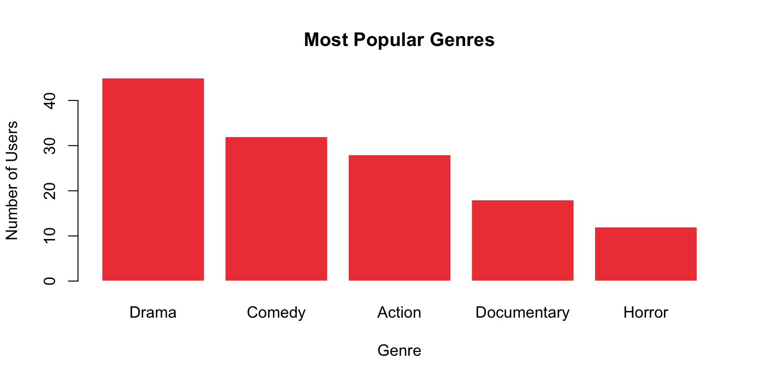
Bar Chart Example
Sarah’s Genre Preferences:
Creating in Google Sheets: Insert → Chart → Column chart (or Bar chart)
Pie Charts: Part of a Whole 🥧
When to Use:
- Show proportions or percentages
- Limited number of categories (3-6 ideal)
- When parts add up to 100%
When NOT to Use:
- Comparing many categories (use bar chart)
- Showing trends over time (use line chart)
- When precise values matter
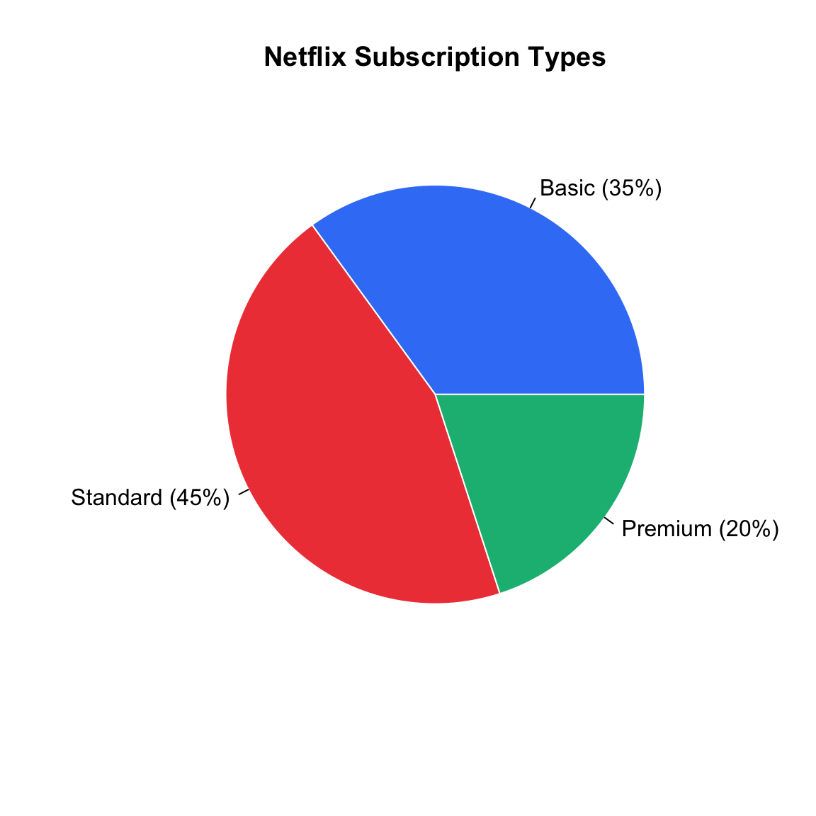
Pie Chart Example
Subscription Type Distribution:
Google Sheets: Insert → Chart → Pie chart
🔄 THINK-PAIR-SHARE #1 (5 minutes)
Chart Selection Challenge: Which visualization would you use?
Scenario 1: Show the distribution of user ages (18-65 years old)
Scenario 2: Compare the number of users across five subscription plans
Scenario 3: Display the market share percentages of different streaming platforms
Discuss with a partner:
- Which chart type for each scenario?
- Why is that the best choice?
- What would be a poor choice and why?
- Sketch the best chart by hand: what goes in each of the axes?
Share your answers on Poll Everywhere!
Share your answers in Poll Everywhere!
Scenario 3: Which chart type for displaying market share percentages of streaming platforms?
Box Plots: The Five-Number Summary 📦
Box Plot shows the distribution through five key values:
- Minimum - smallest value
- Q1 (First Quartile) - 25th percentile
- Median - 50th percentile (middle value)
- Q3 (Third Quartile) - 75th percentile
- Maximum - largest value
Bonus: Easily spots outliers! 🎯
Box Plot Anatomy
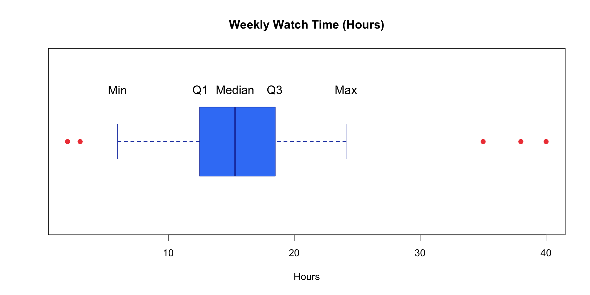
Red dots = Outliers (values far from the rest)
Creating Box Plots in Google Sheets
Unfortunately, Google Sheets doesn’t have a built-in box plot option! 😔
Solutions:
- Create manually using candlestick charts (advanced)
- Use add-ons like “Box and Whisker Chart”
- Calculate five-number summary and describe it
For now: Focus on calculating the five numbers using Google Sheets functions!
Measures of Central Tendency 🎯
Sarah asks: “What’s a typical Netflix user’s weekly watch time?”
She has 50,000 different numbers. Which single number best represents them all?
Three measures of “center”:
- Mean (average)
- Median (middle value)
- Mode (most frequent)
The Mean (Average) 📊
Definition: The sum of all values divided by the number of values
Why use it?:
- Uses ALL data points
- Algebraically useful for further calculations
- Most commonly reported measure
Caution: Sensitive to outliers! 🚨
Mean Formulas and Notation
Sample Mean: \(\bar{x} = \frac{\sum_{i=1}^{n} x_i}{n} = \frac{x_1 + x_2 + ... + x_n}{n}\)
Population Mean: \(\mu = \frac{\sum_{i=1}^{N} x_i}{N}\)
Understanding Sigma Notation (Σ):
- Σ (capital Greek letter sigma) means “sum of”
- i=1 is the starting index
- n or N is the ending index
- xi represents each value in the dataset
Sigma Notation Example
Calculate: \(\sum_{i=1}^{5} x_i\) where x = {10, 15, 12, 18, 20}
Expanding:
\(\sum_{i=1}^{5} x_i = x_1 + x_2 + x_3 + x_4 + x_5\)
\(= 10 + 15 + 12 + 18 + 20 = 75\)
Mean: \(\bar{x} = \frac{75}{5} = 15\) hours
Calculating Mean in Google Sheets
Example data in cells A1:A5: 10, 15, 12, 18, 20
Formula: =AVERAGE(A1:A5)
Result: 15
Alternative (manual calculation):
=SUM(A1:A5)/COUNT(A1:A5)
Also gives 15!
Pro tip: Use AVERAGE for simplicity, but know the underlying calculation!
The Median 🎯
Definition: The middle value when data is arranged in order
How to find it:
- Order the data from smallest to largest
- If n is odd: The median is the middle value
- If n is even: The median is the average of the two middle values
Median Examples
Odd n (n=5):
Data: 10, 12, 15, 18, 20
Median = 15 hours
(The 3rd value)
Even n (n=6):
Data: 10, 12, 15, 18, 20, 22
Median = (15 + 18)/2 = 16.5 hours
(Average of 3rd and 4th values)
Position formula: If ordered, median is at position (n+1)/2
Calculating Median in Google Sheets
Example data in A1:A6: 20, 10, 15, 12, 22, 18
Formula: =MEDIAN(A1:A6)
Result: 16.5
Google Sheets automatically:
- Sorts the data
- Finds the middle value(s)
- Averages if n is even
Key advantage: You don’t need to manually sort! 🎉
The Mode 🔢
Definition: The value that appears most frequently in the dataset
Types:
- Unimodal: One mode (most common)
- Bimodal: Two modes
- Multimodal: More than two modes
- No mode: All values appear equally (or all unique)
Mode Examples
Unimodal:
12, 15, 15, 15, 18, 20
Mode = 15
(appears 3 times)
Bimodal:
12, 12, 15, 18, 18, 20
Modes = 12 and 18
(both appear twice)
No Mode:
10, 12, 15, 18, 20
No mode
(all values unique)
Best for:
Categorical data!
Example: Most popular genre, common subscription type
Calculating Mode in Google Sheets
Example data in A1:A7: 15, 12, 15, 18, 15, 20, 12
Formula: =MODE(A1:A7)
or
=MODE.SNGL(A1:A7)
Result: 15
For multiple modes: =MODE.MULT(A1:A7) returns array of modes
Limitation: Only works with numerical data. For categorical data, use pivot tables or COUNTIF!
Mean vs Median: A Critical Comparison
Sarah’s Dilemma: Weekly watch times (hours) from 7 users
Data: 5, 8, 10, 12, 15, 18, 95
Mean: (5+8+10+12+15+18+95)/7 = 23.3 hours
Median: 5, 8, 10, 12, 15, 18, 95 = 12 hours
Question: Which better represents a “typical” user? 🤔
When Mean ≠ Median
The 95-hour user is an OUTLIER - someone who binges excessively!
Impact:
- Mean is “pulled” toward the outlier (23.3 hrs - inflated!)
- Median is resistant to outliers (12 hrs - more typical!)
Sarah’s decision: Report median to executives when data has outliers!
Which Measure to Use? 🤔
Use MEAN when:
- Data is symmetric (no extreme values)
- You want to use all data
- Doing further calculations
- Working with interval/ratio data
Example: Average test scores in a class
Use MEDIAN when:
- Data has outliers or is skewed
- You want a resistant measure
- Working with ordinal data
- Describing “typical” value
Example: Household income, home prices
Which Measure to Use? (continued)
Use MODE when:
- Working with categorical data
- Want the most typical/popular value
- Interested in what occurs most often
Example: Most popular shoe size, favorite ice cream flavor
Pro tip: Often report multiple measures for complete picture!
Example: “Mean watch time is 23 hours, but median is 12 hours, suggesting some extreme binge-watchers.”
🔄 THINK-PAIR-SHARE #2 (7 minutes)
Scenario Analysis - Work with a partner:
Scenario 1: Netflix user watch times (hours):
5, 8, 10, 12, 15, 18, 95
- Calculate mean and median (use calculator or estimate)
- Which better represents “typical” viewing? Why?
- What does the large difference tell you?
Scenario 2: User satisfaction ratings:
1-star, 3-star, 4-star, 5-star, 5-star, 5-star
- Calculate mean, median, and mode
- Which measure(s) would you report to executives?
- Justify your choice!
🔄 THINK-PAIR-SHARE #2 (7 minutes)
Post one paragraph with your analysis on Ed Discussion!
Post on Ed Discussion:
- Your calculations for both scenarios
- Which measures you chose and why
- Include names of your group members
Google Sheets: Hands-On Summary 💻
Essential Functions:
| Function | Purpose | Example |
|---|---|---|
=AVERAGE(range) |
Calculate mean | =AVERAGE(A1:A100) |
=MEDIAN(range) |
Find median | =MEDIAN(A1:A100) |
=MODE(range) |
Find mode | =MODE(A1:A100) |
=SUM(range) |
Sum all values | =SUM(A1:A100) |
=COUNT(range) |
Count values | =COUNT(A1:A100) |
=MIN(range) |
Minimum value | =MIN(A1:A100) |
=MAX(range) |
Maximum value | =MAX(A1:A100) |
Creating Charts in Google Sheets
Steps:
- Select your data range (including headers if you have them)
- Click Insert → Chart
- Choose chart type in Chart Editor:
- Histogram for distributions
- Column/Bar chart for categories
- Pie chart for proportions
- Customize:
- Add chart title and axis labels
- Adjust colors and styling
- Modify legend position
Sarah’s Success Story! 🎉
What Sarah Discovered:
- Histogram revealed most users watch 10-15 hours/week (clear peak)
- Mean = 18 hours (pulled up by binge-watchers)
- Median = 12 hours (better represents typical user)
- Mode genre = Drama (informed content acquisition strategy)
- Box plot identified super-users (outliers) for targeted retention campaigns
The Impact:
- ✅ 15% increase in user engagement
- ✅ Better content recommendations
- ✅ Informed marketing strategies
Your Statistical Toolkit 🧰
Visualization Skills:
- Histograms show distributions of continuous data
- Bar charts compare categories
- Pie charts show proportions
- Box plots reveal five-number summary and outliers
Central Tendency Mastery:
- Mean = arithmetic average (Σx/n) - use for symmetric data
- Median = middle value - resistant to outliers
- Mode = most frequent - best for categorical data
Google Sheets Proficiency:
- Use built-in functions:
AVERAGE,MEDIAN,MODE - Create insightful visualizations with Insert → Chart
- Understand when to use each measure
Looking Ahead
Next Class: Measures of Spread & Distribution Shape
- Range, variance, standard deviation
- Understanding skewness
- Interpreting data variability
Questions? These concepts are fundamental - make sure you’re comfortable! 🤝
Quick Knowledge Check ✅
Rate your confidence (1-5) on Ed Discussion:
- Creating and interpreting histograms, bar charts, pie charts ⭐⭐⭐⭐⭐
- Understanding when to use each visualization type ⭐⭐⭐⭐⭐
- Calculating and interpreting mean, median, mode ⭐⭐⭐⭐⭐
- Using sigma notation correctly ⭐⭐⭐⭐⭐
- Choosing appropriate measures for different data scenarios ⭐⭐⭐⭐⭐
If you rated anything 3 or below, please visit office hours! 🤝
Thank you! 📊✨
Questions? Office hours information on Canvas.
Next up: Measures of Spread & Distribution Shape!
![]()
STAT 17 – Spring 2026